
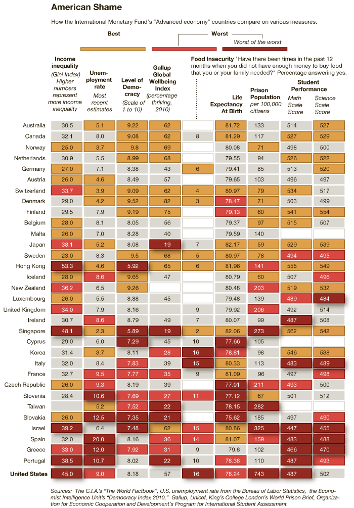
An infographic accompanying an article at the New York Times reveals how “advanced economies” compare on various measures of equality, well-being, educational attainment, and more. To illustrate this, for each measure countries that rank well are coded tan, countries that rank poorly and very poorly are coded orange and red respectively, and countries that are in the middle are grey. The countries are then ranked from best to worst overall, with Australia coming in #1 and the United States coming in last. You might be surprised how some of these countries measure up.
Thanks to Dmitriy T.M. for the link.
Lisa Wade, PhD is an Associate Professor at Tulane University. She is the author of American Hookup, a book about college sexual culture; a textbook about gender; and a forthcoming introductory text: Terrible Magnificent Sociology. You can follow her on Twitter and Instagram.
Comments 46
Anais — March 5, 2011
Interesting, though I am unimpressed the examples for student performance are maths and science results.
Bigglesworth — March 5, 2011
I think the idea is that they are the most highly standardised tests, for a number of reasons including number of languages spoken in a country, whether English is a first language... Maths and science is relatively constant.
George — March 5, 2011
"Income inequality" seems like a meaningless metric. Instead one should be concerned with the quality of life of low income people based on objective factors. The "food insecurity" category is much better. It's unfortunate so much data is lacking for that and the question itself is formulated in an ambiguous way.
Equality My Ass « Queequeg's Mark — March 5, 2011
[...] New York Times has an infographic that compares “Advanced economy” countries on various topics. Check out how we did. (I saw this on sociological images. [...]
et — March 5, 2011
Countries like UK, Italy & Sweden look great when comparing unemployment rates - but look at how these counties do for those under 25.
Mantis Toboggan, MD — March 5, 2011
What a surprise, that commy rag the NYT compiles as many stats where the US falls short and uses them to rank us last in the world.
These numbers can't change the fact that if you want to achieve the highest possible success, you still come the good old US of A.
Unfortunately, with this great opportunity, come the people who get here and fail. Can the US be blamed for the people who come here from Mexico and Africa and have low wage jobs, do poorly in school, and die at a young age?
But of course the NYT would never include things like overall GDP or immigration rate, that might actually make our free market look good.
The Scarlett Letter Series: Income Inequality, Life Expectancy and Other Metrics of Health (Part Un) « The Blue Ink Project — March 5, 2011
[...] International Comparisons of Equality and Prosperity » Sociological Images. [...]
nixwilliams — March 6, 2011
interesting that some of australia's (state) capital cities have just been rated as having some of the world's least affordable housing, though.
Jadehawk — March 6, 2011
good article, but i'd like to slap the designer of that chart. what were they smoking when they decided to make a chart that goes from yellow to gray to orange to red?
Em — March 6, 2011
I have to cautiously agree with the troll. The chosen stats do look a bit random to me. And there's no weighting whatsoever. Having two of the nine slots for "student performance" doesn't seem very balanced to me.
And what's with the weird color coding? "the worst" and "the worst of the worst"? The difference between an inconspicious grey and a signal red are sometimes tiny, look at the "level of democracy" between Greece and Portugal, for example. Is that really a significant difference?
Somehow, it all looks like someone is trying to send a certain message. And then calling it "American Shame"? I don't know. I'm neither a sociologist nor an American, but, personally, I'm not convinced.
Estella — March 6, 2011
The statistic on France's prison population (and I believe a few of the others as well) is in error; you should post the updated chart.
Kasumi Ghia — March 6, 2011
I really like the way that for both Life Expectancy and Math performance the US is the 'Worst of the Worst' while there are other countries at 'Worst' that are both higher and lower than the US.
Life: Taiwan 78.15 (worst) US 78.24 (WoW) Portugal 78.38 (Worst)
Math: Spain 483 (Worst) US 487 (WoW) Sweden 494 (Worst)
So I'm going to say that this is just propoganda chosen to make the US look bad, picking the statistics that making us look bad, and then not even doing a good job of that.
md — March 6, 2011
Well, it seems to me that by throwing together a seemingly random collection of statistics, using inflamatory language (like worst of the worst) and failing to explain the meaning behind certain figures (such as what does level of democracy refer to?), the NY Times has ensured that everyone basically just walks away believing what they already believed. Those that already believe that there are social inequalities in the US will pat themselves on the back, while those that believe the whole thing is a socialist conspiracy will focus on the drawbacks of the data collection.
But how do we explain that absolutely staggering statistics for the US prison population per 100,000 citizens? Putting aside quibbles about the small differences between nations in terms of life expectancy etc, the prison stat seems to be way out of the ballpark.
Cara — March 6, 2011
The stats for the prison population are wrong, definitely for Frances, I'm not sure about others. But France is in the 90s...not the 300s.
Open Thread and Link Farm | Alas, a Blog — March 7, 2011
[...] International Comparisons of Equality and Prosperity » Sociological Images [...]
Derangierte Einsichten - Landesvergleich — March 17, 2011
[...] will natürlich darauf hinaus, dass die USA schlecht dastehen. Mich interessiert eher Deutschland. hier der Link zu Sociological [...]
Leigha — May 23, 2011
I still fail to see why having a higher prison population is always regarded as being a BAD thing.
Which would you rather live in, a place where there are 100 crimes committed (by different people) and 10 of the criminals get put in prison, or a place where there are 100 crimes and 90 criminals in prison? CLEARLY the one with the higher arrest rate is a better place to live. Prison population in and of itself is meaningless without also having a statistic about unpunished crime.