international comparisons

Cross-posted at Reports from the Economic Front.

Wealth data is not easy to get.  Still for three years now, Credit Suisse Research Institute has published an annual Global Wealth Databook which attempts to estimate global wealth holdings.  The most recent issue includes data covering 2012.  According to Credit Suisse, the goal “is to provide the best available estimates of the wealth holdings of households around the world for the period since the year 2000.”

According to the publication, global household wealth was $222.7 trillion in mid-2012, equal to $48,500 for each of the 4.6 billion adults in the world.  Wealth is defined as “the marketable value of financial assets plus non-financial assets (principally housing and land) less debts.”

Not surprisingly, as the figure below shows, average global wealth varies considerably across countries and regions.

picture wealth

Also significant are the values of the mean vs the median wealth in each of the countries.  Mean or average wealth is calculated by dividing the total wealth of a country by its adult population.   Median wealth is the wealth holdings of the adult in the middle of the wealth distribution. The median is generally considered a far more reliable indicator of wealth because it is less sensitive to extremes at the top or bottom of the distribution.  The greater the divergence of mean and median wealth, the greater is the wealth inequality.

The table below provides mean and median wealth estimates for those countries with generally reliable data. As you can see, the U.S. ranks high in terms of mean wealth, trailing only 5 countries.  Things are quite different when it comes to median wealth; the U.S. trails 26 countries!  Not surprisingly, then, the U.S. is No. 1 when it comes to the mean/median wealth ratio, or wealth inequality.

global wealth

We clearly dominate in the number of millionaires and the upper global wealth categories.  Are we a wealthy country? Definitely.  Is that wealth concentrated in relatively few hands?  Definitely.

Martin Hart-Landsberg is a professor of economics at Lewis and Clark College. You can follow him at Reports from the Economic Front.

Cross-posted at Montclair SocioBlog.

According to an op-ed in the Times, America is the global leader in broadband, with high speeds and great service. And it’s all because the government restrained “onerous” regulation and let companies like Verizon do what they want and charge what they want.

It was written by the CEO of Verizon, Lowell McAdam.

I pay Mr. McAdam’s company about $115 each month for my land line, wi-fi, and cable (all FIOS).  Mr. McAdam compares the U.S. favorably with Europe, “where innovation and investment in advanced networks have stagnated under an onerous regulatory regime.”  I asked a friend who lives in Paris what he pays for his FIOS phone, wi-fi, and cable.  The monthly bill:  39.90€ ($52) or half of what I pay Verizon.  Maybe there’s an upside to stagnant and onerous.

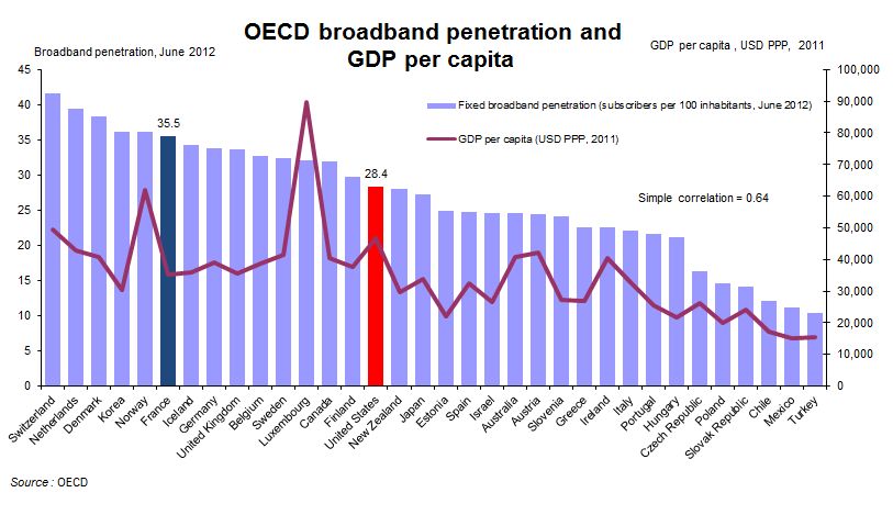
There’s nothing wrong with getting what you can afford, and it occurred to me that U.S. broadband is the best because we can afford more.  Onerous regulations or no, most other countries are not as rich as the U.S.  What if you looked at broadband and per capita GDP?

The OECD did just that with data from June 2012 (their several spreadsheets on this are here). The purple bars are broadband penetration and the bumpy red line is GDP per capita. Do you see a correlation?

1

Consider France: As of a year ago, the country had greater broadband penetration despite a lower per capita GDP than the U.S. ($35,133 vs. $46,588); that’s 25% more broadband on 33% less income and at half the cost to consumers.

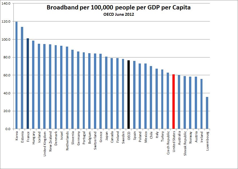
If you re-rank the OECD countries factoring in per capita GDP, the line-up changes.  Notably, the U.S. and Luxembourg drop well below the OECD average, despite being among the wealthiest countries.

2

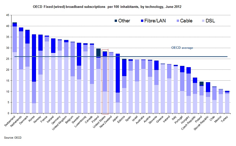
Of course, not all broadbands are equally broad.  Verizon sold me on fiber-optic with their assurance that it was dazzlingly faster than their DSL that I had been clunking along on. This graph breaks down broadband into its various incarnations.

3

The U.S. is slightly above average on all broadband, but when it comes to a high fibre diet, we are ahead of several other countries that have greater total penetration.  On the other hand, the Scandinavian countries are ahead of us, as are, impressively, the Asian countries.

This is not to deny U.S. advances.  TechCrunch summarizes more recent data from Akamai on these changes:

the U.S. is currently second in the price of broadband for entry-level users. The nation is also third in network-based competition, second in the fiber-optic installation rate, first in the adoption of next-generation LTE, ahead of Europe in broadband adoption, and doing quite well in Internet-based services.

Still, the U.S. lags behind other, less wealthy countries.  InnovationFiles, using Akamai data for different variables, has a less congratulatory view.

  • The U. S. has picked up one place in the “Average Peak Connection Speed” that’s the best measurement of network capacity, rising from 14th to 13th as the measured peak connection speed increased from 29.6 Mbps to 31.5 Mbps.
  • In terms of the “Average Connection Speed,” widely cited by analysts who don’t know what it means, the U. S. remains in 8th place world-wide. but we’re no longer tied for it as we were in the previous quarter; Sweden is right behind us on this one.
  • In terms of “High Speed Broadband Adoption”, the proportion of IP addresses with an Average Connection Speed greater than 10 Mbps, we remain in 7th place, but now we’re tied with  Sweden.

The title of CEO McAdam’s op-ed is “How the US Got Broadband Right.”  Given the content, I  guess “We’re Number 13!” wouldn’t have been appropriate.  Even “We’re Number Seven (Tied With Socialist Sweden)!” doesn’t quite have that affirmative zing.

Jay Livingston is the chair of the Sociology Department at Montclair State University. You can follow him at Montclair SocioBlog or on Twitter.

1The phrase “social construction” refers to the fact that things, symbols, places, sounds — basically everything — is devoid of meaning until we, collectively, agree as to what something means.  Once that happens, it has been “socially constructed” and we can refer to it as a “social construct.”

The fact that gestures have any meaning at all, and that they can have different meanings in different places, is a simple example of this basic sociological concept.  Enjoy this one minute compilation of examples!

Via Blame It On The Voices.

Lisa Wade, PhD is an Associate Professor at Tulane University. She is the author of American Hookup, a book about college sexual culture; a textbook about gender; and a forthcoming introductory text: Terrible Magnificent Sociology. You can follow her on Twitter and Instagram.

Cross-posted at Montclair SocioBlog.

Forty years ago Richard Easterlin proposed the paradox that people in wealthier countries were no happier than those in less wealthy countries.  Subsequent research on money and happiness brought modifications and variations, notably that within a single country, while for the poor, more money meant fewer problems, for the wealthier people — those with enough or a bit more — enough is enough.  Increasing your income from $100,000 to $200,000 isn’t going to make you happier.

It was nice to hear researchers singing the same lyrics we’ll soon be hearing in commencement speeches and that you hear in Sunday sermons and pop songs (“the best things in life are free”; “mo’ money mo’ problems”).  But this moral has a sour-grapes taste; it’s a comforting fable we non-wealthy tell ourselves all the while suspecting that it probably isn’t true.

A recent Brookings paper by Betsey Stevenson and Justin Wolfers adds to that suspicion.  Looking at comparisons among countries and within countries, they find that when it comes to happiness, you can never be too rich.

1

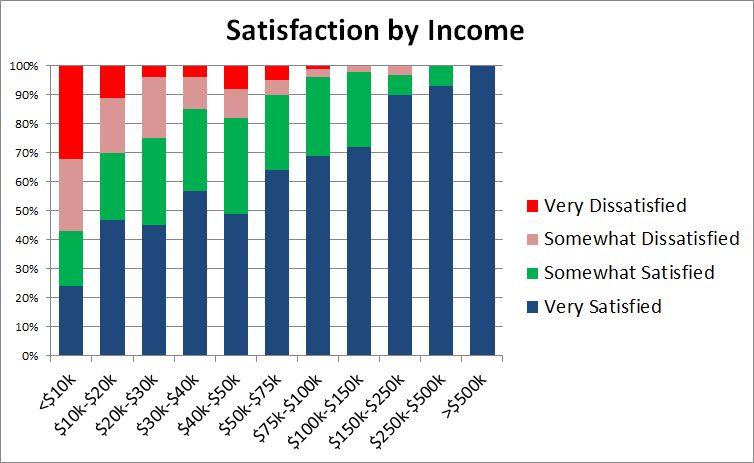
Stevenson and Wolfers also find no “satiation point,” some amount where happiness levels off despite increases in income.  They provide US data from a 2007 Gallup survey:

2

The data are pretty convincing.  Even as you go from rich to very rich, the proportion of “very satisfied” keeps increasing.  (Sample size in the stratosphere might be a problem: only 8 individuals reported annual incomes over $500,000;100% of them, though, were “very happy.”)

Did Biggie and Alexis get it wrong?

Around the time that the Stevenson-Wolfers study was getting attention in the world beyond Brookings, I was having lunch with a friend who sometimes chats with higher ups at places like hedge funds and Goldman Sachs.  He hears wheeler dealers complaining about their bonuses. “I only got ten bucks.”  Stevenson and Wolfers would predict that this guy’s happiness would be off the charts given the extra $10 million.  But he does not sound like a happy master of the universe.

I think that the difference is more than just the clash of anecdotal and systematic evidence.  It’s about defining and measuring happiness.  The Stevenson-Wolfers paper uses measures of “life satisfaction.”  Some surveys ask people to place themselves on a ladder according to “how you feel about your life.”  Others ask

All things considered, how satisfied are you with your life as a whole these days?

The GSS uses happy instead of satisfied, but the effect is the same:

Taken all together, how would you say things are these days – would you say that you are very happy, pretty happy, or not too happy?

When people hear these questions, they may think about their lives in a broader context and compare themselves to a wider segment of humanity.  I imagine that Goldman trader griping about his “ten bucks” was probably thinking of the guy down the hall who got twelve.  But when the survey researcher asks him where he is on that ladder, he may take a more global view and recognize that he has little cause for complaint.  Yet moment to moment during the day, he may look anything but happy.  There’s a difference between “affect” (the preponderance of momentary emotions) and overall life satisfaction.

Measuring affect is much more difficult — one method requires that people log in several times a day to report how they’re feeling at that moment — but the correlation with income is weaker.

In any case, it’s nice to know that the rich are benefitting from getting richer.  We can stop worrying about their being sad even in their wealthy pleasure and turn our attention elsewhere.  We got 99 problems, but the rich ain’t one.

Jay Livingston is the chair of the Sociology Department at Montclair State University. You can follow him at Montclair SocioBlog or on Twitter.

UBC Sociology student Pat Louie tweeted us a touching set of photographs by artist Gabriele Galimberti.  Each image is a child with his or her favorite toys. They are in Malawi, Italy, Ukraine, Thailand, Zanzibar, Albania, Botswana, and elsewhere and the diversity is stunning.

The photographs reveal a universality — pride in favorite toys and the love of play — but, writes Ben Machell at Galimberti’s website, “how they play can reveal a lot.”  The children’s life experiences influenced their imaginative play:

…the girl from an affluent Mumbai family loves Monopoly, because she likes the idea of building houses and hotels, while the boy from rural Mexico loves trucks, because he sees them rumbling through his village to the nearby sugar plantation every day.

Galimberti, interviewed by Machell, also observed class differences in entitlement to ownership:

The richest children were more possessive. At the beginning, they wouldn’t want me to touch their toys, and I would need more time before they would let me play with them. In poor countries, it was much easier. Even if they only had two or three toys, they didn’t really care. In Africa, the kids would mostly play with their friends outside.

These photographs are reminiscent of another wonderful photography project featuring kids and their toys.  JeonMee Yoon photographed boys with all their blue stuff and girls with all their pink stuff.  The results are striking.  Likewise, there’s a wonderful set of photographs by James Mollison, counterposing portraits with children’s sleeping arrangements across cultures.  These are all wonderful projects that powerfully illustrate global and class difference and inequality.

Lisa Wade, PhD is an Associate Professor at Tulane University. She is the author of American Hookup, a book about college sexual culture; a textbook about gender; and a forthcoming introductory text: Terrible Magnificent Sociology. You can follow her on Twitter and Instagram.

Cross-posted at Montclair SocioBlog.

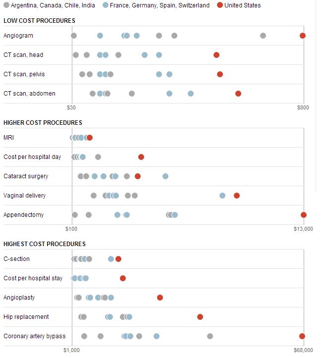
The Washington Post has provided some data on medical costs across a selection of countries (Argentina, Canada, Chile, and India in grey; France, Germany, Switzerland, and Spain in blue; and the U.S. in red). The data reveal that American health care is very expensive compared to other countries.

1

No wonder the US spends twice as much as France on health care.  In 2009, the U.S. average was $8000 per person; in France, $4000.  (Canada came in at $4800).  Why do we spend so much?  Ezra Klein quotes the title of a 2003 paper by four health-care economists:  “it’s the prices, stupid.”

And why are US prices higher?  Prices in the other OECD countries are lower partly because of what U.S. conservatives would call socialism – the active participation of the government.  In the U.K. and Canada, the government sets prices.  In other countries, the government uses its Wal-Mart-like power as a huge buyer to negotiate lower prices from providers.  (If it’s a good thing for Wal-Mart to bring lower prices for people who need to buy clothes, why is it a bad thing for the government to bring lower prices to people who need to buy, say, an appendectomy? I could never figure that out.)

There may also be cultural differences between the U.S. and other wealthy countries, differences about whether greed, for lack of a better word, is good.  How much greed is good, and in what realms is it good?  Klein quotes a man who served in the Thatcher government:

Health is a business in the United States in quite a different way than it is elsewhere.  It’s very much something people make money out of. There isn’t too much embarrassment about that compared to Europe and elsewhere.

So we Americans roll along, paying several times what others pay for medical procedures, doctor visits, and drugs.

Jay Livingston is the chair of the Sociology Department at Montclair State University. You can follow him at Montclair SocioBlog or on Twitter.

New data about the science aptitude of boys and girls around the world inspires me to re-post this discussion from 2010.
Math ability, in some societies, is gendered.  That is, many people believe that boys and men are better at math than girls and women and, further, that this difference is biological (hormonal, neurological, or somehow encoded on the Y chromosome).

But actual data about gender differences in math ability tell a very different story.  Natalie Angier and Kenneth Chang reviewed these differences in the New York Times.  They report the following (based on the US unless otherwise noted):

•  There is no difference in math aptitude before age 7.  Starting in adolescence, some differences appear (boys score approximately 30-35 points higher than girls on the math portion of the SAT).  But, scores on different subcategories of math vary tremendously (often with girls outperforming boys consistently).

•  When boys do better, they are usually also doing worse.   Boys are also more likely than girls to get nearly all the answers wrong.  So they overpopulate both tails of the bell curve; boys are both better, and worse, than girls at math.

•  That means that how we test for math ability is a political choice.  If you report who is best at math, the answer is boys.  If you report average math ability, it’s about the same.

•  How you decide to test math ability is also political.  Even though boys outperform girls on the SAT, it turns out those scores do not predict math performance in classes.  Girls frequently outperform boys in the classroom.

•  And, since girls often outperform boys in a practical setting, math aptitude (even measured at the levels of outstanding instead of average performance) doesn’t explain sex disparities in science careers (most of which, incidentally, only require you to be pretty good at math, as opposed to wildly genius at it).   In any case, scoring high in math is only loosely related to who opts for a scientific career, especially for girls. Many high scoring girls don’t go into science, and many poor scoring boys do.

Now, let’s look at some international comparisons:

•  Boys do better in only about ½ of the OECD nations. For nearly all the other countries, there were no significant sex differences. In Iceland, girls outshine boys significantly.

•  In Japan, though girls perform less well than the boys, they generally outperform U.S. boys considerably.  So finding that boys outperform girls within a country does not mean that boys outperform girls across all countries.

•  Still, even in Iceland, girls overwhelmingly express more negative attitudes towards math.

So what’s the real story here?  Well, one study found that the gender gap in math ability and the level of gender inequality in a society were highly correlated. That is, “…the gender gap in math, although it historically favors boys, disappears in more gender-equal societies.”

Part of the problem, then, is simply that  girls and boys internalize the idea that they will be bad and good at math respectively because of crap like the “Math class is tough!” Barbie (sold and then retracted in 1992):

However, girls’ insecurity regarding their own math ability isn’t just because they internalize cultural norm, their elementary school teachers, who are over 90% female, sometimes do to and they teach math anxiety by example.  A recent study has shown that, when they do, girl students do worse at math.  From the abstract (this is pretty amazing):

There was no relation between a teacher’s [level of] math anxiety and her students’ math achievement at the beginning of the school year.  By the school year’s end, however, the more anxious teachers were about math, the more likely girls (but not boys) were to endorse the commonly held stereotype that “boys are good at math, and girls are good at reading” and the lower these girls’ math achievement.  Indeed, by the end of the school year, girls who endorsed this stereotype had significantly worse math achievement than girls who did not and than boys overall.

So, with only the possible exception of genius-level math talent, men and women likely have equal potential to be good (or bad) at math.  But, in societies in which women are told that they shouldn’t or can’t do math, they don’t.  And, as Fatistician said, “math is a skill.”  People who think practicing it is pointless won’t practice it.  And those who don’t practice, won’t be any good at it… Y chromosome or no.

Lisa Wade, PhD is an Associate Professor at Tulane University. She is the author of American Hookup, a book about college sexual culture; a textbook about gender; and a forthcoming introductory text: Terrible Magnificent Sociology. You can follow her on Twitter and Instagram.

Cross-posted at Racialicious and Family Inequality.

Trying to summarize a few historical trends for the last half century, I thought of framing them in terms of diversity.

Diversity is often an unsatisfying concept, used to describe hierarchical inequality as mere difference. But inequality is a form of diversity — a kind of difference. And further, not all social diversity is inequality. When people belong to categories and the categories are not ranked hierarchically (or you’re not interested in the ranking for whatever reason), the concept of diversity is useful.

There are various ways of constructing a diversity index, but I use the one sometimes called the Blau index, which is easy to calculate and has a nice interpretation: the probability that two randomly selected individuals are from different groups.

Example: Religion

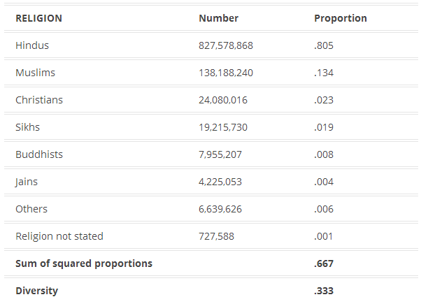
Take religion. According to the 2001 census of India, this was the religious breakdown of the population:

1.jpg

Diversity is calculated by summing the squares of the proportions in each category, and subtracting the sum from 1. So in India in 2001, if you picked two people at random, you had a 1/3 chance of getting people with different religions (as measured by the census).

Is .33 a lot of religious diversity? Not really, it turns out. I was surprised to read on the cover of this book by a Harvard professor that the United States is “the world’s most religiously diverse nation.” When I flipped through the book, though, I was disappointed to see it doesn’t actually talk much about other countries, and does not seem to offer the systematic comparison necessary to make such a claim.

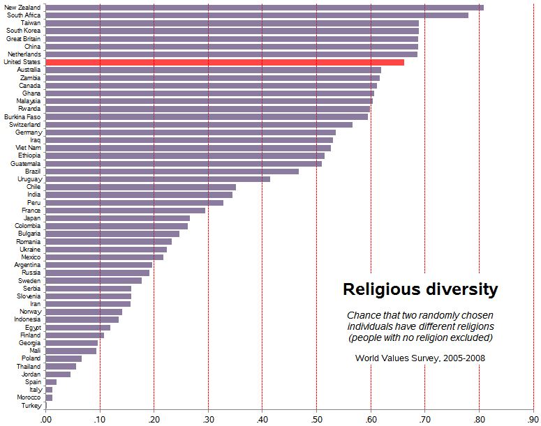
With our diversity index, it’s not hard to compare religious diversity across 52 countries using data from World Values Survey, with this result:

2

The U.S. is quite diverse — .66 — but a number of countries rank higher.


Increasing U.S. Diversity

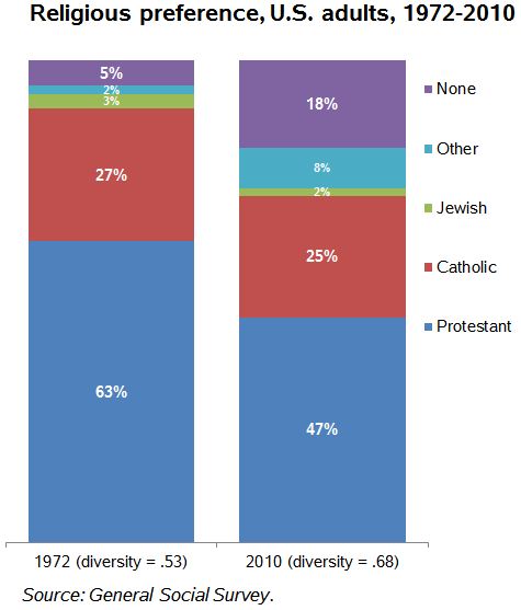
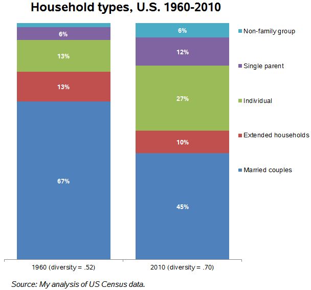
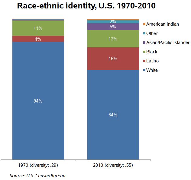
Anyway, back to describing the last half century in the U.S. On four important measures I’ve got easy-to-identify increasing diversity:

3

5

4

6

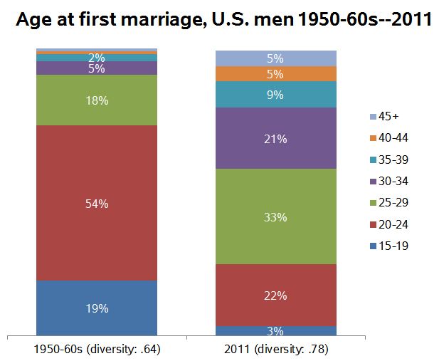
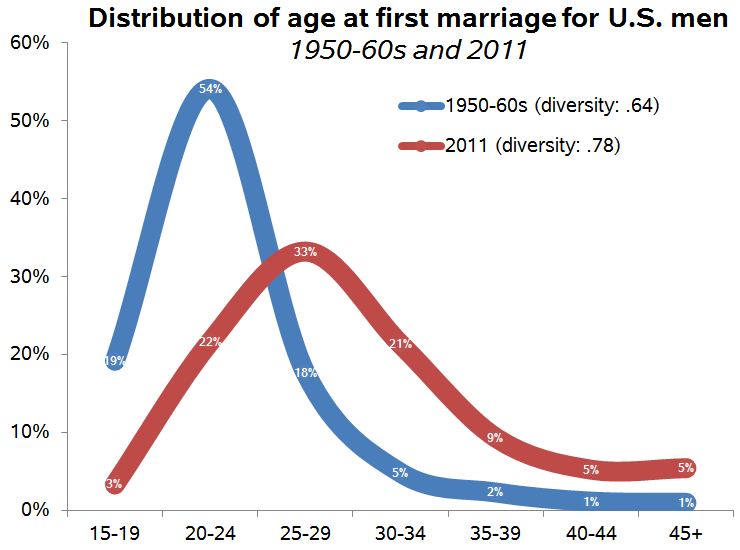
The last one is a little tricky. It’s common to report that the median age at marriage has increased since the 1950s (having fallen before the 1950s). But I realized it’s not just the average increasing, but the dispersion: More people marrying at different ages. So the experience of marriage is not just shifting rightward on the age distribution, but spreading out. Here’s another view of the same data:

7

I calculated these using the Panel Study of Income Dynamics from 1968 (for those married in the years 1950-1968) and comparing it with the 2011 American Community Survey for those married in the previous year. There might be a better way, of course.

I have complained before that using the 1950s or thereabouts as a benchmark is misleading because it was an unusual period, marked by high conformity, especially with regard to family matters. But it is still the case that since then diversity on a number of important measures has increased. Over the period of several generations, in important ways the people we randomly encounter are more likely to be different from ourselves (and each other).

Philip N. Cohen is a professor of sociology at the University of Maryland, College Park, and writes the blog Family Inequality. You can follow him on Twitter or Facebook.