international comparisons

For the last week of December, we’re re-posting some of our favorite posts from 2011.

————————

It seems obvious that basic cognitive perceptions shouldn’t vary by society.  That is, that our eyes should see, and our brains should process, essentially the same no matter what we call ourselves, what language we speak, or what holidays we observe.  It turns out, however, that even basic cognitions vary across the world.

Most Americans, for example, perceive the two lines in this optical illusion to be of different lengths, with line a shorter than line b.  In fact, they are the same length.

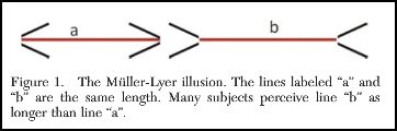
But, as argued by Joseph Henrich and colleagues in the Journal of Behavioral and Brain Sciences, our susceptibility to this illusion varies by culture.  On average, line a needs to be another fifth longer than line b before the average American undergraduate evaluates the lines to be equal in length.  Most other societies that have been tested on this illusion, however, require substantially less manipulation.  The figure below compares how individuals in different societies perform on this test.  The measures are tricky, and you can read more about them here; what you need to know for now is that the societies on the right are more susceptible to the illusion and the societies on the left less.

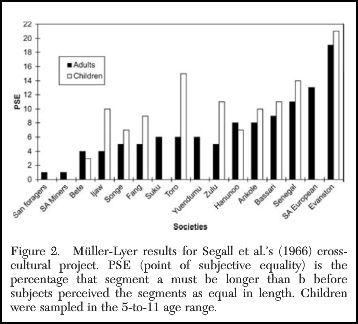
Observing that individuals in more developed societies (e.g., Evanston, Illinois) tend to be more vulnerable to the illusion — indeed, that in some societies, such as the San foragers of the Kalahari, it doesn’t qualify as an illusion at all — Henrich and his co-authors argue that exposure to “modern environments” may be the culprit:

…visual exposure during ontogeny to factors such as the “carpentered corners” of modern environments may favor certain optical calibrations and visual habits that create and perpetuate this illusion.  That is, the visual system ontogenetically adapts to the presence of recurrent features in the local visual environment.

Even basic cognition, that is, varies across cultures.

As Henrich et al. argue, this calls into question all of the truisms of psychology based, primarily, on experimental research with Western subjects.

Lisa Wade, PhD is an Associate Professor at Tulane University. She is the author of American Hookup, a book about college sexual culture; a textbook about gender; and a forthcoming introductory text: Terrible Magnificent Sociology. You can follow her on Twitter and Instagram.

As we enter the last frenzied days of Christmas shopping, Dmitriy T.M. thought it was worth looking at international comparisons in spending on the holiday. The Economist posted a graph based on Gallup polls and other data sources about how much individuals in various countries in Europe, plus the U.S. and South Africa, plan to spend on Christmas shopping this year, plotted against national GDP. Overall, Christmas spending correlates with national wealth, with the Netherlands being a noticeable outlier (spending less than we’d expect) and Luxembourg in a spending league of its own:


Cross-posted at Montclair SocioBlog.

The equation of wealth and virtue seems to come almost naturally, at least among the wealthy.  The logic is simple:  Virtue leads to success, therefore wealth is evidence of one’s virtue.  Virtue, in this case, means the Protestant Ethic – hard work and a willingness to forgo or postpone pleasures.  It follows then that those who are not wealthy must have turned their back on virtue.

David Brooks, in his Friday column (here),  applies this explanation to the wealth of nations.

Why are nations like Germany and the U.S. rich? . . . It’s because many people in these countries believe in a simple moral formula: effort should lead to reward as often as possible.

People who work hard and play by the rules should have a fair shot at prosperity. Money should go to people on the basis of merit and enterprise. Self-control should be rewarded while laziness and self-indulgence should not.

The US, Germany, and the Netherlands are Brooks’s exemplars of these virtues (Brooks uses the word ethos).  The bad countries, the ones whose economies are teetering on the brink, are the grasshoppers to our ant.  There they were – Brooks points his finger at Greece, Italy, and Spain – fiddling and dancing the summer away, refusing to live within their means or “reinforce good values.”

This seems accurate, doesn’t it – the dolce far niente Italians and other Mediterraneans, taking hours at midday for meals and siestas while the industrious Americans, Germans, and Dutch are working away, wolfing down a sandwich at their desks.

Just to be sure I downloaded some OECD data from 2007 – the last year before the big crash – on the number of hours people in different countries work. (Brooks’s three “ant” countries are red, the “grasshoppers” dark blue.)This is puzzling.  The US is slightly above the OECD average, but workers in Greece and Italy spend more hours at work than do Americans, while the Dutch and Germans are down at the low end of the scale.  (I do not know why the OECD still gives data for West Germany as well as Germany.)

I noticed that the OECD also had a measure of “employment protection,” which is basically how hard it is to fire someone.  I figured that workers in non-virtuous countries would be highly protected.  Since it’s nearly impossible for them to be fired, they know they can slack off on the job.  By contrast, virtuous countries would foster Brook’s ethos of “effort, productivity and self-discipline”  in workers, rewarding the industrious, firing the lazy and self-indulgent.I wasn’t surprised that the US anchored the low end of the scale.  Workers here have less job-protection than those in any of the other countries.  And Greece and Spain are above the average.  But so are Germany and the Netherlands, though only slightly, while Italy is slightly below the average.  There’s really not much difference between these three.  And if you look at the array of countries, there seems to be no strong connection between job protection and how well the country is weathering the current long recession.  I’m not sure what the best measure of the overall economy is, but the OECD has composite figure made up from ten main economic indicators.* I just wish we had better measure of Brooks’s “ethos.”

——————-

*  “The Labour Force Survey (MEI) dataset itself covers countries that compile labour statistics from sample household surveys on a monthly or quarterly basis. It is widely accepted that household surveys are the best source for labour market key statistics. In such surveys, information is collected from people living in households through a representative sample. Surveys are based on standard methodology and procedures used all over the world. The 10 subjects available cover labour force, employment, unemployment (including harmonised unemployment), and employees.”


Sara P. sent in a video from The Economist that highlight women’s economic opportunities worldwide. It is based on the results of an economic index ranking of 113 nations, focusing on issues such as workplace policies (for instance, access to paid maternity leave), education, access to the financial system, and the legal and social status of women  in the economy (such as the right to work and social attitudes about women working for pay). The index also attempts to differentiate between official policy and actual practice to provide a better idea of the actual economic environment facing women in each country. The analysis is necessarily limited by the inclusion of only 113 countries (especially for Oceania, where only Australia and New Zealand were included), but it’s a worthwhile watch for a general overview:

You can read the full report here.

Updated; originally posted July 2009.

Americans are notorious for their ignorance of global issues and international news.  This may be because Americans aren’t interested or it may be that our news outlets feed us fluff and focus us only on the U.S.  Probably it’s a vicious cycle.

This month, for example, Time magazine’s cover story is about the political strife in Egypt… everywhere except the U.S. that is.  Americans get “pop psychology” (via Global Sociology):

It turns out you can go to the Time website and compare covers from previous issues going back a long ways.  Here are some more examples from the last couple years (I cherry picked just a bit):

Dmitriy T.M. sent in these previous examples a while back.

The cover story for Newsweek magazine’s September 2006 edition was “Losing Afghanistan” in Europe, Latin America, and Asia.  It was “My Life in Pictures,” a story about the photographer Annie Liebovitz in the U.S. (via):

newsweek

The cover story for Newsweek magazine’s October 2006 edition was “Global Warming’s First Victim” in Europe, Latin America, and Asia.  It was “Off Message,” a story about Republican Congressman Mark Foley’s sexually suggestive emails and IMs to teenage boys (via):

frogs

The cover story for Time magazine’s April 2007 edition was “Talibanistan” in Europe, Latin America, and Asia.  It was “Why We Should Teach the Bible in Public Schools” in the U.S. (via, also see Time):

Capture2

As SocProf writes:

Talk about self-fulfilling prophecy: Americans are assumed to not be interested in international and global affairs… ergo, Time decides to replace a perfectly legitimate and newsworthy cover on a significant event in Egypt with some pop psychology item. As a result, Americans are less informed and knowledgeable on global affairs because they do not get intelligent coverage on that topic.

Lisa Wade, PhD is an Associate Professor at Tulane University. She is the author of American Hookup, a book about college sexual culture; a textbook about gender; and a forthcoming introductory text: Terrible Magnificent Sociology. You can follow her on Twitter and Instagram.


Dmitriy T.M. sent in this hilarious 2-minute rap about first world problems. The idea is to draw attention to how the daily frustrations faced by those of us in the most advantaged and developed countries in the world are really, really, like really small.

Edit: Sociologist Michael Kimmel reminds me that, though in certain ways the above is definitely true, it’s also not useful to trivialize the ways in which advantaged and developed countries still create suffering. Some of us benefit from our overall advantage more than others.

Lisa Wade, PhD is an Associate Professor at Tulane University. She is the author of American Hookup, a book about college sexual culture; a textbook about gender; and a forthcoming introductory text: Terrible Magnificent Sociology. You can follow her on Twitter and Instagram.

Dmitriy T.M. send in a map from National Geographic that shows the wide disparities in national per capita income levels, as well as population density. Different colors represent different income groups, while shades within each color represent population density (darker = lower density):

The map claims to be interactive, though I haven’t figured out any interactive features. They do provide a lot of data on various economic and social indicators for each income group. Of course, this type of representation hides the often wide disparities in income within countries. But it’s a striking general overview of global economic development.

Cross-posted at Family Inequality.

I have criticized sloppy statistical work by some international feminist organizations, so I’m glad to have a chance to point out a useful new report and website.

The Progress of the World’s Women is from the United Nations Entity for Gender Equality and the Empowerment of Women. The full-blown site has an executive summary, a long report, and a statistics index page with a download of the complete spreadsheet. I selected a few of the interesting graphics.

Skewed sex ratios (which I’ve written about here and here) are in the news, with the publication of Unnatural Selection, by Mara Hvistendahl. The report shows some of the countries with the most skewed sex ratios, reflecting the practice of parents aborting female fetuses (Vietnam and Taiwan should  be in there, too). With the exception of Korea, they’ve all gotten more skewed since the 1990s, when ultrasounds became more widely available, allowing parents to find out the sex of the fetus early in the pregnancy.

The most egregious inequality between women of the world is probably in maternal mortality. This chart shows, for example, that the chance of a woman dying during pregnancy or birth is about 100- 39-times higher in Africa than Europe. The chart also shows how many of those deaths are from unsafe abortions.

Finally, I made this one myself, showing women as a percentage of parliament in most of the world’s rich countries (the spreadsheet has the whole list). The USA, with 90 women out of 535 members of Congress, comes in at 17%.

The report focuses on law and justice issues, including rape and violence against women, as well as reparations, property rights, and judicial reform. They boil down their conclusions to: “Ten proven approaches to make justice systems work for women“:

1. Support women’s legal organizations

2. Support one-stop shops and specialized services to reduce attrition in the justice chain [that refers to rape cases, for example, not making their way from charge to conviction -pnc]

3. Implement gender-sensitive law reform

4. Use quotas to boost the number of women legislators

5. Put women on the front line of law enforcement

6. Train judges and monitor decisions

7. Increase women’s access to courts and truth commissions in conflict and post-conflict contexts.

8. Implement gender-responsive reparations programmes

9. Invest in women’s access to justice

10. Put gender equality at the heart of the Millennium Development Goals