international comparisons

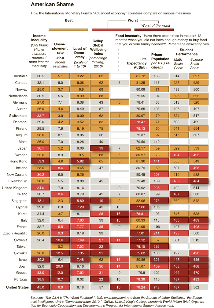
An infographic accompanying an article at the New York Times reveals how “advanced economies” compare on various measures of equality, well-being, educational attainment, and more.  To illustrate this, for each measure countries that rank well are coded tan, countries that rank poorly and very poorly are coded orange and red respectively, and countries that are in the middle are grey.  The countries are then ranked from best to worst overall, with Australia coming in #1 and the United States coming in last.  You might be surprised how some of these countries measure up.

Thanks to Dmitriy T.M. for the link.

Lisa Wade, PhD is an Associate Professor at Tulane University. She is the author of American Hookup, a book about college sexual culture; a textbook about gender; and a forthcoming introductory text: Terrible Magnificent Sociology. You can follow her on Twitter and Instagram.

Via Shamus Khan, I found the Economic Policy Institute’s interactive graph that lets you see which Americans have earned most of the growth (or, more recently, suffered the losses) in U.S. incomes over time, based on IRS data (and reported in constant 2008 dollars):

You can select beginning and ending points and find out how incomes changed during that period and how the growth was distributed. For instance, the increase in average incomes between 1950 and 1960 were widely distributed:

If we look at the 10-year span between 1995 and 2005, the increase was much more concentrated among the very wealthy:

The data come from a study on historical income in equality in the U.S. by economists Thomas Piketty and Emmanuel Saez. They compare the share of income earned by the richest 0.1% of earners in the U.S., France, and the U.K.:

See our previous posts on Saez’s work here and here.

Recently I posted some maps showing global alcohol consumption. As a follow-up, here’s a map, via Blame It on the Voices, showing global consumption of coffee (with the rather major omission of China, among other nations, due to lack of data):

Consumption is measured in kilograms and, as ChartsBin explains, “Weight is presented as Green Bean Equivalent (GBE). 1 pound roasted coffee = 1.19 pounds of green coffee beans.”

Scandinavians drink the most coffee, on average. Based on the most recent available data, Finland, at 12 kg GBE each per year, tops the charts, and Norway, Denmark, and Sweden also make it into the top 10 (from ChartsBin):

The U.S. comes in at #26, consuming 4 kg/person annually. Apparently we’re too busy drinking beer to get serious about coffee.

Thelittlepecan let us know that the World Health Organization has out a new report about global alcohol consumption, as well as the consequences of that consumption. Overall consumption varies significantly, with the highest levels in Russia and much of Europe and the lowest in northern Africa through Asia (the consumption figures exclude tourists):

There are also clear differences in the most-consumed type of alcoholic drinks:

The report also looks at what proportion of all male deaths are related to alcohol consumption, broken down by region, age, and sex. Globally, alcohol-related problems are the leading cause of death for males aged 15-59. For the regions, AFR = Africa, AMR = Americas, EMR = Eastern Mediterranean, EUR = Europe, SEAR = South East Asia, and WPR = Western Pacific:

Clearly the Americas and Europe stand out, though this is  likely because those regions have lower death rates from many sources that are still prevalent in many parts of the world and, thus, alcohol-related ones show up more prominently.

Differences in blood-alcohol limits for drivers:

If you’re interested in more details, you can also get profiles of individual countries in each region at the WHO website.

The figure below contrasts the average U.S. response to various questions measuring perceptions of mobility and inequality with the average response of 27 comparison countries (from the International Social Survey Programme).  In other words, how far from the mean are U.S. citizens’ beliefs about life chances and the value of social inequality?  The pink triangle is the U.S. and the orange line is everyone else.  It’s a bit difficult to read (click to enlarge), so I’ll describe the data below.

  • About 62% of Americans think that “people get rewarded for their effort,” compared to about 35% of citizens in our national comparison group.
  • About 70% of Americans think that “people get rewarded for their intelligence and skills,” compared to about 40% of citizens in our national comparison group.
  • About 19% of Americans think that “coming from a wealthy family is essential/very important to getting ahead,” compared to about 29% of citizens in our national comparison group.
  • About 62% of Americans think that “differences in income in their country are too large,” compared to about 87% of citizens in our national comparison group.
  • And about 33% of Americans think that “it is the responsibility of the government to reduce the differences in income,” compared to about 69% of citizens in our national comparison group.

Americans, then, are much more likely than the average citizen in our comparison countries to believe that individual characteristics determine success, wide gaps in income are acceptable, and the government should let them be.   No wonder Americans tend to vote to cut taxes and services, tolerate unequal educational opportunity, and resist top-down solutions to inequality.  They think inequality is good and that individuals will always get what they deserve.

Like I said, “stunning,” given the depth of our income inequality and the data on class mobility.  Though it makes perfect sense in light of our deep and abiding patriotism.

Via the MontClair SocioBlog.

Lisa Wade, PhD is an Associate Professor at Tulane University. She is the author of American Hookup, a book about college sexual culture; a textbook about gender; and a forthcoming introductory text: Terrible Magnificent Sociology. You can follow her on Twitter and Instagram.

Emory University has a very detailed database about the Atlantic slave trade, titled Voyages: The Trans-Atlantic Slave Trade Database, which I don’t believe we’ve posted before (my apologies if we have). It includes nine maps providing information on major points of departure and destination ports for the trans-Atlantic trade; here’s a general overview:

Initially the vast majority of slave voyages were organized by firms or individuals in Spain and Portugal; however, over time the slave trade was dominated by groups from northern Europe. Great Britain eventually played a major role, and over 1/3 of documented slave voyages were organized there.The description of Map 6 explains, “vessels from the largest seven ports, Rio de Janeiro, Bahia, Liverpool, London, Nantes, Bristol, and Pernambuco carried off almost three-quarters of all captives removed from Africa via the Atlantic Ocean.”

This map shows where voyages were organized, and the % of all documented African slaves that voyages from that country/area transported:

In the U.S., students generally learn about slavery in relation to cotton plantations and, to a lesser extent, tobacco. However, overall those two crops played a relatively minor role in the growth of the global slave trade. It was the growing taste for sugar, and the creation of sugar plantations, particularly in the Caribbean and South American coastal areas, that produced such an enormous demand for African slaves in the Americas. According to the Voyages website, less than 4% of all Africans captured were sold in North America.

The website also has a database of thousands of documented trips in the trans-Atlantic slave trade, including everything from point of origin, destination, number of slaves, % who died during voyage, length of trip, and so on. Some include many more details than others, as you’d expect. You can also create tables to display the variables you’re interested in. Here’s the table showing the slave trade, broken into 25-year intervals and by destination. We can clearly see that the slave trade made one big jump in the late 1500s (going from 4,287 in the 1551-1575 interval to 73,865 between 1576 and the end of the century) and another huge jump in the late 1600s, with the height of the slave trade occuring in the 1700s through the mid-1800s:

You can also create various graphs and charts. Here is a graph of the % of slaves who died during the trip, by year:

I presume the extremely high numbers in the 1550s must be skewed by some ships that sank or met some other disaster that led to the death of everyone aboard.

Over time, ships carried larger numbers of individuals per trip:

The individuals taken as part of the slave trade were predominantly male:

Documented types of resistance from captives or from Africans trying to free them:

You can spend quite a bit of time on this, I warn you — creating timelines, graphs, and so on. It’s taken me an hour to write this post because I keep getting distracted creating charts and tables. Overall, the site is a fantastic resource for both specific information and for helping illuminate the enormity of the Atlantic slave trade. Thanks to Shamus Khan for the tip.

In an earlier post we reviewed research by epidemiologists Richard Wilkinson and Kate Pickett showing that income inequality contributes to a whole host of negative outcomes, including higher rates of mental illness, drug use, obesity, infant death, imprisonment, and interpersonal trust.

In the 3 1/2-minute video below, Kate Pickett argues that social inequality causes violence by creating status inequalities that those on the bottom respond to with violence.

Pickett and Wilkinson’s data is striking, but I’m not sure I buy that low status combined with status-sensitivity instigates violence.  Sociologists have made this argument; but others have questioned these conclusions.

Villanova University’s Lance Hannon, for example, tested this “subculture of violence” thesis as applied to poor African Americans. Using police department homicide data, he found no evidence that Black people were more likely than White people to react to an insult with violence.  This is swapping race for class, of course (and Hannon doesn’t control for class because the data was limited), but it does suggest that we should think carefully about the kind of argument Pickett is making.

See Dr. Pickett making similar arguments as to why raising the average national income in developed countries doesn’t make people happier or enable them to live longer and how status inequality increases stress.  And see more about income inequality and national well-being at Equality Trust.

Lisa Wade, PhD is an Associate Professor at Tulane University. She is the author of American Hookup, a book about college sexual culture; a textbook about gender; and a forthcoming introductory text: Terrible Magnificent Sociology. You can follow her on Twitter and Instagram.

As a member of a cattle-raising family, I hear a pretty steady stream of complaints about people eating less beef, which is variously attributed to a conspiracy against the American rancher (possibly by terrorists), the result of stupid city people who get all terrified over every little health concern (Mad Cow Disease is a myth! Unless it’s a terrorist plot to ruin ranching), environmentalists, animal rights activists, and me (I’ve been a vegetarian since 1996 and thus single-handedly nearly destroyed the beef industry).

The National Cattlemen’s Beef Association is similarly concerned about reduced beef consumption. And given that we frequently hear about the connections between red meat consumption and health concerns such as heart disease, and are advised to substitute white meat for red meat (to the point that the pork industry began branding pork as “the other white meat”), you’d probably expect to see a dramatic decline in consumption of beef.

And we do see a decline, but not as much as you might expect, as this graph from the Freakonomics blog, sent in by Dmitriy T.M. and Bryce M. (a student at Rensselaer Polytechnic Institute), illustrates:

Clearly beef consumption has declined since its peak in the late 1970s, when people in the U.S. ate nearly 90 pounds of beef each per year, to closer to 60 lbs. each today. On the other hand, all those health warnings, disease scares, and environmentalist-vegetarian terrorist plots haven’t yet knocked beef out of its position as the most-eaten meat in the U.S. Clearly, chicken seems poised to take over that position, but beef doesn’t exactly appear to be falling off the charts.

So how do we compare to other countries in terms of overall meat consumption? In a 2003 article in the Journal of Nutrition, Andrew Speedy provided data on global meat consumption (defined as “beef and buffalo, sheep and goat, pig meat and poultry”) — note it’s in kilograms, not pounds, and the legend should be read across, not down (so the first bar is for the U.S., the second is for France, and so on):

So insofar as there has been a decrease in beef consumption in the U.S., and more dramatic increase in chicken consumption: what’s going on? The Freakonomics article presents an explanation:

A study by the agricultural economists James Mintert, Glynn Tonsor, and Ted Schroeder found that for every 1 percent increase in female employment, beef consumption sank by .6 percent while chicken consumption rose by .6 percent. Why? Probably because beef takes longer than chicken to prepare, and because poultry producers did a good job marketing cheap and ready-to-cook chicken products. Furthermore, all those working women meant more household income, which meant more families eating in restaurants — where meals are less likely to contain beef than meals at home.

Health concerns do play a part; the authors found that negative media coverage of beef (either recalls due to contamination or general links to heart disease, etc.) reduced consumption, while positive coverage that linked eating meat to getting iron, zinc, and other minerals increased it. But they found that health effects were small compared to the effects of changing family dynamics — that is, women working outside the home and families eating fewer meals at home.

It’s a nice example of how the factors driving social changes are often much more complex than we’d expect. Common sense explanations of changes in beef consumption would, I think, a) overestimate how much less beef Americans eat than in the past and b) assume the major driving factors to be health-related concerns, whether about chronic disease or recalls. Yet it turns out a major aspect of the story is a structural change that doesn’t seem clearly connected at all.

I guess if I were a health advocate hoping people in the U.S. were starting to listen to messages about healthy eating, that might depress me. But I guess I can tell my grandma that the terrorists’ evil plans to infect U.S. cattle herds with Mad Cow or some other disease might not be as catastrophic as they might imagine.

UPDATE: As a couple of readers point out, the increase in chicken consumption can’t be explained just as a result of people eating chicken when they otherwise would have eaten beef; the drop in beef consumption is way overshadowed by the increase in how much chicken people eat. The total amount of all meat eaten each year has increased dramatically.

I don’t know what is driving all of that change, but I suspect a lot of it is marketing campaigns — not just directly to consumers, but efforts by industry groups and the USDA to get more meat into a wide variety of items at grocery stores and on restaurant menus, as they have done with cheese.