
From the International Service for the Acquisition of Agri-biotech Applications 2007 report on the Global Status of Commercialized Biotech/GM Crops.
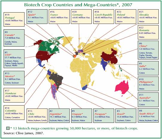
From the International Service for the Acquisition of Agri-biotech Applications 2007 report on the Global Status of Commercialized Biotech/GM Crops.
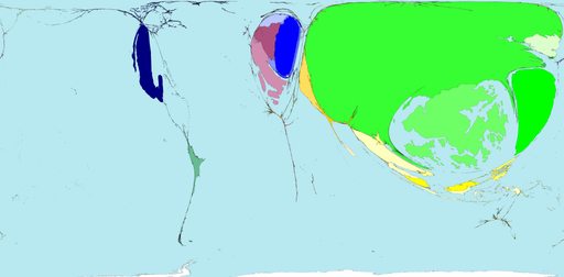
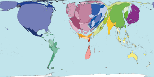
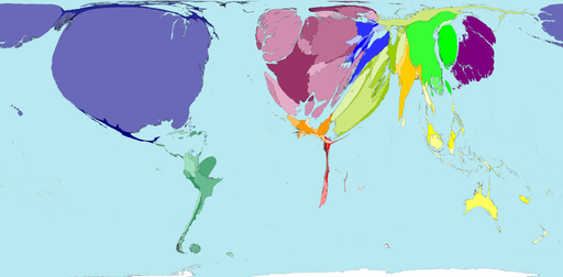
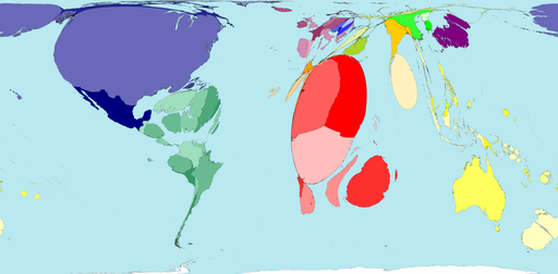
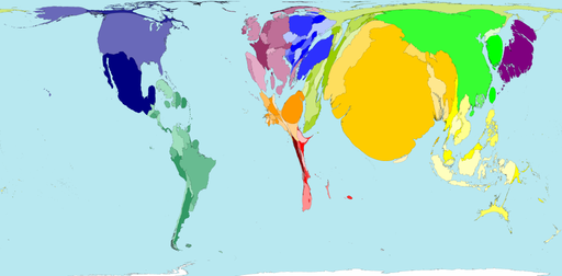
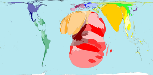
Worldmapper offers maps in which the actual land area is morphed to represent various disproportionalities across the globe. The website has over 300 maps! Thanks 73man for the tip!
I borrowed a few examples and pasted them in below. The first map is an actual land area map for reference.
Territory size shows the proportion of worldwide net exports of toys (in US$) that come from there. Net exports are exports minus imports. When imports are larger than exports the territory is not shown.
Territory size shows the proportion of worldwide net imports of toys (in US$) that are received there. Net imports are imports minus exports. When exports are larger than imports the territory is not shown.
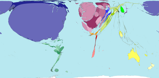
Territory size shows the proportion of carbon dioxide emissions in 1980 that were directly from there.
Territory size shows the proportion of all territory level decreases in carbon dioxide emissions between 1980 and 2000, that occurred there.

Territory size shows the proportion of state military spending worldwide that was spent by that territory in 2002.
Territory size shows the proportion of species worldwide that became extinct between 1500 current era and 2004, that became extinct there.
Territory size shows the proportion of all people over 15 in the world living with diabetes who live there.
Territory size shows the proportion of all people aged 15-49 with HIV (Human Immunodeficiency Virus) worldwide, living there.
See more alternative maps here.
.
When I was in grade school, I remember having one of my first sociological “aha moments” during geography. We were starting a unit on Latin and South American countries and each of us had to draw a map showing the countries and capitals to show how much we already knew. We all had those school issued atlases of the world, but we had to draw the map of Latin and South America without using the atlas.
What I ended up with was similar to most kids at my table– a huge United States with a skinny little piece of land under it, just barely larger than Florida and then a larger piece of land under that about the size of Alaska. As elementary school kids in Maine we obviously knew very little about anything south of say, Washington D.C. and this was reflected in the little pieces of land we drew. I opened up my atlas and looked at how large Latin and South America really were and was shocked. It was nearly as large as Africa, and certainly larger than the the U.S.
How things are measured makes all the difference and cartography (map making) has a fascinating history in colonial empires and imperialism (charting “unknown” far off lands filled with “savages” etc.). So when SWS member Jeanne Flavin sent me a link to the ODT Maps website I had to share some of them here.
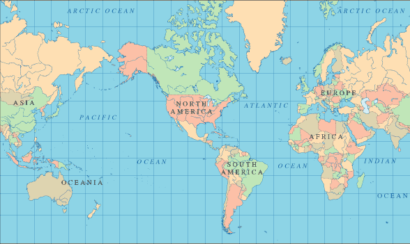
Let’s start with a pretty “typical” North America-centered map of the world–
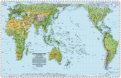
Now how about this equal area ODT map?
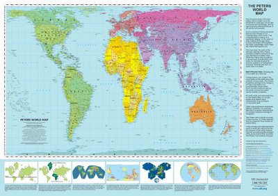 © www.ODTmaps.com
And how about an actual equal area Pacific-centered map from ODT?
 © www.ODTmaps.com
And how about this South-up map, challenging North-South perceptions (how do we know which end of the world is “up” anyway– who decides that?).
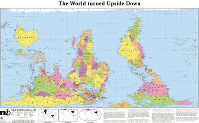 © www.ODTmaps.com
And my favorite– the population map.

There are more maps and resources for the classroom on the ODT website. Thanks Jeanne!
Click here and scroll down for a map showing the number and % of Muslims in various European countries. From NPR.
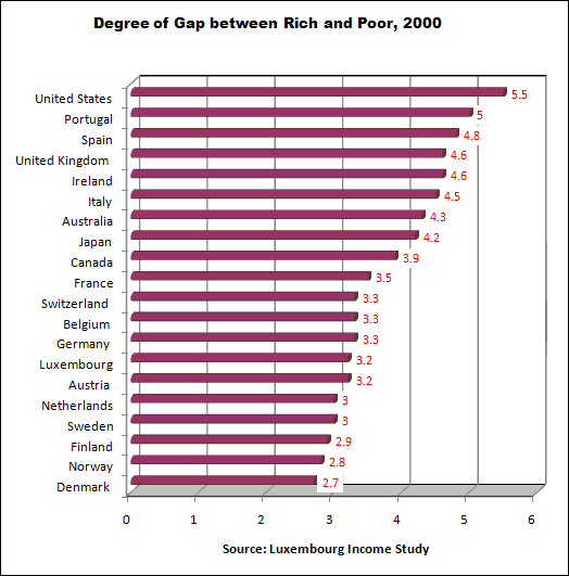
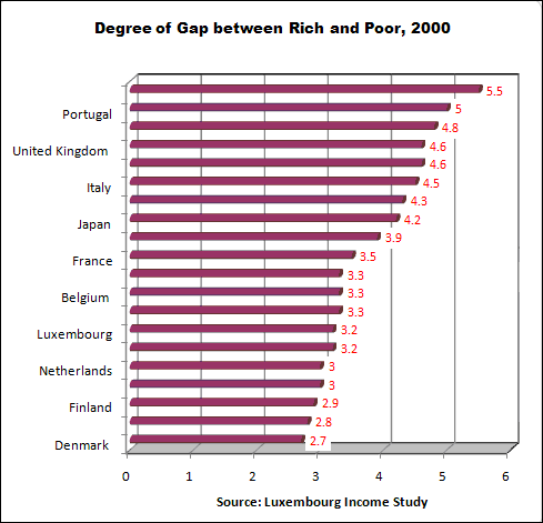
These data come from the Luxembourg Income Study, the most rigorous data source for cross-national income and wealth. The chart’s income gap indicator in each country is the disposable (after tax) annual income of the top 10% divided by the disposable income of the bottom 10%. In other words, the income gap is the ratio of the 10% of persons with the highest income to the 10% with the lowest. For instance, in the USA the income of the top-earning 10% was 5.5 times that of the bottom 10%.
The statistics in this chart can be found on page 4 of a document on the Contexts website: http://www.contextsmagazine.org/resources_vol6-3.php That document is a supplement to an article by Peter Dreier, “The United States in Comparative Perspective,” in the Summer 2007 issue of Contexts.
Some may read these statistics and say “inequality in the US is overblown” because the bottom 10% live better off than most people in the rest of the world. That is true if Americans are compared to countries where the average income is less than a dollar a day. But if the American poor are compared to the poor in other wealthy countries, American poor are far worse off.
Almond = Asia
Apple = Europe/Asia
Apricots = Asia
Arrowroot = South America
Artichoke = Europe
Asparagus = Asia
Avocado = South America
Bamboo = Asia
Banana = Southeast Asia
Barley = Middle East (?)
Basil = India
Beet = Europe/Mediterranean
Bay = Mediterranean
Bitter melon = Africa/Asia/Australia
Black-eyed pea = North Africa/South Asia (?)
Black pepper = Tropical India
Blackberry = North America
Blueberry = North America/Europe
Brazil nut = South America
Breadfruit = Asia
Broccoli = Europe
Brussels sprouts = Europe
Buckwheat = Western China
Cabbage = Europe
Cacoa/cocoa = Mexico
Cannabis = Central Asia
Canna = South America
Capers = Mediterranean
Carambola (star fruit) = Asia
Carrot = Europe
Cashew = South America
Cauliflower = Europe
Celery = Mediterranean (?)
Cherry = Eurasia
Chestnut = North America
Chickpea/garbanzo bean = Southeast Turkey/Middle East
Chicory = Asia
Chili pepper = South American tropics
Chive = North America/Asia
Cilantro/coriander = Europe/Asia
Cinnamon = South Asian tropics
Clove = Indonesia
Coconut = Asia
Coffee = Ethiopia
Cola nut = West Africa
Collard = Europe
Corn = Mexico
Cranberry = Asia
Cucumber = Africa/Asia
Currant = Europe/Asia
Custard apple = South America
Date = Africa/Asia
Date palm = Asia
Eggplant = Africa/Asia
Endive = Asia
Fig = Europe
Garlic = Asia
Ginger = Southern China
Gooseberry = Europe
Grapefruit = Asia or West Indies
Grapes = Europe/North America
Sweet pea = Southwest Asia (?)
Guava = South America
Hazelnut = Europe
Hops = Near East
Jackfruit = Asia
Kale = Europe
Kiwi = Asia
Kohlrabi = Europe
Leek = Mediterranean and Middle East
Lemon = Asia
Lettuce = Western Asia
Lime = Asia
Loganberry = North America
Loquat = Asia
Macadamia nut = Africa/Australia
Mango = Asia
Manioc = South America
Maple sugar = North America
Marjoram = North Africa/Asia
Melon = Africa/Asia
Millet = East/Central Africa
Mint = Europe
Mustard = Mediterranean/Southwest Asia
Nutmeg = Malaysia
Oats = Near East
Oil Palm = West Africa
Okra = Asia
Olive = Europe/Middle East
Onion = Asia
Orange = Southeast Asia
Oregano = Eurasia
Papaya = South America
Paprika = South American tropics
Parsley = Eurasia
Parsnip = Eurasia
Passion fruit = South American tropics
Peach = Asia
Peanut = Brazil
Pear = Western Europe
Pecan = North America
Pineapple = South America
Pistachio = Mediterranean
Pomegranate = Asia
Potato = South America
Pummelo = Asia
Quinoa = South America
Radish = Europe/Asia
Raspberry = North America
Rhubarb = Asia
Rice = India/Southeast Asia
Rosemary = Mediterranean
Sapadilla = South America
Sesame = Africa, Asia
Sorghum = Africa
Soybean = Northeast China
Spinach = Asia
Squash = North America/South America
Strawberry = North America
Sunflower = North America/South America
Sweet pepper = South America
Sweet potato = South America
Swiss chard = Europe/Asia
Tamarind = India/Tropical rainforest
Tea = India/China
Tef = Ethiopia
Thyme = Mediterranean
Tomato = South America
Turnip = Asia
Vanilla = Mexico
Walnut = North America/Asia
Watermelon = Africa/Asia
Wheat = Near East
Wild rice = North America
Yam = Asia
Yantia = South America
Zucchini = North America/South America
I use these in class to illustrate how “tradition” is constructed–for instance, tomatoes are now seen as the essence of traditional Italian cooking, and yet they are native to South America and only made it to Italy a few hundred years ago, and coffee is native to Ethiopia but the country most associated with it today is Colombia.
It’s also useful for talking about globalization and showing that it’s been going on longer than the last 100 years or so–movement of crops within and between hemispheres has been going on for thousands of years.
These are from L.H Bailey, Ethel Zoe Bailey, and the Staff of Liberty Hyde Bailey Hortotorium. 1997. Hortus Third: A Concise Dictionary of Plants Cultivated in the United States and Canada. New York: Barnes & Noble.