international comparisons

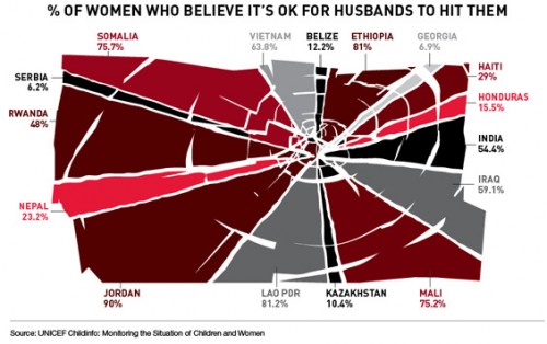
Teresa C. sent in this image created using UNICEF data to show what percent of women surveyed in various countries said it was acceptable for their husbands to hit them:
international-womens-attitudes-towards-domestic-v-28079-1250786064-13

(Found at BuzzFeed.)

You can find the data and a breakdown of UNICEF data collection methods here. The data for many more countries are available there too. I can’t quite figure out why these particular countries were used in the image; they aren’t all of the countries with the highest percentages. As far as I can tell, the UNICEF data table only includes numbers for the “developing” nations and some countries from eastern Europe, which is UNICEF’s focus. But I do wonder what the numbers would be if you asked women in the U.S. a question along the lines of “is it ever acceptable for a man to hit a woman?” or “can you think of any situation where it might be understandable that a man would hit his wife or girlfriend?” You might get higher “support” for violence against women than you’d think. The UNICEF page doesn’t provide the wording of this question, which would be interesting to know.

That’s not to downplay the issue of women justifying or accepting violence against women, just that those of us in the “developed” nations need to be sure not to pat ourselves on the back too much about how enlightened we are about domestic violence.

And I can’t help but dislike the image, in that at first glance it would appear to be a pie chart in which all of the sections add up to 100%; really a bar graph would be a better way to illustrate this. But then, I had a dissertation advisor with a 5-page single-spaced document outlining his standards for data presentation.

UPDATE: Reader P. makes the point I was getting at above (that the wording might greatly impact how much “support” you find for violence against women) much better than I did:

What they were actually asked, in the MICS and the DHS (the two primary sources for the data), was this question:

“Sometimes a husband is annoyed or angered by things that his wife does.  In your opinion, is a husband justified in hitting or beating his wife in the following situations:

– If she goes out with out telling him?
– If she neglects the children?
– If she argues with him?
– If she refuses sex with him?
– If she burns the food?”

I bet you get very different rates for different “justifications,” which is important both for data-gathering/presentation and for anti-domestic violence campaigns. And, again, I bet if you broke down various “reasons” for hitting a woman, I bet you’d get higher-than-expected acceptance of them in countries in the “developed” countries that weren’t presented in the table.

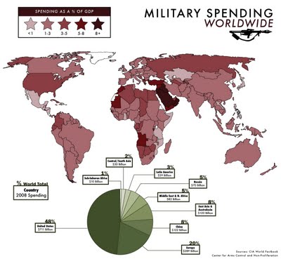
Jessica H.S. sent in a link to this map showing global military spending as a % of GDP as as a % of total world military spending (much larger version available here):

ve-military-spending2

I knew the U.S. spent a ginormous total amount on the military, but I didn’t know we account for right at half of all military spending. And I would have thought China would have more than 8%.

Commenter George has a good point that I really should have thought of:

Saying we account for half of all military spending is misleading. It costs a great deal more to construct military equipment in the U.S. so, of course we spend a larger number of dollars than China would. In China a submarine costs many fewer dollars to build. Of these illustrations the percent of GDP is by far the most informative.

Thanks for pointing that out!

As I understand it, the leisure gap between men and women has largely to do with the fact that women spend more time taking care of children and (especially) the home. I don’t know if this applies internationally or not. In any case, here’s a graphic illustrating the leisure gap across 18 different countries (via Jezebel):

leisuretime1

UPDATE: In the comments, Elena linked to the original OECD report, if you’d like to explore the methodology etc.

A big thanks to Cycles who went and looked it up.  A summary:


Chapter 2, “Special Focus: Measuring Leisure in OECD Countries,” answers most of the questions posed here about what is considered “leisure” and what is not.

Brief overview:

“The approach taken here is to divide time during the day into five main categories. These five-time categories are 1) Leisure, narrowly defined, 2) Paid work, 3) Unpaid work, 4) Personal care, and 5) Other time (uses of time which are either unaccounted for or undefined).”

and

“‘Paid work’ includes full-time and part-time jobs, breaks in the workplace, commuting to the workplace, time spent looking for work, time spent in school, commuting to and from school, and time spent in paid work at home. “Unpaid work” includes all household work (chores, cooking, cleaning, caring for children and other family and non-family members, volunteering, shopping, etc.). “Personal care” includes sleep, eating and drinking, and other household, medical, and personal services (hygiene, grooming, visits to the doctor, hairdresser etc.). “Leisure” includes hobbies, games, television viewing, computer use, recreational gardening, sports, socialising with friends and family, attending events, and so on. “Other time” includes all activities not elsewhere mentioned.”

… and then it goes into even MORE detail about specific activities within each of those five categories.

I highly recommend reading at least Chapter 2 if you have questions. It includes a fascinating backgrounder on past studies and how they categorized of time-use.

—————————

Lisa Wade is a professor of sociology at Occidental College. You can follow her on Twitter and Facebook.

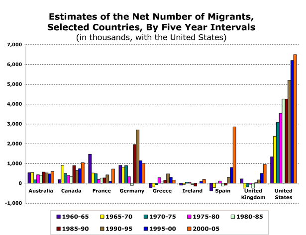
I found this graph illustrating levels of migration to several countries from 1960-65 to 2000-05 at the Migration Policy Institute:

picture-12

Keep in mind, these are total numbers, not weighted by the size of the population of each country, so a country with a relatively small number of migrants compared to other countries may have a much larger percent of the population made up of migrants. But it is interesting to see the increases and decreases of migration over time in each country. The large increase in immigration to Spain especially caught my attention; see also our post on Spain’s voluntary return policy.

Other posts on immigration: the “Muslim demographic threat”, immigration and spouses, volunteer U.S. border guards, the “Battle for Britain”, refugees, immigration streams to the U.S., a horrid Border Patrol video game, Asian Americans and marriage, refugees in the U.S., anti-Puerto Rican statehood movement, pro-environment anti-immigration video, early German assimilation in the U.S., do immigrants work harder?, Muslims in Europe, world stats, and emigration from Mexico.

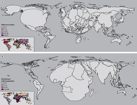
The two maps below are part of a series of maps that warp the size and shape of countries according to various international disproportions (see lots more here).

These two warp countries according to how much they are contributing to global warming and how much they are likely to suffer from global warming respectively.

globeadjustedclimate-thumb-453x348

Ezra Klein interprets:

The first shows the world in terms of carbon emissions. America, for instance, is huge. So is China. And Europe. Africa is hardly visible. The second map shows the world in terms of increased mortality — that is to say, deaths — from climate change. Suddenly, America virtually disappears. So does Europe. Africa, however, is grotesquely distended. South Asia inflates.

Kevin Drum summarizes:

Long story short, we spit out the carbon, but it’s people in Africa and South Asia who are mostly going to die because of it.

Thanks to Toban B. who linked to these maps in a comments thread.

—————————

Lisa Wade is a professor of sociology at Occidental College. You can follow her on Twitter and Facebook.

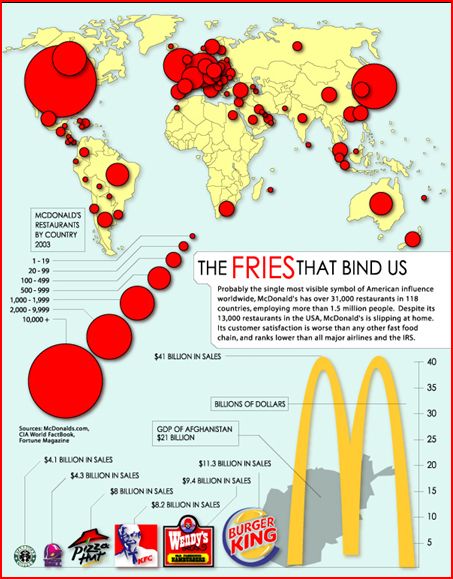
Toban B. sent us a link to these two images illustrating the global spread of Starbucks and McDonalds (put together by Princeton):

captureaa

captureaaa

UPDATE: Toban offered these great insights in the comment thread:

When I sent this in, I was looking at the images as indicators of who is and isn’t part of certain aspects of ‘globalization.’

While there has been increased homogenization, some people also have exaggerated the extent to which we all are part of One world (which some people call a “global village” — a term that I find downright ridiculous, to be frank.) I think that people talk like the world is all One because they are ignoring most of the world — i.e. the spots on the above maps that don’t have many coloured dots on them. Obviously the ‘North’ ‘Western’ areas also are very different in some respects (e.g. linguistically), but there’s more consistency in those areas of the world in terms of McDonaldization, digitization, and other features of the ‘North’ ‘Western’ ends of ‘globalization’ — that is, the sides of ‘globalization’ that people tend to highlight (whereas people don’t pay much attention to international waste trade dumping grounds, for instance).

If the world is all One, it is One in a way that entails different positions (e.g. as producers vs. consumers), and a lot of inequality (e.g. in terms of where the money is). If (for instance) Columbia is part of some sort of globalization, the place of Latin America is a lot different from France (for instance).

—————————

Lisa Wade is a professor of sociology at Occidental College. You can follow her on Twitter and Facebook.

Toban B. sent us a link to a video that condenses 24 hours of air traffic into a minute and 12 seconds. It’s fascinating to see where planes are going to and coming from on a typical day:

—————————

Lisa Wade is a professor of sociology at Occidental College. You can follow her on Twitter and Facebook.

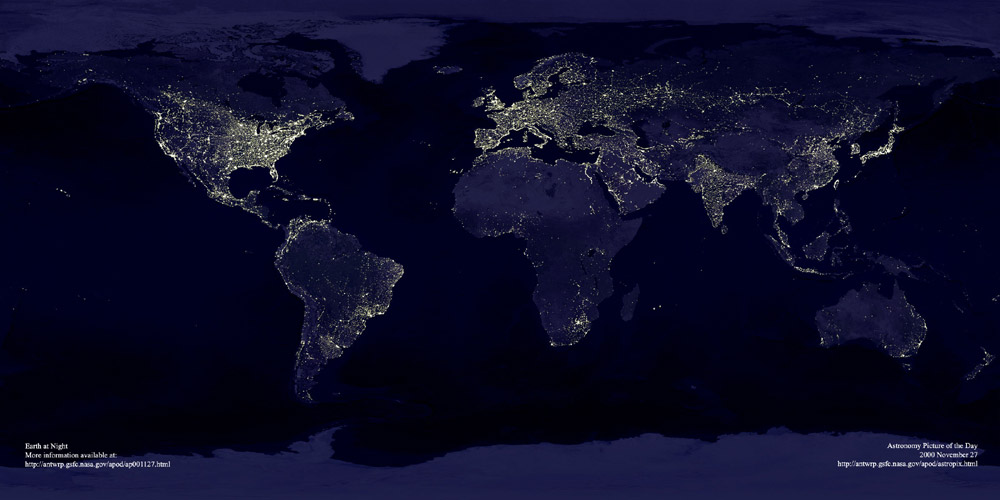
This image, found at International Networks, depicts the globe at night.  The areas bathed in electricity reveal “the global spread of industrialization, as evidenced by the lights of human civilization”:

lights_earth

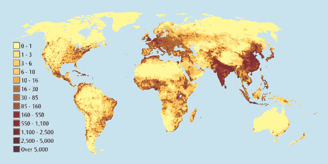
I think it’s interesting to compare this image with a world population map (link):

g-gpw-population-map

At first the two maps seem to overlap pretty nicely, but if you look closely there are plenty of interesting discrepancies, especially in Africa.

Thanks to Toban B. for the link that got me to the graphic that inspired this post.

NEW (Apr. ’10)!  In the comments, Brendon linked to this great image of the Korean peninsula at night that reveals an amazing difference between North and South Korea:

—————————

Lisa Wade is a professor of sociology at Occidental College. You can follow her on Twitter and Facebook.