class

cork

This PostSecret secret offers me an excuse to go on a rant:

Instead of an opportunity to start a national discussion about class, the recession appears to be stimulating a bunch of nationalist, and obfuscatory, rhetoric about our common condition.

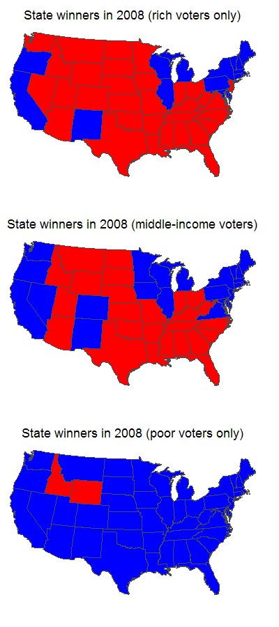
If you listen to most media outlets they say that “America” is in recession.  But not everyone in America is feeling the pain of this economic downturn equally.  I, for example, have not lost my job, have not seen my pay cut, have not lost any benefits, and however much 401k money I’ve lost is rather irrelevant as I’m in my 30s and have no need for it right now.  I am not suffering in this economic depression.   In fact, I’m taking a junior sabattical next year and going half pay BY CHOICE.

Further, I keep hearing things like: “This is a great time to buy a house!” and “Stocks are cheap!  You should invest in [insert random company here]!”  (This advice is lost on a person who comes from humble beginnings and is voluntarily going half pay next year, but I digress.)

So, for many people, this economic downturn is kind of fantastic.  Houses are cheap, stocks are cheap, and companies are offering great deals just to stay afloat.  Plenty of people I know who are upper middle and upper class are considering this a great time to invest (see here for an example).  They look forward to ultimately benefitting from this economic disaster.

Lots of other people around me are suffering.  If you’re already poor or working-class, out-of-work, near retirement or retired, struggling under an adjustable rate mortgage, (and I’m sure there are others I’m forgetting), you may be screwed.

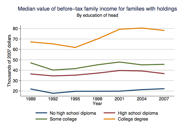
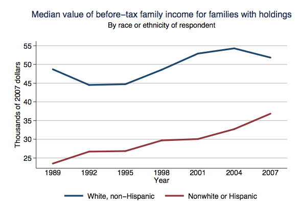
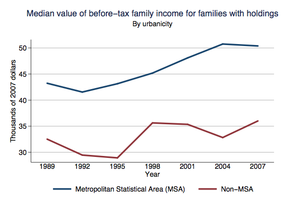
So I wish we would stop talking about how “America” is in recession.  This recession is hurting some kinds of people more than others.  On the whole, those people who were underprivileged before the downturn are taking the brunt of it.


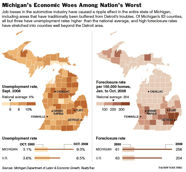
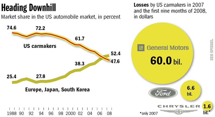
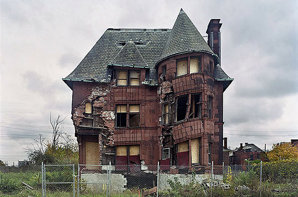
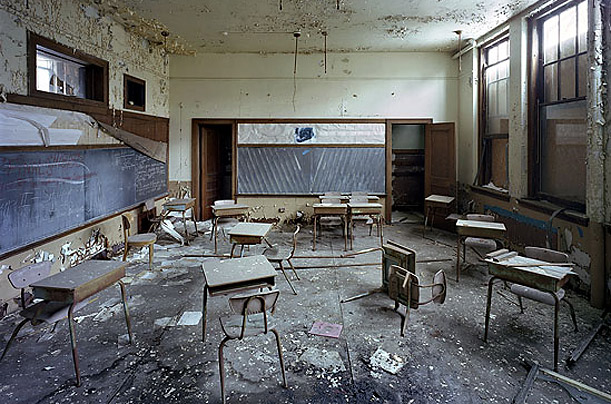
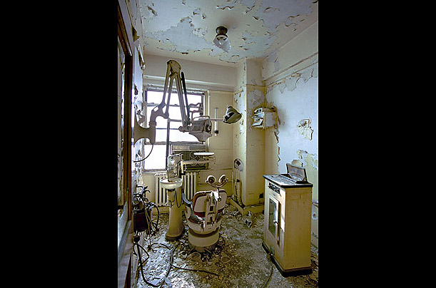
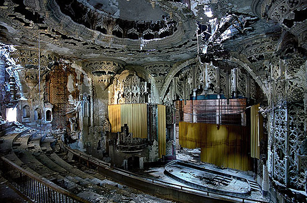
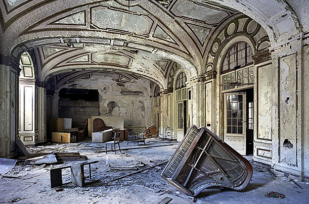
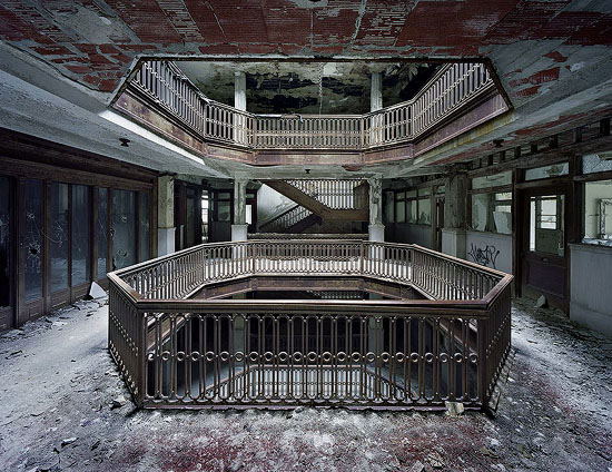
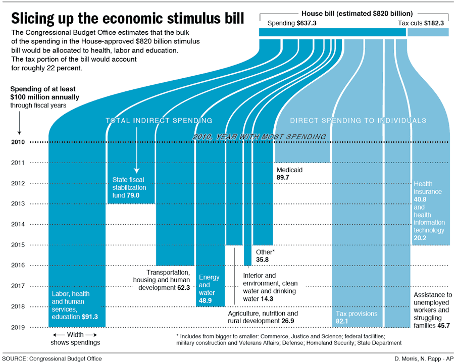
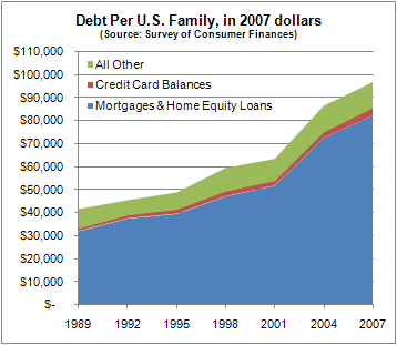
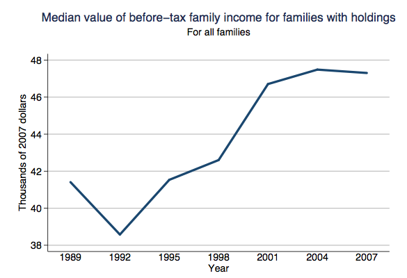
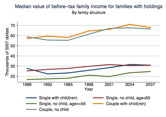
For more on the economy, visit these posts: increases in household debt, job loss and unemployment (herehere, here, and here), cessna responds to the attack on private jet travel, Walmart encourages moms to make the difference, an animated explanation of the credit crisis, images of  the economic depression in Las Vegas (here and here), slumping car sales and overstocked lots, measuring the recession with beer sales, and changes in immigration.

The desperate economic situation of Detroit, Michigan is in the headlines these days.  From the New York Times:

In one sign of distress, in the first nine months of this year [2008], some 130,000 Michigan residents who had lost their jobs remained out of work so long that they ran out of regular unemployment benefits. By the middle of this month, 63,000 people (who had already run out of their ordinary maximum benefit — as many as 26 weeks, at as much as $362 a week) also ran out of an extension authorized by Congress.

This figure shows the unemployment and forclosure rate in Michigan as of Oct. 2008.  It shows that Michigan in general, and Detroit especially, is doing much worse than the national average:

23michigan_graphic_correx

Today’s numbers reflect not just the current recession, but 30 years of decline.  A figure from Spiegel reveals that the marketshare of U.S. automakers have been steadily dwindling:

01020139856300

Spiegel reports that the city has lost more than half its inhabitants since the 1950s (from close to 2 million, to 917,000 in 2009).  The tax base has plummeted and city services, in turn, have been cut.

The conditions in Detroit are dire, and they contrast greatly with the city in the late 1800s and early 1900s.  Then, Detroit’s shipping and manufacturing economy, innovative for its time, made it a rich and vibrant city.  Today, the ruins of that vibrancy still occupy the city.

Detroit’s main train station, opened in 1913 has not been used since 1988:

reliques_01

Constructed in 1893 in the once-elegant Brush Park neighborhood, this home, designed by architect Albert Kahn, was moved from its original location several years ago by preservationists who hoped to preserve it. It was demolished last year:

reliques_02

Many of the city’s Catholic schools have been closed, though the churches they are affiliated with remain active:

reliques_03

One of the city’s most prominent skyscrapers, this 35-story tower once housed the offices of many doctors, lawyers and dentists. It has been virtually empty since the 1980s. Developers hope to convert the building to residential units by 2010:

reliques_04

This spectacular Spanish Gothic theater, built in 1928, was closed in the 1970s:

reliques_05

Once one of the most luxurious residential hotels in Detroit, Lee Plaza closed in the 1990s:

reliques_07

The Farwell Building:

farwell1

Photographers Yves Marchand and Romain Meffre write: Detroit’s “splendid decaying monuments are, no less than the Pyramids of Egypt, the Coliseum of Rome, or the Acropolis in Athens, remnants of the passing of a great civilization.”

Images first found here.

I came across this great photo at BAGnews NOTES, entitled, “Reflecting on the Meltdown”:
85742709MT009_Protesters_De

The author describes the photo and its meaning this way:

It captures a two-day anti-capitalist rally protesting the Wall Street bailout. Through the use of reflection (in this photo of a restaurant, as well as this one playing the street off against a corporate lobby), Mario [Mario Tama, Getty Photographer] portrays America’s class schism (note the guy in the lime-colored reflective vest overlapped with the guy in the jacket with the wristwatch); America flip-flopping between awareness and denial; and the strange disconnect these days between crisis and ‘business as usual.

This is a wonderfully telling picture, but perhaps in addition to “America flip-flopping between awareness and denial,” one could also interpret the artistic use of reflection as representative of the ever-widening chasm between the social classes in the United States – one that will most likely not be remedied or even addressed in the near future.

Yes, it’s another table from Nate Silver at FiveThirtyEight. He’s had some great stuff up lately. Here we have changes in compensation (per employee) between 1992 and 2007 for various industries, based on Bureau of Labor Statistics data:

finpay2

I do question some of these classifications–for instance, is “performing arts, spectator sports, museums, and related activities” really a coherent category? Nonetheless, it provides a relatively consistent measurement of compensation, which is useful for comparing change over time.

I wandered over to the BLS website and ended up on their Occupational Injuries and Illnesses page. There I discovered this in the National Census of Fatal Occupational Injuries in 2007:

picture-18

Along with the graph, we learn,

Workplace homicides involving police officers and supervisors of retail sales workers both saw substantial increases in 2007.

Police officers makes sense. But retail supervisors? Huh. I wonder what the actual numbers are.

From the same report we get the number and rate of fatalities by industry:

picture-19

The extraction industries (mining, forestry, farming, fishing, hunting) are noticeable outliers here, with significantly higher fatality rates (though not overall numbers) than any other industries.

So there’s some totally unconnected information about the labor force for you.

stimulus_large

(Found here, via Thick Culture.)

Nate Silver at FiveThirtyEight put up this graph of U.S. household debt (from the 2007 Survey of Consumer Finances):

debt2

Silver says,

Per-family household debt increased by about 130% in real dollars between 1989 and 2007, from roughly $42,000 per family in 1989 to $97,000 eighteen years later. Most of that increase has come during the past six or seven years — household debt increased by 52% between 2001 and 2007 alone. Almost all of the debt (about 85%) falls into the category that the Fed calls “secured by residential property” — which means mortgages and home-equity loans.

Some other images from the SCF Chartbook (available here)–and pay attention to the y axis, since the scale isn’t the same in all of them:

picture-16

picture-23

picture-3

picture-4

This next one is for rural (non-MSA) and urban (MSA) areas:

picture-5

picture-6

The Chartbook has images of the mean values for all these calculations as well, I just prefer the median to reduce the effects of outlier incomes.

In the wake of the embarassing incident where car company executives were called out for flying in private jets to beg Congress for money, Cessna, manufacturer of private jets, is fighting back.  At their new website, www.cessnarise.com, they’re framing the attack as skeptical hyperbole that doesn’t take into account the facts and recommending that potential purchasers of private jets “rise” above it all.  Some screenshots:

capture9

Notice that Cessna frames the resistance to private-jet-flying chastisement as a “challenge” that should be overcome.

capture11

I don’t know whether private jet ownership is, in fact, economically smart.  I am rather sure that it depends on the company/person.  I do, however, think it’s interesting the way that Cessna is framing a rejection of the point made by Congress (that it is, perhaps, indulgent to insist upon private jet travel) in moral terms.  Customers should “rise” above, take on the “challenge,” fight the “naysayers,” beat the “skeptics.”    Real economics, then, appear to take a backseat to resisting the accusation that some of us enjoy extreme class privilege that is not necessarily justified by the books.

Andrew over at FiveThirtyEight posted three maps that show which candidate would have carried each state if only members of one social class voted (in case it’s not obvious, blue = Obama and red = McCain):

pewmaps

For the purposes of the estimate, “rich” was defined as a household income of $150,000+, “middle-income” was $40,000-75,000, and “poor” was $0-20,000. [Note: for the point of illustration, he just made maps showing the lowest, middle, and upper 20% of households by income, which is why the groups between $20,000-39,000 and $76,000-150,000 don’t show up here–he just made the 3 maps to illustrate the point.]

So what we seem to see here is that poor voters were more consistently partisan than rich voters, at least in the 2008 election. Whether this is a general pattern or something unique to 2008 I don’t know.