Search results for The

Father’s Day advertisements are a peek into what we think dads are all about.  As cultures change, advertising shifts too, giving us a peek into the social construction of fatherhood.

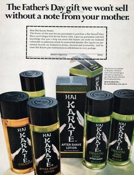
Karl Bakeman pointed us to a series of vintage Father’s Day ads at Retronaut.  They label them with the range from 1943 to 1981. Perhaps we can have fun guessing which was when.  According to these ads, great gifts for dads include recliners, whiskey, cologne, and a pack of smokes.  Today the perfect Dad’s Day gift appears to be meat and meat.

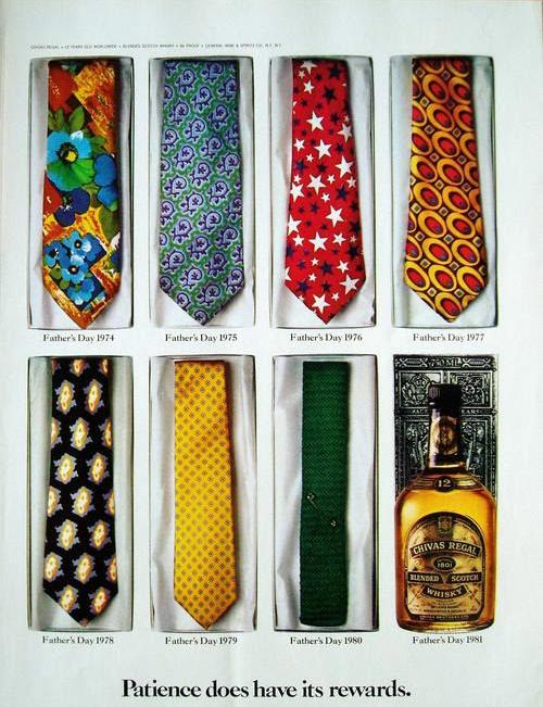
Ties were timeless, until 1981:

Lisa Wade, PhD is an Associate Professor at Tulane University. She is the author of American Hookup, a book about college sexual culture; a textbook about gender; and a forthcoming introductory text: Terrible Magnificent Sociology. You can follow her on Twitter and Instagram.

Please enjoy these posts from Father’s Days past:

Stereotyping Men on Dad’s Day

Also…

Unless we’re one of them, many of us learn the habit of looking away from the down-and-out when we’re going about our daily lives.  Truly seeing the homeless, the mentally ill, the drug-addicted, and others in crisis (not overlapping populations, but intersecting ones) potentially forces us to think about our role in a society that has largely abandoned them.

Meanwhile, art photography of these populations tends to force us to look, to see just how much pain and suffering there is to see on the streets.

In light of this — not looking vs. looking to see the pain — I found the photography of Chris Arnade to be a breath of fresh air.  Featured at Mother Jones, his portraits of “drug abuse, sex work, and homelessness in the Bronx” are humanizing. Many of them show smiling faces, dignity, pride, and peace. I recommend going to see the Flickr set.

Lisa Wade, PhD is an Associate Professor at Tulane University. She is the author of American Hookup, a book about college sexual culture; a textbook about gender; and a forthcoming introductory text: Terrible Magnificent Sociology. You can follow her on Twitter and Instagram.

The Fourth Estate has found that the vast majority of people quoted in news coverage of the 2012 election are men.  The media research group collected a sample of election-related news stories from print newspapers and TV broadcasts, finding that 13% of print sources were women (79% were men and 8% were organizations) and 16% of TV sources were women (81% were men and 3% were organizations).

Male dominance was true in all outlets, though Meet the Press and Time Warner stand out as the least disproportionate:

This might be old (though still frustrating) news, except for the fact that the pattern held for issues traditionally considered “women’s”: abortion, birth control, Planned Parenthood, and women’s rights (blue is men, pink is women, grey is organizations):

This asymmetry is found across media.  See also our posts on gender and book reviewinggender and top billing at Paramount pictures, gender and top creatives for family movies, and women as news subjects.

Lisa Wade, PhD is an Associate Professor at Tulane University. She is the author of American Hookup, a book about college sexual culture; a textbook about gender; and a forthcoming introductory text: Terrible Magnificent Sociology. You can follow her on Twitter and Instagram.

In capitalism, owners of the “means of production” (things like land, factories, technologies, and natural resources, or the money to buy these things) employ labor to do the work of actually producing things.  If the system is working correctly, the value of the labor that goes into making something is worth less than the value of the thing.  This way the capitalist can sell the thing, pay the worker, and skim some profit off the top.

But how much profit?  In a less exploitative system, the worker is paid close to what his work is worth (after accounting for the expenses of maintaining the means of production). In a more exploitative system, the capitalist takes a larger chunk of the enhanced value for himself and gives less to the worker.

What kind of system do we have in the U.S.?  Let’s take a look at some data.

Over at Reports from the Economic Front, Martin Hart-Landsberg posted this graph. It shows that  workers have become increasingly productive since 1948 (i.e., they have created more and more surplus value).  Employers largely shared the increase in profitability with their workers… until the mid-1970s.  Since then, wages have remained stagnant even as worker productivity has continued to rise.  “In other words,” Hart-Landsberg writes, “the owners of the means of production have basically stopped sharing gains in output with their workers.”

You wonder why the middle class is shrinking?  This is one reason.

Lisa Wade, PhD is an Associate Professor at Tulane University. She is the author of American Hookup, a book about college sexual culture; a textbook about gender; and a forthcoming introductory text: Terrible Magnificent Sociology. You can follow her on Twitter and Instagram.

The conventional wisdom seems to be that our biggest economic challenge is runaway government spending. The reality is that government spending is contracting and pulling economic growth down with it.  And worse is yet to come.

Perhaps the best measure of active government intervention in the economy is something called “government consumption expenditure and gross investment.”  It includes total spending by all levels of government (federal, state, and local) on all activities except transfer payments (such as unemployment benefits, social security, and Medicare).  

The chart below shows the yearly percentage change in real government consumption expenditure and gross investment over the period 2000 to 2012 (first quarter).  As you can see, while the rate of growth in real spending began declining after the end of the recession, it took a nose dive beginning in 2011 and turned negative, which means that government spending (adjusted for inflation) is actually contracting.

fredgraph-percente-change-from-a-year-ago.png

The next chart, which shows the ratio of government consumption expenditure and gross investment to GDP, highlights the fact that government spending is also falling as a share of GDP.

dolan-relative-to-gdp.png

Adding transfer payments, which have indeed grown substantially because of the weak economy, does little to change the picture.  As the chart below shows, total government spending in current dollars, which means unadjusted for inflation, has stopped growing.  If we take inflation into account, there can be no doubt that total real government spending, including spending on transfer payments, is also contracting. 

current-total-expenditures.png

The same is true for the federal government, everyone’s favorite villain.  As the next chart shows, total federal spending, unadjusted for inflation, has also stopped growing.

federal-current.png

Not surprisingly, this decline in government spending is having an effect on GDP. Real GDP in the 4th Quarter of 2011 grew at an estimated 3 percent annual rate.  The advanced estimate for 1st Quarter 2012 GDP growth was 2.2 percent.  A just released second estimate for this same quarter revised that figure down to 1.9 percent.  In other words, our economy is rapidly slowing.

What caused the downward revision? 

The answer, says Ed Dolan, is the ever deepening contraction in government spending:  

What is driving the apparent slowdown? It would be comforting to be able to blame a faltering world economy and a strengthening dollar, but judging by the GDP numbers that does not seem to be the case. The following table (see below) shows the contributions of each sector to real GDP growth according to the advance and second estimates from the Bureau of Economic Analysis. Exports, which we would expect to show the effects of a slowing world economy, held up well in the first quarter. In fact, the second estimate showed them even stronger than did the advance estimate. The contribution of private investment also increased from the advance to the second estimate, although not by as much. Exports and investment, then, turn out to be the relatively good news, not the bad, in the latest GDP report.

Instead, the largest share of the decrease in estimated real GDP growth came from an accelerated shrinkage of the government sector. The negative .78 percentage point decrease of the government sector is the main indicator that we are already on the downward slope toward the fiscal cliff.

p120601-1a.png

If current trends aren’t bad enough, we are rapidly approaching, as Ed Dolan noted, the “fiscal cliff.” That is what I was referring to above when I said that worse is yet to come. As Bloomberg Businessweek explains 

Last summer, as part of its agreement to end the debt-ceiling debate (debacle?), Congress strapped a bomb to the economy and set the timer for January 2013. Into it they packed billions of dollars of mandatory discretionary spending cuts, timed to go off at exactly the same time a number of tax cuts [for example, the Bush tax cuts and the Obama payroll-tax holiday] were set to expire  

The congressional deficit supercommittee had a chance to disarm the bomb last fall, but of course it didn’t. And so the timer has kept ticking. The resulting double-whammy explosion of spending cuts and tax increases will likely send the economy careening off a $600 billion “fiscal cliff.”

The fiscal contraction will actually be even worse, since the extended unemployment benefits program is also scheduled to expire at the end of the year.  

So, what does all of this mean?  According to Bloomberg Businessweek:

If Congress does nothing, the U.S. will almost certainly go into recession early next year, as the combo of spending cuts and tax hikes will wipe out nearly 4 percentage points of economic growth in the first half of 2013, according to research by Goldman’s Alec Phillips, a political analyst and economist. Since most estimates project the economy will grow only about 3 percent next year, that puts the U.S. solidly in the red.

One can only wonder how it has come to pass that we think government spending is growing when it is not and that it is the cause of our problems when quite the opposite is true.  Painful lessons lie ahead — if only we are able to learn them.

In the late 1940s and 1950s, sex researcher Alfred Kinsey estimated that about 10% of the population was something other than straight (and then, as now, a much larger number have same sex experiences or attraction).  Today scholars believe that about 3.5% of the U.S. population identify as gay, lesbian or bisexual, a considerably lower number.  Yet, a telling poll by Gallup shows that Americans wildly — wildly — overestimate the number of people who identify as non-heterosexual:

The table shows that more than a third of Americans believe that more than one out of every four people identifies as gay or lesbian.  Only 4% of Americans answered “less than 5%,” the correct answer.

Estimates varied by demographics and political leaning. Liberals were more likely to overestimate, as were younger people, women, Southerners, and people with less education and income:

Interestingly, these numbers are higher than in 2008, when Gallup asked a similar questions. In that poll, only a quarter of the respondents choose “more than 25%” and more than twice as many said that they had “no opinion.”

Gallup concludes: “…it is clear that America’s gay population — no matter the size — is becoming a larger part of America’s mainstream consciousness.”

Lisa Wade, PhD is an Associate Professor at Tulane University. She is the author of American Hookup, a book about college sexual culture; a textbook about gender; and a forthcoming introductory text: Terrible Magnificent Sociology. You can follow her on Twitter and Instagram.

Remapping Debate has posted an interactive graph that lets you look at the decreasing relative value of the federal minimum wage. The graph shows the gap, at various points in time, between the annual income of a full-time worker earning minimum wage and the poverty line for a family of four (all expressed in 2011 dollars; you can see specific historical, unadjusted minimum wage rates here). In 1968, a single minimum-wage earner made about 94% of the federal poverty line for four people:

By 2011, the gap had widened significantly; one minimum-wage worker earns about 66% of the poverty threshold for a family of four:

Though the federal minimum wage has gone up over time, its relative value covers less and less of the costs of living in the U.S.