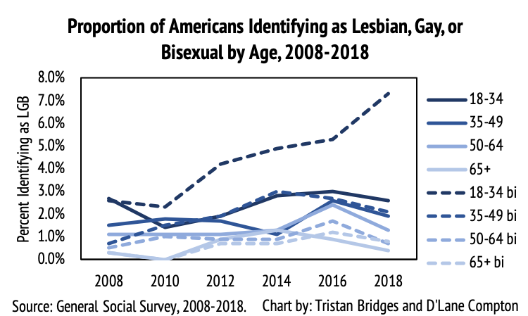
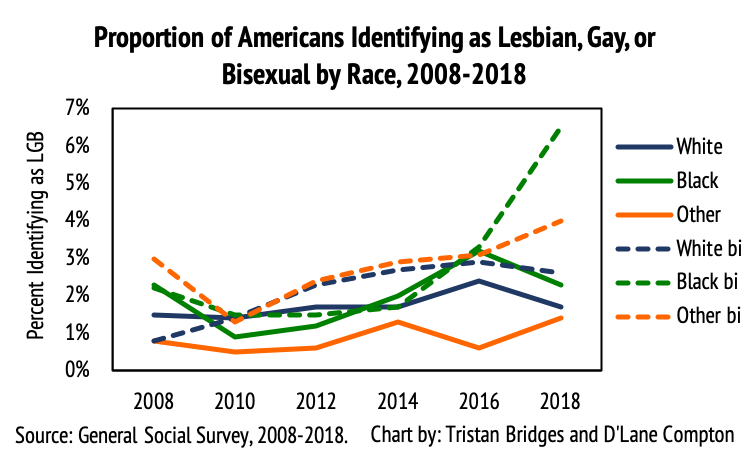
Search results for inequality

Sociologists
studying emotion have opened up the inner, private feelings of anger, fear,
shame, and love to reveal the far-reaching effects of social forces on our most
personal experiences. This subfield has given us new words to make sense of shared
experiences: emotional labor in our professional lives, collective
effervescence at sporting events and concerts, emotional capital as a resource
linked to gender, race, and class, and the relevance of power in shaping
positive and negative emotions.

Despite
these advances, scholars studying emotion still struggle to capture emotion
directly. In the lab, we can elicit certain emotions, but by removing context,
we remove much of what shapes real-life experiences. In surveys and interviews,
we can ask about emotions retrospectively, but rarely in the moment and in
situ.

One
way to try to capture emotions as they unfold in all of their messy glory is
through audio diaries (Theodosius 2008). Our team set out to use audio
diaries as a way to understand the emotions of hospital nurses—workers on the
front lines of healthcare. We asked nurses to make a minimum of one recording
after each of 6 consecutive shifts. Some made short 10-minute recordings. Some
talked for hours in the midst of beeping hospital machines and in break rooms,
while walking to their cars, driving home, and as they unplugged after a long
day. With the recorders out in the world, we couldn’t control what they
discussed. We couldn’t follow-up with probing questions or ask them to move to
a quieter location to minimize background noise.

But what this lack of control gave us was a trove of emotions and reflections, experienced and processed while recording. One fruitful way to try to distill these data, we found, was through visuals. We created wavelength visualizations in order to augment our interpretation of diary transcripts. Pairing the two reintroduces some of the ‘texture’ of spoken word often lost in the transcription process (Smart 2009:296). The following is from our new article in the journal, Qualitative Research (Cottingham and Erickson Forthcoming).

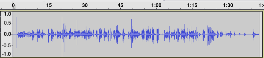
In this first segment, Tamara (all participant names are pseudonyms) describes a memorable situation in which a patient’s visitor assumed that Tamara was a lower-level nursing aid rather than a registered nurse (the full event is discussed in greater detail in Cottingham, Johnson, and Erickson 2018). This caused her to feel “ticked” (angry), which is the word she uses after a quick, high-pitched laugh that peaks the wavelength just after the 30-s mark (Figure 1). The wavelength peak just after the 1:15 mark is as she says the word ‘why’ with notable agitation in ‘I’m not sure why. Maybe cuz I’m Black. I don’t know.’

Figure 1. Tamara’s “Ticked” Segment (shift 2, part 1)

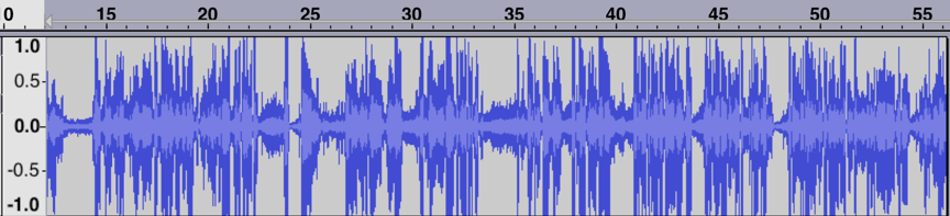
We can compare Figure 1 that visualizes Tamara’s feelings of
anger with the visualization of emotion in Figure 2. “Draining” is the
description Tamara gives at the beginning of this second segment. The peak just
after the 15-second mark is from a breathy laugh as she describes her sister “who
has MS is sitting on the bedside commode” when she gets home from work. After
the 45-second mark, she has a similar breathy laugh but in conjunction with the
word ‘compassionate’ as she says ‘I’m trying to be as empathetic and
compassionate as I want to be, but I know I’m really not. So I feel kinda
crappy, guilty maybe about that.’ Just before the 1:30 mark she draws out the
words ‘draining’ and ‘frustrating’ before finishing: ‘because you leave it and
you come home to it…you know…yeah.’ We can see that the segment ends with
longer pauses, muted remarks, and sighs, suggesting low energy and representing
the drained feelings she expresses, particularly in comparison to the lively
energy seen in the first segment when she discusses feeling angry.

Figure 2. Tamara’s “Draining” Segment (shift 2, part 2)

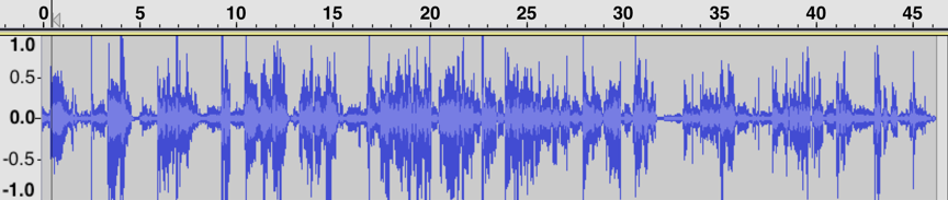
A second example comes from Leah, recorded while driving to work. Here she is angry (“pissed off”) because she has to work on a day that she was not originally scheduled to work. This segment is visualized in the waveform shown in Figure 3.

Figure 3. Leah’s ‘Righteous Indignation’ Segment (shift 2, part 1)
Figure 4. Leah’s ‘I Don’t Want to Stay’ Segment (shift 2, part 3)

In contrast to her discussion of being pissed off and working to ‘retain enough righteous indignation’ to confront her boss later (in figure 3), we see a different wavelength visualization in her second segment (figure 4). In that segment, she describes her lack of enthusiasm for continuing the shift. She reflects on this lack of desire (‘I don’t want to stay’) by stepping outside her own feelings and contrasting them with the dire circumstances of her young patient. This reflexivity leads her to conclude that she has reached the limits of her ability to be compassionate.

To
be sure, waveform visualizations are only meaningful in tandem with what our nurses say. And they do not
provide definitive proof of certain emotions over others. They can’t fully
identify the sighs, deep inhales, uses of sarcasm, or other subtle features of
spoken diary entries. They do, however, offer some insight into how speed,
pitch, and pauses correspond to different emotional expressions and, arguably,
levels of emotional energy (Collins 2004) that vary across time and interactions.

While
there is little that can serve as a substitute for hearing the recordings
directly, the need to protect participants’ confidentiality compels us to turn
to other means to convey the nuances of these verbalizations. Visualization of
wavelengths, in combination with transcripts, can lend themselves to further
qualitative interpretation of these subtleties, conveying the dynamics of a
segment to others who do not have direct access to the recordings themselves.

Check
out the full, open-access article on this topic here and more on the experiences of nurses
here.

Marci Cottingham is assistant professor of sociology at the University of Amsterdam. She researches emotion and inequality broadly and their connection to healthcare and biomedical risk. She is a 2019-2020 visiting fellow at the HWK Institute for Advanced Study. More on her research can be found here: www.uva.nl/profile/m.d.cottingham

References:

Collins, Randall.
2004. Interaction Ritual Chains. Princeton, New Jersey: Princeton
University Press.

Cottingham,
Marci D. and Rebecca J. Erickson. Forthcoming. “Capturing Emotion with Audio
Diaries.” Qualitative Research. https://doi.org/10.1177/1468794119885037

Cottingham,
Marci D., Austin H. Johnson, and Rebecca J. Erickson. 2018. “‘I Can Never Be
Too Comfortable’: Race, Gender, and Emotion at the Hospital Bedside.” Qualitative
Health Research
28(1):145–158. https://doi.org/10.1177/1049732317737980

Smart,
Carol. 2009. “Shifting Horizons: Reflections on Qualitative Methods.” Feminist
Theory
10(3):295–308.

Theodosius,
Catherine. 2008. Emotional Labour in Health Care: The Unmanaged Heart of
Nursing
. NY: Routledge.
[

What do college graduates do with a sociology major? We just got an updated look from Phil Cohen this week:

These are all great career fields for our students, but as I was reading the list I realized there is a huge industry missing: data science and analytics. From Netflix to national policy, many interesting and lucrative jobs today are focused on properly observing, understanding, and trying to predict human behavior. With more sociology graduate programs training their students in computational social science, there is a big opportunity to bring those skills to teaching undergraduates as well.

Of course, data science has its challenges. Social scientists have observed that the booming field has some big problems with bias and inequality, but this is sociology’s bread and butter! When we talk about these issues, we usually go straight to very important conversations about equity, inclusion, and justice, and rightfully so; it is easy to design algorithms that seem like they make better decisions, but really just develop their own biases from watching us.

We can also tackle these questions by talking about research methods–another place where sociologists shine! We spend a lot of time thinking about whether our methods for observing people are valid and reliable. Are we just watching talk, or action? Do people change when researchers watch them? Once we get good measures and a strong analytic approach, can we do a better job explaining how and why bias happens to prevent it in the future?

Sociologists are well-positioned to help make sense of big questions in data science, and the field needs them. According to a recent industry report, only 5% of data scientists come out of the social sciences! While other areas of study may provide more of the technical skills to work in analytics, there is only so much that the technology can do before companies and research centers need to start making sense of social behavior. 

Source: Burtch Works Executive Recruiting. 2018. “Salaries of Data Scientists.” Emphasis Mine

So, if students or parents start up the refrain of “what can you do with a sociology major” this fall, consider showing them the social side of data science!

Evan Stewart is an assistant professor of sociology at University of Massachusetts Boston. You can follow his work at his website, on Twitter, or on BlueSky.

Buzzfeed News recently ran a story about reputation management companies using fake online personas to help their clients cover up convictions for fraud. These firms buy up domains and create personal websites for a crowd of fake professionals (stock photo headshots and all) who share the same name as the client. The idea is that search results for the client’s name will return these websites instead, hiding any news about white collar crime.

In a sea of profiles with the same name, how do you vet a new hire? Image source: anon617, Flickr CC

This is a fascinating response to a big trend in criminal justice where private companies are hosting mugshots, criminal histories, and other personal information online. Sociologist Sarah Lageson studies these sites, and her research shows that these databases are often unregulated, inaccurate, and hard to correct. The result is more inequality as people struggle to fix their digital history and often have to pay private firms to clean up these records. This makes it harder to get a job, or even just to move into a new neighborhood.

The Buzzfeed story shows how this pattern flips for wealthy clients, whose money goes toward making information about their past difficult to find and difficult to trust. Beyond the criminal justice world, this is an important point about the sociology of deception and “fake news.” The goal is not necessarily to fool people with outright deception, but to create just enough uncertainty so that it isn’t worth the effort to figure out whether the information you have is correct. The time and money that come with social class make it easier to navigate uncertainty, and we need to talk about how those class inequalities can also create a motive to keep things complicated in public policy, the legal system, and other large bureaucracies.

Evan Stewart is an assistant professor of sociology at University of Massachusetts Boston. You can follow his work at his website, on Twitter, or on BlueSky.

The 2018 General Social Survey data was just recently publicly released. We were eager to see how things shifted, especially for the demographic questions on sexual identity. As of 2018, it has officially been one decade that GSS has been asking respondents to characterize their sexual identity on the survey, you can self-classify as “heterosexual or straight,” “gay,” “lesbian,” “homosexual,” “bisexual,” or “don’t know.” This is only one way to measure sexual identity among many,  but the growth in LGB identity has been generally comparable across instruments in the past.

As Tristan has noted before, reporting on shifts in the LGBT population treats the group as homogenous and artificially presents growth in LGBT identity as though it might be equally distributed among the L’s, G’s, B’s, and T’s. But that’s not true. Bisexual women account for the lion’s share on the growth in LGBT identification. And, as Tristan and Mignon Moore showed in 2016, young Black women account for a disproportionate amount of the growth in LGB identification.

Data from GSS shows an increase in LGB identification between 2008 and 2018. Below, we charted shifts in those identifying as lesbian and gay alongside those identifying as bisexual. Consistent with what Tristan showed in 2016, bisexual identification continues to be increasing at a steeper rate.

In fact, when you look at the proportions identifying as lesbian and gay or bisexual in 2008 and compare those with the proportions identifying as lesbian and gay or bisexual in 2018, lesbian and gay identifications have not really moved much. But bisexual identities continue to increase every year.

This is consistent with other national survey work. For example, using the National Survey of Family Growth (NSFG), Compton, Farris and Chang (2015) found that almost nine percent of women in the sample and about four percent of men in the sample in 2008 and 2002 reported behavior as bisexual; that is, having sex with at least one male and at least one female partner in their lifetime. Rates of self-identification as bisexual were much lower (in 2008 0.43% of women and 0.38% of men). Perhaps with increases in social tolerance people are more likely to claim bisexual identities today, regardless of their participation in the behavior.

Previous work has also suggested that much of the growth in LGB identities is happening among women. The GSS data show that the shift appears to be primarily happening among bisexual women. Indeed, bisexuality continues to be a more popular sexual identity than lesbian among women, but a less popular sexual identity than gay among men, as others have shown. As of 2018, almost 6% of women responding to the survey identified as bisexual compared with 1.5% in 2008. Comparatively, shifts in lesbian identities among women and both gay and bisexual identities among men really haven’t shifted much.

And similar to previous analyses (herehere, and here), this shift is particularly pronounced among the young. The figure below shows changes in lesbian and gay identities alongside shifts in bisexual identities for four separate age cohorts. The real shift in among bisexual identification among 18-34 year-olds. Between 7 and 8% identified as  bisexual on the 2018 GSS survey. This is all the more interesting when you look at the 2008 data on these figures. Bisexuality did not stand out in these data in 2008. In fact, in 2008, more people identified as lesbian and gay than bisexual. This shift has emerged and grown in an incredibly short period of time.

As other data have shown as well (see here and here, for instance), people of color account for a disproportionate amount of this shift. Black bisexuals accounted for almost 7% of Black respondents on the 2018 GSS. That’s a big shift as well. And while bisexual and lesbian/gay identities were moving along similar trajectories for Black Americans through 2016, as of 2018, bisexuality was much more common (as has been true for White respondents and those of other races… yes “other race” is actually the category GSS uses… and no, it’s not a good idea).

So what do we do with all of this? One thing that we ought to take from this is to take scholarship on bisexuality more seriously. As a sexual identity, bisexuality is less studied than it ought to be. But bisexuality has continued to grow and continues to represent a larger number of people’s sexual identities than lesbian and gay combined. This is interesting for a number of reasons, but one is that much of the growth in the LGBT community might actually be the result of changes in the population of bisexual identifying people (and this is a group that is disproportionately composed of women). Whether bisexual identifying people understand themselves as a part of a distinct sexual minority, though, is a question that deserves more scholarship. If we are going to continue to group bisexuals with lesbian women and gay men when we report on shifts in LGB populations, this might be something that deserves better understanding and more attention. Context matters in how we understand identities and how they change or evolve over time.

Originally posted at Inequality by Interior Design. Read more and dive into the details there!

D’Lane R. Compton, PhD is an associate professor of sociology at the University of New Orleans with a background in social psychology, methodology, and a little bit of demography, they are usually thinking about food, country roads, stigma, queer nooks and places, sneakers and hipster subcultures. You can follow them on twitter.

Tristan Bridges, PhD is a professor at the University of California, Santa Barbara. He is the co-editor of Exploring Masculinities: Identity, Inequality, Inequality, and Change with C.J. Pascoe and studies gender and sexual identity and inequality. You can follow him on Twitter here. Tristan also blogs regularly at Inequality by (Interior) Design.

Black history in Appalachia is largely hidden. Many people think that slavery was largely absent in central and southern Appalachia due to the poverty of the Scots-Irish who frequently settled in the area, and who were purportedly more “ruggedly independent” and pro-abolitionist in their sentiments. Others argue that the mountainous land was not appropriate for plantations, unlike other parts of the South, and so slavery in the area was improbable.

A Sample Slave Schedule
(Wikimedia Commons)

As historian John Inscoe and sociologist Wilma Dunaway show us, this is not the case. According to Inscoe, slavery existed in “every county in Appalachia in 1860.” Dunaway—who collected data from county tax lists, census manuscripts, records from slaveholders, and slave narratives from the area—estimates that 18% of Appalachian households owned slaves, which compares to approximately 29% of Southern families, in general.

While enslaved people in the Appalachian region were less likely to work on large plantations, their experiences were no less harsh. They often tended small farms and livestock, worked in manufacturing and commerce, served tourists, and labored in mining industries. Slave narratives, legal documents, and other records all show that slaves in Appalachia were treated harshly and punitively, despite claims that slavery was more “genteel” in the area than the deep South.

My own research, which focuses on the life experiences of Leslie [“Les”] Whittington, whose grandfather was enslaved, helps to document the presence of slavery in Appalachia and the consequences that exploitative system had for African Americans in the region. Les’s grandfather, John Myra, was owned by Joseph Stepp, who lived in Western North Carolina. Census records show that Joseph Stepp owned seven slaves in 1850, five women and two men, who together ranged from one to 32 years of age. Ten years later, in 1860, schedules show Stepp owned 21 slaves, making him one of the wealthiest property owners in Buncombe County, the county in which he and John Myra lived.

Joseph Stepp was not unique. According to Dunaway, slave owners in Appalachia “monopolized a much higher proportion of their communities’ land and wealth” compared to those outside the area, driving wealth inequality in the region. Part of the legacy of slavery, these inequities remained in place after the Civil War, reinforced by Jim Crow legislation that subjugated African Americans socially, culturally, and politically. Sociologist Karida Brown explains how Jim Crow Laws led approximately six million African Americans to migrate from the South to the North between 1910 and 1970.

Poverty Rates in Appalachia by Race (U.S. Census Bureau, 2000).
Click to view report
Graphic by Evan Stewart

Those who stayed in Appalachia, such as John Myra and his descendants, faced continued restrictions, like living in racially segregated neighborhoods, having limited employment opportunities, and not being able to attend racially integrated schools. Such systematic forms of discrimination explain why racial disparities continue to exist today, even within a region where poverty among whites remains above the national average. To understand these existing inequities, we must document the past accurately.

Jacqueline Clark, PhD is a professor of sociology at Ripon College. Her teaching and research interests include social inequalities, the sociology of health and illness, and the sociology of jobs and work. 

Last month, Green Book won Best Picture at the 91st Academy Awards. The movie tells the based-on-a-true-story of Tony Lip, a white working-class bouncer from the Bronx, who is hired to drive world-class classical pianist Dr. Don Shirley on a tour of performances in the early-1960s Deep South. Shirley and Lip butt heads over their differences, encounter Jim Crow-era racism, and, ultimately, form an unlikely friendship. With period-perfect art direction and top-notch actors in Mahershala Ali and Viggo Mortensen, the movie is competently-crafted and performed fairly well at the box office.

Still, the movie has also been controversial for at least two reasons. First, many critics have pointed out that the movie paints a too simple account of racism and racial inequality and positions them as problem in a long ago past. New York Times movie critic Wesley Morris has called Green Book the latest in a long line of “racial reconciliation fantasy” films that have gone on to be honored at the Oscars.

But Green Book stands out for another reason. It’s an unlikely movie to win the Best Picture because, well, it’s just not very good.

Source: Wikimedia Commons

Sociologists have long been interested in how Hollywood movies represent society and which types of movies the Academy does and doesn’t reward. Matthew Hughey, for example, has noted the overwhelming whiteness of Oscar award winners at the Oscars, despite the Oscars A2020 initiative aimed at improving the diversity of the Academy by 2020. But, as Maryann Erigha shows, the limited number of people of color winning at the Oscars reflects, in part, the broader under-representation and exclusion of people of color in Hollywood.

Apart from race, past research by Gabriel Rossman and Oliver Schilke has found that the Oscars tend to favor certain genres like dramas, period pieces, and movies about media workers (e.g., artists, journalists, musicians). Most winners are released in the final few months of the year and have actors or directors with multiple prior nominations. According to these considerations, Green Book had a lot going for it. Released during the holiday season, it is a historical movie about a musician, co-starring a prior Oscar winner and a prior multiple time Oscar nominee. Sounds like perfect Oscar bait.

And, yet, quality matters, too. It’s supposed to be the Best Picture after all. The problem is what makes a movie “good” is both socially-constructed and a matter of opinion. Most studies that examine questions related to movies measure quality using the average of film critics’ reviews. Sites like Metacritic compile these reviews and produce composite scores on a scale from 0 (the worst reviewed movie) to 100 (the best reviewed movie). Of course, critics’ preferences sometimes diverge from popular tastes (see: the ongoing box office success of the Transformers movies, despite being vigorously panned by critics). Still, movies with higher Metacritic scores tend to do better at the box office, holding all else constant.

If more critically-acclaimed movies do better at the box office, how does quality (or at least the average of critical opinion) translate into Academy Awards? It is certainly true that Oscar nominees tend to have higher Metacritic scores than the wider population of award-eligible movies. But the nominees are certainly not just a list of the most critically-acclaimed movies of the year. Among the films eligible for this year’s awards, movies like The Rider, Cold War, Eight Grade, The Death of Stalin, and even Paddington 2 all had higher Metacritic scores than most of the Best Picture nominees. So, while nominated movies tend to be better than most movies, they are not necessarily the “best” in the eyes of the critics.

Even among the nominees, it is not the case that the most critically-acclaimed movie always wins. In the plot below, I chart the range of Metacritic scores of the Oscars nominees since the Academy Awards reinvented the category in 2009 (by expanding the number of nominees and changing the voting method). The top of the golden area represents the highest-rated movie in the pool of nominees and the bottom represents the worst-rated film. The line captures the average of the pool of nominees and the dots point out each year’s winner.

Click to Enlarge

As we can see, the most critically-acclaimed movie doesn’t always win, but the Best Picture is usually above the average of the pool of nominees. What makes Green Book really unusual as a Best Picture winner is that it’s well below the average of this year’s pool and the worst winner since 2009. Moreover, according to MetaCritic (and LA Times’ film critic Justin Chang), Green Book is the worst winner since Crash in 2005.

Green Book’s Best Picture win has led to some renewed calls to reconsider the Academy’s ranked choice voting system in which voters indicate the order of preferences rather than voting for a single movie. The irony is that when Moonlight, a highly critically-acclaimed movie with an all-black cast, won in 2016, that win was seen as a victory made possible by ranked choice voting. Now, in 2019, we have a racially-controversial and unusually weak Best Picture winner that took home the award because it appears to have been the “least disliked” movie in the pool.

The debate over ranked choice voting for the Academy Awards may ultimately end in further voting rule changes. Until then, we should regard a relatively weak movie like Green Book winning Best Picture as the exception to the rule.   

Andrew M. Lindner is an Associate Professor at Skidmore College. His research interests include media sociology, political sociology, and sociology of sport.

Happy Valentine’s Day! A sociological look at love is always a little awkward, because it means coming to terms with just how much our most personal, intimate, and individual relationships are conditioned by the cultures we live in. Dating preferences reflect broader patterns in social inequality, external strains like job insecurity can shape the way we think about romantic commitment, and even the way people orgasm can be culturally conditioned.

Classic sociological research finds that love follows cultural scripts and repertoires. While every relationship is unique, we learn fundamental patterns about how to love from the world around us. Breaking those scripts can be uncomfortable, but also hilarious and genuine. This year the internet has gifted us two amazing examples where romantic scripts and comedy collide.

One comes from research scientist Janelle Shane. Shane recently trained a machine learning algorithm using a collection of phrases from those candy hearts that always pop up this time of year. After detecting patterns in the real messages, the program generated its own. You can see a full set of hearts on her blog. These hearts get so very close to our familiar valentine scripts, but they miss hilariously because the program can only ever approximate the romantic gesture.

The other comes from comedy writer Ryan Creamer, who has uploaded an entire series of simple, earnest, and distinctly not pornographic videos to PornHub. Hit titles include, “I Hug You and Say I Had a Really Good Time Tonight and Then I Go Home,” and “I Ride in a Taxi and Don’t Have Sex With the Driver.” Check out Joana Ramiro’s analysis of Creamer’s work, capitalism, and intimacy at Jacobin. 

This Valentine’s Day, take a moment and see if you’re just following the typical social script. Breaking up the romantic routine can lead to a genuine laugh or two, and you might even learn something new about your relationship.Evan Stewart is an assistant professor of sociology at University of Massachusetts Boston. You can follow his work at his website, on Twitter, or on BlueSky.

As a feminist sociologist, I couldn’t help but notice how reality competition shows like Dwayne “The Rock” Johnson’s  The Titan Games and American Ninja Warrior can teach us a lot about how society understands physical strength in relation to gender. 

Each of these shows takes a different approach to including women in strength competitions. On The Titan Games, women compete against women, while men compete against men. For each round, there is a man and woman winner. Given this format, men and women get equal screen time throughout the show. We see pairs of women and men compete in the same competitions like the Herculean Pull—the most intense one-on-one game of tug-of-war you have ever seen. This same-gender competition can actually minimize gender differences to the audience. Even if the pairs of women are slower than the pairs of men on some events, competition times are not shown to the television audience, so this difference is not highlighted.

In contrast, in the original rules of Ninja Warrior, everyone competed and the highest ranked individuals moved on to the next round. This quickly resulted in few women being represented beyond the first round (although some women were advanced as “wildcards” at the producers’ discretion). On Ninja Warrior, the audience sees the ranks of all the competitors, so it is very clear how the women do in comparison to the men (not so well, for the most part).

Source: “Numbers of Ninja Warrior: Ladies Night in Philadelphia”

In 2017 (Season 9), the rules were modified to secure slots for women in later rounds. Interestingly, the rule change was in response to fan interest in seeing more women compete. Under the new rules, the top five women in qualifying rounds would advance and the top two women in the city finals would move on to national finals. This format results in some women moving forward based on performance in relation to all competitors and other women moving on based on their performance in relation to other women. For example, in Philadelphia qualifiers in Season 10, three women earned a spot in the city finals based on their overall rank in the competition and the next two highest-ranking women (although lower ranking than some men) also advanced to the City finals to attain the minimum of five women advancing.

From a feminist perspective, which approach is best for showing women’s strength in competition? Do you prioritize representation and visibility for women, giving equal time to men and women throughout the competition as in The Titan Games? Or do you prioritize eliminating gender as an organizing category, providing the opportunity for (some) women to be ranked higher than (some) men, and including the potential for participation of folks outside the gender binary as in the original Ninja Warrior rules? Or do you try to do both?

Five women moving on from American Ninja Warrior Philadelphia qualifiers to city finals in Season 10. (Click for Source)

This question matters because there are real stakes to the way we see strength in pop culture. The way we consider gender and physical strength affects many women, even those who are not elite athletes. For example, in my own research on the construction trades, many tradeswomen face assumptions and stereotypes about women’s physical ability that disadvantage them throughout their careers. It’s important to disrupt discourses about strength when they are leveraged to unnecessarily disadvantage women. Not all women (or men) have the physical ability to do construction work. But many do. 

Strength competitions like these might seem to support stereotypes, but our scientific understanding of strength raises some troubling ideas about perceived “natural” differences of the body. Biological differences between men and women are not a clear as some would like to believe, this had led to problems with determining athletes’ genders for competition. In the US, large and muscular bodies are seen as desirable for men and problematic for women; this shapes who trains to complete in these types of competitions. If more women trained for strength-based competitions, we can assume the gap between men and women in these competitions would shrink, but not fully disappear. Similar trends have occurred in long distance running.

It’s difficult to imagine that anyone who has seen the women competitors on these shows could believe that women are not strong enough to do construction. Especially if you watched the first episode of The Titan Games and saw Tina Rivas, a sheet metal installer. And as she said about her work, “I am the only woman. So obviously that’s a little bit hard. But I can handle it.” Indeed.

Maura Kelly is an Associate Professor of Sociology at Portland State University. Her research and teaching interests include gender, sexualities, social inequality, work and occupations, and popular culture. Her current research is primarily focused on the experiences of women and people of color in the construction trades as well as policy and programs intended to increase the diversity of the construction trades workforce. She is the co-editor of the forthcoming book Feminist Research in Practice (Rowman & Littlefield 2019).