
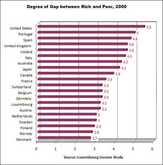
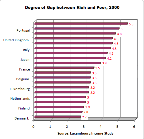
These data come from the Luxembourg Income Study, the most rigorous data source for cross-national income and wealth. The chart’s income gap indicator in each country is the disposable (after tax) annual income of the top 10% divided by the disposable income of the bottom 10%. In other words, the income gap is the ratio of the 10% of persons with the highest income to the 10% with the lowest. For instance, in the USA the income of the top-earning 10% was 5.5 times that of the bottom 10%.
The statistics in this chart can be found on page 4 of a document on the Contexts website: http://www.contextsmagazine.org/resources_vol6-3.php That document is a supplement to an article by Peter Dreier, “The United States in Comparative Perspective,” in the Summer 2007 issue of Contexts.
Some may read these statistics and say “inequality in the US is overblown” because the bottom 10% live better off than most people in the rest of the world. That is true if Americans are compared to countries where the average income is less than a dollar a day. But if the American poor are compared to the poor in other wealthy countries, American poor are far worse off.


