Search results for inequality

Bemoaning how Halloween has turned into an opportunity/requirement for women and girls to dress sexy is nothing new.  The trend isn’t just about Halloween, however, it reflects an everyday expectation for women.  Women are expected to dress in ways that reveal their body and please a hypothetical male gaze daily.  Men just aren’t.

University of Akron sociology graduate student Will LeSuer took some great photographs illustrating the different expectations for men and women.  The same idea for a costume is sexualized when it’s a woman in it and not-at-all sexualized when it’s a man.  Notice, too, that the sizing is different.  The costumes for women come in three sizes, while the men’s is usually just one size.  This is because women are expected to wear clothes that reveal the shape of her body, so the exact size is more important.

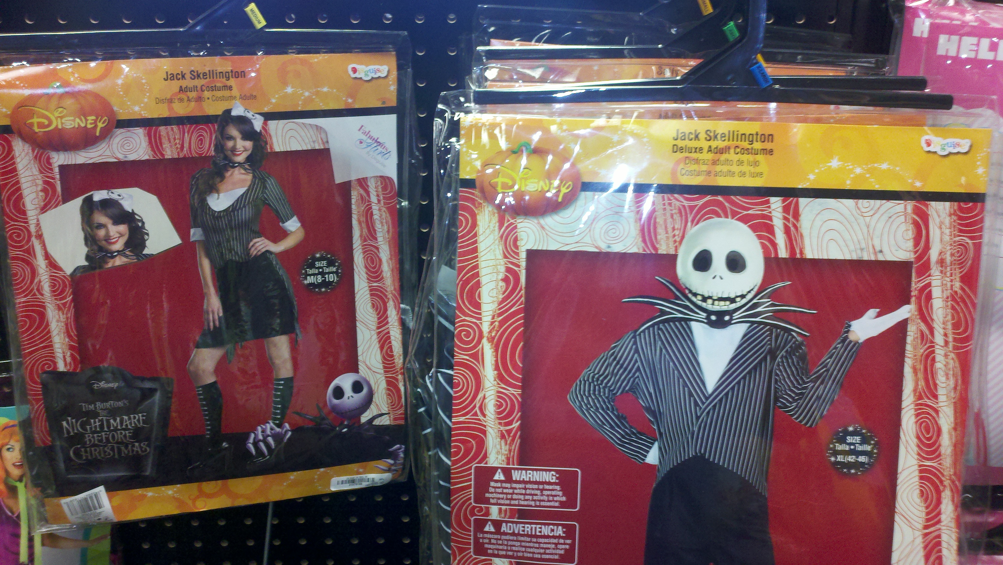
You might have observed, also, that the costumes aren’t called “men’s” and “women’s.”  They’re all just “adult.”  So women could, if they wanted to, buy and wear the non-sexy version of the costume, and vice versa for men.   And we might imagine a woman doing that.  But would a guy do that?  Probably only as a joke (unless they’re in a queer-safe space).

This pattern — women can dress like men, but men don’t dress like women — suggests that there is, in fact, something demeaning, ridiculous, or subordinating about presenting oneself to the male gaze.  Most men feel stupid, gross, or vulnerable when they do it.  This isn’t just about conformity to different gendered expectations.  If it were just about difference women would feel equally weird dressing in men’s clothes.  Instead, when women adopt masculine ways of dressing and moving, they often feel empowered.

So, when men do femininity they feel ridiculous and when women do masculinity they feel awesome. This is what gender inequality looks like.

Lisa Wade, PhD is an Associate Professor at Tulane University. She is the author of American Hookup, a book about college sexual culture; a textbook about gender; and a forthcoming introductory text: Terrible Magnificent Sociology. You can follow her on Twitter and Instagram.

The OccupyWallStreet movement has succeed in forcing the media to acknowledge the extent and seriousness of income inequality.  In many ways wealth inequality is a bigger problem since it is wealth that largely underpins income and power differences.  According to an Economic Policy Institute posting,

the richest 5 percent of households obtained roughly 82 percent of all the nation’s gains in wealth between 1983 and 2009. The bottom 60 percent of households actually had less wealth in 2009 than in 1983, meaning they did not participate at all in the growth of wealth over this period.

It is worth dividing the top 5% into what has now become two familiar groups, the top 1% and the next 4%.  As the chart below shows, the top 1% of households captured 40% of all the growth in wealth over the period 1983 to 2009.  The next 4% gained 41.5%.

ob-pr379_wealth_g_20110916115942.jpg

Putting these trends into dollars, households in the top 1% gained an average of $4.5 million in wealth and households in the next 4% gained an average of $1.2 million over the period.  It is worth restating that those are just their gains. How does your existing wealth stack up against their gains?

Shamus Khan posted a link to a great slideshow put together by the Business Insider that summarizes the current state of our economy. It’s a one-stop illustration of, in their words, “What the Wall Street protestors are so angry about,” and definitely worthy of clicking over to see the whole thing. I’m posting just a few of the images here.

The median length of unemployment for those who lose their jobs is now over 20 weeks:

About 45% of the currently unemployed have been without a job for at least 27 weeks — six to seven months without a job:

CEO pay is now roughly 350 times higher than the average worker’s:

And CEO pay has grown dramatically since the early ’90s, though production workers’ pay has barely budged and the minimum wage has actually dropped if you adjust for inflation:

We often hear that the extremely wealthy pay a very disproportionate amount of U.S. taxes. It is true that they pay a large share. But it’s not so imbalanced compared to how much of all income they earn. For instance, the richest 20% of earners receive 59.1% of all U.S. income but pay 64.3% of taxes:

There’s much, much more in the full slideshow; go check it out.


Last month I posted a video from the PBS series on U.S. inequality, showing the misperceptions many Americans have about the level of economic stratification in the U.S. In a new segment in the series, PBS looks at the often hidden health impacts of this economic inequality:

Watch the full episode. See more PBS NewsHour.

Full transcript available here.

The Census Bureau just published new data revealing trends in living standards as of 2010.  The trends are troubling to say the least. Median household income (adjusted for inflation) fell to $49,445.  That means that the median household now earns less than it did a decade ago.  This marks the first decade since the Great Depression without an increase in real median income.

According to Lawrence Katz, a labor expert and Harvard economist:

This is truly a lost decade.  We think of America as a place where every generation is doing better, but we’re looking at a period when the median family is in worse shape than it was in the late 1990s.

The percentage of Americans living in poverty hit 15.1 percent, the highest percentage since 1993.  There are now 46.2 million people living below the poverty line, the greatest number ever recorded by the Census Bureau. Child poverty stood at 22 percent.

Things are unlikely to get better this year.  State and local governments are slashing employment and programs and the federal government is now moving into cutting mode itself.

This depressing situation is not simply a recession phenomenon.  As the New York Times reports, the expansion period of 2001 to 2007 “was the first… on record where the level of poverty was deeper, and median income of working-age people was lower, at the end than at the beginning.”

Of course, while the great majority of people are struggling, a small minority have been doing very well.  One consequence, as the chart below highlights, is a strong growth in inequality (as measured by the Gini coefficient with higher numbers reflecting greater inequality).  As I noted in a previous post, over the years 2002 to 2007, the top 1% of households captured 58% of all the income generated.

inequality-2.jpg


In brief, there is a small minority that is doing very well and a great majority that is struggling, with a significant number in free fall.


Katrin let us know about this great clip from PBS News Hour (and posted at Boing Boing) about inequality and Americans’ perceptions about how wealth is distributed in the U.S. It’s a great clip:

PBS posted the pie charts used in the video as well.

Captain Crab sent us an article by David Johnston in the Willamette Week that looks at changes in income inequality in the U.S. since 1950.Based on an analysis of research by Saez and Piketty (2007, with updated 2008 data available at Saez’s website–the first entry under “Income and Wealth Inequality”), Johnston calculated changes in income for various income percentiles in the U.S. Between 1950 and 1980, the bottom 90% of income earners saw their incomes increase by 75% (a gain of $13,222), a rate higher than or comparable to the highest income groups. However, between 1980 and 2008, incomes of the bottom 90% has largely stagnated, while the incomes of the super rich have soared (all data in constant 2008 dollars, adjusted for inflation):

As a result the difference between the median wage and the mean wage has widened (data from the Social Security Medicare Database):

Johnston also includes data on changes in corporate income tax rates, based on IRS data. The actual tax rate — how much corporations pay after various loopholes and tax breaks — fell between 2000 and 2008:

On a similar topic, Deeb K. sent in a link to images at Think Progress showing the actual tax rate of the 400 richest Americans between 1995 and 2007, based on IRS data. During that period, the effective tax rate of this group fell by 13 percentage points:

Their incomes, on the other hand, jumped significantly:

Also see my recent post on various illustrations of inequality in the U.S.

Elyse Mc.D. sent in this graphic based on data from the Stanford Center for the Study of Poverty and Inequality that summarizes a number of aspects of inequality.

You can get a larger version here. I took screencaps of three of the figures I found most striking:

Via.