Search results for inequality

The figure below contrasts the average U.S. response to various questions measuring perceptions of mobility and inequality with the average response of 27 comparison countries (from the International Social Survey Programme).  In other words, how far from the mean are U.S. citizens’ beliefs about life chances and the value of social inequality?  The pink triangle is the U.S. and the orange line is everyone else.  It’s a bit difficult to read (click to enlarge), so I’ll describe the data below.

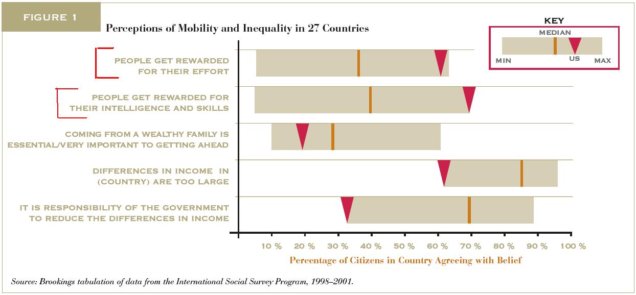
  • About 62% of Americans think that “people get rewarded for their effort,” compared to about 35% of citizens in our national comparison group.
  • About 70% of Americans think that “people get rewarded for their intelligence and skills,” compared to about 40% of citizens in our national comparison group.
  • About 19% of Americans think that “coming from a wealthy family is essential/very important to getting ahead,” compared to about 29% of citizens in our national comparison group.
  • About 62% of Americans think that “differences in income in their country are too large,” compared to about 87% of citizens in our national comparison group.
  • And about 33% of Americans think that “it is the responsibility of the government to reduce the differences in income,” compared to about 69% of citizens in our national comparison group.

Americans, then, are much more likely than the average citizen in our comparison countries to believe that individual characteristics determine success, wide gaps in income are acceptable, and the government should let them be.   No wonder Americans tend to vote to cut taxes and services, tolerate unequal educational opportunity, and resist top-down solutions to inequality.  They think inequality is good and that individuals will always get what they deserve.

Like I said, “stunning,” given the depth of our income inequality and the data on class mobility.  Though it makes perfect sense in light of our deep and abiding patriotism.

Via the MontClair SocioBlog.

Lisa Wade, PhD is an Associate Professor at Tulane University. She is the author of American Hookup, a book about college sexual culture; a textbook about gender; and a forthcoming introductory text: Terrible Magnificent Sociology. You can follow her on Twitter and Instagram.

Cross-posted at Ms. and Family Inequality.

In the early 1990s, Arline Geronimus proposed a simple yet profound explanation for why Black women on average were having children at younger ages than White women, which she called the “weathering hypothesis.”

It goes like this: Racial inequality takes a cumulative toll on Black women, increasing the chance they will have health problems at younger ages. So, early childbearing might pose health risks for White women, but for Black women it makes more sense to start earlier — before their health declines. Although it’s hard to measure the motivations of people having children, her suggestion was that early childbearing reflected a combination of cumulative cultural wisdom and individual adaptation (for example, reacting to the health problems experienced by their 40-something mothers).

She showed the pattern nicely with data from Michigan in 1989, in which the percentage of first births that were “very low birthweight,” increased with the age of Black women, but decreased for White women, through their twenties:

Source: My graph from Geronimus (1996).

If the hypothesis is correct, she reasoned, the pattern would be stronger among poor women, who experience more health problems, which is also what she found.

The most recent national data, for 2007, continue to show Black women have their first children, on average, younger than White women: age 22.7 versus 26.0. And the infant mortality rates, by mothers’ age, also show the lowest risk for White women at older ages than for Black women:

Source: My graph from CDC data.

Note that, for White women, mothers have children in the early thirties face less than half the infant-mortality risk of those having children as teenagers. For Black women, waiting till their lowest-risk age — the late 20s — yields only a 14% reduction in infant mortality risk. So it looks like waiting is much more important for White women, at least as far as health conditions are concerned.

The implications are profound. If you base your perceptions on the White pattern, it makes sense to discourage early childbearing for health reasons. But if you look at the Black pattern, it becomes more important to try to improve health problems at early ages — and all the things that contribute to them — rather than (or in addition to) trying to delay first births.

—————————-

Cohen’s previous posts featured on SocImages include ones on the recession and divorce datathe relationship between cell phone use and driving deathsmeasuring the number of welfare recipients, delusions of gender dimorphism, and the gender binary in children’s books.

The World Economic Forum recently released its Global Gender Gap Report for 2010, authored by Ricardo Hausmann (Harvard University), Laura Tyson (UC Berkeley), and Saadia Zahidi (World Economic Forum).  The report ranks countries according to concrete measures of gender inequality.  They write:

The Global Gender Gap Index… is a framework for capturing the magnitude and scope of gender-based disparities and tracking their progress. The Index benchmarks national gender gaps on economic, political, education – and healthbased criteria, and provides country rankings that allow for effective comparisons across regions and income groups, and over time.

You can read about their methods, in depth, in the Report.

Here are the rankings:

Lisa Wade, PhD is an Associate Professor at Tulane University. She is the author of American Hookup, a book about college sexual culture; a textbook about gender; and a forthcoming introductory text: Terrible Magnificent Sociology. You can follow her on Twitter and Instagram.

Dan S. forwarded a post by Matthew Yglesias in which he presents recent data from the OECD Factbook (larger version at the link).  It is another interesting way to think about income inequality.

First, we can look at a comparison of how much median income earners in the U.S. make compared to other countries (in U.S. dollars).  Luxembourg is the standout at the far right, with the U.S. not far behind, showing the fourth highest median income alongside some Scandinavian countries.  Mexico, Turkey and some Eastern European countries have the lowest median incomes.

A story starts to emerge, however, if we look at the median income of the bottom 10% of earners.  Suddenly the relative position of the U.S. shifts way to the left; the bottom 10% of earners in the U.S. make less than the OECD average.  Notice that the relative placements of the other high income and low income states don’t shift very much.  This means that while people in the U.S. are doing relatively well overall, the poorest people in the U.S. are doing worse than the poorest in about 2/3rds of the other countries:

Then, if you look at the median income of the top 10%, the relative position of the U.S. moves all the way to the right; that is, the top 10% of U.S. earners make more than the top 10% of earners in any other OECD country.  We even beat out Luxembourg:

Most other countries retain their relative position, more or less, with the exception of Sweden, which drops way down.  So the richest Swedes are, relatively speaking, not that rich.

The lesson is that income inequality–the difference between the incomes of the high earners and low earners–is significantly more severe in the U.S. than it is in other OECD countries (and that may be an understatement).

See this post for another graphic showing that income inequality is larger in the U.S. than in most other industrialized countries.  Also, the top 1/100th of a percent in the U.S. brings home a larger proportion of the total earned income in 2007 than they have since 1913.  And here is the percent of total U.S. income that went to the top 1% of earners (23% as of 2006).  Also see our posts breaking down CEO compensation, on the disproportionate tax burden by social class, and on class inequality across U.S. states.

Lisa Wade, PhD is an Associate Professor at Tulane University. She is the author of American Hookup, a book about college sexual culture; a textbook about gender; and a forthcoming introductory text: Terrible Magnificent Sociology. You can follow her on Twitter and Instagram.

Business Management offers this great visual for understanding income in equality in the U.S.  Each light blue figure in this visual represents 50 years of work at minimum wage (making $15,080 a year); the medium blue figures represent 50 years of work at the average wage (making $40,690 a year); the dark blue figures represent 50 years as the President of the United States (making $400,000 a year).

090915-BMUS-PayRise2

Let’s take the most dramatic example, just for fun: Hewlett-Packard.

Capture

A minimum wage worker would have to work for 2,256 years to make what what the CEO of Hewlett-Packard makes in a year.

The average worker would have to work 836 years to match his yearly salary.

And Barack Obama would have to President for 85 years before he made what the CEO of Hewlett-Packard makes in one year.

See other posts on income inequality here, here, here, here, and here.

Via Chartporn.

—————————

Lisa Wade is a professor of sociology at Occidental College. You can follow her on Twitter and Facebook.

Here are some graphs about income inequality over time:

From the Working Group on Extreme Poverty.

This first graph shows the relative increase in the incomes (inflation adjusted) of the top 1% of income earning households, the middle 60% and the lowest 20% (percentages, presumably, approximate) since 1979.

This second graph shows a more detailed picture of the relative increase in the incomes (inflation adjusted) of households in the 95th , 80th, 60th, 40th, and 20th percentile since 1949. Note how household incomes were rising at about the same rate prior to 1970, at which point those households in the 95th percentile started out growing other percentiles, those in the 20th stayed stagnant, and those in between were somewhere in between.

I borrowed these graphs from Lane Kenworthy, who also offers a truly excellent and detailed explanation of the measures.

.

This image illustrates what class inequality would look like if our level of income/wealth were reflected in our height (click to enlarge). Class inequality was first described this way by economist Jan Pen. The image was reproduced for an Atlantic article (view here). Even though the illustration is for 1971 and Britain, it would be useful, especially if we had evidence that income inequality is greater now than in 1971 and greater in the U.S. (or wherever you are) than in Britain (which I think is true… anyone?). An excerpt explaining the illustration is included below. (By the way, what first looked to me like a dark green blob behind the tallest guy is actually the foot of the next tallest guy.)

Excerpt:

Suppose that every person in the economy walks by, as if in a parade. Imagine that the parade takes exactly an hour to pass, and that the marchers are arranged in order of income, with the lowest incomes at the front and the highest at the back. Also imagine that the heights of the people in the parade are proportional to what they make: those earning the average income will be of average height, those earning twice the average income will be twice the average height, and so on. We spectators, let us imagine, are also of average height.

Pen then described what the observers would see. Not a series of people of steadily increasing height—that’s far too bland a picture. The observers would see something much stranger. They would see, mostly, a parade of dwarves, and then some unbelievable giants at the very end.

As the parade begins, Pen explained, the marchers cannot be seen at all. They are walking upside down, with their heads underground—owners of loss-making businesses, most likely. Very soon, upright marchers begin to pass by, but they are tiny. For five minutes or so, the observers are peering down at people just inches high—old people and youngsters, mainly; people without regular work, who make a little from odd jobs. Ten minutes in, the full-time labor force has arrived: to begin with, mainly unskilled manual and clerical workers, burger flippers, shop assistants, and the like, standing about waist-high to the observers. And at this point things start to get dull, because there are so very many of these very small people. The minutes pass, and pass, and they keep on coming.

By about halfway through the parade, Pen wrote, the observers might expect to be looking people in the eye—people of average height ought to be in the middle. But no, the marchers are still quite small, these experienced tradespeople, skilled industrial workers, trained office staff, and so on—not yet five feet tall, many of them. On and on they come.

It takes about forty-five minutes—the parade is drawing to a close—before the marchers are as tall as the observers. Heights are visibly rising by this point, but even now not very fast. In the final six minutes, however, when people with earnings in the top 10 percent begin to arrive, things get weird again. Heights begin to surge upward at a madly accelerating rate. Doctors, lawyers, and senior civil servants twenty feet tall speed by. Moments later, successful corporate executives, bankers, stock­brokers—peering down from fifty feet, 100 feet, 500 feet. In the last few seconds you glimpse pop stars, movie stars, the most successful entrepreneurs. You can see only up to their knees (this is Britain: it’s cloudy). And if you blink, you’ll miss them altogether. At the very end of the parade (it’s 1971, recall) is John Paul Getty, heir to the Getty Oil fortune. The sole of his shoe is hundreds of feet thick.