Search results for census

Fellow Contexts blogger Flaneuse over at Graphic Sociology posted this map showing increases in milk production by region:

milk_production_us

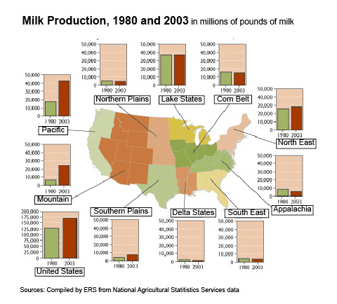
As we see, overall production has been more or less stable in most regions but has increased dramatically in the Pacific and Mountain regions.

This data hides another pattern, however: changes in average dairy herd size. Dairy operations in the West and Pacific regions tend to be significantly larger than dairy farms in the more traditional dairy states in the Great Lakes region and the Northeast. I went to the 2007 Census of Agriculture site and grabbed some data to do a few quick calculations. I chose two states in the western U.S. and two in the traditional Dairy Belt, just for illustrative purposes:

picture-18

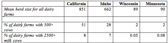
All calculations use data available in Table 17 in the Census reports for the total U.S. and each individual state, which you can easily access at the link above if you want to check my numbers. I rounded everything off to the next highest whole number except for the two percentages in the lower right-hand cells, where doing so would greatly over-represent the percent of farms of that size.

In general, dairy farms with more than 500 milking cows are considered very large in the industry. Those with over 2500 cows are really extremely large, though there are dairies with more than 10,000 milking cows (including the Vander Eyk dairy, which supplies organic milk to be sold under the Horizon brand, as well as conventional, non-organic milk to other companies). But I digress.

Anyway, clearly we see that farms in California and Idaho (and the other Pacific/Mountain states) are larger, on average, than dairy farms in the traditional dairy states. The increase in milk production in the western U.S. is due predominantly to increases in the number (and herd sizes) of very large industrial dairies.

The growth of these large dairies depends on very cheap rates for water used to irrigate agricultural land. Those dairies have to grow lots of alfalfa and other feed crops to feed so many cows, since they certainly can’t afford enough land to have thousands of cows on pasture. And big dairies produce enormous amounts of manure that have to be carted off somewhere each day, meaning they often have big manure lagoons where they store it (as well as spraying as much as possible on fields). The lagoons are lovely, if you haven’t ever been really close to one, or perhaps nearly fallen into one while conducting research for your thesis. Not that I know anyone who has had such an experience. Point being, the competitive success of large western dairies is dependent on favorable political conditions (such as decisions to keep agricultural water rates lower than other water usage rates), and they have significant environmental consequences when we consider the use of water for irrigation in states that are often relatively arid and potential pollution from manure runoff.

I have some issues with Flaneuse’s implication that the growth of western dairies is a fairly natural result of population growth because milk is a localized commodity. I don’t know that you can really call milk a localized product these days–California milk is for sale in every state, and CA has aggressively marketed the state’s dairy industry with their “Happy cows” campaign. I can also buy milk from dairies in Minnesota here in Vegas, if I look a bit. So while I’m sure population growth has a role, I think it’s important to look at the political factors–particularly environmental laws as they apply to agriculture and local opposition to large dairies–that encourage the growth of huge industrial dairies in some regions more than others.

Also keep in mind, the production of milk when measured in pounds doesn’t just indicate there are more dairies or more dairy cows…it can also be the result of getting more pounds of milk per year per cow through the use of technologies such as bovine growth hormone (rBGH). I’m not up on rates of use of rBGH by region right at the moment, but I do know its use is nearly universal in industrial dairies; if smaller dairies in the midwest are less likely to use rBGH for various reasons (including concerns about customer opposition), that would also have an impact on where milk production is increasing most rapidly.

That was a lot of rambling to have just added one little image to what was in the original post at Graphic Sociology, but soc of ag is my specialty area and I geek out about it sometimes. You have no idea how much I reined myself in to tell you just this much about the dairy industry!

[Note: If you’re really super interested in this and don’t mind reading academic articles, I suggest an article by Jess Gilbert and Raymond Akor (1988) “Increasing Structural Divergence in U.S. Dairying: California and Wisconsin since 1950,” Rural Sociology 53(1): 56-72. They lay out some of the effects of politics, water subsidies, technological change, etc., and how they’ve favored a particular type of dairy system in the West. Also check out the Program on Agricultural Technology Studies at the University of Wisconsin, which has links to lots of easy-to-understand reports about trends in the dairy industry.]

Daniel T. Lichter and Domenico Parisi provide a couple of interesting images using 2000 Census data in a recent article about rural poverty. They use Census block-group data (block-groups are significantly smaller than counties) to identify non-metro areas of concentrated poverty. This map shows all block-groups with more than 20% poverty in 2000:

picture-17

If you overlaid this map onto a map of American Indian reservations, you’d notice that many of these high-poverty block-groups are on reservations–particularly in the Dakotas, Idaho, Montana, Arizona, and New Mexico.

UPDATE: Here’s a map of state and federal reservations put out by Pearson (you can find very detailed maps of individual reservations at the Census Bureau):

indian91

And TOTALLY AWESOME reader Matt Wirth overlaid the poverty map on the reservations map. The two maps weren’t exactly the same so some of the state outlines don’t line up perfectly, but you can get a good sense of how high-poverty block-groups (blue areas) and reservations (red areas) overlap:

poverty-over-20-and-indian-reservations

Clearly there are many poor block-groups in the west that aren’t associated with reservations, but we see an awful lot of overlap of blue on red, as well as in the regions directly surrounding reservations. Thanks so much, Matt!

We also see a band of high-poverty block-groups in border counties in Texas with high numbers of Latino residents, and of course the band along the Mississippi River and through the Black Belt up to North Carolina, and the ever-present Appalachian section.

Another note about the map: As Lichter and Parisi point out, if they had mapped poverty at the county level instead of the block-group level, many of these areas of high poverty would not have shown up. These are areas of concentrated poverty in counties that are not, overall, particularly poor. The authors note that studies of poverty that look at county-level data often miss isolated rural areas with extremely high poverty rates.

On a side note, see that little blotch of brown in north-central Oklahoma? That’s where I grew up! According to the 2000 Census, my specific hometown has a 17.6% individual poverty rate and the median home value is $24,400. That doesn’t matter to you, I know, but it does make me acutely aware of the problems of rural poverty.

The following bar graph shows how geographically concentrated poverty is among three racial groups. The graph shows what percent live in Census blocks of concentrated poverty–that is, areas where 20% or more of the population is poor (20% is the standard baseline among researchers for defining an area as “high poverty”):

picture-26

Clearly, in both metro and non-metro areas, a much higher percentage of all Blacks and Hispanics (both the poor and non-poor) than Whites live in areas of concentrated poverty. Notice (in the last two sets of bars) that less than 40% of poor Whites live in neighborhoods with such high proportions of poverty, whereas the vast majority of both Blacks and Hispanics who are poor live in areas where many of their neighbors are poor as well.

Lichter and Parisi argue that the concentration of poverty matters, particularly when it indicates that the poor are socially isolated. Such isolation can mean lack of access to social services, decent schools, and the types of social networks that provide job leads, recommendations, and so on. This type of social isolation can be much more harmful than being poor in and of itself, a topic also investigated by William Julius Wilson in When Work Disappears: The World of the New Urban Poor and The Truly Disadvantaged.

From “Concentrated Rural Poverty and the Geography of Exclusion,” Rural Realities, Fall 2008, p. 1-7, available from the Rural Sociological Society.

I just discovered the entirely excellent website Asian Nation, run by C.N. Le and full of great information about the Asian American community. Here are some tables showing what percent of various Asian American groups are married to spouses of the same or other groups, updated as of October 2007 using Census data (an explanation of the three columns follows):

Ok, now to explain the three columns of numbers. The first one presents data for all marriages that include at least one Asian American spouse–this will include large numbers of immigrants who were married before they moved to the U.S. The second column includes only those marriages where at least one spouse was raised in the U.S., defined as either born here or moved here by age 13. The third column includes only those marriages where both spouses were raised in the U.S. According to Le, this group represents less than 25% of all marriages including an Asian partner, but “…has the advantage of including only those who were raised and socialized within American society and its racial dynamics. It is this U.S.-raised population that best represents young Asian Americans, since they are the ones who have the most exposure to prevailing American cultural images and media.”

Not surprisingly, endogamous (in-group) marriage rates drop off significantly among U.S.-raised Asian Americans. There are other interesting gender patterns as well. Notice, for instance, that Chinese, Vietnamese, Korean, and Filipina women are quite a bit more likely to be married to a White partner (the most common out-group spouses) than are men, and for the remaining groups, women are slightly more likely to be married to a White spouse. You might discuss the social and historical factors that might cause that pattern, and compare it to the trend in marriages with a Black and a White spouse, in which the gender pattern is usually reversed–Black men are more likely to be married to Whites than are Black women. It might also be worth noting that Korean and Filipina women are significantly less likely to marry endogamously than the other Asian American ethnic groups.

The following graphs all show how much of American’s wealth is (or, um, was) in the form of home equity. They are all based on 2002 data, several years before housing prices hit their peaks, which means by the time the housing bubble burst, home equity was an even larger proportion of all net worth.

It’s not that I didn’t already know the economy was in trouble. That’s obvious–I live in Vegas, all I have to do is drive around a little and see all the houses sitting empty. But looking at these images I kept thinking, “a good portion of that home equity wealth is just gone.” On paper, we had all this wealth, and people borrowed based on it…and a lot of it is simply gone. Just…poof. Gone!

This one shows what percent of all net worth in the U.S. falls into various categories.

Here we have median net worth in 2002 for different age groups…and then the lighter purple bar, which is median net worth if you took out home equity:

A similar breakdown, except by race, not age this time. Notice how much Blacks and Hispanics lag behind Asians, and how much they lag behind non-Hispanic Whites in terms of net worth:

On the up side, if the stock market keeps going down, then home equity as a percent of our net worth will go up again because we’ll have lost so much in stocks. So, you know, look on the bright side!

All of these graphs came from “Net Worth and the Assets of Households: 2002,” written by Alfred O. Gottschalck and published by the U.S. Census Bureau in April 2008.

I found these vintage (1967-68) ads for Tiparillo cigars at Found in Mom’s Basement. All answer the question, “Should a gentleman offer a Tiparillo to…” a particular type of woman.

After a tough evening with the Beethoven crowd, she loves to relax and listen to her folk-rock records. Preferably, on your stereo. She’s open-minded. So maybe tonight you offer her a Tiparillo. She might like it–the slim cigar with a white tip. Elegant. And, you dog, you’ve got both kinds on hand, Tiparillo Regular and new Tiparillo M with menthol–her choice of mild smoke or cold smoke. Well? Should you offer? After all, if she likes the offer, she might start to play. No strings attached.

Underneath that pocket of pencils there beats the heart of a digital computer. This girl has already catalogued and cross-indexed the Tiparillo slim, elegant shape. And the neat, white tip. She knows that there are two Tiparillos. Regular, for a mild smoke. Or new Tiparillo M with menthol, for a cold smoke. She knows. She’s programmed. And she’s ready. But how about you? Which Tiparillo are you going to offer? Or are you just going to stand there and stare at her pencils?

She’ll read anything she can get her hands on. From Medieval History to How-to-Build-a-24-Foot-Iceboat. Loves books. Loves new ideas. Okay. No doubt, she’s seen the unusual, slim Tiparillo shape. She’s been intrigued by the neat, white tip. She may even know that there are two Tiparillos. Regular, for a mild smoke. And new Tiparillo M with menthol, for a cold smoke. Your only problem is which to offer. P.S. If she accepts your Tiparillo, remember to fumble with the matches until she decides to light it herself. That way, she’ll have to put down the book.

I found these next two on ebay (all these vintage ads can be purchased on ebay, it turns out):

Is this the old did-it-with-mirrors ploy? Look again. Okay, that’s enough looking. What you’ve got on your hands are carbon copy twins. And what you’ve got in your hands are Tiparillo and Tiparillo M with menthol. Since Tiparillo is the slim, elegant cigar with the neat tip, would it be statistically correct to offer it to this census-taking twosome? Because all they really want is your name, address, phone number and a few other factual facts. But what they get sort of depends on what you offer.

“The doctor is a little late, sir. Will you have a seat?” She’s the best thing to hit dentistry since novocaine. “Hey Dummy,” your mind says to you, “why didn’t you have this toothache sooner?” Maybe if…well, you could offer her a Tiparillo. Or a Tiparillo M with menthol. An elegant, tipped cigar. Slim. And your offer would be cleverly psychological. (If she’s a bit of a kook, she’ll take it. If not, she’ll be flattered that you thought she was a bit of a kook.) And who knows? Your next visit might be a house call.

I will lead it to you, dear reader, to decide if there was supposed to be anything else “cleverly psychological” in any of these ads.

Stephen W. sent us this picture of the “Hispanic” foods aisle at a Walmart in Sioux Falls, South Dakota:

Why is this odd? 

The word “Hispanic” was actually invented by the U.S. government to mean Spanish-speaking.  The government invented it for the census because they wanted to be able to label and identify all Spanish speakers.  “Hispanic,” then, unlike the terms “Latino” or “Chicano,” is not an identity that originated among those to whom it applies.  Further, though it is sometimes used as a euphemism for “Mexican” or “Latino,” Spanish is only spoken in Latin America because of the conquest of parts of Latin America by Spain.

Given the history and use of this term, what would “Hispanic” food be?!  (According to Walmart, it’s salsa and tacos.)

NEW: Another use of the term “Hispanic.”  This time on a bag of peanuts passed out on a Southwest Airlines flight. 

From a press release by Southwest Airlines about their celebration of Southwest Airlines:

Southwest Airlines shares its passion for Hispanic Heritage Month with our internal and external Customers by hosting celebrations in our Hispanic focus markets. Local Employees kick off the festivities by partnering with local organizations, and at airports, with gate games, Mariachi music, authentic foods, and distributing commemorative T-shirts and lapel pins emblazoned with our Hispanic Heritage Month message “Celebremos Tu Herencia,” “We Celebrate Your Heritage.” Hispanic Heritage month posters also are on display during this month-long celebration. Finally, be on the lookout for Southwest’s Hispanic Heritage Month specialty packaged peanuts! (emphasis mine)

Thanks to Stephen W. for this link, too!

This website contains links to a lot of Census Bureau maps showing where different racial and ethnic groups (including White ethnics) are concentrated in the U.S. They also have “absence of” maps showing counties with less than 25 people from different racial grops, which are fascinating. They’re all available from the Census, but it’s nice to have them all collected here for easy access and comparison.

Thanks to Kelly V. for pointing it out!

The U.S. population is becoming less and less overwhelmingly white. Projections suggest that, by 2050, whites will compromise less than half of the population. This trend, according to the New York Times today, is being driven by our kids. Below, a map shows the percentage of non-white children in each state of the Union.

race-minority-children.jpg

Among other things interesting to me about this discussion is the tendency to compare the proportion of the population that is “white” with the proportion of the population that is “not white.” This reinforces the notion that white is somehow pure and important, and everything else is just… something else. While some say that we will no longer be a “white nation” (for better or worse) when whites are outnumbered by non-whites, whites will still be the majority insofar as the non-white group is comprised of an incredibly diverse group of people by race, ethnicity, and immigration-status.