Cross-posted at Family Inequality.
Things that make you say… “peer review”?
This is the time of year when I expect to read inflated or distorted claims about the benefits of marriage and religion from the National Marriage Project. So I was happy to see the new State of Our Unions report put out by W. Bradford Wilcox’s outfit. My first reading led to a few questions.
First: When they do the “Survey of Marital Generosity” — the privately funded, self-described nationally-representative sample of 18-46-year old Americans, which is the source of this and several other reports, none of them published in any peer-reviewed source I can find — do they introduce themselves to the respondents by saying, “Hello, I’m calling from the Survey of Marital Generosity, and I’d like to ask you a few questions about…” If this were the kind of thing subject to peer review, and I were a reviewer, I would wonder if the respondents were told the name of the survey.
Second: When you see oddly repetitive numbers in a figure showing regression results, don’t you just wonder what’s going on?
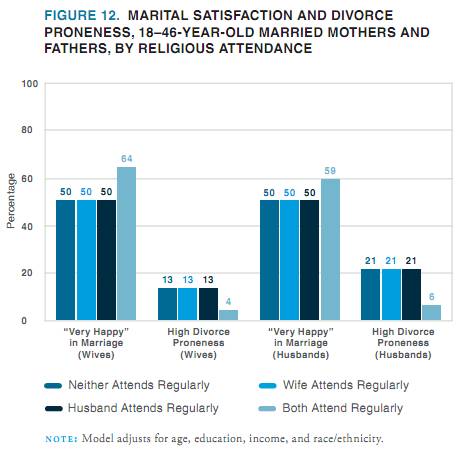
Here’s what jumped out at me:
If a student came to my office with these results and said, “Wow, look at the big effect of joint religious practice on marital success,” I’d say, “Those numbers are probably wrong.” I can’t swear they didn’t get exactly the same values for everyone except those couples who both attend religious services regularly — 50 50 50, 13 13 13 , 50 50 50, 21 21 21 — in a regression that adjusts for age, education, income, and race/ethnicity, but that’s only because I don’t swear.*
Of course, the results are beside the point in this report, since the conclusions are so far from the data anyway. From this figure, for example, they conclude:
In all likelihood, the experience of sharing regular religious attendance — that is, of enjoying shared rituals that endow one’s marriage with transcendent significance and the support of a community of family and friends who take one’s marriage seriously— is a solidifying force for marriage in a world in which family life is increasingly fragile.
OK.
Anyway, whatever presumed error led to that figure seems to reoccur in the next one, at least for happiness:
Just to be clear with the grad student example, I wouldn’t assume the grad student was deliberately cooking the data to get a favorable result, because I like to assume the best about people. Also, people who cook data tend to produce a little more random-looking variation. Also, I would expect the student not to just publish the result online before anyone with a little more expertise had a look at it.
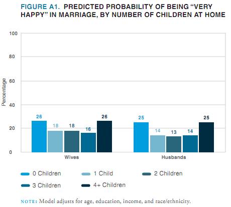
Evidence of a pattern of error is also found in this figure, which also shows predicted percentages that are “very happy,” when age, education, income and race/ethnicity are controlled.
 Their point here is that people with lots of kids are happy (which they reasonably suggest may result from a selection effect). But my concern is that the predicted percentages are all between 13% and 26%, while the figures above show percentages that are all between 50% and 76%.
So, in addition to the previous figures probably being wrong, I don’t think this one can be right unless they are wrong. (And I would include “mislabeled” under the heading “wrong,” since the thing is already published and trumpeted to the credulous media.)
Publishing apparently-shoddy work like this without peer review is worse when it happens to support your obvious political agenda. One is tempted to believe that if the error-prone research assistant had produced figures that didn’t conform to the script, someone higher up might have sent the tables back for some error checking. I don’t want to believe that, though, because I like to assume the best about people.
* Just kidding. I do swear.


Comments 14
Anonymous — December 15, 2011
Even if the numbers aren't cooked, this statement seems like a bit of a leap: "In all likelihood, the experience of sharing regular religious attendance...."
It's ONE POSSIBLE explanation, but it could be that just doing things together--i.e., having common interests--makes the marriage happier. If it was religious attendance, specifically, I'd expect there to be a slight bump in the numbers when only one spouse attends regularly.
PinkWithIndignation — December 15, 2011
Don't forget- NO kids makes you happier than having 1-3 kids! If you're not going to see a return on your happiness until you hit the financially straining 4-kid mark, why bother! What a wonderful study TO PROMOTE THE USE OF BIRTH CONTROL.
jam — December 15, 2011
I can't think of the last time that statistics made me laugh so heartily. Seriously, when does anyone get numbers like that in real life? If I were more of a geek I might want to think of a way to calculate the probability of getting the same exact regression result on so many variables in the same study.
Good post!
National Marriage Project Does S***ty Research Again; People Always Thought Students Couldn’t Write; and More « Welcome to the Doctor's Office — December 15, 2011
[...] CHURCH SAVES MARRIAGE… AND PRODUCES CURIOUS COEFFICIENTS by Philip N. Cohen, [...]
Lance — December 16, 2011
You might ask how one measures "divorce proneness", in that second graph. Fortunately, their "e-ppendix" at http://www.stateofourunions.org/2011/e-ppendix.php has the answer (and so very much more!). In this case,
So it's (a) self-determined, and (b) set at 30% likeliness to be "highly prone". Thanks, science!
Doulamichelle — December 16, 2011
The only thing I can say right now is, I'm not surprised they claim couples with four or more children are happier. Because, it is "in" to have large families within some Christian circles. They want to put thier couples, families, and life style in a good light.
benji — December 16, 2011
The numbers are obviously not real. And it's rather easy to prove even just using the first two graphs.
Look at the average high divorce proneness in husbands in the whole population from the second graph. Obviously you can't tell what it is excatly because you don't know how many people feel whether god is the center of their marriage. But you know that it is at most 11%.
Now from the first graph we know that 21% of the husbands in marriages in which not both partners attend church regularly have a high divorce proneness and it's 6% for husbands in marriages where both partners regularly attend church.
We can now calculate how many married couples have to both attend church regularly so that the average high divorce proneness in husbands is at most 11%.
Let x be the ratio of married couples who both attend church regularly per married couples, then:
6% * x + 21% *(1-x) x > 2/3
So at least two thirds of married couples attend church together* regularly.
If that was true churches wouldn't have to lie so obviously...
Now ... let's come to the third graph ...
to put it simply:
For this and the other two graphs to be true at the same time a LOT of married couples would have to have at least 5 children. And by a lot i mean AT LEAST HALF OF THEM. This is obviously not true in the american society as a whole and it's nigh imposible to draw such a subset of the americans in a representative way. (minor concern: why don't you list 5+ children if that is more than half your sample?)
TL:DR results are mathematically about as unlikely as you quantum tunneling to the other side of the planet in the next five minutes.
*They don't have to go together, but both partners in a marriage attending church regularly will result in them doing so together rather often, i guess.
Ben Zvan — December 19, 2011
They tell you the numbers are adjusted for age, income, education, and race/ethnicity...they just don't tell you how. "These numbers are all different...make them the same."
Doora — August 20, 2023
Many peoples are interested to get rewards by providing their feedback. In the same way, Walgreens Pharmacy offers a $3000 Gift Card to their customers who participated in the Walgreens Listens survey. You can visit the Walgreens Survey Official Website to take part in the survey.