
Back in September, I posted about some maps put together by Eric Fischer, using 2000 Census data, showing the racial/ethnic makeup of selected cities. As Jeff H., Eluned J., and Dmitriy T.M. pointed out, the NYT now has up an interactive map where you can see the racial/ethnic composition of any Census tract, using more updated Census Bureau data from 2005 to 2009. For instance, here’s a map of the neighboring cities of Midland and Odessa, Texas, which I picked for no reason other than that I just watched an episode of Friday Night Lights, which is set in a fictionalized version:
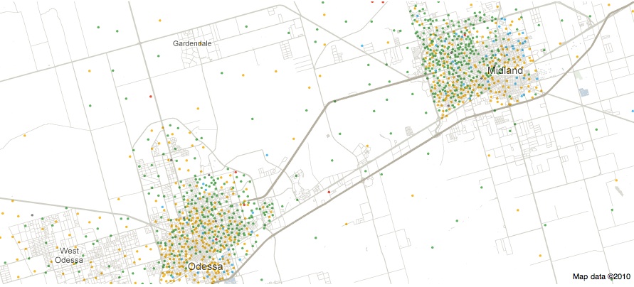
Color key:
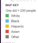
You can zoom in to get quite detailed information about individual neighborhoods. I zoomed in as far as I could on Miami (each dot now represents 50 people):
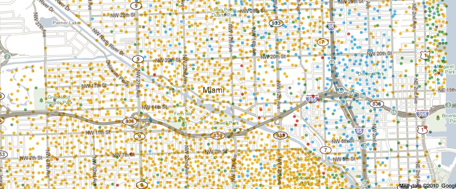
There’s also a tab that says “View More Maps.” It allows you to select to see just the distribution of Whites, Blacks, Hispanics, Asians, or the foreign-born population. Here’s the map of the Hispanic population of Las Vegas:
As you can see, if you hover over a Census tract, you can get specific data on its racial/ethnic makeup.
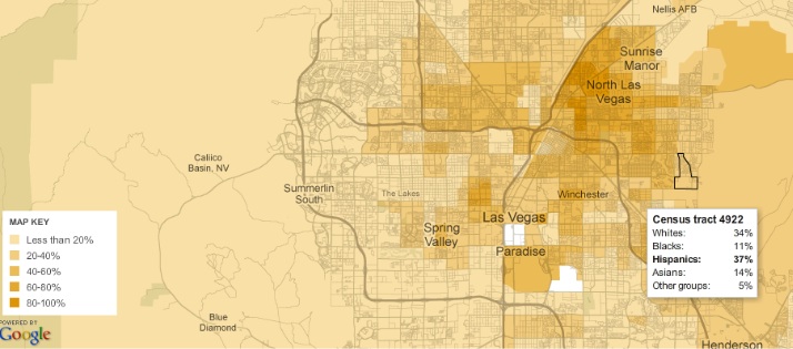
The foreign-born population of Seattle (if you hover over a tract, it will tell you the % foreign-born, as well as the % increase in the foreign-born population since 2000):

A great resource. Although I tried to look up my home town, and even zooming in to the smallest scale, it’s too small to have any data available.
Comments 8
That Interactive Census Map | Root of All Brians — December 16, 2010
[...] as a huge Friday Night Lights fan, I was thrilled Sociological Images looked up Midland/Odessa because of their [...]
Lynn — December 17, 2010
Its a fun concept, but I wonder if it works best for densely populated cities? When I looked up three cities approximately 25,000 to 150,000 in size, I wound up with lots of dots in non-residential industrial areas, parks, even in a lake.
For example, in Cedar Rapids, Iowa there would seem to be a large number of aquatic citizens living in Cedar Lake (just north of downtown). And its not as if these dots were merely misplaced by a couple blocks. The lake is surrounded by a park land and an industrial belt (which are also shown as populated.)
Rachael — December 17, 2010
My town has fewer than 10,000 people, and when I entered the ZIP code, I was taken to a spot far to the north of my census tract. I had to zoom out quite a few times before I found it.
But it was kind of neat to look at. :)
Waiting Room Reading 12/17 « Welcome to the Doctor's Office — December 17, 2010
[...] INTERACTIVE MAPS OF U.S. RACIAL/ETHNIC DISTRIBUTIONS by gwen [...]
Sheena Roetman — December 17, 2010
Except that Native Americans are only represented under "Other groups."
Rickey — December 18, 2010
Nice choice with Odessa. I think it's interesting how Odessa is portrayed in the media. It is usually depicted as some tiny dying town built around a football stadium. It is really a city of near 100,000 in a metro area of close to 300,000. That is still a tiny metro by U.S. standards, but it is significantly larger than the popular image of Odessa would have you believe. It is also much more diverse, or at least it has a large Hispanic population despite its portrayal as a mostly white racist town.
Anonymous — December 18, 2010
*
1°
Sociological Images course guide: Asian Americans and Pacific Islanders : Asian-Nation : Asian American News, Issues, & Current Events Blog — April 16, 2013
[...] Interactive Maps of U.S. Racial/Ethnic Distributions [...]