I took these pictures at a Vons in Los Angeles, CA (Eagle Rock neighborhood):

Someone or someones somewhere made a conscious decision to hang candy bars on the outside of the freezer doors leading to the TV dinners marketed as healthy. I think it nicely illustrates how, in American culture, we are subject to incredible temptation and pressure to consume more calories than we need at the same time that we’re encouraged to look as if we do not submit to that temptation. This is good for the economy in that both the food industry and the diet industry are far larger industries than they would be were we to restrict our caloric intake according to need.

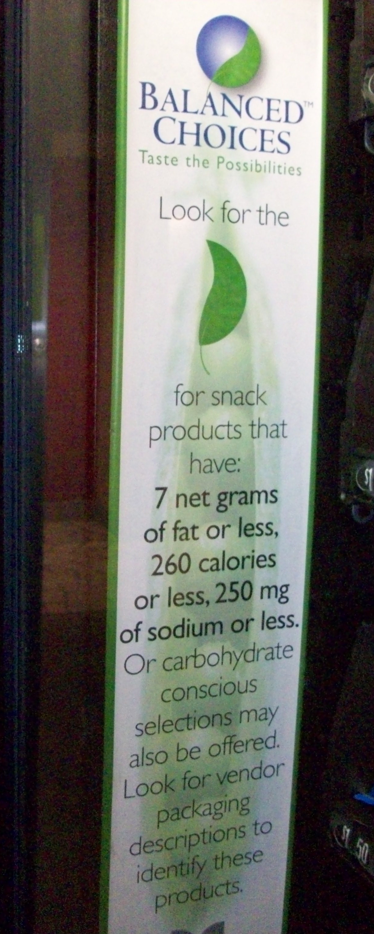
NEW (from Gwen): I took the following two photos in my office building at Nevada State College. We don’t have any food service program and there aren’t any places to eat within walking distance, so the only options faculty and students have are the vending machines. The other day my attention was drawn to this sign posted inside one of them:

Now, on the face of it, this seems all good–individuals should take responsibility for their food choices by choosing healthier options, and the vendor is even providing guidelines. How nice!

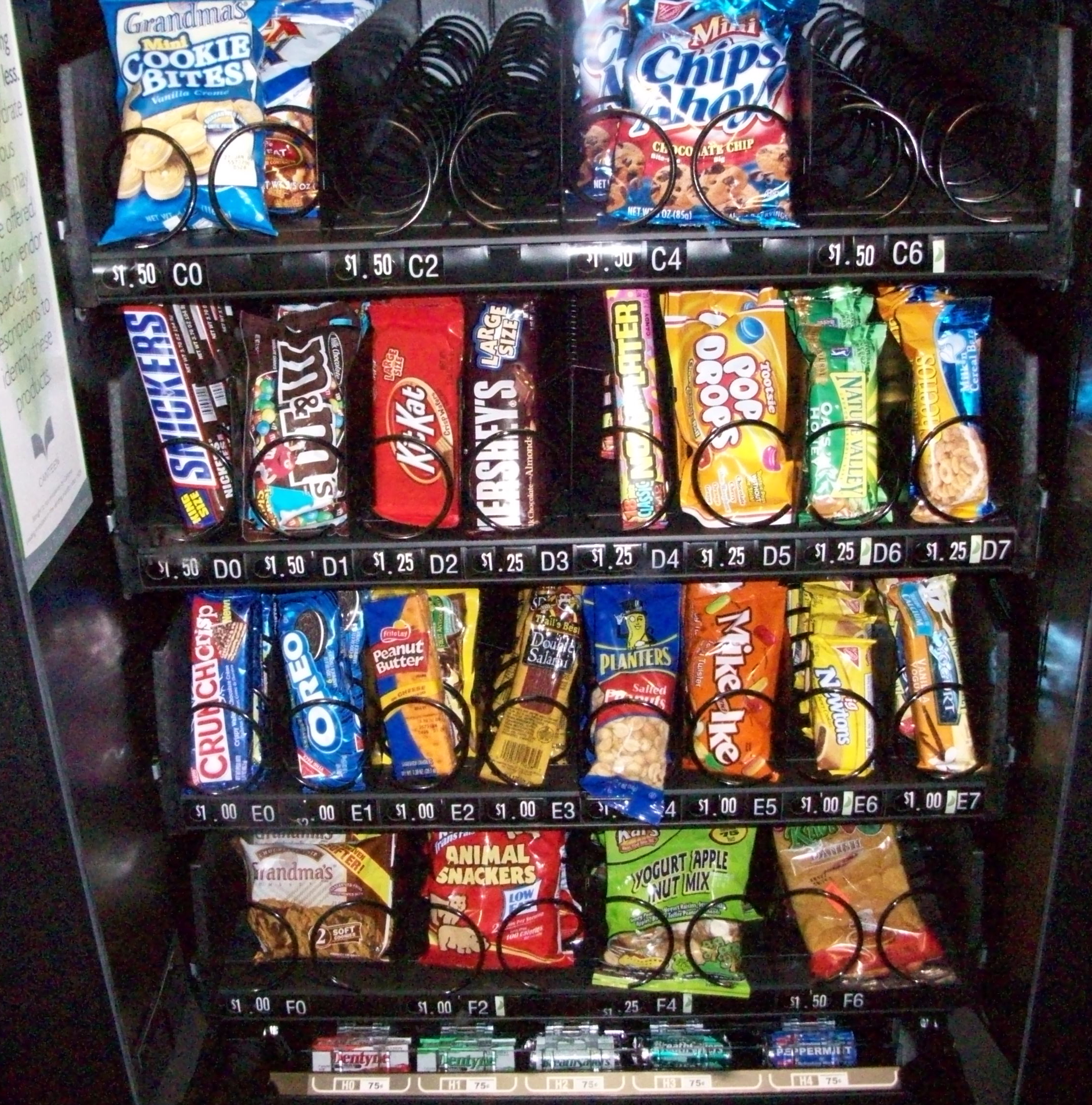
But then I stood back and looked at the products for sale in that same vending machine (there were a couple of rows of chips at the top that got cut off in the photo):

None of these products had nutritional information in view, so I couldn’t actually see how many of them fell within the guidelines helpfully posted along the side. I know, from looking at similarly-sized packages at a convenience store later, that all the chips had over 350 calories.

My guess would be that most people would choose the “yogurt apple nut mix” on the next-to-last row as the healthiest item, but I’ve found that mixes like that often have surprisingly high fat and calorie contents, particularly because they often come in multiple-serving packages. But without access to more information, the consumer is left to try to guess what would be healthiest and what might have lots of hidden calories (like those yogurt-covered nuts might).

I thought it was a great example of how concerns about unhealthy eating habits and obesity are often framed as failures of individual responsibility–people just eat too much and make bad decisions about food. The food industry likes this explanation because it takes the focus off of the types of products it makes available or the responsibility food companies might have for producing healthier options…or at least telling us more openly about what we’re eating. But this framing of the issue ignores the fact that it’s often very difficult to make better eating decisions; nutritional information is often lacking (I have on several occasions asked for nutritional information at restaurants, just out of interest, and usually found that employees have difficulty locating it; in one case they eventually found it posted on a chart hidden by a fake plant), and in other cases there simply aren’t better options (or they’re more expensive than the unhealthy ones). Providing platitudes about “making balanced choices” isn’t that helpful in the absence of specific information about and access to foods that are, you know…balanced.

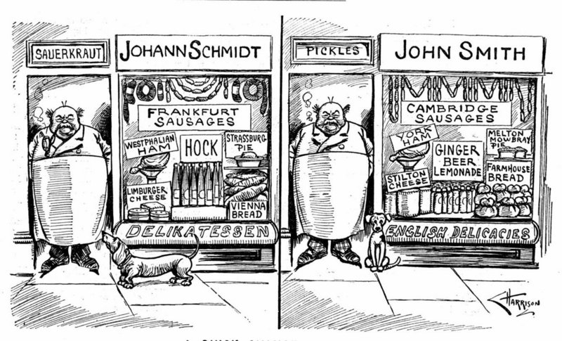
During World War I and World War II, being German-American in the U.S. became less-than-agreeable.  At that time, due to interpersonal and institutionalized discrimination, many German-Americans actively tried to assimilate into a still-very British America by downplaying their ethnic characteristics.  This cartoon, published in 1921, illustrates how German-Americans attempted to do this and how well-aware the larger society was of their efforts:

(I have long since lost the source on this, but if someone sends one in, I will gladly link to it.)

In the U.S. today, when infants are born with ambiguous genitalia, surgeons often operate in order to bring the child’s body into accordance with our expectations for “correct” male or female genitalia, even when the actual morphology of their bodies causes no dysfunction or harm.

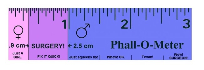
Some activists, such as those involved with the Intersex Society of North America, are trying to stop these surgeries.  The Phallo-O-Meter (found here) is a satirical ruler designed to draw attention to the way in which the surgeries force bodies existing in nature into social categories of our own invention (it is attributed to Kiira Triea here).  Here it is:

The ruler is satirical (as you can tell by the tongue-in-cheek “just squeeks by” etc.), but the measurements are based on the kind of decisions doctors actually make.  Indeed, if doctors decide that a penis is “too small” or a clitoris is “too big,” an infant is in danger of having corrective cosmetic surgery.  The point here is: When bodies don’t fit into our pre-existing notions of male and female, we will force them to, even if it involves a knife.  Clitorises that are longer than .9 cm and penises that are shorter than 2.5 must be fixed.  As Martha Coventry says in Making the Cut:

The strict division between female and male bodies and behavior is our most cherished and comforting truth.  Mess with that bedrock belief, and the ground beneath our feet starts to tremble.

In Creating Good-Looking Genitals in the Service of Gender, Suzanne Kessler found that clitorises that were seen as “too big” were often described by doctors in moral terms.  They were “defective,” “anatomic derangements,” “obtrusive,” “embarrassing,” “offensive,” and “troublesome.”

Surgery on intersex infants reflects a taboo on gender similarity; a moral objection to gender sameness.  We must be separated… by at least .6 cm.

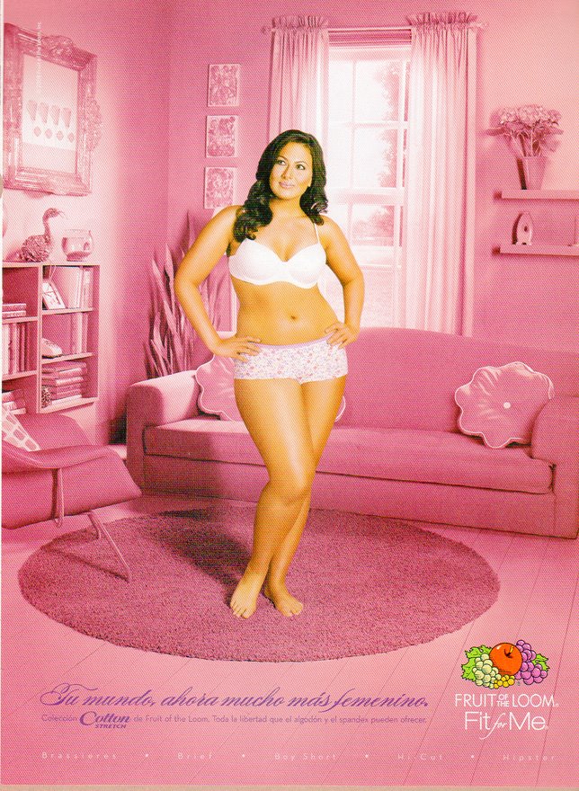
Multicult Classics posted these two Spanish-language Fruit of the Loom ads.  They are an extra nice example of the way that color is used to communicate gender:


Text: “Your world, now much more feminine.”

See also this post of kids with their stuff, these pictures of the Toys ‘R Us aisles, these breast cancer PSAs, and these guns marketed to women.

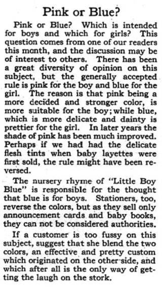
It’s obvious to us, today, that pink is for girls.  But it wasn’t until about the 1950s that our current gendered color scheme became widely accepted.  Before that, the colors were reversed.  In this excerpt for a vintage advice column (found here), we learn that:

“…the generally accepted rule is pink for the boy and blue for the girl.  The reason is that pink being a more decided and stronger color, is more suitable for the boy; while blue, which is more delicate and dainty is prettier for the girl.”

Coal Black and de Sebben Dwarfs (found here):

NEW FEATURE!

We crafted four sample class assignments using Sociological Images.  One for a lower-division class and three for an upper-division class.  Check them out here.

By the way, if you have crafted assignments using our blog, we’d love to publish them here!  Please send them along!  Email us at socimages@thesocietypages.org.

AND BACK TO THE OL’ BEHIND YOUR BACK:

A series of toys by Playmobil, sent in by Kirsten D., were added to our post illustrating what it means to be a neutral versus a marked social group.  See it here.

We add another beer commerical to the three we posted trivializing love, sex, and relationships in favor of beer. This one was pointed out in our comments by Pharmacopaeia. Thanks!

Daniel B. sent in a picture of the Spanish women’s Olympic basketball team in the infamous “slant-eyed” pose (meant to make them look, um, Chinese) and we added it to this post that showed the Spanish men’s team in the same pose. We added another image he found of the Spanish tennis team in that same pose to this post showing the Argentine women’s soccer team doing it too. Then we sat around and scratched our heads and wondered if every Olympic team felt the need to pose like that before leaving for Beijing.

We added a Budweiser ad in which foaming surf on the beach forms a phallus pointing to a bikini-clad woman’s crotch to our post on “subliminal” sex in ads.  (Somehow a month rarely goes by without a new addition to this particular post!)

We added a Mini Cooper ad that brags about the car’s “carfun footprint” to this post about the commodification of environmentalism. While it would be great if a car’s effect on the environment actually became a major selling point, when you look at the Mini’s gas mileage ratings (which I report in the post), it’s not clear that the “carfun footprint” is much more than a tagline.

We added another commercial, sent in by Corey, to this post about Just for Men’s Touch of Grey line, a product that allows the user to decide how much grey they would like to leave in… something we can’t image a woman’s hair dye company ever offering, since women don’t get to benefit from the “distinguished look.”

We added Paris Hilton’s humorous response to this post about John McCain’s campaign ad that associated Barack Obama with Hilton and Britney Spears in an attempt to portray him as a lightweight with no experience.

Elizabeth sent in a PETA ad that compared slaughtering animals to the beheading of a man on a Canadian bus. We added it to this post about the use of Holocaust imagery in PETA ads and who claims the right to use horrific incidents (both historic and current) in their attempts to frame social issues.

In the contemporary U.S., the feminist movement has been so thoroughly intertwined with the pro-choice movement that the rhetoric of choice has become a common way to talk, more generally, about women’s liberation.  And women’s liberation, as we have demonstrated (see here, here, here, here, here, here, and here), is frequently co-opted for the purposes of selling women all sorts of products (including those in decided conflict with mainstream feminism, like this one and this one).

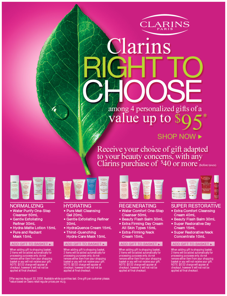
A reader, Tracy in Canada, saw these ads at Sears.  In them, the phrase “the right to choose” is used to invoke feminist ideals and applied to the right to select a “gift adapted to your beauty concerns.”

NEW! (Nov. ’09): Kristyn G. sent in this commercial for a cable company in India that also co-opts the right to choose…in this case, the right to choose her own husband:


Lisa Wade, PhD is an Associate Professor at Tulane University. She is the author of American Hookup, a book about college sexual culture; a textbook about gender; and a forthcoming introductory text: Terrible Magnificent Sociology. You can follow her on Twitter and Instagram.

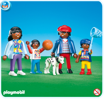
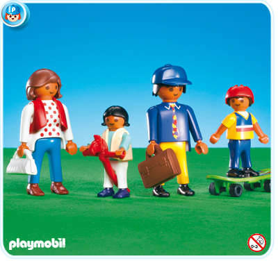
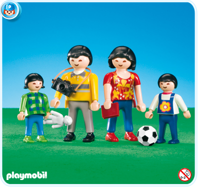
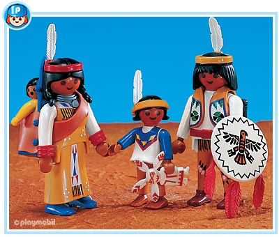
Kirsten D. sent us this link to a series of Playmobil families.  She notes how the families are all racially marked (using racial categories like “Asian” and “African” instead of nationality categories like “Japanese” and “Somalian”).  The “Mediterranean/Hispanic” category also points to the social construction of race and the way in which social construction varies across cultures (Playmobil are made in Germany).

They families are also racially homogeneous.  In the world of Playmobil (at least how it is sold, though not necessarily how it is played with) there are no interracial families and, therefore, no bi- or multi-racial people.  In this way the toys reify racial categories and naturalize racial matching in relationships.

African/African American Family:

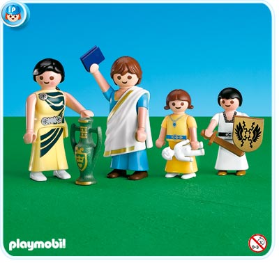
Mediterranean/Hispanic Family:

Asian Family:

Native American Family:

Notice also that all of the families are in contemporary clothes except for the Native American family.  Ethnicized groups are often represented in “native” costume, but this is especially true for American Indians (at least in the U.S.).  It is as if, in the popular imagination, American Indians are extinct; as if there are no American Indians alive today walking around in Nikes (there are).

So, in the world of Playmobil, American Indians are, like Romans, a historical artifact:

Also, because it warrants pointing out, all the female and male children all have gender stereotypical toys.