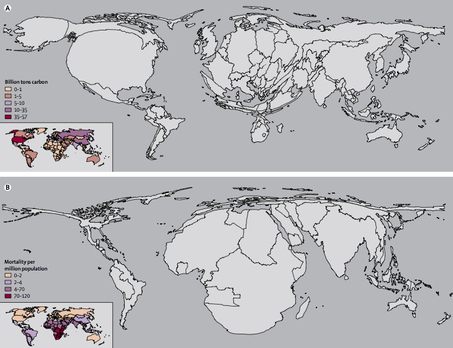
The two maps below are part of a series of maps that warp the size and shape of countries according to various international disproportions (see lots more here).
These two warp countries according to how much they are contributing to global warming and how much they are likely to suffer from global warming respectively.

The first shows the world in terms of carbon emissions. America, for instance, is huge. So is China. And Europe. Africa is hardly visible. The second map shows the world in terms of increased mortality — that is to say, deaths — from climate change. Suddenly, America virtually disappears. So does Europe. Africa, however, is grotesquely distended. South Asia inflates.
Long story short, we spit out the carbon, but it’s people in Africa and South Asia who are mostly going to die because of it.
Thanks to Toban B. who linked to these maps in a comments thread.
—————————
Lisa Wade is a professor of sociology at Occidental College. You can follow her on Twitter and Facebook.


