Search results for venn diagram

Mitt Romney’s campaign put out a set of graphics illustrating a “gap” between what Obama promised and what he has delivered.  The graphic is in the form of a Venn diagram, a visual designed to show the overlap between two conditions.  For an example, see this platypus playing a keytar.

Unfortunately, Romney’s overlapping circles are not Venn diagrams, making the campaign somewhat ridiculous and giving nerdy liberals all over America a good chuckle.

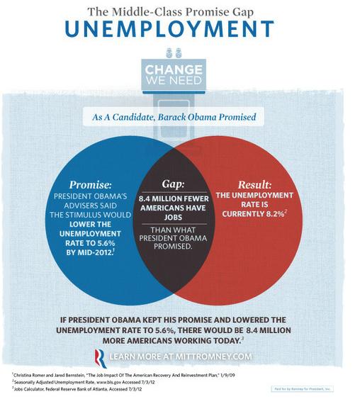
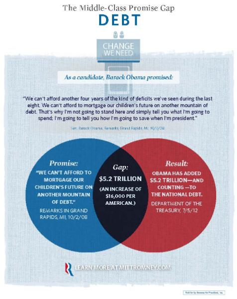
So, there you have it, an example of how not to use Venn diagrams to illustrate your data.

Via Feministing and Dolores R.

Lisa Wade, PhD is an Associate Professor at Tulane University. She is the author of American Hookup, a book about college sexual culture; a textbook about gender; and a forthcoming introductory text: Terrible Magnificent Sociology. You can follow her on Twitter and Instagram.

At Flowing Data, the Venn Diagram illustrated by a platypus playing a keytar. Go there.

Lisa Wade, PhD is an Associate Professor at Tulane University. She is the author of American Hookup, a book about college sexual culture; a textbook about gender; and a forthcoming introductory text: Terrible Magnificent Sociology. You can follow her on Twitter and Instagram.

In 1956 sociologist C. Wright Mills published a book titled The Power Elite.  In it, he argued that our democracy was corrupt because the same people exercised power in business, the military, and politics.  This small group, with so many important roles and connections, had an influence on our society that was far out-of-proportion with their numbers.  This, he concluded, was a dire situation.

Fast forward to 2012 and Lambert Strether posted a series of Venn diagrams at Naked Capitalism.  Strether writes:

[This] nifty visualization… shows how many, many people, through the operations of Washington’s revolving door, have held high-level positions both in the Federal government and in major corporations. To take but one example, the set of all Treasury Secretaries includes Hank Paulson and Bob Rubin, which overlaps with the set of all Goldman Sachs COOs. The overlapping is pervasive. Political scientists and the rest of us have names for such cozy arrangements — oligarchy, corporatism, fascism, “crony capitalism” — but one name that doesn’t apply is democracy.

UPDATE: I’ve included a criticism of the methodology after the diagrams; the overlap portrayed here is almost exclusively among Democratic politicians and the diagrams were explicitly intended to point out connections among progressives.

See for yourself:

On the methods for putting together these diagrams, Strether writes about the person who’s behind the diagrams:

Herman’s honest: Her goal is to “expose progressive corporatism,” and — assuming for the sake of the argument that D[emocrat]s are progressive, and that “progressives” are progressive — her chart does exactly that, and very effectively, too.

But what her data does not do is expose corporatism as such; there are very, very few Rs listed; it strains credulity that Hank Paulson was the only high-level GS operative in the Bush administration, for example, and if GS isn’t the R[epublican]s’ favorite bank, there’s surely another.

Hence, Herman’s chart, if divorced from context[2], might lead somebody — say, a child of six — to conclude that the only corporatists in Washington DC are D[emocrat]s.

Thanks to Carolyn Taylor for pointing out the methods bias.

Lisa Wade, PhD is an Associate Professor at Tulane University. She is the author of American Hookup, a book about college sexual culture; a textbook about gender; and a forthcoming introductory text: Terrible Magnificent Sociology. You can follow her on Twitter and Instagram.

Appearances and Publications:

After I posted about the Jimmy Kimmel prank in which he encouraged parents to film their kids getting “bad” presents, I had the opportunity to inform a New York Times article about the subject.  I discussed the social rules of the Christmas gift-giving (and the importance of teaching kids how to be the butt of a joke).  My first time in the NYT. w00t!

Also, I’m proud to report that a paper I co-wrote with Caroline Heldman has been published in a new book titled Sex For Life: From Virginity to Viagra, How Sexuality Changes Throughout Our Lives (edited by Laura Carpenter and John DeLamater, and published by NYU Press).  Our chapter is about first-year college students experiences with hook up culture.  You can get a sneak peak here.

Pinterest!

Over the holiday I went sort of bonkers and decided to start up a Pinterest site for SocImages.  Pinterest is a virtual “pin board” where people can collect images from around the web.  I uploaded our entire archive to the site: 4,002 posts and 8,040 images.  It will let you peruse our images much more quickly. If anything inspires, you can click through to the blog to read the analysis.  These are the “boards” we have so far:

They look like this (then you scroll down):

 Best of December:


Meanwhile, our fabulous intern, Norma Morella, collected the stuff ya’ll liked best from this month.  Here’s what she found:

Best of 2011:

Gwen and I ran our favorite posts from 2011 over the last five days.  Just in case you missed them, here’s a list:

Over at his blog, Family Inequality, SocImages Contributor Philip Cohen made a list of his best liked posts from 2011 too.  Check them out here.

Social Media ‘n’ Stuff:

Finally, this is your monthly reminder that SocImages is on TwitterFacebook and, now, Pinterest.  Gwen and I and most of the team are also on twitter:

Course Guide for
SOCIOLOGICAL RESEARCH METHODS
(last updated 10/2011)

Developed by Lisa Wade
Occidental College

Disclaimer: This course guide is far from comprehensive, but it does collect what we have in an organized way. If you’re a methods instructor, and would like to write a guest post, please do!


Research Design

On Objectivity

Sampling

Delimiting Variables

Operationalization

Research Ethics


Methodological Approaches

Surveys


Data Analysis and Interpretation

Data Requires Interpretation

Correlation vs. Causation

Spurious Relationships

Mean vs. Categorical Difference

Paying Attention to Variance

Statistical Significance


Communicating Results

Types of Graphs

The X and Y Axis

(Mis)Representing Data

Lying with Statistics

Publishing

To see where Sociological Images and its authors are appearing around the internet and in print, visit our list of Interviews (podcasts, radio, and print), Reviews, Essays and Posts published elsewhere, and instances in which we’ve been Quoted (in news articles, industry pages, etc.).

INTERVIEWS:

REVIEWS:

ESSAYS AND POSTS AT:

APPEARANCES IN ONLINE AND PRINT MEDIA

To be effective, every social movement has to ensure that the language used to describe it sends the message it wants to send and resonates with a large audience.  The Occupy Movement’s popularization of the phrase “We are the 99%” is an excellent example of this.  It is a simple, inclusive phrase that brings to mind the wealth gap.  It has certainly resonated and it has changed the overall discourse.

Keeping atop of the language, though, is always an ongoing battle.  This flyer, put up by members of Occupy Phoenix, is a great example of a conscious effort to get control of the discourse.  It targets the word “camping,” suggesting that what they are doing is not accurately described by the term:

“Using a tent,” they claim, is not the same as camping.  Camping is fun, filled with leisure activities.  They, in contrast, are doing hard work, “petitioning the government for redress of grievances.”  I hadn’t thought of it before I saw the flyer, but they are absolutely right that the word “camping” threatens their cause.  What a wonderful example of the power of language and the need to carefully control it.

Lisa Wade, PhD is an Associate Professor at Tulane University. She is the author of American Hookup, a book about college sexual culture; a textbook about gender; and a forthcoming introductory text: Terrible Magnificent Sociology. You can follow her on Twitter and Instagram.