rural/urban

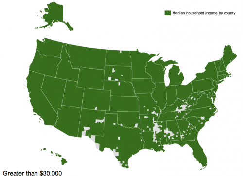
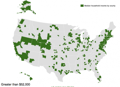
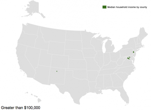
The Census Bureau has created an interactive map that lets you see median household income by county. Median household income for the entire U.S. is $51,914, but of course there is enormous variety around the country. The map lets you select an amount and see which counties have medians below that level.

Three counties — Owsley and Breathitt in Kentucky and Brooks in south Texas — have median household incomes below $20,000 a year (the white spot in Louisiana is water):

So half of households in those areas are living on less than $20,000 a year.

If we go up to $30,000 a year, we see a clear pattern. The counties are particularly concentrated in the South, especially along the Mississippi River, in Appalachia, in southern Texas, a few areas of New Mexico, and several counties in South Dakota that include Native American reservations:

If we look at the $52,000 mark — right at the overall U.S. median — we see, unsurprisingly, a lot of counties on the coasts or that have at least mid-sized cities in them, though there are certainly some counties that don’t fit that pattern:

On the upper end, there are six counties where the median household income is above $100,000 — Hunterdon, in New Jersey; Howard, in Maryland; Los Alamos, New Mexico; and three Virginia counties, Fairfax, Falls Church, and Loudoun:

You can see the Census Bureau’s table of median household income in every county in the U.S. here.

Katrin sent in a set of signs and advertisements, collected at Buzzfeed, urging young people to refrain from doing methamphetamine, or “meth.”

What I found interesting was how many home made signs in rural areas were included.  It suggests that many people in small towns feel that their children are under attack.  Meanwhile, there’s no big money in drug addiction prevention.  Hence the town-specific, home made signs that contrast so starkly to the generic, glossy, high-production value advertising we are so used to seeing.

Many examples at Buzzfeed.

Lisa Wade, PhD is an Associate Professor at Tulane University. She is the author of American Hookup, a book about college sexual culture; a textbook about gender; and a forthcoming introductory text: Terrible Magnificent Sociology. You can follow her on Twitter and Instagram.

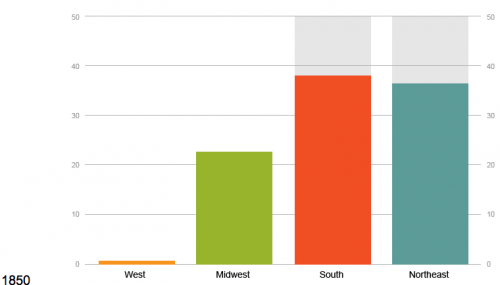
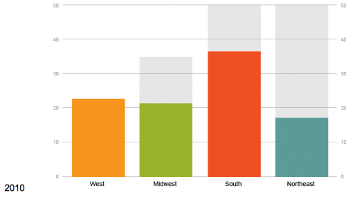
The U.S. Census Bureau recently posted some visualizations of data related to urbanization and the distribution of the U.S. population. One shows changes in the regional distribution of the population from 1790 to 2010. I can’t embed it, but I took a couple of screencaps, but it’s much more striking to watch it and see when various trends (say, the surge of population in the Midwest in the late 1800s) first appear, so I’d go check it out at the Census site.

In 1850, the South and Northeast had about equal portions of the population, and the West was just barely in the picture (I presume the 1850 Census data excludes Native Americans living in the West; if anyone is certain, let us know in the comments):

By 2010, we see a smaller percent of the population living in the Northeast, which has been overtaken by the West (though the Northeast is also the smallest of the four geographic areas, so it’s still overall more densely settled than the West):

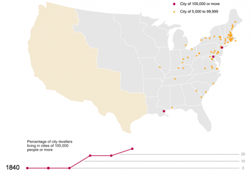
There’s also an animated graph showing urbanization in the U.S. between 1790 and 1890. Here’s 1840:

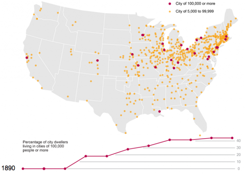
And fifty years later:

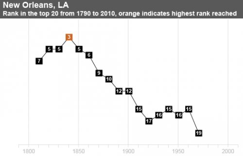
Finally, there’s a map showing all cities that have ever been in the top 20 largest cities in the U.S. since 1790. If you click on a city name, you can see

Los Angeles:

And for Dmitriy T.C., here’s New Orleans:

The Census site lets you click through for the data each visualization is based on, so there’s lots to dig through if you’re really excited about this type of thing, as I am.

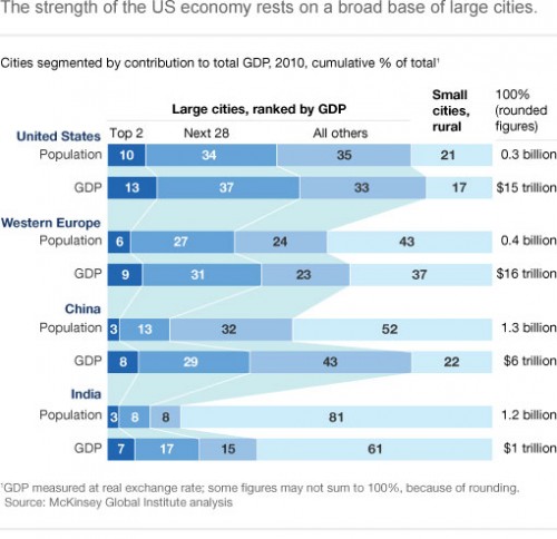
Peter Nardi, from Pitzer College, let us know that the McKinsey Global Institute recently released a report on U.S. cities and the economy. Large cities (those with 150,000+ residents), are more dominant in the U.S. than in Western Europe, China, and India. More of both the national population and economic productivity (measured by GDP) is concentrated in cities in the U.S. than in those other areas, with the exception of the concentration of GDP in large cities in China:

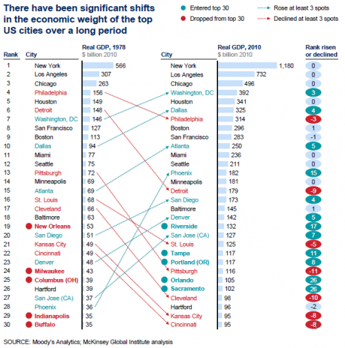
So overall, the vast majority of the U.S. population lives in cities, and they drive economic development and change here. But of course, the fortunes of cities within the U.S. have varied greatly. If we look at the top 30 cities (by GDP) in 1978 and 2010 (in constant 2010 dollars), we can see the decline of many older manufacturing and transportation centers in the northeast and Great Lakes areas. Milwaukee, Indianapolis, Columbus, and Buffalo fell out of the top 30 altogether, while Philly, Detroit, Pittsburgh, Cleveland, and Cincinnati experienced decreases in their contributions to the overall economy, as did three river port cities — New Orleans, Kansas City, and St. Louis. On the other hand, the Sun Belt has become much more prominent, with cities in the South and Southwest entering the top 30 or rising in the rankings (and 6 of the top 30 from California alone):

Most of the economic growth, the study finds, is due to expanding populations. Large cities aren’t becoming much more productive — cities with high overall GDP growth didn’t have higher per capita growth rates than other cities, so it isn’t that their economies are transforming in ways that make workers tremendously more productive individually. They’re growing much faster in terms of population, and that expansion pushes economic growth.

The report also found there’s no single path to successful economic growth for cities. Some with diversified local economies did very well, but others were below average; similarly, some cities that were largely dependent on just one or two economic sectors have suffered, but others did quite well. Check out the full report for a much more detailed analysis on the factors that influence the rise or decline of the economies of U.S. cities, as well as future challenges.

(Via The Atlantic.)

Yesterday I posted about the extraordinary number of people in Louisiana prisons.  The rise in imprisonment mirrors the U.S. growth that began with the so-called war on drugs, but was also triggered by a crisis in the early 1990s, after two decades of growth.  A federal court ordered Louisiana to reduce overcrowding in prisons, which had risen to an inhumane level.  They  had to either let criminals out or build more prisons.  They did the latter.

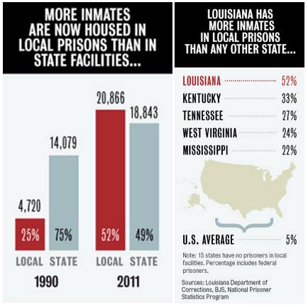
Instead of building more state-funded prisons, though, for-profit prisons were built by sheriffs and residents of local parishes.  Today there are more inmates housed in local, for-profit prisons than in state prisons (left) and Louisiana has more inmates in private prisons than any other state in the U.S. (right):

Why should we care if so many prisoners are housed in private, for-profit institutions?

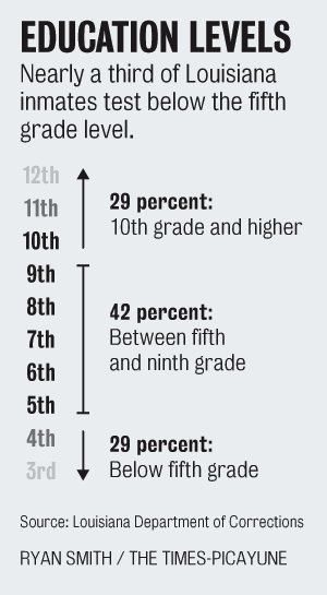
The conditions in these prisons are worse than those in state prisons, especially when it comes to quality of life (like the opportunity to develop hobbies or practice their religion) and rehabilitative services (like high school equivalency classes and job training). These are desperately needed services; the average Louisiana prisoner has a 7th grade education and nearly a 3rd read below a 5th grade level:

State facilities simply spend more money, while for-profit prisons skim as much off the top as possible.  Writes reporter Cindy Chang:

An inmate at the Angola state penitentiary costs $63.15 a day, compared with the $24.39 sheriff’s per diem. State facilities house the sickest and oldest, but [Department of Corrections] Secretary Jimmy LeBlanc admits part of the differential is the lack of educational offerings.

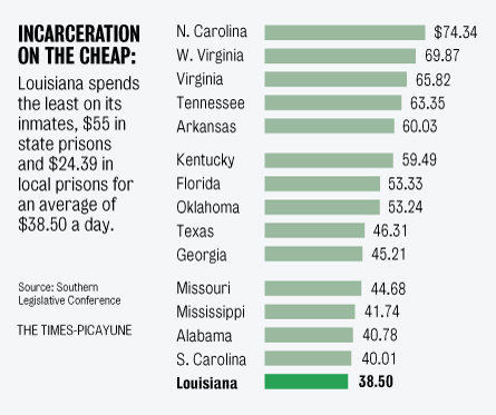
In fact, Louisiana spends less on its prisoners (in state and private facilities combined) than any other state in the U.S.:

Law enforcement officials and parish residents may not like what’s happened in Louisiana, but many feel trapped.  For-profit prisons are sustaining local communities: they fund police departments and employ residents. Often they are the only local jobs with decent wages and benefits. Those residents support the local economies and keep small towns alive.

In this short video, an employee talks about the occupational opportunity the prison provides:

Many Louisianans, then, see the harsh sentences and high imprisonment as a price worth paying.  Says Sheriff Charles McDonald: “I know it sounds crazy and impersonal… but we’re stuck with this jail. We can’t walk away. We’ve got investors, employees.”

Lisa Wade, PhD is an Associate Professor at Tulane University. She is the author of American Hookup, a book about college sexual culture; a textbook about gender; and a forthcoming introductory text: Terrible Magnificent Sociology. You can follow her on Twitter and Instagram.

NASA has posted a series of pairs of satellite images that show a range of changes around the world. They’re great for illustrating human-environment interactions; some of the changes are directly human-caused, while others, while others show the changing consequences of floods and fires as our settlement and agricultural patterns change.

For those of us living in Las Vegas, these images of the shrinking Lake Mead reservoir, which provides water and electricity, is not reassuring. The reservoir has gotten smaller due to multiple factors, including a long-term drought and more water being taken from the Colorado River upstream:

Deforestation in Niger, as land has increasingly been turned over to agriculture:

Here, we see increasing urban growth around Denver International Airport, which now takes up 53 square miles of what used to be farmland:

Algal blooms due to agricultural and household runoff into Lake Atitlan, Guatemala:

Changes to the Sonoran coastline in Mexico due to shrimp farming:

The dramatic shrinking of the Aral Sea, largely due to the amount of water taken out of rivers for irrigation:

The full set of 167 paired images is really striking, and if viewed in the “all images” layout, you can select among various topics, focusing on cities, water, human impacts, and so on.


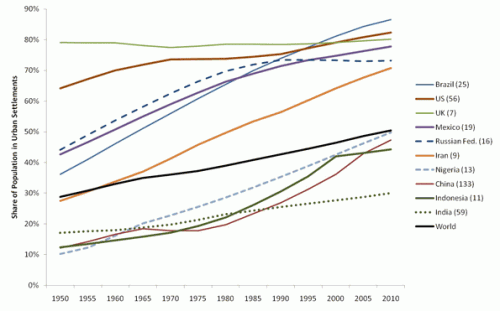
Urban Demographics posted some graphs from the UN’s State of the World’s Cities 2010/2011 report on global urbanization trends. A snapshot of urbanization in 11 countries:

You can see a few other notable trends here that illustrate various national trajectories, as Phil McDermott at Cities Matter points out. For instance, notice that while Russia underwent rapid urbanization between 1950 and 1980, it has leveled off since then. Similarly, Indonesia’s urbanization slowed significantly in the late ’90s and has continued at a much slower pace since then. We also see quite different patterns between the world’s two most populous nations: While China’s urbanization rate sped up in the early ’90s (after urbanization actually dipped in the ’70s), India has experienced fairly slow urbanization.

Credit Suisse released a report on urbanization and emerging markets, if you’re interested in the impacts of urbanization on a wide array of economic development indicators, from electricity and steel consumption to projections of future housing needs to incomes and standards of living.

In his book, Great American City, sociologist Robert Sampson argues that, while the effects of macro factors like poverty and political neglect on individual lives are well-documented, other local mechanisms matter too.  It’s important, then, to think about the constitution of neighborhoods.

Along these lines, he argues, even if a community is economically- and socially-marginalized, an existing neighborhood organizations can make a big difference.  He takes natural disasters as a case study.  A neighborhood organization can spread the news of an impending disaster, establish leadership, and organize assistance before, during, and after a crisis.  In this way, Sampson brings together micro, meso, and macro forces shaping the impact of disaster.

Lisa Wade, PhD is an Associate Professor at Tulane University. She is the author of American Hookup, a book about college sexual culture; a textbook about gender; and a forthcoming introductory text: Terrible Magnificent Sociology. You can follow her on Twitter and Instagram.