race/ethnicity: Asians/Pacific Islanders

You know how sometimes you see something and you just cringe and wonder how, how, something made it into the public sphere? Paul Fidalgo, of Near Earth Object, took a photo of this display illustrating the career ladder at McDonald’s. The display provides a rather unintended commentary on race and corporate hierarchies in general:

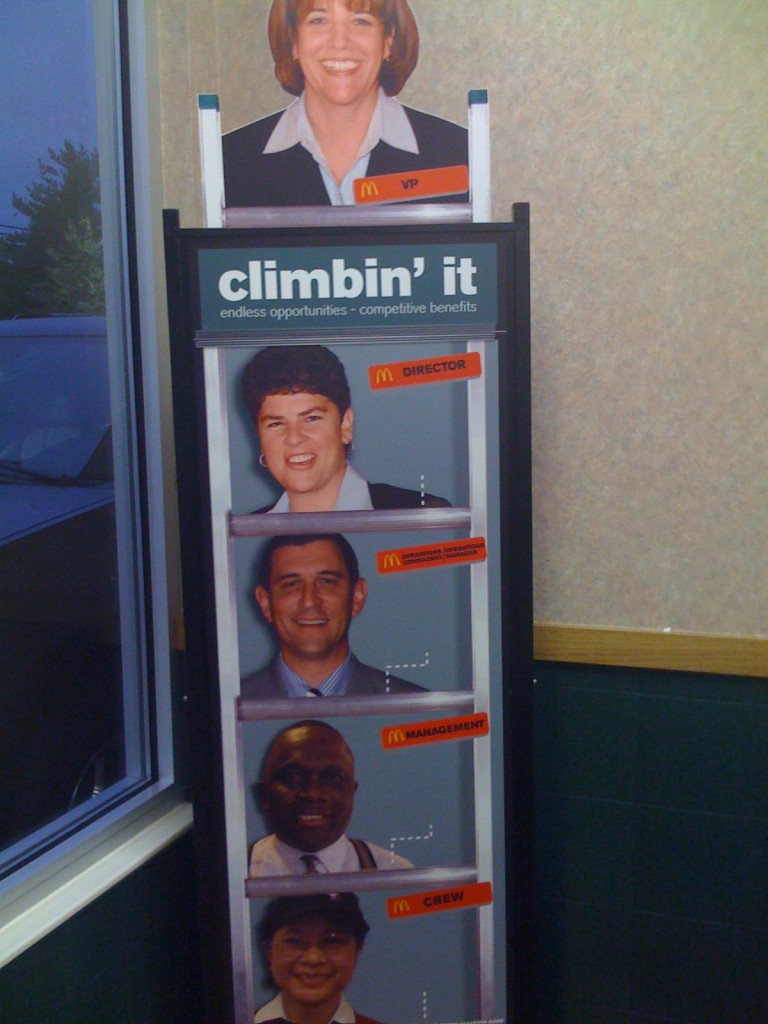
I suppose I should be happy, as the sky appears to be the limit for White women like me on the Ladder of Whiteness.

I was doing some googling, looking for data on the racial diversity of McDonald’s employees, since the company has touted itself as a leader in providing career opportunities to women and underrepresented minorities. I’m always surprised how corporations that carefully guard their brand in other ways, and talk about diversity issues, often seem to drop the ball when it comes to thinking about the cultural politics of representations of race and ethnicity in their materials.

[UPDATE: A number of commenters argue that McDonald’s has a better record on promoting women and minorities than most corporations. I’m not trying to argue there that they don’t — I was trying to find some data on their employees because I’ve also heard they stand out, as far as corporate America goes. That’s why I found the display surprising, as opposed to perhaps predictable.]

So anyway, my online search led me to 365Black, the website McDonald’s set up to appeal to African Americans:

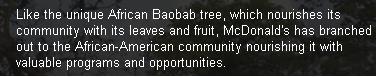
Ok…uh, sure. Just exactly like the baobab tree.

I’d seen 365Black before — readers have sent it in, and we just couldn’t think of much to say so we’ve never posted about it. But then my googling took me to MeEncanta, the McDonald’s page for the Latino community. They offer this sticker (i.e., instruct you to download the image and print it on sticky-backed paper) to show off your Latin pride:
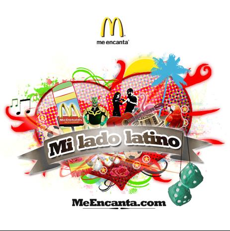
Alrighty…

And finally I arrived at Myinspirasian, which targets Asian Americans. On the page about Asian Pacific American Heritage Month they include information about contributions by Asian Pacific Americans, such as this:

Multimedia creations inspired by Asian Pacific Americans are the latest rage among kids, teens and young adults of all ages. The multimedia creations offer a variety of the trendiest ways to receive news, information, entertainment and services using the worldwide web.

No specifics are given, so you’ll have to figure out what these mysterious “multimedia creations” are. Also, “they have become household names in a host of sporting activities,” though apparently not the type of household names where McDonald’s could actually name one. The entire section is similarly vapid, completely lacking in anything other than non-specific statements that Asian Pacific Americans have, like, done stuff, and things. It reminded me of some of the very superficial celebrations of Black History Month we’ve seen.

But if you want, you can take the Asian Phrases Challenge, where you can hear various phrases spoken in either Mandarin or Cantonese, Filipino/Taglish, Indian/Hinglish, or Korean:

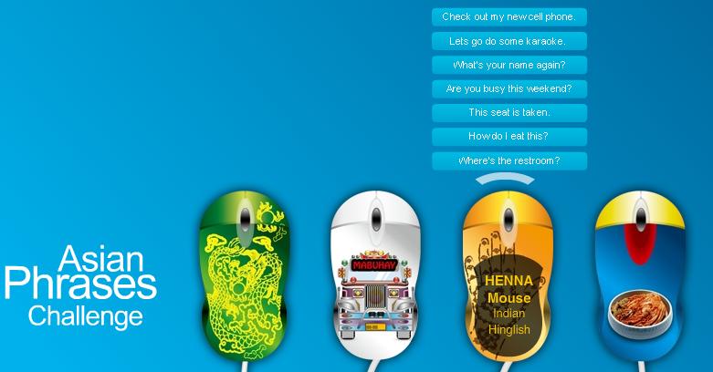
I’m not sure what the “challenge” aspect is, since it doesn’t do anything but play the phrases.

I just…I don’t know. You decide to make webpages entirely devoted to a particular demographic and this is the best you can do? And do these types of marketing projects actually work?

———————–

For more, see our previous post showing how people of color are subordinated visually in advertising materials.

Jessica L., a doctoral candidate in sociology at Kent State and traveling adjunct instructor at Lewis University and Indiana University Northwest, let us know that the New York Times has an interesting interactive map that uses Census data from 1880 to 2000 to show where various immigrant groups have settled. You can select area of origin (some specific, such as China, others very broad, such as “All Africa”) and see where individuals from that area were living in the U.S. for different years (because of changes in Census categories and data gathering, information isn’t available for all groups for all years).

The German-born population in 1880:

If you go to the NYT site, you can roll over the circles to get the specific population.

The Japanese-born population in 1900, indicating immigration to Hawaii and, to a lesser extent, California and Washington to work in agriculture:

The map also lets you trace the rise and fall of some immigration streams. For instance, in 1880 there were 198,595 people born in Ireland living just in Manhattan alone:

By 2000, the Irish-born population in the U.S. was tiny, and only 4,147 of them lived in Manhattan:

The Mexican-born population in 2000:

Cross-Posted at BagNewsNotes.

We have posted in the past about how airlines use images of female flight attendants in ads to appeal to customers with promises of caretaking, eye candy, flirtation, and emotion work. Katrin sent in another example. This Cathay Pacific ad, which appeared in the U.K.,  presents Karina Yau, a flight attendant, to customers as the perfect caretaking woman — one who just wants to listen to you, not talk:

Notice also the passive stance — arms pulled into the body, her face turned away and eyes averted, hand fiddling with her coat sleeve. The text reads:

Karina went from fashion model to flight attendant — and still doesn’t think that life has had any real ups and downs. You can meet her and other members of the Cathay Pacific team at www.cathaypacific.co.uk. And while you’re there, check out our great fares to over 110 destinations worldwide. If you see Karina on your next flight, you might recommend a favourite book — she loves to read.

A post on the Cathay Pacific blog about Yau describes her as “modest.” At Cathay’s website you can “meet the team who go the extra mile to make you feel special.” It includes photos and bios of some employees, and I found Yau’s. The text they chose to highlight reinforces the emotion work she engages in for customers — “of course” she “smiled and apologised immediately.”

The ad and the features present customers with the promise of more than just a flight attendant who will do her job well. This flight attendant is the ideal of femininity: she’s beautiful (a former model), she’s submissive (apologizes immediately!), and she’s interested in you — your thoughts, your taste in books — whoever you are.

I wonder to what degree this draws on a specifically racialized femininity — the stereotypical depiction of Asian women as particularly submissive and docile. But since this ad ran in the U.K., I don’t know if that stereotype is as relevant. Readers, what say you?

We previously posted a series of Valentine’s Day cards featuring Native Americans. They aren’t the only racial group to be caricatured in cards, though. Carrie S. sent in this vintage Valentine, found at Adventures of Accordion Guy in the 21st Century, that presents a stereotyped Asian character (doing laundry even!), complete with mangled English:

I was able to locate more Asian-themed racist vintage Valentine’s Day cards at Buzzfeed:

2 (2)

1 (4)


Gwen Sharp is an associate professor of sociology at Nevada State College. You can follow her on Twitter at @gwensharpnv.

Sara P. let us know about a map at National Geographic that shows the distribution of surnames in the U.S.

The names are color coded by region of origin of the name:

A note on methodology: geographers looked at the most common by counting the most common last names in phone books and selecting the most common names in each state. This hides significant diversity in names in large cities that may have had a greater mix of immigrant groups that the state overall; for instance, a map of the most common names just in New York City might look quite a bit different than the most common names in New York state.

Nonetheless, the concentration of last names serves as an echo of immigration and settlement patterns. British-origin names tend to dominate across the U.S., unsurprisingly, particularly Smith, Johnson, and Williams. Because slaves were often given the last names of their owners, a significant proportion of individuals with British last names are African American — for instance, African Americans are about 20% of people named Smith.

Several Irish-origin names stand out in Massachusetts, as well as some French surnames in Maine:

The map of Hawaii reflects the significance of the Asian population there:

Spanish-origin names in the Southwest:

The names common in the Great Lakes/upper plains region reflects the fact that the area was a common destination for immigrations from Germany and Scandinavia:

I looked up the geographers who created the maps (James Cheshire, Paul Longley, and Pablo Mateos at University College London) and that led me to an interesting website sponsored by UCL, the World Names Project. If you type in a surname, it will show where on the globe it is most common. You can also zoom in on individual nations and see the distribution within them. Here’s the global distribution of my last name, Sharp:

You also get some data about the name: its origin, the top 10 regions and individual cities for that name, and the most common first names that go with it (which, in all the names I tried, were overwhelmingly male, so I don’t know what to make of that).

As Sara said of the National Geographic map, many of the results are predictable, but that doesn’t mean it’s not fun to look at them.

UPDATE: Reader Kristina provides an explanation for why male names dominate the most common first names lists:

My explanation for Gwen’s finding that the most common first names are overly represented by male names is that names for boys are less variable than names for girls.

Interesting post on that here, which notes, “it [natural language geocoder] needs 4200 first names for girls to cover 90% of the population, but it only needs 1200 boy’s names to reach a 90% coverage. The reason for this huge difference is mainly found in the top positions. The ten most popular male names reach 23% whereas the ten most popular female names reach a comparatively meager 10%.”

The CDC has just released a Health Disparities and Inequalities Report with new numbers detailing the uneven mortality and morbidity in the U.S.  Family Inequality‘s Philip Cohen highlighted the data on pre-term birth among whites, blacks, Asians/Pacific Islanders, Hispanics, and some Hispanic subgroups.  It’s nice to see data that includes more than just whites and blacks; studies often do not report data on Hispanics, Asian/Pacific Islanders, and especially American Indians because the number of respondents is considered too low (and they do not over sample these groups).  More, breaking out the different Hispanic sub-groups is also rare.  As Cohen said, it’d be nice to see such detail for other groups as well (though it’s tough to do so for black Americans because those who arrived in the slave trade have often lost track of their national/ethnic origin).

In any case, the data both confirm previous findings and offer an important insight.  In the confirmatory case, it shows that Asians and whites are less likely to give birth to pre-term babies than other groups, with blacks suffering the worst outcomes.  As for the interesting finding: notice the wide range of outcomes for Hispanics of different origin.  Reporting only “All Hispanic” hides important variation. We can be assured that that variation is true for the other racial groups as well.

Lisa Wade, PhD is an Associate Professor at Tulane University. She is the author of American Hookup, a book about college sexual culture; a textbook about gender; and a forthcoming introductory text: Terrible Magnificent Sociology. You can follow her on Twitter and Instagram.

The color of one’s nipples varies according to the color of one’s skin. Lighter-skinned people tend to have lighter nipples, while darker-skinned people tend to have darker nipples. To add to the many racist products and procedures designed to make the bodies of darker-skinned people more like the bodies of lighter-skinned people — eyelid surgery, eyelid gluing, Asian rhinoplasty, hair straightening, and skin lightening — Theresa W. sent in a product designed to make the nipples more “pink.”  These products, featured at The Faster Times, seem to be mostly aimed at the Asian market, many of whom are already quite light-skinned.  Below is a selection of the many products one can find.

Finale Pink Nipple Cream:

Bioglo Cherry Pink Lip Nipple Cream:

The rest are after the jump because the packaging shows images of breasts.

more...

Back in September, I posted about some maps put together by Eric Fischer, using 2000 Census data, showing the racial/ethnic makeup of selected cities. As Jeff H., Eluned J., and Dmitriy T.M. pointed out, the NYT now has up an interactive map where you can see the racial/ethnic composition of any Census tract, using more updated Census Bureau data from 2005 to 2009. For instance, here’s a map of the neighboring cities of Midland and Odessa, Texas, which I picked for no reason other than that I just watched an episode of Friday Night Lights, which is set in a fictionalized version:

Color key:

You can zoom in to get quite detailed information about individual neighborhoods. I zoomed in as far as I could on Miami (each dot now represents 50 people):

There’s also a tab that says “View More Maps.” It allows you to select to see just the distribution of Whites, Blacks, Hispanics, Asians, or the foreign-born population. Here’s the map of the Hispanic population of Las Vegas:

As you can see, if you hover over a Census tract, you can get specific data on its racial/ethnic makeup.

The foreign-born population of Seattle (if you hover over a tract, it will tell you the % foreign-born, as well as the % increase in the foreign-born population since 2000):

A great resource. Although I tried to look up my home town, and even zooming in to the smallest scale, it’s too small to have any data available.