
Sara P. let us know about a map at National Geographic that shows the distribution of surnames in the U.S.
The names are color coded by region of origin of the name:

A note on methodology: geographers looked at the most common by counting the most common last names in phone books and selecting the most common names in each state. This hides significant diversity in names in large cities that may have had a greater mix of immigrant groups that the state overall; for instance, a map of the most common names just in New York City might look quite a bit different than the most common names in New York state.
Nonetheless, the concentration of last names serves as an echo of immigration and settlement patterns. British-origin names tend to dominate across the U.S., unsurprisingly, particularly Smith, Johnson, and Williams. Because slaves were often given the last names of their owners, a significant proportion of individuals with British last names are African American — for instance, African Americans are about 20% of people named Smith.
Several Irish-origin names stand out in Massachusetts, as well as some French surnames in Maine:
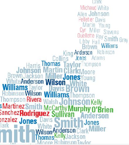
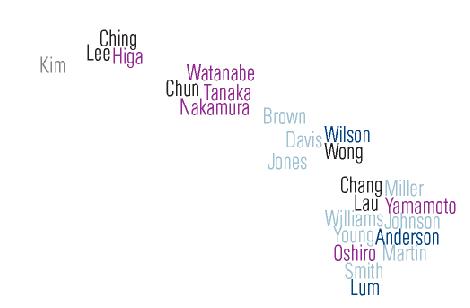
The map of Hawaii reflects the significance of the Asian population there:
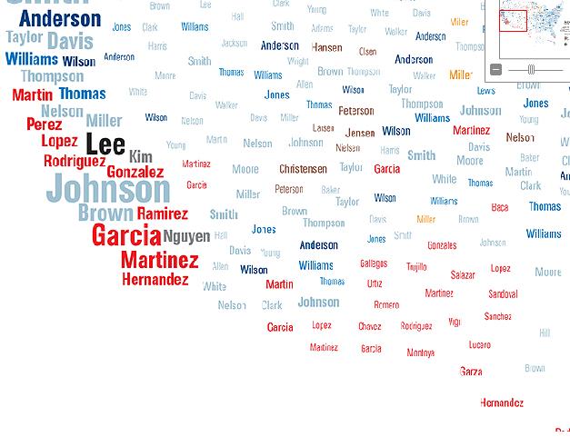
Spanish-origin names in the Southwest:
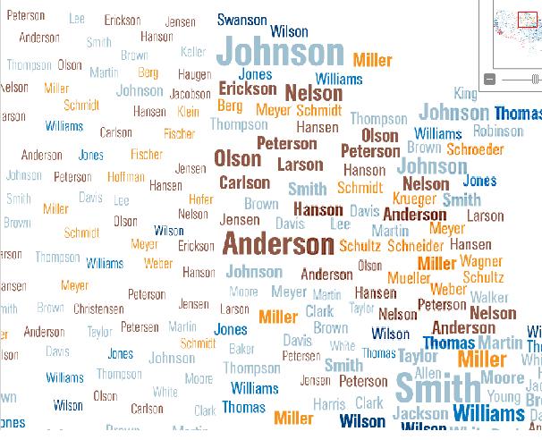
The names common in the Great Lakes/upper plains region reflects the fact that the area was a common destination for immigrations from Germany and Scandinavia:
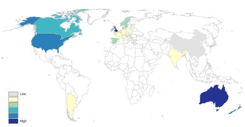
I looked up the geographers who created the maps (James Cheshire, Paul Longley, and Pablo Mateos at University College London) and that led me to an interesting website sponsored by UCL, the World Names Project. If you type in a surname, it will show where on the globe it is most common. You can also zoom in on individual nations and see the distribution within them. Here’s the global distribution of my last name, Sharp:
You also get some data about the name: its origin, the top 10 regions and individual cities for that name, and the most common first names that go with it (which, in all the names I tried, were overwhelmingly male, so I don’t know what to make of that).
As Sara said of the National Geographic map, many of the results are predictable, but that doesn’t mean it’s not fun to look at them.
UPDATE: Reader Kristina provides an explanation for why male names dominate the most common first names lists:
My explanation for Gwen’s finding that the most common first names are overly represented by male names is that names for boys are less variable than names for girls.
Interesting post on that here, which notes, “it [natural language geocoder] needs 4200 first names for girls to cover 90% of the population, but it only needs 1200 boy’s names to reach a 90% coverage. The reason for this huge difference is mainly found in the top positions. The ten most popular male names reach 23% whereas the ten most popular female names reach a comparatively meager 10%.”
Comments 31
Kristina — February 5, 2011
My explanation for Gwen's finding that the most common first names are overly represented by male names is that names for boys are less variable than names for girls.
Interesting post on that here (http://geonames.wordpress.com/2006/05/20/first-names-more-variety-for-girls/), which notes, "it [natural language geocoder] needs 4200 first names for girls to cover 90% of the population, but it only needs 1200 boy's names to reach a 90% coverage. The reason for this huge difference is mainly found in the top positions. The ten most popular male names reach 23% whereas the ten most popular female names reach a comparatively meager 10%."
Alison — February 5, 2011
Or, from the FAQ:
Why do the most common forenames associated with a particular surname mainly show masculine names?
Most of our names data comes from telephone directories, and unfortunately since most telephone directories are still registered under a male forename, female forenames are hence unrepresented in our database. However, this is not the case for the countries in which we have used electrol registers. Both telephone directories and electrol registers present a further bias, since they only cover adult names. As a result the latest fashion in forenaming practices are not necessarily covered by our database.
Elsajeni — February 5, 2011
Wow -- my mother's family name is unusual, so when I look it up, I can zoom in on the U.S., then on Texas, and see the cluster of my relatives around Austin. Neat. The map itself is kind of disappointing, though, because it lacks data for so much of the world -- I can see where on the globe my surname is most common, as long as my surname is common in Western Europe, North America, Australia, China, or India.
Liz — February 5, 2011
This also seems likely to skew towards an older demographic-- many younger people no longer have home phone numbers (if they ever did), and thus aren't listed in the directories where these names were found. I know that I've never been listed in a telephone directory in my life, and I'm quite sure that's the case for many people 30 and under. That probably offers a further explanation for why, as the FAQ states, most telephone numbers are listed in men's names, which seems a bit old-fashioned otherwise.
ache — February 5, 2011
the true reason for male forename domination is that datas come from telephone directories and telephone directories are still registered under a male forename...
thewhatifgirl — February 5, 2011
Can anyone explain why the surname "Anderson" is in two different colors in the maps?
Also, were different spellings of similar-sounding names included in one or considered separate? For instance, I know someone whose Welsh last name is spelled Wyman but she's seen multiple different other ways to spell the name within her own family tree, mainly (I think) because of the forced Americanization of names at Ellis Island.
Treefinger — February 5, 2011
In California, there is a light blue "Nelson", and in the upper plains pic there is a brown "Nelson". So is the name of Scandinavian or English origin?
Liz — February 5, 2011
I loved pondering this map in NG, and playing with the website you mentioned. I found it especially interesting that there seemed to be no data from Africa or Asia west of India, or south of China. Even trying surnames I know to be of those origins yielded nothing.
Still, interesting look at the movement of the global population.
azizi — February 5, 2011
Gwen, I clicked the hyperlink provided in your post about the name Smith for African Americans and found this comment: "Slaves often took their owners' names, so about one in five Americans now named Smith are African American".
That sentence is given in your post as "Because slaves were often given the last names of their owners, a significant proportion of individuals with British last names are African American — for instance, African Americans are about 20% of people named Smith".
-snip-
African Americans recognised the importance of exercising their right to choose a surname to the extent that immediately after emancipation many Black Americans called last names "entitles" (meaning they were entitled to have a last name). Given the importance to African Americans of this right to name themselves, I wonder why you felt the need to change the original sentence in such a way that it makes those African Americans seem to have been less assertive than they were about which surnames that they chose to carry.
I also wonder whether the oft repeated claim that freed African Americans took the last name of their former owners is even true. I grant you that most African Americans took last names that were familiar to them, but were those names really the last name of their latest owner? If that person had treated those enslaved people horribly, why would they have wanted to have that last name and give it to their descendents?
Some years ago, I attended a friend's family reunion and heard the story about how four siblings chose their last name after being emancipated. One of those siblings took on the last name of his former owner. Two of the siblings walked some distance to ask a White man who was known for being good to his slaves whether they could take his last name. They were given that permission, but both of the siblings spelled that name differently -and each spelling was different from how that White man spelled it. This was probably because those siblings did not know how to read or write. The fourth sibling took another last name because of other reasons. That is just one example of African American surname practices. The story I love the most was one I read in a book on African American history. In that story a man took the name "Beman" because he said that when White people said his name, they would be acknowleging that he was a man.
Again, Gwen, I wonder why you decided to change that sentence from African Americans being responsible for their choice of surnames to African Americans passively accepting a last name that their former owners gave them.
Citizen 5 — February 6, 2011
Just a general caution: it is important not to conflate surname with ethnicity - they do not always correlate. There are many reasons for the predominance of Western European surnames. In addition to African American surname practices that other people have commented on, many new immigrants, particularly in the 18 and 1900s, have changed, shortened or otherwise Anglicized their surnames. Also, many North American Indians were given Anglicized surnames in the boarding schools.
Sarah — February 6, 2011
This was really, really interesting! I searched for my last name, and found that there are apparently very many people of that name in one particular city in Austria, but not anywhere else, for some reason.
Also, according to the chart there are approximately 2.5 fpm in the USA for my name, and when I zoomed in on the region I, my parents and my brother live, it showed it as having a moderate density. So that's us! If we moved that region wouldn't be represented at all by our last name!
I know it seems silly and obvious, because it's not a common last name, but I am very tickled that I, personally, show up on that map.
Andy — February 6, 2011
Hm. Where are all the Europeans from the East? Poland? Russia? Hm. What about the "english" names from french-speaking Normans or Vikings from Scandinavia? Hm. What about Yiddish names which look and sound german? What about spanish "apellidos" (YOUR surname is the surname of your mother AND the one of your father)? Hm. Hm. Hm. Nice map, nice idea.
Rachael — February 6, 2011
Sigh...And once again, Alaska gets left completely out of the picture.
Robin — February 6, 2011
The world names site you mention seems to have a major issue: It looks like it's only considering places that use the Cyrillic alphabet. (Or so I'm assuming from the fact that Russia isn't mentioned as a top place for the names Romanov and Petrov and nowhere in Asia is mentioned as a top place for Weng or Wong. I guess it makes sense not to include them: is the *right* spelling for the Chinese last name Weng or Wong or Wing? But you end up with a pretty distorted picture if you think Denmark is the most common location for Wengs.
Now I'm actually really confused, because there are countries in Asia (i.e., Singapore, Malaysia) that use the Cyrillic alphabet, but they don't seem to be being included. This is strange.
Dan — February 8, 2011
Another explanation for Gwen's finding: This was done using phone books, yes? Many couples and widows are listed by only the husband's name both for societal reasons and as protection. This means the phone book itself is biased towards male names, biasing the results.
sam — February 9, 2011
As far as I can tell, "World Names Project" is actually kind of a misnomer. Seems they don't have enough data from places in the world besides the West for anything to show up on the map. I have a fairly unusual Arabic name...you'd think it ought to show up in the Middle East, no? But it doesn't.
Waiting Room Reading 2/10 « Welcome to the Doctor's Office — February 10, 2011
[...] MAPS OF SURNAMES by Gwen Sharp [...]
Anonymous — February 16, 2011
They have pretty much all the major regions of Europe, except...ITALY. What the heck? Italians don't exist in America?
Best of 2011: Weed Is Not a Gateway Drug, Politics and Religion Are Key in Choosing Mates, and More Random Stories of 2011 « Welcome to the Doctor's Office — December 29, 2011
[...] MAPS OF SURNAMES by Gwen Sharp [...]
Zuzanna — March 19, 2012
Anderson wins.
Zuzanna — March 19, 2012
I think they used surname dictionaries (such things exist) or census data and the reason why they have 'more' male forms in some places is because the male form is traditionally considered 'basic' form and used in statistics and dictionaries.
Using phone books would be a bad idea, because it would reflect only people who have a landline registered on their name.
7 Things Your Name Instantly Reveals About You – Team BPCS — May 4, 2026
[…] National Geographic created a map showing that people with certain surnames tend to live in the same area. This makes sense, since families tend to stick together. It also makes sense in terms of immigration. Certain ethnicities settled in different parts of the country. […]