race/ethnicity: Asians/Pacific Islanders

The U.S. Census Bureau has started releasing data from the 2010 Census. This map shows the change in the racial/ethnic minority (i.e., anything other than non-Hispanic White) population over the last decade:
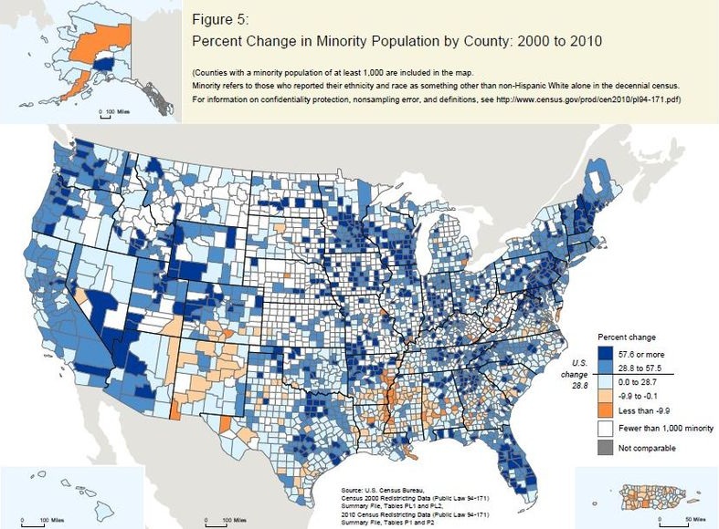
Legend:

They released a report, An Overview: Race and Hispanic Origin in the 2010 Census (available here), which includes data on those who reported more than one race. Among those who reported more than one race, the vast majority listed two. Here are the most commonly reported combinations:

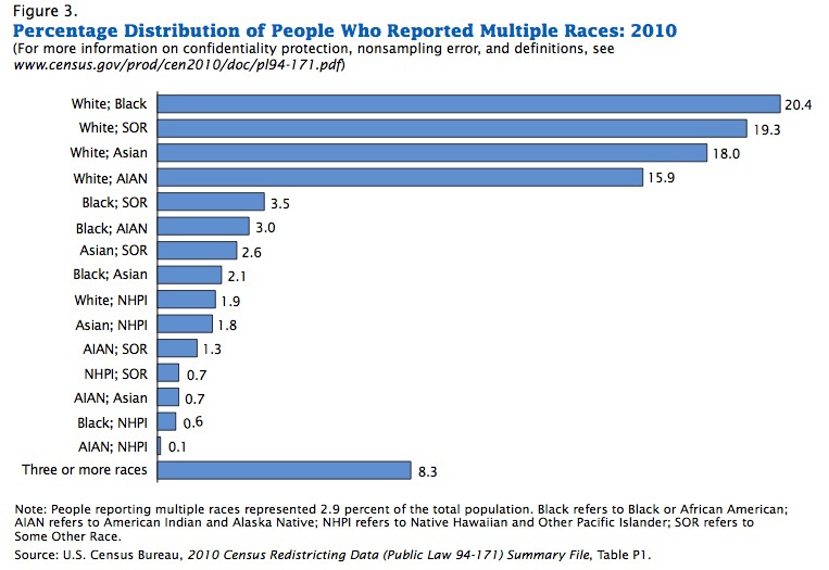
AIAN = American Indian/Alaska Native, NHPI = Native Hawaiian/Pacific Islander, and SOR = some other race.

Laura E. pointed out that New Geography posted some maps based on 2010 Census data. Here’s the Hispanic population as a percent of the total population, by county (notice that the legend need to be multiplied by 100 to get the percent):

The African American population (alone or in combination with another race, and again, multiply by 100):


(source)

Many of you have probably seen the recent anti-Asian rant released by UCLA student Alexandra Wallace. In it, she says that “hordes” of Asians who are admitted to UCLA inappropriately bring their parents along and obnoxiously speak foreign languages in the library (“Oooooooh! Ching chong, ling long, ting tong!? Ooooooh!”). And she compares them to herself, the “polite, nice, American girl that my momma raised me to be.”

Okay so yes, this is what racism looks like. It’s also what sexism looks like. People who objected to Wallace’s video (as they should), often did so with sexist language, including these examples collected by Caroline Heldman for Ms. magazine:

  • “I bet her grades match her cup size.”
  • “i have big tits and gave the dean a blowjob to get into UCLA is all I hear.”
  • “EXCUSE ME WHILE I WHIP MY DICK OUT AND JERK IT TO THOSE TITS.”

But the most interesting thing I’ve heard about Wallace’s video and the response came from What Tami Said.  Tami suggested that all the shock and outrage regarding Wallace’s racism was naive, at best, and delusional, at worst.  Expressing shock, she said, may be a way to spice up a headline.  Or, it might be reflective of a belief among some that this sort of racism doesn’t exist anymore.  Or, she speculates, expressing shock may be a way for people to distance themselves from people like Wallace, a way for them to advertise the notion that they aren’t racist.

Tami’s insight is that the language of shock deserves analysis in itself.  What does it mean that we’re expressing shock when events like this on college campuses are rather routine (e.g., see “Conquistabros and Navajos,” “Compton Cookouts,” and other race-mocking parties).

In any case, she doesn’t think it’s helpful:

I get that few understand “isms” like marginalized people… But, for God’s sake pay attention! You needn’t be victim to oppression to know it exists. I submit that if you are truly shocked in the face of racism and sexism and homophobia and transphobia and other injustices, then you are as big a problem as the perpetrators of same. Because people who persist in being unaware of “isms” create an environment where ridiculous people like Amanda Wallace and, more importantly, people with far greater power and influence can conduct their bigotry unchallenged.


Lisa Wade, PhD is an Associate Professor at Tulane University. She is the author of American Hookup, a book about college sexual culture; a textbook about gender; and a forthcoming introductory text: Terrible Magnificent Sociology. You can follow her on Twitter and Instagram.

Karma Japan and Ignorant and Online are new sites, featured at BoingBoing, dedicated to collecting tweets and Facebook status updates that suggest that the tsunami in Japan is karmic: pay-off for supposed Japanese sins.  The guilt ascribed to Japan ranges from their hunting and eating dolphins and whales and their bombing of Pearl Harbor especially, but also things like their rate of atheism and their politics.  But all have in common the notion that the Japanese deserve what has happened and that mother nature/God herself is against Japan and ensuring that the society is punished.  A fascinating peek into the minds of these Americans.


Trigger Warning: These comments are hateful and vulgar (and in pretty large font if you’re at work).


From Karma Japan:

The rest after the jump:

more...

Via Colorlines I discovered an Applied Research Center report titled The Color of Food.  The report found that Blacks, Latinos, and Asians were overrepresented in food service work:

The report also discovered a wage gap between White workers and non-White workers at every level of food production:

Race intersected with gender, such that women earned less than men of their same race for each group studied:

The authors go on to break down the data further by each part of the commodity food chain — production, processing, distribution and service — and by racial group.  For example, they show that the average wage of Latinos and Asians differs by ethnic background (always a good reminder that racial categories obscure variability):

Lots more at The Color of Food.

Lisa Wade, PhD is an Associate Professor at Tulane University. She is the author of American Hookup, a book about college sexual culture; a textbook about gender; and a forthcoming introductory text: Terrible Magnificent Sociology. You can follow her on Twitter and Instagram.

New-ish data from the Pew Research Center suggests that inter-racial and -ethnic marriages are on the rise due to cohort changes.  First, the report shows that people who were newly married in 2008 were more likely to be married to someone of a different racial or ethnic group:

This trend is likely facilitated by greater acceptance of intermarriage.  According to the report, in 1987 less than half of Americans said it was okay for White and Black people to date each other, by 2009 that number had risen to 83%.  Among 18- to 32-year-olds, 93% approve.

Among Pew’s respondents, 63% said that they approved of inter-racial and -ethnic marriages without reservation and another 17% said that they approved of at least one type of intermarriage, but not others.  Still, overall acceptance of intermarriage still aligns with the familiar racial hierarchy in that Americans are more comfortable with outmarriages to Whites, than to Asians, Hispanics, and especially Blacks.

Acceptance of inter-racial and -ethnic marriage is on the rise, then, in part because younger people are more accepting of it than older people.  Acceptance, however, still reflects a color-based racial hierarchy.

Lisa Wade, PhD is an Associate Professor at Tulane University. She is the author of American Hookup, a book about college sexual culture; a textbook about gender; and a forthcoming introductory text: Terrible Magnificent Sociology. You can follow her on Twitter and Instagram.

Kristina K. sent in a link to an interactive map at the New York Times that shows the results of Gallup’s 2010 polls of well-being. [UPDATE: Reader Danielle pointed out I forgot to provide a link to the map. Sorry! You can find it here.] Gallup surveys 1,000 people per day about a variety of indicators of well-being, including questions about physical, mental, and emotional health, various health-related behaviors, ability to access health care, access to adequate food and housing, and perceptions of their communities. Here are the overall composite scores, by congressional district (a higher score is better):


The general geographic pattern indicates a swath of relatively low well-being curving from Louisiana up through Michigan, while those in the upper Great Plains and the inter-mountain West are doing better than average.

Percent reporting experiencing a lot of stress:

Percent who have ever been told they have depression:

Of course, this may reflect differences in rates of depression, but it could also reflect differences in medical professionals’ likelihood of identifying a set of symptoms as depression and bringing it up with a patient. For example, we see significant differences by state in the frequency of Caesarean sections among pregnant women.

Percent of people who smoke:

Percent reporting an inability to buy sufficient food:

The Gallup page on well-being presents more data. Here is a map of 2009 overall well-being that is a bit easier to read since it’s presented by state rather than congressional district:

Hawaii had the highest overall score, at 70.2; West Virginia had the lowest, 60.5. If you go to their site and click on a state, you can get a breakdown of scores in each area (emotional well-being, physical health, healthy behaviors, and so on).

Finally, the NYT provides some demographic information on who was most likely to have said they spent a lot of the previous day laughing or smiling vs. being sad:

The blog Of Another Fashion, by Minh-Ha T. Pham, serves as “an alternative archive of the not-quite-hidden but too often ignored fashion histories of U.S. women of color.” The collection includes images taken from public sources as well as photos sent in by readers and provides a contrast to fashion exhibits that usually present fashion trends as almost entirely White experiences.

While the collection is fascinating overall and definitely worth a look, I was particularly struck by the photos of life among Japanese Americans forced to live in internment camps during World War II.

A legal notice requiring Japanese Americans on the West Coast to relocate voluntarily to internment camps or face arrest:

Women playing volleyball:

(Library of Congress. Photo by Ansel Adams.)

Walking to school at the Manzanar camp:

(Library of Congress. Photo by Ansel Adams.)

Women in biology and dressmaking classes:

(Both images by Ansel Adams, 1943; Library of Congress.)

One camp’s version of a beauty salon:

Intake processing at the Santa Anita center:

(From the Library of Congress’ Farm Security Administration and Office of War Information Collection (April 1942). Photographer unknown.)

Pham discusses the fact that in many of the photos of the processing centers, the women are smiling and look very happy, despite going through what had to be an upsetting, frightening, and humiliating experience. Japanese Americans were not allowed to bring their own cameras into the camps; the photos were taken by others, including Dorothea Lange and Ansel Adams. And they found their subjects didn’t always cooperate with the images they were planning to provide of the camps:

According to Sue Kunitomi Embrey the chair of the Manzanar Committee, Adams hoped to capture the despair of camp life in order to stir some public sympathy for Japanese Americans but was frustrated by all the primping and posing Japanese Americans did when he was photographing.

…I hope that images of smiling and fashion-conscious Japanese American women…adds to and deepens our appreciation of the small acts of feeling, creativity, and resistance that happen everyday in spite of huge limitations. In an act as seemingly trivial and trite as smiling for the camera, these women interrupt and take some control of the historical, political, and visual frames through which they’re being viewed.

One of my colleagues, Kate Hahn, sent me a link to an interactive map at The Chronicle of Higher Education website that presents data on the proportion of U.S. adults with a bachelor’s degree over time. In 1940, in the vast majority of counties no more than 10% of the population had graduated from college (the national average was 4.6%):

Now the national average is 27.5%:

You can also compare counties to the national average. Green counties are above the national average, brown ones are below and, not surprisingly, we see clear regional variations in rates of college education, with Colorado and the Northeast doing particularly well and the South and Appalachian regions lagging:

Wealthy counties (those with a median income of $60,000+) in general have higher than average rates of bachelor’s degrees, with the exception of a few counties in the Mountain West, Alaska, and a few scattered areas:

We see the opposite with poor counties (median income under $30,000):

You can break down any of the comparisons by sex or race/ethnicity, and/or look only at  counties with 20% or more Hispanic or Black residents.  You can also select a particular county for more detailed information. For instance, here’s the info on Clark County, Nevada, where I live:

By comparing the maps over time, you can easily track a number of changes: the increase in college degrees overall, of course, but also changes in education such as the dramatic gains women have made in earning college degrees in the past few decades — the gender gap in college degrees was over 7 percentage points in 1980 but only about 1.5 points today.