methods/use of data

(Image found here.)

Ballgame at Feminist Critics writes:

The assertion, “children do better with parents together” could mean a number of different things, so let’s go through the possible ways the statement could be interpreted:

The notion that “Children ALWAYS do better with parents together” is almost certainly false. If one of the parents is abusive, it seems pretty non-controversial to assume that the kids would be better off with the non-abusive parent alone.

The notion that “Children SOMETIMES do better with parents together” is almost certainly true, but so banal and useless an observation that it’s not worth the expense of a billboard or worth discussing at any length.

That leaves “Children GENERALLY do better with parents together.” This, itself, has two entirely different meanings which are easily confused. Take 100 couples with children. Of those couples, 75 are (at the moment) happily married, while 25 have marital difficulties — some severe — and are on the brink of divorce. Let’s say 20 of the 25 couples actually go through with the divorce.

The notion that “Children GENERALLY do better with parents together” could be taken to mean that, out of the 100 families described above, children from the 80 non-divorcing families end up being mentally and emotionally healthier (as a group) than the children from the 20 divorcing families. That is very easy to believe. Indeed, there are any number of studies that show this, and these are the studies that are typically trotted out to misleadingly imply that divorce hurts children. In fact it’s just another rather banal observation that children from happy families do better than children from emotionally fraught ones, and hardly worth the price of a billboard. It’s almost like saying, “People with money are less likely to have difficulties making ends meet.”

But the other meaning of “Children GENERALLY do better with parents together” is quite different: namely, that the children in the 20 divorcing families would have been better off if those parents hadn’t gotten divorced. THAT notion is purely speculative as far as I know.

Via Alas.

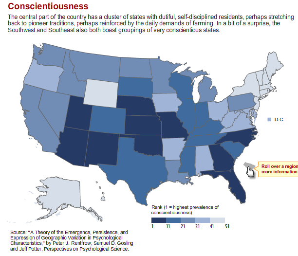
Breck C. sent in this story in the Wall Street Journal about a study showing a link between geography and personality– that is, that different personality traits are dominant in different regions of the U.S. Personality traits were measured by answers to the Big Five Personality Test, which is widely used in psychology and other fields to determine a person’s dominant personality traits. The story was accompanied by maps showing where five traits (extraversion, agreeableness, conscientiousness, neuroticism, and openness) are dominant. According to the study, many stereotypes, such as the neurotic East Coaster, have a basis in reality.

Here is a screenshot of the map of conscientiousness:

Leaving aside any questions about personality questionnaires, and whether people are very accurate at reporting their own personality traits, what I found interesting here is the explanation of this pattern in the caption above the map (which I’m assuming was written by someone at the WSJ and didn’t come from the study): perhaps the Great Plains region is conscientious because of “pioneer traditions” reinforced by “the daily demands of farming.” On the other hand, it’s “surprising” that people in the Southwest and Southeast would be conscientious.

This is a great example of a non-scientific explanation of data that relies more on stereotypes and assumptions than anything else. Why would pioneer traditions be any stronger in Kansas and Missouri than in Oregon or Montana (or a number of other states) that were also settled by “pioneers” (however you want to define that term)? I’m unclear whether the reference to farming is meant to describe the past or the present, but either way, it’s suspect. Lots of other states (including those surprisingly conscientious states in the Southwest and Southeast and many of the less conscientious states) have farming traditions, as well as important agricultural sectors today (like, say, Iowa and its corn). The vast majority of people in those conscientious states aren’t engaged in agriculture today. And for that matter, why would the “demands of farming” lead to conscientiousness in a way that other types of work wouldn’t? These seems to play on stereotypes of farmers (and rural folk more generally) as hard-working, honest, salt-of-the-earth types, compared to superficial, rude (but hipper) city dwellers.

It’s the type of unsophisticated, stereotypical interpretation of academic studies that I often see in the media, and I think this particular explanation of why these states would be conscientious is just silly.

Thanks for the link, Breck!

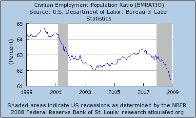
If there are any method-heads out there who want to tell me this isn’t as bad as it looks, I’m ready to listen.

Actually, I just thought of one.  The line looks like it drops to the bottom, but the scale starts at 61 and ends at 65.  Even still… method-heads?

(Found here, via Alas!)

Many of the polls that we have been consuming voraciously have not included people without a land line (like me).  In the figure below, we can see what a difference that makes in the results.  Yellow bars are polls that included cell phones and grey bars are polls that did not.  Those that excluded cell phones are significantly skewed towards McCain, and falsely so insofar as people without a landline vote.

From 538 via Thick Culture.

In her book, The Averaged Americans, Sarah Igo talks about the development of statistical methods.  Their development allowed for the emergence of the idea of an “average American.”  An idea that carried moral weight; “average” was “good.” 

Looking at the famous “Middletown” study, the Kinsey Reports, and the invention of polling, she discusses how methods aimed at identifying the average Amerian often reproduced preconceived notions of who was a real American.  In the Middletown study, Blacks were ignored because the researchers decided they didn’t count as average Americans.  Similarly, polling methodology is aimed at getting a representative sample, but representative of who?  Deciding who is being over- or under-represented in a sampling strategy is always a choice.

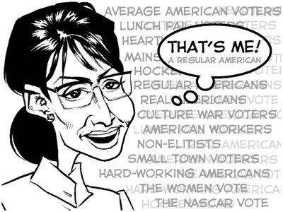
The invention of the “average American” as an idea is interesting in light of the McCain/Palin rhetoric about “main street” and “real America” and the way in which being a “typical” American is being framed as morally good (image from Stuff White People Do)


As with Middletown, the idea of the average American used by McCain/Palin is still racially-coded.  We Are Respectable Negroes lists 69 terms–including “regular folks,” “responsible Americans,” and “good hard-working people”–used by speakers in this election to mean middle-class white person.  Here are Palin’s words:

[youtube]http://www.youtube.com/watch?v=Vob9vFvojN8[/youtube]

Which brings me to Joe the Plumber.  Joe the Plumber, of course, is supposed to represent an “average” American.  But every in-group needs an out-group and, like all incarnations of the average, Joe has to be differentiated from the extremes, the non-average, the tails of the distribution: the blacks, the traitors, the poor, the Muslims, etc.  Here he is making exactly such an argument about Obama:

[youtube]http://www.youtube.com/watch?v=xw2Wczp9yOc[/youtube]

Indeed, convincing us that Obama is Other has been a central part of the McCain/Palin strategy (see here, here, a here, a here, here, here, here).

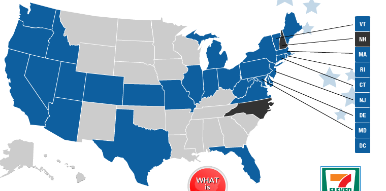
Apparently for the last several presidential elections 7-11 has had a “7-Election” marketing campaign, in which they offer blue and red coffee cups and customers “vote” by choosing one or the other. Here is a screenshot from the 7-Election 2008 website:

You can go to the website and see the “voting” results map (current as of this morning), which shows two states at 50/50 and every other state going for Obama:

If you go to the actual website, you can hover over each state and see what the % breakdown is.

Now, in and of itself, I just thought this was slightly interesting as an example of the commodification of political choice (“express your voting preference through a coffee cup!”), and I thought it could be used as an example of made-up statistics that are entirely meaningless. For instance, at the 7-11 near my house, I noticed they only have blue cups available, so it would be impossible to “vote” for McCain. Anyone with just some basic common sense could think of tons of problems with this as a real methodology–it didn’t even really seem worth my time to go into much detail about why a poll based on sale of coffee cups is unscientific and stupid.

But then I noticed something on the website: according to the website, results are reported weekly in USA Today (although I wasn’t able to find links to any weekly reports, which seemed odd). I know USA Today isn’t considered a high-quality newspaper by a lot of people, but still, it’s at least ostensibly reporting news. The 7-Election website also has a link to CNN, so perhaps they are partnering with them, too. Editor & Publisher ran a story on it. The results of a marketing scheme to sell coffee is being treated as news. I’m going to try to use it in class to discuss how things get defined as “newsworthy,” and who sets the agenda for what we’re going to talk about. Here we have a company getting free publicity for its marketing promotion because that marketing promotion has been declared “news.” What important information about the world is being ignored in favor of this? How does treating this as newsworthy legitimize it, as though these statistics are meaningful or accurate? Does that increase sales for 7-11?

I found a lot of comments on blogs where people claimed that after hearing about this campaign, they went out and bought coffee just to “vote” for their preferred candidate, and a few who said they refused to buy coffee because the store was out of the cups they wanted. I find this entire thing incredibly bizarre, and I don’t see why news outlets and individuals are buying into the idea that this is anything other than a way to convince more people to buy 7-11 coffee.

NEW!  In our comments, Penny pointed out that Baskin Robbins does the same thing.  Here are the results from this suspicously delicious poll as of the morning of Nov. 4th:

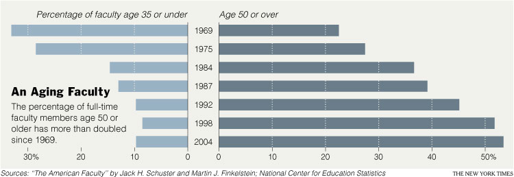
In a New York Times article today, Patricia Cohen describes the changing demographics of the American professoriate. It had two main points:

(1) Profs are WAY OLDER now then they used to be.

(2) The older ones appear to be more liberal than the younger ones, so we can expect academia to be more moderate as the older profs retire. This table shows how “liberal,” “moderate,” and “conservative” professors report being by age and academic field (click to enlarge so you can see it better).

Cohen summarizes this table as follows:

‘Self-described liberals are most common within the ranks of those professors aged 50-64, who were teenagers or young adults in the 1960s,’ they wrote, making up just under 50 percent. At the same time, the youngest group, ages 26 to 35, contains the highest percentage of moderates, some 60 percent, and the lowest percentage of liberals, just under a third.

I’m not sure I buy it.

First, notice that they’re comparing two groups (26-35 and 50-64) and making a claim about a trend instead of a claim about group difference. You can’t do that. Look at the data on the age group between them (36-49), they are all over the place, not neatly sitated between the age groups that sandwich them. (This also points to the always interesting question of how the data looks if you chop up your continuous variables–in this case, age–differently.)

Second, if you stick to group differences, they are comparing the youngest group and the second to oldest group in their data. Why? If you compare the youngest to the oldest group, the data looks a bit different.

Third, their interpretation of the overall “trend”–that is, the average difference across all fields–is obscuring some really interesting variation by subfield! So maybe the overall interpretation works for the social sciences, but wow look at the physical and biological sciences! Again, here we see a choice about reporting that obscures one finding in favor of another. The choice to emphasize averages/means/medians versus ranges/variety has consequences for how we understand our world.

Finally, there is the possibility that what it means to be “liberal,” “moderate,” and “conservative” differs in a systematic way across age groups. The reporter doesn’t address this at all.

There’s are also some really interesting assumptions about what counts as “political” in the article. Cohen points to the fact that quantitative research is somehow thought to be inherently less ideological than pure theory or qualitative research. And she quotes Marxist sociologist Erik Olin Wright saying: “in the late ’60s and ’70s, the Marxist impulse was central for those interested in social justice.” “Now,” Cohen adds, “it resides at the margins.” But it seems to me that it is Cohen who is assuming that quantitative research isn’t justice-oriented. Her example of a not-so-politicized younger professor is Sara Goldrick-Rab, also a sociologist, who says, “My generation is not so ideologically driven.” But whose projects, detailed in the story, include college opportunities for low-income students and the way that welfare reform decreased college attendance by the poor. Goldrick-Rab also complains about the lack of support for women academics who are also mothers. Those all sound damn political to me. But Cohen writes, partially quoting Goldrick-Rab: “They [older professors] want to question values and norms; ‘we [younger professors] are more driven by data.’ ” In this sentence, Cohen puts values and data on opposite ends of a spectrum. (It’s also interesting how she opposes Goldrick-Rab’s quote to her own words, we have no idea what Goldrick-Rab meant to oppose to being data-driven.)

I am troubled by the reproduction of the binary between “objective” and “normative” “science.”

I love, however, seeing the places and people of my alma mater described! Go Wisconsin!!!

The trouble is… people will answer them.

Found here thanks to commenter Phili-Chan! From an Australian show featuring Charles Firth.