methods/use of data


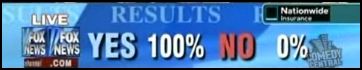
This clip from The Daily Show nicely illustrates how ridiculous and utterly meaningless the statistics we encounter can be:

This probably goes without saying, but there are multiple problems here:

1. Viewers of these shows are a self-selected group who are quite likely watching because they agree with the hosts to some degree, so it wouldn’t be surprising they’d agree with the hosts’ views.

2. Viewers who care enough to text are an even more unusual group, likely to be those who feel most passionately about an issue.

3. Only those people watching the show and are able to text right then are able to vote.

4. The wording of the questions is clearly intended to lead to a particular answer, using leading phrases like “are you outraged,” which responsible social scientists would never use–any question that uses something along the lines of “don’t you agree” or “wouldn’t you say that” makes it more likely the respondents will, indeed, agree with the point.

5. The hosts actively cajole viewers to give a specific answer if they aren’t getting as many of that answer as they wanted.

Of course, the hosts aren’t trying to present factual, useful information and almost certainly know very well that they’re manipulating questions to get results that will appear to overwhelmingly support their position. But we’re inundated with “statistics” such as these every day that are completely meaningless, but many many people don’t know how to evaluate them. This little clip shows some of the things a person should look for as an indication that a number was created to support a particular viewpoint and should be viewed with extreme skepticism, if not dismissed altogether.

Gwen Sharp is an associate professor of sociology at Nevada State College. You can follow her on Twitter at @gwensharpnv.

Headlines across the country recently noted that more Americans now consider themselves “pro-life” than ”pro-choice”. In the last month many polls have focused on Americans’ views on abortion, yet the Gallup poll released on May 15, 2009, got the most attention. President Obama was just about to give the commencement address at Notre Dame where a controversy had erupted; critics complained that a pro-choice politician should not have been granted an honorary degree at a Catholic institution.

The Gallup poll graphs below show the new divergence of opinion. Looking at the pattern over time, it is clear that opinions of pro-choice versus pro-life have been changing, although the trend between 1998 and 2008 is not remarkable in its variety. The change that the news signaled is that last switch in the apparent prevalence of pro-life opinions.

clip_image001

Sociologically, let’s look at this issue more closely. Opinions on abortion, its availability, one’s identification with the issue, and its legality are sensitive and controversial because they involve religious, political, and cultural values and very personal, often difficult situations.

Polls show a variety of support depending on the wording of the questions. Look at the poll results from the last month:

Gallup Poll (May 7-10, 2009. N=1,015 adults nationwide. Margin of Error ± 3).

“Do you think abortions should be legal under any circumstances, legal only under certain circumstances, or illegal in all circumstances?”

Legal Under any Circumstance Legal only under Certain Circumstances Illegal in all Circumstances Unsure
22% 53% 23% 2%

Quinnipiac University Poll (April 21-27, 2009. N=2,041 registered voters nationwide. Margin of Error ± 2.2).
“Do you think abortion should be legal in all cases, legal in most cases, illegal in most cases or illegal in all cases?”

Always Legal Usually Legal Usually Illegal Always Illegal Unsure
15% 37% 27% 14% 7%

The wording of the questions are only slightly different (circumstances versus cases) yet the results are quite different. Note that a only a minority hold that abortions should always be illegal. “Identity” issues also frame the debate. As the following polls show, when asked whether they consider themselves pro-life or pro-choice, respondents offered slightly different results.

Here’s something sociologists need to consider: We don’t know whether these differences are statistically significant. This rather important issue is not addressed in news reports on the Gallup Poll. It may be that we have equal percents of people in each category and the oscillations over time are not statistically significant. At the very least, the reported margin of error (MoE) shows that the percent of people in these groups may not be so different after all.

FOX News/Opinion Dynamics Poll (May 12-13, 2009. N=900 registered voters nationwide. MoE ± 3).

“On the issue of abortion, would you say you are more pro-life or more pro-choice?”

Pro-life Pro-Choice Both/Mix Unsure
49% 43% 6% 2%

Gallup Poll (May 7-10, 2009. N=1,015 adults nationwide. MoE ± 3).

“With respect to the abortion issue, would you consider yourself to be pro-choice or pro-life?”

Pro-choice Pro-life Mixed/Neither Don’t Know What Terms Mean Unsure
42% 51% 2% 4% 1%

CNN/Opinion Research Corporation Poll (April 23-26, 2009. N=2,019 adults nationwide. MoE ± 2).

“With respect to the abortion issue, would you consider yourself to be pro-choice or pro-life?”

Pro-choice Pro-life Unsure about Terms Mixed/Both/Neither Unsure
49% 45% 1% 3% 1%

Another way to look at abortion opinions is to ask about people’s legal opinions as this poll does. The CNN poll below asked specifically about the Roe v. Wade decision. Even if more people might identify themselves as pro-life, there is still a preponderance of support for the Supreme Court decision.

CNN/Opinion Research Corporation Poll (May 14-17, 2009. N=1,010 adults nationwide. MoE ± 3).

“The 1973 Roe versus Wade decision established a woman’s constitutional right to an abortion, at least in the first three months of pregnancy. Would you like to see the Supreme Court completely overturn its Roe versus Wade decision, or not?”

Yes, Overturn No, Not Overturn Unsure
30% 68% 1%

Here’s another piece of data to consider – the actual trends in abortions. Since the 1980s, the rates have leveled off thus abortion has not increased in use. The fact that it is has been decreasing and not increasing might lessen opinions about its availability.

clip_image002

To better understand how the pro-life and pro-choice opinions may be changing; take a look at these graphs from the Gallup poll and notice which lines are moving in which direction.

clip_image003

clip_image004

clip_image005

It seems pretty clear that more conservative, moderate, and Republican people are leaning more pro-life than they were in years past. How might we explain this? Republican leaders have stressed this issue in their attempt to solidify opposition to the Obama administration and the gains made by Democrats in the House and Senate.

From a sociological perspective, we can see that this issue is much more complex than a single headline. Before we can conclude that social change is happening, we need to examine the data available and whether our findings are statistically significant. What other methodological questions do you think we need to ask to better understand trends in public opinion?

————————–

Sally Raskoff is a blogger at the Everyday Sociology Blog and is an Associate Professor of Sociology at Los Angeles Valley College. One of her main goals in life is to demystify society through the use of sociology.

If you would like to write a post for Sociological Images, please see our Guidelines for Guest Bloggers.

Nanette D. informed us about the site Books that Make You Dumb, which uses a questionable methodology to correlate SAT scores at various colleges and universities with the books Facebook users from those schools list as their favorites, taking the 10 most popular from each school (there’s an explanation of the methodology at the website; the width of the bubble the names are in indicate the standard deviation in SAT scores). By seeing which books are listed by people at schools with higher overall SATs, we supposedly find out which books make people smarter or dumber:

booksthatmakeyoudumblarge

So Their Eyes Were Watching God, by the fabulous Zora Neale Hurston, makes you dumber than Gone with the Wind or A Million Little Pieces? Really?

Nanette says,

I think it reinforces a lot of ugly stereotypes about what type of person reads what type of literature, and the inherent “quality” of particular genres.

It’s a good point. There’s something interesting about designating certain types of books as “genre fiction,” which seems to be kind of a negative label, in general. Isn’t all literature technically part of a genre?

It’s all very Bourdieuian, really. To a great extent, what we read is a reflection of our class and our class is the number one predictor of our SAT score. So what is being measured (if anything) the way that class determines both our “taste” in literature and (or by way of) our educational achievements.

Aside from those issues, you could definitely have some fun talking about meaningless statistics and methodological issues with this graph. Just because you can find some statistics to correlate doesn’t mean they’re actually useful.

[Note: For the record, yes, I get it that the author was being kind of silly, and that he didn’t make up the genre classifications. The reason I find it interesting is that I think it reflects to some degree what a lot of people think–that certain types of books are inherently indicators of bad taste. I have friends who read fantasy and science fiction and get annoyed that it’s considered “genre fiction,” which they feel carries a negative connotation. Black authors have similarly complained about their books automatically going into the “African American literature” section at some bookstores rather than the mainstream “regular” fiction section. So mostly the image was a jumping off point for me thinking about how we often judge people by the types of books they read. And believe me, I’m not immune to this. When a relative gave me a set of three romance novels for Christmas a couple of years ago because I “like books,” I was perplexed. Though part of my confusion came from the fact that they were romance novels set among the Amish, and the concept of Amish romance novels had never in my life occurred to me. And then it turned out the relative didn’t know what they were; she had looked at the cover, saw a woman in the bonnet, and thought they were Little House on the Prairie books, which then left me with the question of why you would buy the Little House books for a 33 year old. But, you know, the thought that counts, etc. etc.]

Matthew Yglesias featured two figures from the Pew Economic Mobility project.  They show how long different types of people tend to take to recover from income loss (within 1 year, 2-4 years, or 5-10 years).

This figure shows that people who are older, have more education, or are poor, working, or middle class have a harder time recovering from tough economic times:

recovery

This figure shows how marital status is related to recovery.  Most dramatically, people who get married before recovering financially (especially men), women who split with a partner, and women who are single have a more difficult time recovering.

recoverygender

Something to consider: As several commenters noted, I’m not sure how they defined “recovery” from income loss.  If you never made a lot of money to begin with, does recovery simply mean returning to a state of low income?  Then, does the income for an initially high income person need to return to its high state for it be counted as a “recovery”?

(Just FYI: I revised my interpretation of these figures.  Thanks to the early commenters who noticed I’d misinterpreted.  It was really late at night when I wrote this post!)

—————————

Lisa Wade is a professor of sociology at Occidental College. You can follow her on Twitter and Facebook.

Andrew Gelman, over at FiveThirtyEight, presents a graph from data put together by Jeff Lax and Justin Phillips regarding opinions about various policies affecting gays and lesbians:

gay1

In another post, Nate Silver asks how public opinion about same-sex marriage might change if polls worded the question somewhat differently. Instead of asking “should the government allow same-sex couples to marry?”, we could just as well ask “should the government prevent same-sex couples from marrying?” He suggests that pro-gay-marriage groups might also frame the issue in this way–of keeping the government from taking away rights that people presumably already have rather than as the government giving new rights. It’s an interesting thought, and illustrates the role that question wording can play in affecting how survey respondents think about an issue.

UPDATE: Well, I was taken to task for not providing a better explanation of the graph. However, commenter Christopher explains it pretty well:

For each state, the status of seven public policies is listed as either pro- or anti-gay with seven colored circles which are either filled or empty with respect to the status. In addition, the position of the circle reflects the status of public opinion for each policy.

That is, each color represents one of the policies listed in the legend in the upper-left corner, so, for instance, red = public support for same-sex marriage. If the dot is filled in, it means gay-friendly legislation about the issue was actually passed in the state. If the dot is an empty circle, it means no gay-friendly legislation exists in the state. And the position of the circle tells you what percent of people in each state support each policy.

Jim C. sent us this graphic designed to illustrate a proposal to reduce the lanes on Jarvis Street in Toronto from five to four (Globe and Mail, May 22, 2009, p. A12).   As Jim points out, the text of the graphic describes the proposal accurately, and even points out that the graphic misrepresents the change, but the graphic itself still gives the impression that the reduction will be to two, not four lanes.

jarvisbikelanes2

It is a good example of how much graphics matter. Even with the text, it is potentially misleading.  Such misrepresentation can also be purposeful and political.  Jim speculates that this is the case here:

As is often the case whenever there are modest efforts to make space on city streets for pedestrians and cyclists, right-wing councillors (and affluent commuters) raised the spectre of traffic chaos and a ‘war on the car’.

If you’re interested in comparing the representation of this proposal by the Globe with its representation in the proposal itself, check out the final page of the proposal.  Thanks to Nick J. B. in the comments for the link.

—————————

Lisa Wade is a professor of sociology at Occidental College. You can follow her on Twitter and Facebook.

The contact hypothesis postulates that being near people of a different social group (e.g., race, class, sexual orientation, etc) translates into greater tolerance for that type of person. In other words, it’s harder to hate all Latinos (for example) when your neighbor is Latino and, damn it, you kind of like him.  Andrew Sullivan posted this figure:

6a00d83451c45669e2011570b1f019970b-800wi

Jose at Thick Culture suggests that this could be evidence for the contact hypothesis.  But he also asks whether it might also be true that less homophobic people are more likely to come into contact with gays and lesbians because of a third variable that correlates with both (like choosing to live in a big city), making the relationship spurious.

(What’s a spurious relationship?  Here’s one:  People who eat ice cream are more likely to drown.  Both incidence of ice cream eating and rates of drowning are related to summertime.  The relationship between ice cream and drowning is spurious.  That is, there is no relationship.  Yet they appear related because they are both related to a third variable.)

—————————

Lisa Wade is a professor of sociology at Occidental College. You can follow her on Twitter and Facebook.

The graph below reveals the percent of before-tax income given to charity by class (separated into fifths):

giving

There is a positive correlation between income and absolute giving (the higher their income, the more money they donate), but a negative correlation between income and relative giving (as incomes go down, households donate a higher and higher percentage of their income).

From Chris Uggen’s weblog via.

—————————

Lisa Wade is a professor of sociology at Occidental College. You can follow her on Twitter and Facebook.