methods/use of data

Using the same OECD data set that produced this graph on time spent eating and BMI, Floyd Norris at the New York Times brings us a new finding. The “10 countries where people spend less than 100 minutes eating and drinking each day have, as a group, consistently shown higher economic growth than those that took more than 100 minutes to savor their daily repasts.”
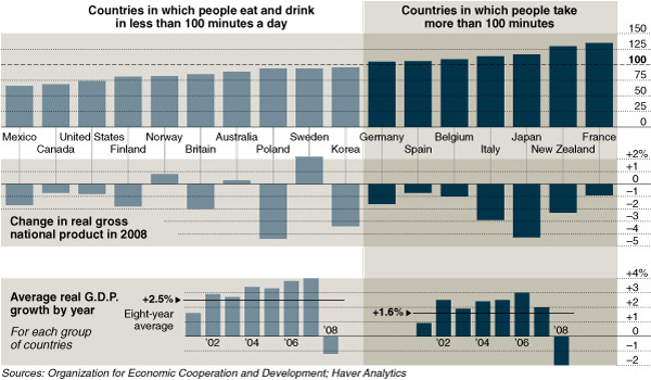
eatquicklyAs before, the statistics are far from conclusive, but the data continues to invite a discussion about food and culture.

It also invites a discussion of atheoretical data analysis. Last year, Chris Anderson’s article in Wired Magazine (The End of Theory: The Data Deluge Makes the Scientific Method Obsolete) argued that our ability to generate vast amounts of data, made theory unnecessary, and that scientists were starting to look at correlations as a sufficient analysis level of analysis.

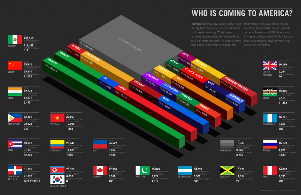
From the folks at Good Magazine, a “look at the 20 countries from which the most people came to America in 2008,” including how many were immediate relatives of US citizens, and how many received asylum, based on data from the Department of Homeland Security.

trans0509whoiscomingtoamerica

Does anyone know why data from North Korea and South Korea is combined? How can country be “unknown” for so many?

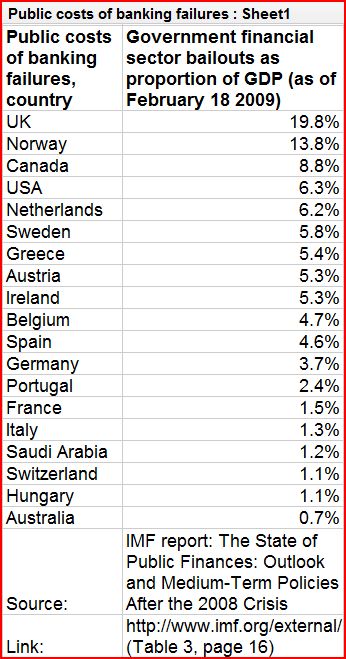
The Guardian is now making all of the data it uses in its stories available for free online. You can browse their data on subjects as wide ranging as imports and exports of plastic bags, reported amounts of exercise, and the best selling singles of 2008 at their Data Store. As one example, I’ve pasted in 20 government financial bail outs as a percentage of their GDP:


capture10

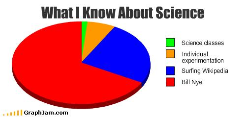
If you’re teaching methods this semester and go over pie charts or proportions, many of your students were raised on Bill Nye, the Science Guy.  They might get a kick out of this:
untitled
This one’s for you, Bill!

More fun illustrations for methods classes here and here.

(Found here.)

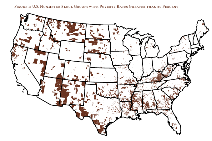
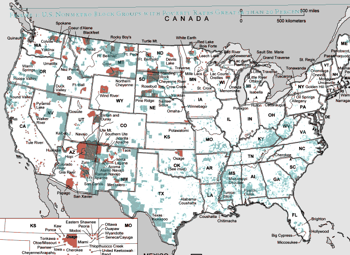
Daniel T. Lichter and Domenico Parisi provide a couple of interesting images using 2000 Census data in a recent article about rural poverty. They use Census block-group data (block-groups are significantly smaller than counties) to identify non-metro areas of concentrated poverty. This map shows all block-groups with more than 20% poverty in 2000:

picture-17

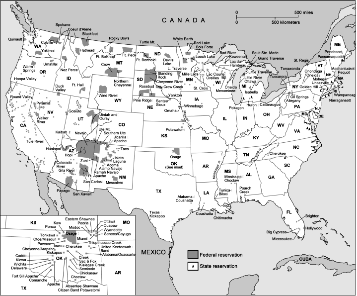
If you overlaid this map onto a map of American Indian reservations, you’d notice that many of these high-poverty block-groups are on reservations–particularly in the Dakotas, Idaho, Montana, Arizona, and New Mexico.

UPDATE: Here’s a map of state and federal reservations put out by Pearson (you can find very detailed maps of individual reservations at the Census Bureau):

indian91

And TOTALLY AWESOME reader Matt Wirth overlaid the poverty map on the reservations map. The two maps weren’t exactly the same so some of the state outlines don’t line up perfectly, but you can get a good sense of how high-poverty block-groups (blue areas) and reservations (red areas) overlap:

poverty-over-20-and-indian-reservations

Clearly there are many poor block-groups in the west that aren’t associated with reservations, but we see an awful lot of overlap of blue on red, as well as in the regions directly surrounding reservations. Thanks so much, Matt!

We also see a band of high-poverty block-groups in border counties in Texas with high numbers of Latino residents, and of course the band along the Mississippi River and through the Black Belt up to North Carolina, and the ever-present Appalachian section.

Another note about the map: As Lichter and Parisi point out, if they had mapped poverty at the county level instead of the block-group level, many of these areas of high poverty would not have shown up. These are areas of concentrated poverty in counties that are not, overall, particularly poor. The authors note that studies of poverty that look at county-level data often miss isolated rural areas with extremely high poverty rates.

On a side note, see that little blotch of brown in north-central Oklahoma? That’s where I grew up! According to the 2000 Census, my specific hometown has a 17.6% individual poverty rate and the median home value is $24,400. That doesn’t matter to you, I know, but it does make me acutely aware of the problems of rural poverty.

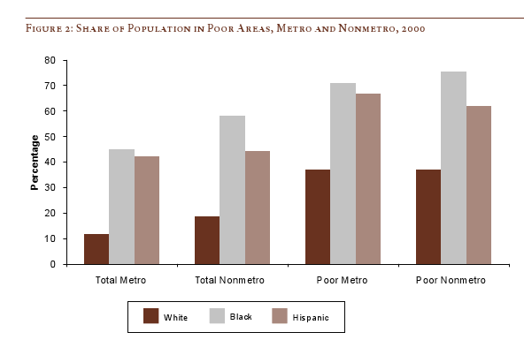
The following bar graph shows how geographically concentrated poverty is among three racial groups. The graph shows what percent live in Census blocks of concentrated poverty–that is, areas where 20% or more of the population is poor (20% is the standard baseline among researchers for defining an area as “high poverty”):

picture-26

Clearly, in both metro and non-metro areas, a much higher percentage of all Blacks and Hispanics (both the poor and non-poor) than Whites live in areas of concentrated poverty. Notice (in the last two sets of bars) that less than 40% of poor Whites live in neighborhoods with such high proportions of poverty, whereas the vast majority of both Blacks and Hispanics who are poor live in areas where many of their neighbors are poor as well.

Lichter and Parisi argue that the concentration of poverty matters, particularly when it indicates that the poor are socially isolated. Such isolation can mean lack of access to social services, decent schools, and the types of social networks that provide job leads, recommendations, and so on. This type of social isolation can be much more harmful than being poor in and of itself, a topic also investigated by William Julius Wilson in When Work Disappears: The World of the New Urban Poor and The Truly Disadvantaged.

From “Concentrated Rural Poverty and the Geography of Exclusion,” Rural Realities, Fall 2008, p. 1-7, available from the Rural Sociological Society.

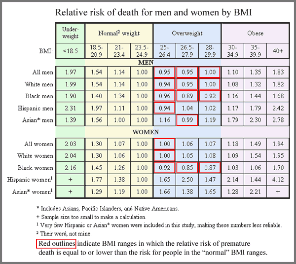
Much of the discourse around the benefits of being thin revolves around the assumption that extra pounds are harmful to health.  Ampersand at Alas A Blog posted about a study in the New England Journal of Medicine (citation below) that shows that  those who are overweight (according to the BMI scale) are not at a higher risk of premature death than those who are deemed of “normal” weight.   The boxes in red are categories in which the risk for premature death is equal to or less than the reference group (normal weight people).

rr_by_bmi_large

This is Ampersand’s conclusion (and his table, too).

The authors of the study, as commenter A.C. pointed out,  come to the opposite conclusion.  They argue, after looking at the data in different ways, say that overweight persons are at a higher risk for death.

Ampersand doesn’t buy it.  He offers a critique here where, among other things, he points out:

In order to produce the finding that “overweight” is less healthy than “normal weight,” Dr. Adams did a very dishonest statistical manipulation – he compared just one “normal” BMI range, representing the heaviest people in the “normal” range, to the entire “overweight” range. This is because the majority of people in the “normal weight” categories had a greater risk of death than the majority of people in the “overweight” category.

This might be a great way to discuss how methods and statistics never speak for themselves.

Relatedly, this post offers a really great visual critique of the BMI scale.

Citation:  Adams, K., et al., “Overweight, Obesity, and Mortality in a Large Prospective Cohort of Persons 50 to 71 Years Old.” New England Journal of Medicine, 2006. 355(8): p. 763-8.  Here if you have a subscription to ProQuest.

We used to have a post up about Milgram’s famous obedience study, in which he led people to think they were giving other participants electric shocks, including some that were supposedly at a fatal level. It’s often used as an example of unethical research, since some participants suffered mental distress because they thought they had seriously hurt or even killed someone. We took the original post down when the videos we linked to disappeared, but I just found another video of some footage. For some reason it won’t embed, but here’s a link.

UPDATE: The original footage has been taken down, but the BBC did a replication:

Via.