methods/use of data

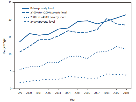
At Flowing Data, the Venn Diagram illustrated by a platypus playing a keytar. Go there.

Lisa Wade, PhD is an Associate Professor at Tulane University. She is the author of American Hookup, a book about college sexual culture; a textbook about gender; and a forthcoming introductory text: Terrible Magnificent Sociology. You can follow her on Twitter and Instagram.

Cross-posted at Family Inequality.

Poverty is usually described as a status, as there are people below and above the poverty line. We need to do more to capture and represent the experience of poverty.

There are ways this can be done even in a single survey question, such as this one: ”During the past 12 months, was there any time when you needed prescription medicine but didn’t get it because you couldn’t afford it?” Below are the percentages answering affirmatively, by official poverty-line status.

Percentage of Adults Aged 18-64 Who Did Not Get Needed Prescription Drugs Because of Cost, by Poverty Status (National Health Interview Survey, 1999-2010)

This is not the same as not having any of the prescription drugs you need. What it indicates is economic insecurity rather than deprivation per se, a more nuanced measure than simply being above or below (some percentage of) the poverty line.

Cross-posted at Family Inequality.

Things that make you say… “peer review”?

This is the time of year when I expect to read inflated or distorted claims about the benefits of marriage and religion from the National Marriage Project. So I was happy to see the new State of Our Unions report put out by W. Bradford Wilcox’s outfit. My first reading led to a few questions.

First: When they do the “Survey of Marital Generosity” — the privately funded, self-described nationally-representative sample of 18-46-year old Americans, which is the source of this and several other reports, none of them published in any peer-reviewed source I can find — do they introduce themselves to the respondents by saying, “Hello, I’m calling from the Survey of Marital Generosity, and I’d like to ask you a few questions about…” If this were the kind of thing subject to peer review, and I were a reviewer, I would wonder if the respondents were told the name of the survey.

Second: When you see oddly repetitive numbers in a figure showing regression results, don’t you just wonder what’s going on?

Here’s what jumped out at me:

If a student came to my office with these results and said, “Wow, look at the big effect of joint religious practice on marital success,” I’d say, “Those numbers are probably wrong.” I can’t swear they didn’t get exactly the same values for everyone except those couples who both attend religious services regularly — 50 50 50, 13 13 13 , 50 50 50, 21 21 21 — in a regression that adjusts for age, education, income, and race/ethnicity, but that’s only because I don’t swear.*

Of course, the results are beside the point in this report, since the conclusions are so far from the data anyway. From this figure, for example, they conclude:

In all likelihood,  the experience of sharing regular religious attendance — that  is, of enjoying shared rituals that endow one’s marriage with transcendent significance and the support of a community  of family and friends who take one’s marriage seriously— is a solidifying force for marriage in a world in which family life is  increasingly fragile.

OK.

Anyway, whatever presumed error led to that figure seems to reoccur in the next one, at least for happiness:

Just to be clear with the grad student example, I wouldn’t assume the grad student was deliberately cooking the data to get a favorable result, because I like to assume the best about people. Also, people who cook data tend to produce a little more random-looking variation. Also, I would expect the student not to just publish the result online before anyone with a little more expertise had a look at it.

Evidence of a pattern of error is also found in this figure, which also shows predicted percentages that are “very happy,” when age, education, income and race/ethnicity are controlled.

Their point here is that people with lots of kids are happy (which they reasonably suggest may result from a selection effect). But my concern is that the predicted percentages are all between 13% and 26%, while the figures above show percentages that are all between 50% and 76%.

So, in addition to the previous figures probably being wrong, I don’t think this one can be right unless they are wrong. (And I would include “mislabeled” under the heading “wrong,” since the thing is already published and trumpeted to the credulous media.)

Publishing apparently-shoddy work like this without peer review is worse when it happens to support your obvious political agenda. One is tempted to believe that if the error-prone research assistant had produced figures that didn’t conform to the script, someone higher up might have sent the tables back for some error checking. I don’t want to believe that, though, because I like to assume the best about people.

* Just kidding. I do swear.

Cross-posted at Montclair SocioBlog.

The best way to lie with statistics, says Andrew Gelman, is just lie.  This graph from Fox news is a visual version of that.  It’s published at Flowingdata.com via Media Matters.

The numbers are correct, but the Foxy graphmongers are making up the Y-axis as they go along.  The 8.6% of November is higher than than 8.8%, 8.9%, and maybe even the 9.0% of the first three months of the year.

Or maybe it’s an optical illusion.

[HT:  Max Livingston]

Cross-posted at Montclair SocioBlog.

If your survey doesn’t find what you want it to find . . .

. . . say that it did.

Doug Schoen is a pollster who wants the Democrats to distance themselves from the Occupy Wall Street protesters.   (Schoen is Mayor Bloomberg’s pollster.  He has also worked for Bill Clinton.)  In the Wall Street Journal,  he reported on a survey done by a researcher at his firm.  She interviewed 200 of the protesters in Zucotti Park.

Here is Schoen’s overall take:

What binds a large majority of the protesters together—regardless of age, socioeconomic status or education—is a deep commitment to left-wing policies: opposition to free-market capitalism and support for radical redistribution of wealth, intense regulation of the private sector, and protectionist policies to keep American jobs from going overseas.

I suppose it’s nitpicking to point out that the survey did not ask about SES or education.  Even if it had, breaking the 200 respondents down into these categories would give numbers too small for comparison.

More to the point, that “large majority” opposed to free-market capitalism is 4% — eight of the people interviewed.  Another eight said they wanted “radical redistribution of wealth.”  So at most, 16 people, 8%, mentioned these goals.  (The full results of the survey are available here.)

What would you like to see the Occupy Wall Street movement achieve? {Open Ended}

35% Influence the Democratic Party the way the Tea Party has influenced the GOP
4% Radical redistribution of wealth
5% Overhaul of tax system: replace income tax with flat tax
7% Direct Democracy
9% Engage & mobilize Progressives
9% Promote a national conversation
11% Break the two-party duopoly
4% Dissolution of our representative democracy/capitalist system
4% Single payer health care
4% Pull out of Afghanistan immediately
8% Not sure

Schoen’s distortion reminded me of this photo that I took on Saturday (it was our semi-annual Sociology New York Walk, and Zucotti Park was our first stop).

The big poster in the foreground, the one that captures your attention, is radical militance — the waif from the “Les Mis” poster turned revolutionary.  But the specific points on the sign at the right are conventional liberal policies — the policies of the current Administration.

There are other ways to misinterpret survey results.  Here is Schoen in the WSJ:

Sixty-five percent say that government has a moral responsibility to guarantee all citizens access to affordable health care, a college education, and a secure retirement—no matter the cost.

Here is the actual question:

Do you agree or disagree with the following statement: Government has a moral responsibility to guarantee healthcare, college education, and a secure retirement for all.

“No matter the cost” is not in the question.  As careful survey researchers know, even slight changes in wording can affect responses.  And including or omitting “no matter the cost” is hardly a slight change.

As evidence for the extreme radicalism of the protestors, Schoen says,

By a large margin (77%-22%), they support raising taxes on the wealthiest Americans,

Schoen doesn’t bother to mention that this isn’t much different from what you’d find outside Zucotti Park.  Recent polls by Pew and Gallup find support for increased taxes on the wealthy ($250,000 or more) at 67%.  (Given the small sample size of the Zucotti poll, 67% may be within the margin of error.)  Gallup also finds the majorities of two-thirds or more think that banks, large corporations, and lobbyists have too much power.

Thus Occupy Wall Street is a group of engaged progressives who are disillusioned with the capitalist system and have a distinct activist orientation. . . . .Half (52%) have participated in a political movement before.

That means that half the protesters were never politically active until Occupy Wall Street inspired them.

Reading Schoen, you get the impression that these are hard-core activists, old hands at political demonstrations, with Phil Ochs on their iPods and a well-thumbed copy of “The Manifesto” in their pockets.  In fact, the protesters were mostly young people with not much political experience who wanted to work within the system (i.e., with the Democratic party) to achieve fairly conventional goals, like keeping the financial industry from driving the economy into a ditch again.

And according to a recent Time survey, more than half of America views them favorably.

The U.S. Census Bureau reported last week that there were 46.2 million people in poverty in 2010, out of a population of 305.7 million. That is 15.1%, or if you prefer whole numbers, call it 151 out of every 1,000.

Most news reports seem to prefer reducing the rate to a numerator of one — which makes sense since it uses the smallest whole number possible, for your mental image. In that case, you could accurately call it one out of every 6.6, but no one did. Like the Washington Post and NPR, most called it some version of “nearly one in six.” That’s OK, if you’re willing to call 15.1 “nearly 16.7.”

Using percentages, here’s the difference:

A substantial minority of reports on the poverty report took the low road of rounding the fraction in the direction of their slant on the story. Some reports just went with “one in six,” including people on the political left who may be inclined to enlarge the problem, such as Democracy Now and the labor site American Rights at Work.

On the right, the Heritage Foundation’s Robert Rector and Rachel Sheffield called it “one in seven” in a column carried by the Boston Herald and others. (Their point, repeated here when the new numbers came out, is that the poor aren’t really poor anymore since they have many more amenities than they used to.) That’s cutting 15.1% down to 14.3%, which is actually closer to the truth than 16.7%:

It’s not that far off, but if your story is about the increase in poverty rates, it’s unfortunate to round down exactly to last year’s rate: 14.3%.

Then there are the people who may have just gotten stuck on the math and couldn’t decide which way to go, like the columnist who called it “essentially one in six” (which was ironic, because the point of his post was, “That’s the nice thing about most statistics, handled deftly, they can say just about anything you want them to.”) In some cases headline writers seem to have been the culprits, shortening the writer’s “almost one in six” to just “one in six.”

The worst exaggeration was from Guardian correspondent Paul Harris, who wrote, “the US Census Bureau has released a survey showing that one in six Americans now live in poverty: the highest number ever reported by the organisation.” The number — 46.2 million — is the highest ever reported, but the percentage was higher as recently as 1993.

If the point is to conjure an image that helps make the number seem real to people, it probably doesn’t matter — you may as well just go for accuracy and say “fifteen percent.” (You definitely shouldn’t use pie charts, which are hard for viewers to judge.) That’s because most people can’t immediately make an accurate mental image of either six or seven — after four they count. But I could be wrong about that. Consider these images — would the choice of one over the other change your opinion about the poverty problem?

They both create a reasonable image. But the choices people made are revealing about their biases  — and the unfortunate state of numeracy in America. Because it does matter that the number of people in poverty rose by 2,611,000.

Maybe more important is who and where these poor people are. Here’s two other ways of representing it, with very different implications.

Fifteen percent over there:

Fifteen percent spread according to a random number generator:

Note that those are just abstractions for visualizing the overall percentage of poverty. But there is a real geographic distribution of rich and poor, described in recent research by Sean Reardon and Kendra Bischoff (free version here). They found that, not surprisingly, as income inequality has grown, so has income segregation — the tendency of rich and poor to live in different parts of town. And that probably makes reality even more abstract — and more subject to media construction — for people who aren’t poor.

Kelsey C. sent in a some great data from the Bureau of Labor Statistics that helps illustrate why variance matters as much as a measure of the average.  The figure shows the median income by race and education level, as well as the typical earnings of each group’s members in the third quartile (or the 75th percentile) and first quartile (or the 25th percentile).  What you see is that the median earnings across these groups is different, but also that the amount of inequality within each group isn’t consistent.  That is, some groups have a wider range of income than others:

So, Asians are the most economically advantaged of all groups included, but they also have the widest range of income.  This means that some Asians do extremely well, better than many whites, but many Asians are really struggling.  In comparison, among Blacks and Hispanics, the range is smaller.  So the highest earning Blacks and Hispanics don’t do as well relative to the groups median as do Whites and Asians.

Likewise, dropping out of high school seems to put a cap on how much you can earn; as education increases it raises the floor, but it also raises the variance in income. This means that someone with a bachelors degree doesn’t necessarily make craploads of money, but they might.

Lisa Wade, PhD is an Associate Professor at Tulane University. She is the author of American Hookup, a book about college sexual culture; a textbook about gender; and a forthcoming introductory text: Terrible Magnificent Sociology. You can follow her on Twitter and Instagram.

Cross-posted at Montclair SocioBlog.

Is the SAT biased?  If so, against who is it biased?

It has long been part of the leftist creed that the SAT and other standardized tests are biased against the culturally disadvantaged – racial minorities, the poor, etc.  Those kids may be just as academically capable as more privileged kids, but the tests don’t show it.

But maybe SATs are biased against privileged kids.  That’s the implication in a blog post by Greg Mankiw.  Mankiw is not a liberal.  In the Bush-Cheney first term, he was the head of the Council of Economic Advisors.  He is also a Harvard professor and the author of a best-selling economics text book.  Back in May he had a blog post called “A Regression I’d Like to See.” If tests are biased in the way liberals say they are, says Mankiw, let’s regress GPA on SAT scores and family income.  The correlation with family income should be negative.

…a lower-income student should do better in college, holding reported SAT score constant, because he managed to get that SAT score without all those extra benefits.

In fact, the regression had been done, and Mankiw added this update:

Todd Stinebrickner, an economist at The University of Western Ontario, emails me this comment:

“Regardless, within the income groups we examine, students from higher income backgrounds have significantly higher grades throughout college conditional on college entrance exam . . . scores.” [Mankiw added the boldface]

What this means is that if you are a college admissions officer trying to identify the students who will do best in college, as measured by grades, you would give positive rather than negative weight on family income.

Not to give positive weight to income, therefore, is bias against those with higher incomes.

To see what Mankiw means, look at some made-up data on two groups.  To keep things civil, I’m just going to call them Group One and Group Two.  (You might imagine them as White and Black, Richer and Poorer, or whatever your preferred categories of injustice are.  I’m sticking with One and Two.)  Following Mankiw, we regress GPA on SAT scores.  That is, we use SAT scores as our predictor and we measure how well they predict students’ performance in college (their GPA).

In both groups, the higher the SAT, the higher the GPA.  As the regression line shows, the test is a good predictor of performance.  But you can also see that the Group One students are higher on both.  If we put the two groups together we get this.

Just as Mankiw says, if you’re a college admissions director and you want the students who do best, at any level of SAT score, you should give preference to Group One.  For example, look at all the students who scored 500 on the SAT (i.e., holding SAT constant at 500).  The Group One kids got better grades than did the Group Two kids.  So just using the SATs, without taking the Group factor (e..g., income ) into account, biases things against Group One.  The Group One students can complain: “the SAT underestimates our abilities, so the SAT is biased against us.”

Case closed?  Not yet.  I hesitate to go up against an academic superstar like Mankiw, and I don’t want to insult him (I’ll leave that to Paul Krugman).  But there are two ways to regress the data.  So there’s another regression, maybe one that Mankiw does not want to see.

What happens if we take the same data and regress SAT scores on GPA?  Now GPA is our predictor variable.  In effect, we’re using it as an indicator of how smart the student really is, the same way we used the SAT in the first graph.

Let’s hold GPA constant at 3.0.  The Group One students at that GPA have, on average, higher SAT scores.  So the Group Two students can legitimately say, “We’re just as smart as the Group One kids; we have the same GPA.  But the SAT gives the impression that we’re less smart.  So the SAT is biased against us.”

So where are we?

  • The test makers say that it’s a good test – it predicts who will do well in college.
  • The Group One students say the test is biased against them.
  • The Group Two students say the test is biased against them.

And they all are right.

————————

Huge hat tip to my brother, S.A. Livingston.  He told me of this idea (it dates back to a paper from the1970s by Nancy Cole) and provided the made-up data to illustrate it.  He also suggested these lines from Gilbert and Sullivan:

And you’ll allow, as I expect
That they are right to so object
And I am right, and you are right
And everything is quite correct.