methods/use of data

Keeping a trend in perspective.

The sociologist down the hall pointed out that yesterday’s chart gave the impression of a whopping increase in TANF (Temporary Assistance to Needy Families) support for poor families. But I have been complaining since December 2008 that the welfare system is not responding adequately to the recession’s effects on poor single mothers and their children. I wrote then:

We now appear headed back toward a national increase in TANF cases. But the restrictive rules on work requirements and time limits are keeping many families that need assistance out of the program…. If the government can extend unemployment benefits during the crisis, why not impose a moratorium on booting people from TANF?

So it does seem contradictory that I would post a chart yesterday showing a huge increase in TANF family recipients, and continue the same complaint. So let me put it in better perspective. It’s a good lesson for me on the principles of graphing data, which I have made a point of picking on others for.

Height and width

There were two problems with yesterday’s chart. First, the vertical scale only ran from 1.6 million to 1.9 million families. Second, the horizontal scale only ran for 26 months. I’ll correct each aspect in turn to show their effects. Here’s yesterday’s chart:

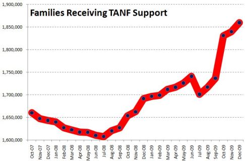
It sure looks like a dramatic turnaround. And any turnaround is a big deal. I wrote last year:

What should be striking in this is that the rolls are increasing even as the punitive program rules continue to pull aid from families according to the draconian term limits dreamed up by Gingrich, ratified by Clinton and endorsed by Obama — 2 years continuous, 5 years lifetime in the program. The current stimulus package includes more money for TANF, to help cover an expected growth in families applying — but no rule change to permit families to keep their support in the absence of available jobs.

But, run the vertical axis down to zero, and the same trend is not so dramatic:

Now the big bounce since July 2008 is put in perspective. We’ve seen a 16% increase since that bottom point, but the response seems much more modest in light of the size and impact of the Great Recession we’ve come to know.

In fact, though, the longer-term view underscores how paltry that response has really been. Back the chart up to 1996, and you can see how small the increase has been compared with the pre-draconian reform period:

All three images are correct, but their emphasis is different. To me, the important take-home message from this trend is, “That’s it? The greatest economic recession since the Great Depression, and our welfare response was that measly uptick? Our system really is a shambles.”

One important issue remains, however, and that is some measure of the need for welfare. So consider the number of single-parent families below the poverty line, compared with the number of families receiving TANF (formerly AFDC):

Now the story is much more clear.

After welfare reform in 1996, the number of families receiving welfare was cut by half in just a few years. At the same time, however, the number in poverty dropped. Since then, as the number in poverty has increased, the number on welfare has not. The two trends appeared to be uncoupled through most of the 2000s. In the last year we’ve seen the first increase in TANF numbers since 1996, but nowhere near enough to meet the increase in poor single-parent families.*

It is still the case that, although the stimulus bill allocated more money to TANF, the punitive rules and term limits have not been changed. So the system does not address longer-term poverty — something we should expect to see much more of in the next few years.

*We don’t have the official 2009 poverty rates yet, since they are compiled from a survey done in March 2010, to be released this fall.

Philip Cohen, PhD, is a professor of sociology at the University of North Carolina at Chapel Hill, where he teaches classes in demography, social stratification, and the family.  You can visit him at his blog, Family Inequality, and see his previous posts on SocImages here, here, and here.

Lisa Wade, PhD is an Associate Professor at Tulane University. She is the author of American Hookup, a book about college sexual culture; a textbook about gender; and a forthcoming introductory text: Terrible Magnificent Sociology. You can follow her on Twitter and Instagram.

The new Pew Research Center report on the changing demographics of American motherhood (discovered thanks to a tip by Michael Kimmel) reveals some pretty dramatic changes in the ideal family size between 1990 and 2008.  In the late 1960s and early ’70s, two suddenly overtook three and four or more and it’s never looked back:

Here are today’s preferences (notice how few people want to remain childless or only have one child):

I’d love to hear ideas as to why this change happened at that moment in history.  Is it possible that the introduction of the contraceptive pill, which was the most effective method of contraception that had ever been available to women (I think that’s true), made smaller families an option and that people became interested in limiting family size once they knew that could actually do it?

Interestingly, people still overwhelmingly say that they want children because they bring “joy.”  But apparently two bundles of joy are enough!

UPDATE! A number of commenters have pointed out that both I and the authors of the study are conflating people’s opinions about ideal family size and the number of children they personally want to have (see the second figure especially).  I think they’re right that asking the question “What is the ideal family size?” will not necessarily get the same response as “How many children do you want to have?”   A very nice methodological point.

For more on this data, see our posts on age and racetrends in American motherhood.

—————————

Lisa Wade is a professor of sociology at Occidental College. You can follow her on Twitter and Facebook.

You might have heard that the U.S. added 290,000 jobs in April.  At the same time, the unemployment rate rose!  Bwhat!?

The unemployment rate doesn’t measure how many people are unemployed.  It sounds like it should, being that it includes the words “unemployment” and “rate” and all, but it doesn’t.  Instead, the unemployment rate measures how many people are looking for jobs.  When things are really bad, some people get discouraged and give up, or go to school instead, or stay home to take care of their kids and save day care money.

So the number of jobs and the unemployment rate are not directly correlated.  Ezra Klein posted this visual:

It shows unemployment rising as job growth remains negative, leveling off as (perhaps) people drop out of active job seeking, and than actually going up again there at the end in response to two months of solid job growth.

So it turns out that, in this case, a rise in the unemployment rate is good news.  It means some people are hopeful again.

Lisa Wade, PhD is an Associate Professor at Tulane University. She is the author of American Hookup, a book about college sexual culture; a textbook about gender; and a forthcoming introductory text: Terrible Magnificent Sociology. You can follow her on Twitter and Instagram.

PART ONE:

Drinking lowers your GPA. So do smoking, spending time on the computer, and probably other forms of moral dissolution. That’s the conclusion of a survey of 10,000 students in Minnesota.

Inside Higher Ed reported it, as did the Minnesota press with titles like “Bad Habits = Bad Grades.” Chris Uggen reprints graphs of some of the “more dramatic results” (that’s the report’s phrase, not Chris’s). Here’s a graph of the effects of the demon rum.

Pretty impressive . . . if you don’t look too closely. But note: the range of the y-axis is from 3.0 to 3.5.

I’ve blogged before about “gee whiz” graphs , and I guess I’ll keep doing so as long as people keep using them. Here are the same numbers, but the graph below scales them on the traditional GPA scale of 0 to 4.0.

The difference is real – the teetotalers have a B+ average, heaviest drinkers a B. But is it dramatic?

I also would like finer distinctions in the independent variable, but maybe that’s because my glass of wine with dinner each night, six or seven a week, puts me in the top category with the big boozers. I suspect that the big differences are not between the one-drink-a-day students and the teetotalers but between the really heavy drinkers – the ones who have six drinks or more in a sitting, not in a week– and everyone else.

—————————-

PART TWO:

Some time ago, the comments on a post here brought up the topic of the “gee whiz graph.” Recently, thanks to a lead from Andrew Gelman, I’ve found another good example in a recent paper.

The authors, Leif Nelson and Joseph Simmons, have been looking at the influence of initials. Their ideas seem silly at first glance (batters whose names begin with K are more likely to strike out), like those other name studies that claim people named Dennis are more likely to become dentists while those named Lawrence or Laura are more likely to become lawyers

But Nelson and Simmons have the data. Here’s their graph showing that students whose last names begin with C and D get lower grades than do students whose names begin with A and B.

The graph shows an impressive difference, certainly one that warrants Nelson and Simmon’s explanation:

Despite the pervasive desire to achieve high grades, students with the initial C or D, presumably because of a fondness for these letters, were slightly less successful at achieving their conscious academic goals than were students with other initials.

Notice that “slightly.” To find out how slight, you have to take a second look at the numbers on the axis of that gee-whiz graph. The Nelson-Simmons paper doesn’t give the actual means, but from the graph it looks as though he A students’ mean is not quite 3.37. The D students average between 3.34 and 3.35, closer to the latter. But even if the means were, respectively, 3.37 and 3.34, that’s a difference of a whopping 0.03 GPA points.

When you put the numbers on a GPA axis that goes from 0 to 4.0, the differences look like this.

According to Nelson and Simmons, the AB / CD difference was significant (F = 4.55, p < .001). But as I remind students, in the language of statistics, a significant difference is not the same as a meaningful difference.

Yes, but not, perhaps, as non-religious as you might think.

A study just published in Sociology of Religion, by Neil Gross and Solon Simmons, reported that about 3/4ths of professors report some belief in God or a higher power.  About 35% of professors are absolutely certain that God exists, while 21% believe, but are not absolutely sure.

Only 10% of professors are athiests and another 13 percent are agnostic.

So, is 23 percent many or only a few non-believers?

On the one hand, it may seem like very few if you consider that the professoriate is routinely characterized as radically liberal and anti-religious.  As Shannon Golden at Contexts Crawler says:

Devout parents often worry about the “secularizing” effects of sending their children off to college. They envision professors pushing secular thoughts and anti-religious values on their impressionable students.

Despite the stereotype, this data suggests that the majority of professors would welcome religious belief in their classrooms.

On the other hand, it may seem like a lot of athiests and agnostics if you compare the numbers to the general U.S. population.  According to the Pew Forum on Religious and Public Life, only 4% of the U.S. population is athiest or agnostic (see the data waaaay down at the bottom there):

From this perspective, 23% is a lot.

So what do you think?  Are you surprised by how few professors report being athiests or agnostics?  Or are you surprised by how many?

Lisa Wade, PhD is an Associate Professor at Tulane University. She is the author of American Hookup, a book about college sexual culture; a textbook about gender; and a forthcoming introductory text: Terrible Magnificent Sociology. You can follow her on Twitter and Instagram.

Rob D. sent along a commercial, made by the non-profit organization Iranians Be Counted, aimed at encouraging Iranian Americans filling out the U.S. Census to check “Other” and write in “Iranian.” It features a famous Iranian commedian doing a bunch of outrageous personalities, but in between the schtick is an argument that there is power in numbers and, therefore, a benefit to being identified as specifically Iranian:

This type of effort is really interesting and taps into a larger debate about Census categories.  How do we divide up the categories that we count?  Iranians are a much smaller group than, say, Arab American Persian (which is currently not an option on the U.S. Census).  If there is power in numbers, then wouldn’t it be better to write in “Arab American” “Persian”?  But, if you write in Arab Persian instead of Iranian, the resources to be gained from being counted may not benefit your community specifically. [As two commenters have pointed out, Iranian Americans are not Arab, except for a small minority. Iranians are Persian and most speak Farsi, not Arabic.  My mistake.]

The Asian American community in the U.S. is a good example of this conundrum.  “Asian” is a social construction; it is an umbrella label that includes very, very different groups.  There is great power in the social construction because it gives “Asians” a presence in American politics that, for example, the Hmong or the Vietnamese alone could never have.  But counting Asians as a group also means obscuring some very important differences among them.

For example, Asians outearn Whites in income surveys, suggesting that Asians should be excluded from programs trying to help groups escape poverty.  But, in reality, the groups we categorize as Asian vary tremendously in their average socioeconomic status.  Some Asian groups (e.g., the Japanese) outearn Whites; other Asian groups (e.g., the Hmong) have very high poverty rates.  When we look at the data broken out by smaller groups, we see more need, but the group itself is small enough that it can be ignored by politicians.

UPDATE: Roshan, in the comments, corrects me further:

Not all Iranians are Persians… Persians compose only 51 percent of the population. Other groups include the Azeris (24 percent), Gilaki and Mazandaranis (eight percent), Kurds (seven percent), Arabs (three percent), Lurs (two percent), Baluchs (two percent), and Turkmens (two percent) (Hakimzadeh, 2006).

Lisa Wade, PhD is an Associate Professor at Tulane University. She is the author of American Hookup, a book about college sexual culture; a textbook about gender; and a forthcoming introductory text: Terrible Magnificent Sociology. You can follow her on Twitter and Instagram.

Everyone knows phones and other devices are a major source of distraction to drivers, with deadly consequences. Six states — including New York and California — ban handheld phones while driving. The New York Times is running a major series on the danger, reporting that 11% of drivers are on the phone at any one time, causing 2,600 deaths per year.

I don’t doubt the danger. But this is my question: Where is the upward trend in traffic deaths and accidents? The number of wireless phone subscribers increased by 10-times from 1994 to 2006, but the rate of traffic fatalities per mile traveled dropped 18% during that time. Here’s my chart based on those numbers.

2010-03-13-cellphonedeaths.jpg

I don’t doubt it’s dangerous to talk on the phone while driving, and texting is reportedly even worse. So I’m left with a few possible explanations. First, maybe cars are just safer. So there is an increase in accidents but fewer deaths per mile driven. Second, maybe distracted driving is more likely to cause minor collisions, because people jabber and text less in high-risk situations. (OK, I checked it out and those explanations won’t do: Accidents causing property damage only, per mile driven, have also declined, by 24%, from 1994 to 2007.)

Or third — and I like this idea, though I have no evidence for it — maybe phone-based distractions are replacing other distractions, like eating, grooming, listening to music, supervising children, or interacting with other passengers.

Can you explain this?

(And no, I don’t work for the telecommunications industry.)

Religion is the sigh of the oppressed creature, the heart of a heartless world, and the soul of soulless conditions. It is the opium of the people. The abolition of religion as the illusory happiness of the people is the demand for their real happiness.

With these words Karl Marx condemned religion for making the class-disadvantaged masses complacent in the face of injustice. New data from the Pew Forum, sent in by Dmitriy T.M. and Allie B., suggests that this may be true for some religions more than others!

Visual at GOOD, shown here in three parts:

Allie was actually quite troubled by this figure, arguing that it affirmed stereotypes that Jews controlled all the money and encouraged people of different religions to see each other as competition.

Indeed, how we choose to present data is always a political decision.   Why correlate religion with income at all?  Maybe religion is somewhat spurious, compared to variables like geographic location, race, or immigration status.  That is, it may be that income correlates with geography, race, and immigration status and those variables correlate with religion.

It’s pretty tricky to figure these things out (and that’s why we force sociology graduate students to learn fancy statistical methods), but in the end we still can’t attribute causality, just correlation.  Figuring out why and how things correlate requires qualitative of research.

Lisa Wade, PhD is an Associate Professor at Tulane University. She is the author of American Hookup, a book about college sexual culture; a textbook about gender; and a forthcoming introductory text: Terrible Magnificent Sociology. You can follow her on Twitter and Instagram.