
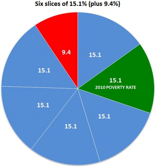
The U.S. Census Bureau reported last week that there were 46.2 million people in poverty in 2010, out of a population of 305.7 million. That is 15.1%, or if you prefer whole numbers, call it 151 out of every 1,000.
Most news reports seem to prefer reducing the rate to a numerator of one — which makes sense since it uses the smallest whole number possible, for your mental image. In that case, you could accurately call it one out of every 6.6, but no one did. Like the Washington Post and NPR, most called it some version of “nearly one in six.” That’s OK, if you’re willing to call 15.1 “nearly 16.7.”
Using percentages, here’s the difference:
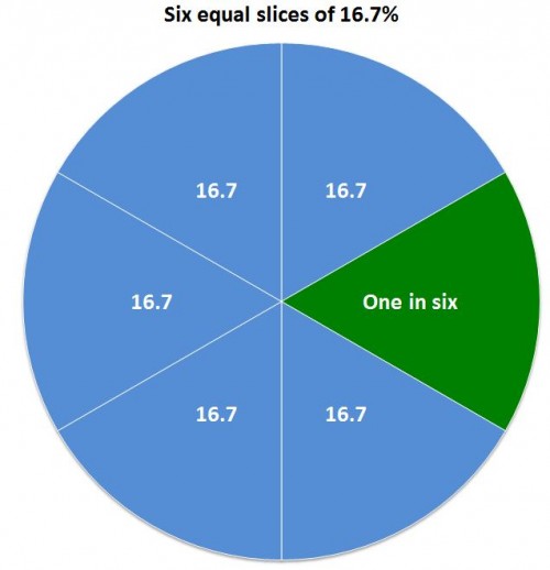
A substantial minority of reports on the poverty report took the low road of rounding the fraction in the direction of their slant on the story. Some reports just went with “one in six,” including people on the political left who may be inclined to enlarge the problem, such as Democracy Now and the labor site American Rights at Work.
On the right, the Heritage Foundation’s Robert Rector and Rachel Sheffield called it “one in seven” in a column carried by the Boston Herald and others. (Their point, repeated here when the new numbers came out, is that the poor aren’t really poor anymore since they have many more amenities than they used to.) That’s cutting 15.1% down to 14.3%, which is actually closer to the truth than 16.7%:
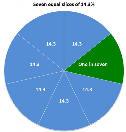
It’s not that far off, but if your story is about the increase in poverty rates, it’s unfortunate to round down exactly to last year’s rate: 14.3%.
Then there are the people who may have just gotten stuck on the math and couldn’t decide which way to go, like the columnist who called it “essentially one in six” (which was ironic, because the point of his post was, “That’s the nice thing about most statistics, handled deftly, they can say just about anything you want them to.”) In some cases headline writers seem to have been the culprits, shortening the writer’s “almost one in six” to just “one in six.”
The worst exaggeration was from Guardian correspondent Paul Harris, who wrote, “the US Census Bureau has released a survey showing that one in six Americans now live in poverty: the highest number ever reported by the organisation.” The number — 46.2 million — is the highest ever reported, but the percentage was higher as recently as 1993.
If the point is to conjure an image that helps make the number seem real to people, it probably doesn’t matter — you may as well just go for accuracy and say “fifteen percent.” (You definitely shouldn’t use pie charts, which are hard for viewers to judge.) That’s because most people can’t immediately make an accurate mental image of either six or seven — after four they count. But I could be wrong about that. Consider these images — would the choice of one over the other change your opinion about the poverty problem?
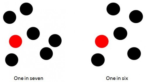
They both create a reasonable image. But the choices people made are revealing about their biases — and the unfortunate state of numeracy in America. Because it does matter that the number of people in poverty rose by 2,611,000.
Maybe more important is who and where these poor people are. Here’s two other ways of representing it, with very different implications.
Fifteen percent over there:

Fifteen percent spread according to a random number generator:

Note that those are just abstractions for visualizing the overall percentage of poverty. But there is a real geographic distribution of rich and poor, described in recent research by Sean Reardon and Kendra Bischoff (free version here). They found that, not surprisingly, as income inequality has grown, so has income segregation — the tendency of rich and poor to live in different parts of town. And that probably makes reality even more abstract — and more subject to media construction — for people who aren’t poor.
Comments 4
Anonymous — September 20, 2011
I encounter a lot with fractions/proportions in my work, so this is a way I'm used to thinking about things. To me, none of these "one-in" values feel particularly useful. When I hear a one-in, I translate it to a percent in my head anyway.
How Not to Describe the Poverty Number and More Information « Welcome to the Doctor's Office — September 24, 2011
[...] HOW (NOT) TO DESCRIBE THE POVERTY NUMBER by Philip N. Cohen, [...]
How (Not) to Describe the Poverty Number | Environmental, Health and Safety News — September 25, 2011
[...] (View original at http://thesocietypages.org/socimages) [...]
Array | Zlihologija — October 14, 2011
[...] Igranje statistikom siromaštva [...]