marriage/family

Cross-posted at Family Inequality.

The Pew Research Center put out a report this month titled, “Modern Parenthood: Roles of Moms and Dads Converge as They Balance Work and Family,” written by Kim Parker and Wendy Wang. It analyzes trends in time use among men and women in families, showing the big changes since the 1960s, and adds Pew’s own survey data on attitudes and perceptions. Lots of interesting information.

But what jumped out at me was that the stall in progress did not feature much in Pew’s narrative. I really noticed that when the Joy Cardin show featured the report on Wisconsin Public Radio, and Cardin’s intro was this:

Family gender roles are converging, according to a new survey from the Pew Research Center. Father’s have more than doubled the time they spend on housework. More moms are paid to work outside the home (audio here).

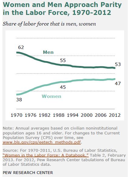
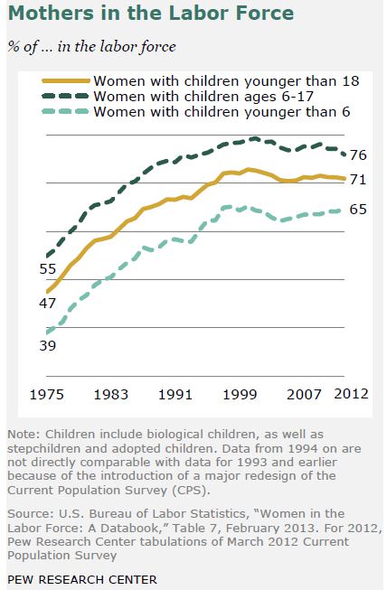
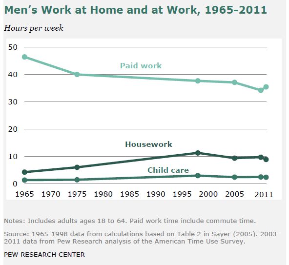
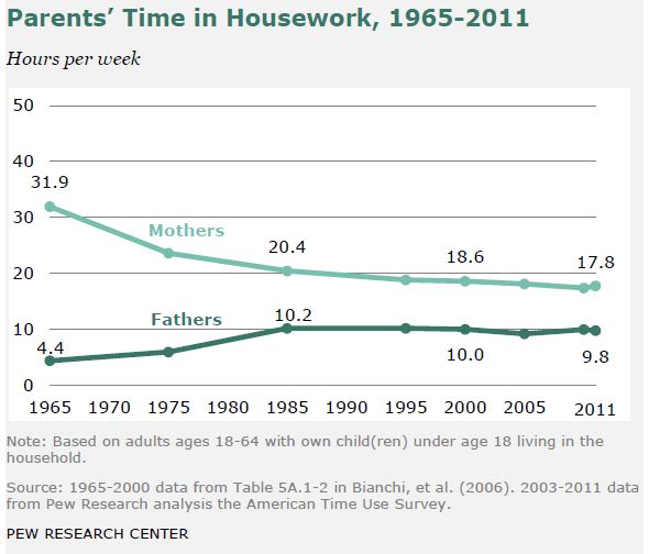
Those facts are true, but old news — older than the new news, which is that nothing much has happened since the early 1990s.  Here are the trends, in Pew’s nice graphics. See if you can find the stall point in each figure.

1 ****** 2 ****** 3 ****** 4 ****** 5 ****** 6

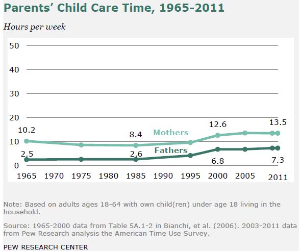
The last one, parents’ child care time, is the only one that shows continued real progress, albeit slower, in the last decade.

I favor three explanations for this gender stall:

  • Work-family policy that encourages specialization in domestic or labor force roles, as described by Stephanie Coontz here.
  • Cultural trends toward “egalitarian essentialism,” which “blends aspects of feminist equality and traditional motherhood roles” (e.g., intensive parenting mania), as described by David Cotter, Joan Hermsen and Reeve Vanneman here.
  • Weaker government enforcement of anti-discrimination law, as described in the new book Documenting Desegregation, by Don Tomaskovic-Devey and Kevin Stainback.

These explanations do not exclude others.

Philip N. Cohen is a professor of sociology at the University of Maryland, College Park, and writes the blog Family Inequality. You can follow him on Twitter or Facebook.

Dylan Matthews, blogging in the Washington Post, discusses a very interesting paper that provides evidence showing that politicians seriously underestimate the progressivity of their constituents.

David Broockman and Christopher Skovron, the authors of the paper, “surveyed every candidate for state legislative office in the United States in 2012 [shortly before the November election] and probed candidates’ own positions and their perceptions of their constituents’ positions on universal health care, same-sex marriage, and federal welfare programs, three of the most publicly salient issues in both national-level and state-level American politics during the past several years.”  They then matched the results with estimates of the actual district- and issue-specific opinions of those residing in the candidates’ districts using a data set of almost 100,000 Americans.

Here is what they found:

Politicians consistently and substantially overestimate support for conservative positions among their constituents on these issues. The differences we discover in this regard are exceptionally large among conservative politicians: across both issues we examine, conservative politicians appear to overestimate support for conservative policy views among their constituents by over 20 percentage points on average… Comparable figures for liberal politicians also show a slight conservative bias: in fact, about 70% of liberal office holders typically underestimate support for liberal positions on these issues among their constituents.

The following two charts illustrate this bias when it comes to universal health care and same sex marriage.

1

As Matthews explain:

The X axis is the district’s actual views, and the Y axis their legislators’ estimates of their views. The thin black line is perfect accuracy, the response you’d get from a legislator totally in tune with his constituents. Lines above it would signify the politicians think the district more liberal than it actually is; if they’re below it, that means the legislators are overestimating their constituents’ conservatism. Liberal legislators consistently overestimate opposition to same-sex marriage and universal health care, but only mildly. Conservative politicians are not even in the right ballpark.

The authors found a similar bias regarding support for welfare programs.  Perhaps even more unsettling, the authors found no correlation between the amount of time candidates spent meeting and talking to people in their districts while campaigning for office and the accuracy of their perceptions of the political positions of those living in their districts.

One consequence of this disconnect is that office holders, even those with progressive views, are reluctant to take progressive positions.  More generally, these results speak to a real breakdown in “the ability of constituencies to control the laws that their representatives make on their behalf.”

Martin Hart-Landsberg is a professor of economics at Lewis and Clark College. You can follow him at Reports from the Economic Front.

Originally posted in 2009. Re-posted in honor of Women’s History Month; cross-posted at Mental Floss.

Several factors were in play in the 1920s for the emergence of what came to be known as flappers, teenagers and young women who flaunted convention and spent their time pursuing fun instead of settling down to raise children in the prime of their lives. Many entered college or the workforce and felt entitled to make their own decisions about how to live their lives.

4502flappers

A lot of young men did not return home from World War I, which left an entire cohort of women without enough husbands to go around. The horror of the war (and the Spanish flu pandemic of 1918) also impressed young people with the knowledge that life is short and could end at any moment. Instead of staying home preparing to marry a man who might never come, young women wanted to spend what time they had enjoying all that life had to offer.

450thomasbrooks

Movies popularized the image of the fun-loving and free-thinking woman throughout the US and Europe. The 1920 movie The Flapper introduced the term in the United States. The title character, Ginger, was a wayward girl who flouted the rules of society. Played by Olive Thomas, a former Ziegfeld Girl (left), Ginger had so much fun that a generation of lonely young women wanted to be like her. Another role model was stage and screen actress Louise Brooks (right), who also modeled for artists and fashion designers. She was the inspiration for the flapper comic strip Dixie Dugan.


450clarabow

Clara Bow wasn’t the first flapper on screen, but she was certainly a role model for young women of the era. She didn’t play by the rules, and was tabloid fodder for years for her sexual escapades with the biggest movie stars of the time. Bow’s first film was in 1922 and her career peaked in 1927 with the film It. “It” was defined as the sexual allure some girls have and others don’t. Bow’s fans wanted “it”, so they copied her look and behavior.

450twentiescar

The rise of the automobile was another factor in the rise of flapper culture. Cars meant a woman could come and go as she pleased, travel to speakeasys and other entertainment venues, and use the large vehicles of the day for heavy petting or even sex.

450flappertoon

These young women had plenty of opportunities for fun. Although Prohibition drove alcohol underground, that only added to its allure. Postwar prosperity allowed for leisure time and the means to spend that time drinking, dancing, and hanging out with free thinkers.

425flapperfashion

Being a flapper wasn’t all about fashion. It was about rebellion. In this article from 1922, a would-be flapper (but still a “nice girl”) explains her lifestyle choices to her parents. Flappers did what society did not expect from young women. They danced to Jazz Age music, they smoked, they wore makeup, they spoke their own language, and they lived for the moment. Flapper fashion followed the lifestyle. Skirts became shorter to make dancing easier. Corsets were discarded in favor of brassieres that bound their breasts, again to make dancing easier. The straight shapeless dresses were easy to make and blurred the line between the rich and everyone else. The look became fashionable because of the lifestyle. The short hair? That was pure rebellion against the older generation’s veneration of long feminine locks.

450loneflapper

The party stopped when the economy crashed and the Great Depression curtailed the night life. Although the flapper lifestyle died along with the Roaring Twenties, the freedoms women tasted in that era weren’t easily given up. They may have gone back to marriage and long hours of toil for little pay, but hemlines stayed above the ankle, and the corset never went back to everyday status. And we’ve been driving cars ever since.

Miss Cellania is a newlywed mother of four, full-time blogger, former radio announcer, and worst of all, a Baby Boomer. In addition to mental_floss, she posts at Neatorama, YesButNoButYes, Geeks Are Sexy, and Miss Cellania. Miss C considers herself an expert on no particular subject at all.

The ’60s is often held up as a time of dramatic upheaval in American life.  It brought us civil rights victories, the sexual revolution, the women’s movement, the gay liberation movement, and anti-war activism.  It was, in short, antiestablishmentarian.

What were the concrete impacts of these changes?  One is the birth rate, as illustrated in a post by Made in America‘s Claude S. Fischer. Far from introducing a new normal, the ’60s reversed what was a relatively recent a rise in the ideal number of children and actual fertility rate.

While data not shown suggest that the ideal number of children in the ’30s was under three, the ideal had risen to 3.6 by 1962.  This dropped quickly across the rest of the decade.

2

Likewise, the actual number of children born to the average woman in the 1930s was about two, but this started shooting up in the late ’30s and ’40s.  Then, just as quickly as it had risen, it plummeted again:

1

This data reminds us of how unusual the ’50s really was.  It was an especially pro-natal family-centered time.  As historian Stephanie Coontz puts it:

At the end of the 1940s, all the trends characterizing the rest of the twentieth century suddenly reversed themselves. For the first time in more than one hundred years, the age for marriage and motherhood fell, fertility increased, divorce rates declined, and women’s degree of educational parity with men dropped sharply.  In a period of less than ten years, the proportion of never-married persons declined by as much as it had during the entire previous half century.

So, while in some ways the 1960s dramatically changed American culture, in other ways it simply put us back on track.

Lisa Wade, PhD is an Associate Professor at Tulane University. She is the author of American Hookup, a book about college sexual culture; a textbook about gender; and a forthcoming introductory text: Terrible Magnificent Sociology. You can follow her on Twitter and Instagram.

1In the two-minute animation below, sociologist Dalton Conley describes how inequality between families can create inequality within families. My favorite of his examples: if a family doesn’t have a lot of resources, it will often pour more of them into the most promising child instead of spreading the goods around equally to everyone.

For more, watch:

More at Norton Sociology’s YouTube page.

Lisa Wade, PhD is an Associate Professor at Tulane University. She is the author of American Hookup, a book about college sexual culture; a textbook about gender; and a forthcoming introductory text: Terrible Magnificent Sociology. You can follow her on Twitter and Instagram.

Following up on our recent posts on representations of “person”, I discovered a set of stick figures from around the world, collected by Steve Portigal.  He has some observations on variations.  From a gender perspective, however, they all look more or less like this one from Bali, Indonesia:

bali

What is interesting for our purposes, though, is this Chinese language example from Bangkok, Thailand:

bangkok

Do you see it?  In case you doubted it, the fact that the fourth panel includes a stick figure in a skirt (1) proves that the non-skirted stick figures are implicitly men and, on an entirely different note, (2) reminds us that men do not take care of children.

Similarly, these two pictures of warning signs for moving sidewalks (snapped in the Dublin airport) feature “neutral” stick figures, unless a child is involved:

Picture2

Picture1

We see the same phenomenon in commercial airplanes, where “flight attendants” still tend to be pictured in skirts.

Prof. Shaun Huston sent in these photos from United Airlines. Everyone’s in pants… except the person changing a diaper:

IMG_1671 IMG_1672IMG_1673

Amanda C. sent in another example from a hotel in Sydney. When the stick figures are housekeepers, suddenly they sprout skirts!

Screenshot_16

Sophie pointed out that in Holland, bike traffic lights only include images of what most people would recognize as a “men’s” bike, with the bar across the top, thereby managing to gender the traffic signals without including any figures of people at all (images found here and here):

For what it’s worth, here’s a counter-example from Malmö, Sweden:

-1

Emanuelle, who took the photo and submitted it, says it’s the only time she can remember that she’s seen a silhouette figure like this with a kid where the figure isn’t clearly marked as female.  We’ve a fun collection of traffic lights featuring female stick figures.

We’d love to collect more examples!

Lisa Wade, PhD is an Associate Professor at Tulane University. She is the author of American Hookup, a book about college sexual culture; a textbook about gender; and a forthcoming introductory text: Terrible Magnificent Sociology. You can follow her on Twitter and Instagram.

Cross-posted at Racialicious and Family Inequality.

Trying to summarize a few historical trends for the last half century, I thought of framing them in terms of diversity.

Diversity is often an unsatisfying concept, used to describe hierarchical inequality as mere difference. But inequality is a form of diversity — a kind of difference. And further, not all social diversity is inequality. When people belong to categories and the categories are not ranked hierarchically (or you’re not interested in the ranking for whatever reason), the concept of diversity is useful.

There are various ways of constructing a diversity index, but I use the one sometimes called the Blau index, which is easy to calculate and has a nice interpretation: the probability that two randomly selected individuals are from different groups.

Example: Religion

Take religion. According to the 2001 census of India, this was the religious breakdown of the population:

1.jpg

Diversity is calculated by summing the squares of the proportions in each category, and subtracting the sum from 1. So in India in 2001, if you picked two people at random, you had a 1/3 chance of getting people with different religions (as measured by the census).

Is .33 a lot of religious diversity? Not really, it turns out. I was surprised to read on the cover of this book by a Harvard professor that the United States is “the world’s most religiously diverse nation.” When I flipped through the book, though, I was disappointed to see it doesn’t actually talk much about other countries, and does not seem to offer the systematic comparison necessary to make such a claim.

With our diversity index, it’s not hard to compare religious diversity across 52 countries using data from World Values Survey, with this result:

2

The U.S. is quite diverse — .66 — but a number of countries rank higher.


Increasing U.S. Diversity

Anyway, back to describing the last half century in the U.S. On four important measures I’ve got easy-to-identify increasing diversity:

3

5

4

6

The last one is a little tricky. It’s common to report that the median age at marriage has increased since the 1950s (having fallen before the 1950s). But I realized it’s not just the average increasing, but the dispersion: More people marrying at different ages. So the experience of marriage is not just shifting rightward on the age distribution, but spreading out. Here’s another view of the same data:

7

I calculated these using the Panel Study of Income Dynamics from 1968 (for those married in the years 1950-1968) and comparing it with the 2011 American Community Survey for those married in the previous year. There might be a better way, of course.

I have complained before that using the 1950s or thereabouts as a benchmark is misleading because it was an unusual period, marked by high conformity, especially with regard to family matters. But it is still the case that since then diversity on a number of important measures has increased. Over the period of several generations, in important ways the people we randomly encounter are more likely to be different from ourselves (and each other).

Philip N. Cohen is a professor of sociology at the University of Maryland, College Park, and writes the blog Family Inequality. You can follow him on Twitter or Facebook.

Cross-posted at Policy Mic and The Huffington Post.

The gap between the household wealth of Black and White families is massive.  Today the median wealth held by White households is 20 times that of Black households.  There are lots of reasons for this difference and a new study offers great data on one of them: the need to assist poor relatives.

Kevin Hartnett, at Braniac, writes:

Middle-income blacks are more than twice as likely as middle-income whites to have a poor sibling and more than four times as likely to have parents below the poverty line. And because of these relationships, they’re called upon more often to provide financial assistance.

Sociology graduate student Rourke O’Brien used data on spending and other financial patterns among Americans to test whether this is a significant source of the wealth gap (link).  He found that, at all but the most low income level, Black households are more likely than White households to give money to struggling relatives.  And the wealthier the Black household, the more likely they were to help others.

The graph below illustrates this.  The vertical axis represents the proportion of households offering assistance and the horizontal axis represents increasing income levels (in thousands of dollars).

blackwhitewealth

The lesson is simple, but all too often unnoticed.  Due to hundreds of years of enslavement and discrimination, African Americans are more likely to be poor than Whites. If you grow up poor then most of the people in your family are poor.  Accordingly, even if you “make it out” and arrive in the middle class (income-wise), you will likely be less financially secure than a person that earns the same income but came from a middle class family.  That person can put all of their extra money towards buying a home (and earning equity), retirement, additional degrees, starting a business, and sending their kids to college.

But the poor person who earns a middle-class income might use a significant portion of their income keeping their parents’ heat on, helping their little brother go to college, or buying back-to-school clothes for their nieces and nephews.  This makes it much harder for poor and working class people who become middle class to stay that way.  And the cycle continues.

Via Citings and Sightings.

Lisa Wade, PhD is an Associate Professor at Tulane University. She is the author of American Hookup, a book about college sexual culture; a textbook about gender; and a forthcoming introductory text: Terrible Magnificent Sociology. You can follow her on Twitter and Instagram.