
Emory University has a very detailed database about the Atlantic slave trade, titled Voyages: The Trans-Atlantic Slave Trade Database, which I don’t believe we’ve posted before (my apologies if we have). It includes nine maps providing information on major points of departure and destination ports for the trans-Atlantic trade; here’s a general overview:

Initially the vast majority of slave voyages were organized by firms or individuals in Spain and Portugal; however, over time the slave trade was dominated by groups from northern Europe. Great Britain eventually played a major role, and over 1/3 of documented slave voyages were organized there.The description of Map 6 explains, “vessels from the largest seven ports, Rio de Janeiro, Bahia, Liverpool, London, Nantes, Bristol, and Pernambuco carried off almost three-quarters of all captives removed from Africa via the Atlantic Ocean.”
This map shows where voyages were organized, and the % of all documented African slaves that voyages from that country/area transported:
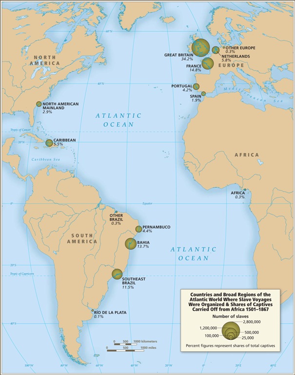
In the U.S., students generally learn about slavery in relation to cotton plantations and, to a lesser extent, tobacco. However, overall those two crops played a relatively minor role in the growth of the global slave trade. It was the growing taste for sugar, and the creation of sugar plantations, particularly in the Caribbean and South American coastal areas, that produced such an enormous demand for African slaves in the Americas. According to the Voyages website, less than 4% of all Africans captured were sold in North America.
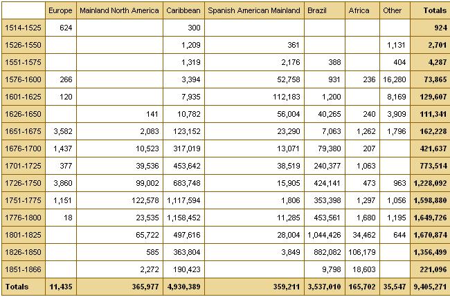
The website also has a database of thousands of documented trips in the trans-Atlantic slave trade, including everything from point of origin, destination, number of slaves, % who died during voyage, length of trip, and so on. Some include many more details than others, as you’d expect. You can also create tables to display the variables you’re interested in. Here’s the table showing the slave trade, broken into 25-year intervals and by destination. We can clearly see that the slave trade made one big jump in the late 1500s (going from 4,287 in the 1551-1575 interval to 73,865 between 1576 and the end of the century) and another huge jump in the late 1600s, with the height of the slave trade occuring in the 1700s through the mid-1800s:
You can also create various graphs and charts. Here is a graph of the % of slaves who died during the trip, by year:
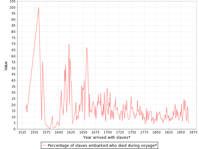
I presume the extremely high numbers in the 1550s must be skewed by some ships that sank or met some other disaster that led to the death of everyone aboard.
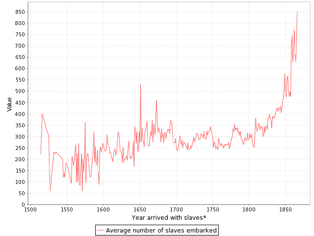
Over time, ships carried larger numbers of individuals per trip:
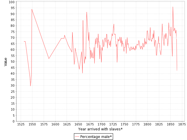
The individuals taken as part of the slave trade were predominantly male:
Documented types of resistance from captives or from Africans trying to free them:

You can spend quite a bit of time on this, I warn you — creating timelines, graphs, and so on. It’s taken me an hour to write this post because I keep getting distracted creating charts and tables. Overall, the site is a fantastic resource for both specific information and for helping illuminate the enormity of the Atlantic slave trade. Thanks to Shamus Khan for the tip.
Comments 24
azizi — January 7, 2011
My ancestors, I solemnly honor you and thank you for my life.
Ashé.
**
Here is an article that speaks to the importance of the translantic slave trade:
House Approves Lee Bill Honoring the 200th Anniversary of the End of the Transatlantic Slave Trade
May 1, 2007
(Washington, DC) – The House today unanimously approved a resolution introduced by Congresswoman Barbara Lee (D-Oakland) to commemorate the 200th anniversary of the end of the transatlantic slave trade.
H. Res. 272 recognizes the historical significance of the 200th anniversary of the abolition of the transatlantic slave trade to the world; respects the memory of those who died as a result of slavery, supports the preservation of historical records and documents and urges increased education of current and future generations about this crime against humanity.
March 25th was the 200th Anniversary of the passage of the Slave Trade Abolition Act, which was enacted by the British Parliament in 1807.
The following is Congresswoman Lee’s statement, as prepared for delivery:
“Madame Speaker, H.Res. 272 commemorates a very somber and serious occasion--the 200th anniversary of the abolition of the transatlantic slave trade by the United Kingdom.
“Two hundred years ago on March 25th in 1807, Great Britain abolished the transatlantic slave trade in England and its colonies. This act began a worldwide revolt against the trade of human beings by other European nations.
“This is an important milestone because it represents the beginning of the end of one of the most deplorable chapters in human history.
“The slave trade was vital to England and other European colonial powers. It provided the basis for modern capitalism to take root, generating immense wealth for business enterprises in colonial America and Europe.
“In many ways, the industrial strength of our nation was built on the blood, sweat and tears of African Americans’ free labor. Today, the U.S. reaps the fruits of labor of these enslaved Africans.
“However, in spite of the considerable riches enslaved Africans created for others, the slave trade also represented was the lowest expression of humanity.
“Captured Africans were subjected to the worst forms of cruelty and inhumanity. Millions were crammed in the hulls of slave ships like sardines in a can. The stench of filth and death reeked from the ships. Disease ran rampant throughout the ships. Traders used any means of violence to subdue insurrection including torture, mutilation and rape. The death rate during transport would reach as high as 50 percent.
“The world will never know the exact number of enslaved Africans transported to America. But, it is estimated that between 10 to 15 million were brought here, making it the largest forced migration in history.
“Given its immense significance, it is unfortunate that the transatlantic slave trade is a subject only briefly discussed in our nation’s classrooms.
“It is essential that we acknowledge how slavery created attitudes of racism that persists in our society today.
“Sadly, the legacy of the slave trade and slavery are with us to this day...
We must honor the courage of those who died in slavery, and those who worked to end it. But at the same time, we must use this occasion to recommit ourselves to eliminating the disparities that exist in our society.
“We must not let their sacrifices been in vain.”
http://lee.house.gov/index.cfm?sectionid=57&parentid=35§iontree=&itemid=63
forsythia — January 7, 2011
I live in a community where slave trade money ended up, even if few actual slaves themselves ever did (there is a mansion with slave quarters about 1km from my home). While there is a narrow line headed up to the northeast (which would mostly be Boston) for actual slaves, it would be interesting to see a separate graphic for where the actual money from sugar plantations and slave trading ended up. My guess is that much of it would wind up in both England and New England.
Village Idiot — January 8, 2011
The idea that the Trans-Atlantic (or Trans-Pacific or Trans-Lots of Other Large Bodies of Water) slave trade is in the past is probably part of the reason why it's still happening to the degree that it is in the present. There are about 2.7 million people (mostly children) currently enslaved worldwide as per the Anti-Slavery Society's definition,and many more than that are in forced servitude of some sort or other that doesn't quite qualify as 'slavery.'
The points of departure, the destinations, and the purposes have changed but it's clearly not over (some old African routes are still active even today, right now). Official government-sanctioned slavery has been abolished and large companies aren't engaged in enslavement and transport of slaves as their primary business model (as far as we know anyway), but from the perspective of someone caught up in the modern slave trade I'd guess those points add up to a distinction without a difference. In other words, ridding ourselves of this kind of barbarism is a job we're not finished with yet. Not by a long shot.
It would probably be better if this kind of information was presented along a time line that went from the dawn of human civilization until the present moment (doing the best we can with the data we have). We'll know we've collectively moved another notch up the evolutionary scale of consciousness when all slavery and other forms of forced servitude really are in the past.
Gadema K. Quoquoi — January 8, 2011
From the 15th Century through the 19th Century, it is estimated that 15 million Africans were enslaved by: Portugal (started 1442), Spain (in 1515 Queen Isabella issued License to Spanish Noblemen to import Africans Salves into the New World), England, Holland, France, the Arabs (started enslaving Africans,1000 years earlier), and their Africans Collaborators.
The Enslaved Africans' Labor enabled the Development of Western and American Capitalism, in other words, the Enslaved Africans' Labor was to developed Capitalist economics all around the World.
It is Time that the Purveyors of The African Slave Trade PAY $15 TRILLION REPARATION. THE MONEY MUST BE USED TO DEVELOP AREAS WHERE AFRICANS WERE ENSLAVED.
Please See: www.enslavedafricans.blogspot.com
Gadema Korboi Quoquoi
President & CEO
COMPULINE INTERNATIONAL, INC.
Fernando — January 8, 2011
Over here in Brasil during the 19th century nearly 80% of our population were of slaves or former slaves. Authorities feared that we'd get here what happened in Haiti, a rebellion by the enslaved.
After slavery was over a little more than 100 years ago we also tried, unsuccessfully, to "whiten" the country by bringing european immigrants. Some of the immigrants were submitted to conditions similar to the african slaves and some countries, like Italy, stopped any of their people from coming here.
Rhiannon — February 3, 2011
The jump in mortality around the 1500's could also be partially explained by the world wide outbreak of Epidemic Typhus occuring at that time.
Some questions that are really bothering me. - Page 2 - Stormfront — March 15, 2011
[...] [...]
History you never learned in High school - Stormfront — March 21, 2011
[...] Less than 4% of African slaves ever wound up in America. Most of them wound up in Brazil. http://thesocietypages.org/socimages/2011/01/07/fascinating-database-about-the-trans-atlantic-slave-... No, whites did not invent slavery, but we did invent abolition. [...]
Datenbank zum Transatlantischen Sklavenhandel « Afrika Wissen Schaft — March 28, 2011
[...] Anfang Januar in meiner Schublade. Da hatte nämlich Sociological Images unter dem Titel „Fascinating Database about the Trans-Atlantic Slavetrade“ über die Datenbank „Voyages: The Trans-Atlantic Slave Trade Database“ [...]
Why don't all the WN's move to Wyoming? - Page 4 - Stormfront — March 31, 2011
[...] Less than 4% of African slaves ever even wound up in America. Most of them wound up in Brazil. http://thesocietypages.org/socimages/2011/01/07/fascinating-database-about-the-trans-atlantic-slave-... No, whites did not invent slavery, but we did invent abolition. [...]
1000 blacks killed by whites in Africa - Stormfront — April 3, 2011
[...] Less than 4% of African slaves ever even wound up in America. Most of them wound up in Brazil. http://thesocietypages.org/socimages/2011/01/07/fascinating-database-about-the-trans-atlantic-slave-... No, whites did not invent slavery, but we did invent [...]
America for whites. Now GTFO. - Stormfront — April 13, 2011
[...] Less than 4% of African slaves ever wound up in America. Most of them wound up in Brazil. http://thesocietypages.org/socimages/2011/01/07/fascinating-database-about-the-trans-atlantic-slave-... No, whites did not invent slavery, but we did invent abolition. [...]
Let's Debate History - Stormfront — April 25, 2011
[...] Less than 4% of African slaves ever wound up in America. Most of them wound up in Brazil. http://thesocietypages.org/socimages/2011/01/07/fascinating-database-about-the-trans-atlantic-slave-... No, whites did not invent slavery, but we did invent abolition. [...]
Were Whites ever enslaved by non-whites? - Page 3 - Stormfront — May 25, 2011
[...] Less than 4% of African slaves ever wound up in America. Most of them wound up in Brazil. http://thesocietypages.org/socimages/2011/01/07/fascinating-database-about-the-trans-atlantic-slave-... No, whites did not invent slavery, but we did invent [...]
How can we get blacks to stop blaming Whites for slavery? - Page 6 - Stormfront — September 19, 2011
[...] [...]
In NC: 4th of July parade float advertises White History Month - Democrats, Republicans, Libertarians, Conservatives, Liberals, Third Parties, Left-Wing, Right-Wing, Congress, President - Page 5 - City-Data Forum — July 7, 2013
[...] [...]
Infografik “Das Barbarendreieck” | Anna — January 21, 2016
[…] Viel und lange habe ich über das Thema atlantsicher Sklavenhandel recherchiert und dabei bin ich auf viele verschiedene Zahlen gestossen. Ich habe mich dann auf folgende Webseite konzentriert. http://www.slavevoyages.org Dabei handelt es sich um eine Datenbank, worauf ich alle spannenden und wichtigen Zahlen und Fakten fand. Auch die meisten Studien, die ich zum Thema finden konnte, basieren auf den Zahlen dieser Webseite. So auch diese: http://thesocietypages.org/socimages/2011/01/07/fascinating-database-about-the-trans-atlantic-slave-… […]