environment/nature

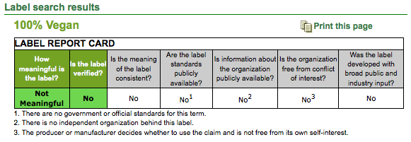
Consumer Reports has an awesome interaction Eco-label website that provides information on what different types of “green” labels mean (organic, natural, free trade, and so on) and how meaningful they are in terms of indicating that a product is more environmentally friendly than other brands. For instance, you can search the label “organic” and get really detailed information about different organizations that certify products as organic and what their standards are. Or you can search by product (food, household cleaners, and so on) and get more information about the types of labels you’ll often see on them. Here’s a small segment of the page about “100% Vegan” labels under the household cleaners section:

picture-21

The criteria they used to rate labels, such as transparency, consistency, and freedom from conflicts of interest, are available here.

The website would be great for a discussion of greenwashing (claiming to be environmentally friendly as a marketing technique, with little significant changes in production practices) and how eco-friendly is defined, but it’s also just useful if you’re interested on a personal level.

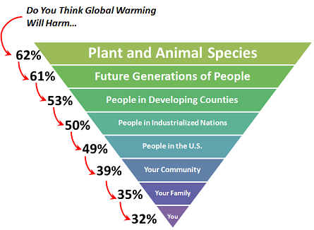
Nate Silver at FiveThirtyEight put up an image that illustrates the findings of a recent survey by George Mason University’s Center for Climate Change Communication.This inverted pyramid shows the percent of those polled who said they think global warming will hurt each group “a great deal” or “a moderate amount”:

warming

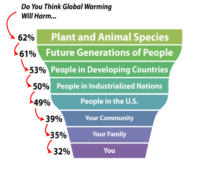
So as we see, the closer the question got to the person answering the survey, the less severe they thought the impacts of global warming were likely to be. Silver says,

These beliefs are not necessarily irrational. Climate change probably will have more impact on the developing world than the developed one, and it almost certainly will have more impact on our children than it does on ourselves.

But if individuals don’t perceive climate change to really have negative consequences for them or their families, they may not support climate change policies if they fear those policies will hurt jobs/business in the short-term, since they may be more likely to see the economic impacts as personally problematic.

UPDATE: An anonymous commenter pointed out that the 538 pyramid is a bit misleading. Brad Johnson at Wonk Room created a more representative one:

global_warming_perceptions

Thanks for the tip!

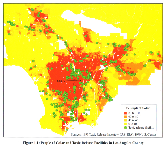
Environmental sociologists have noted that environmental toxicity is most concentrated in communities that include a disproportionate proportion of poor, working class, and non-white people. The map below compares the locations of toxic release facilities (green) with the percentage of people of color in neighborhoods in and near Los Angeles (yellow = 0-40 percent people of color; red = 80-100 percent of color).  The overlap is striking.
2651199629_ab93bd190f_o

Hat tip to Jose at Thick Culture.

Also in race and the environment, check out our post on the anti-immigrant/pro-environment movement, our post on lead poisoning and poor children, and our post on the use of American Indians as environment mascots.

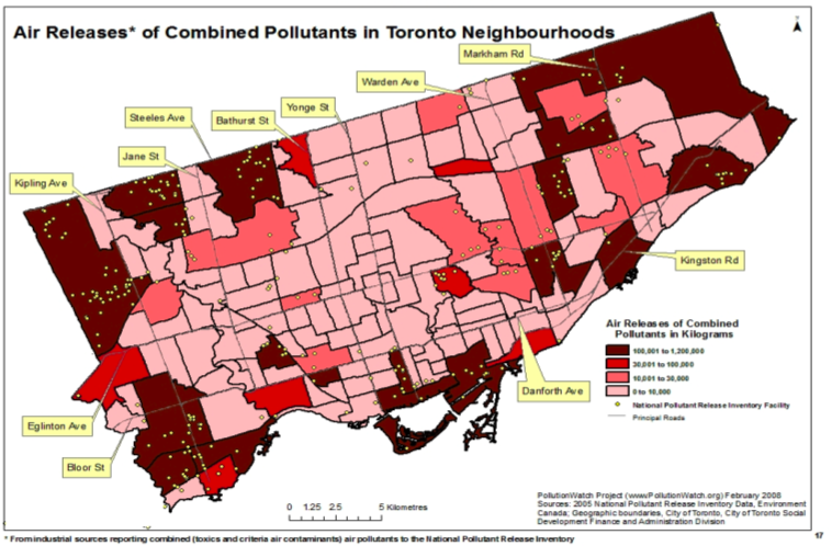
NEW! Katherine O. sent us a link to a Canadian study showing how poverty and pollutants overlap in the city of Toronto. A map of air pollutants released from pollutant inventory facilities in Toronto in 2005, in kilograms:

picture-22

The green dots show where releasing facilities that must take part in the inventory are located; not surprisingly, there are more pollutants in areas with facilities. Of course, the siting of polluting facilities is often fraught with class and race issues, as we saw above.

There are three different measures of air pollution in the report, so you might check the others out too–this one is apparently conservative. While we can see here where there are higher levels of air pollutants, I couldn’t find in the report (which, granted, I didn’t read word-for-word) an absolute level above which pollution is considered harmful to human health, so this graph could be more helpful there.

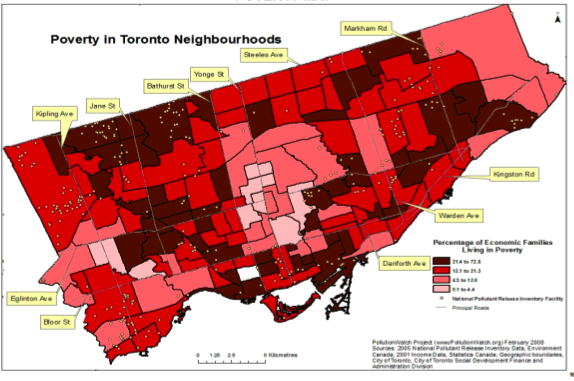
Poverty rates in Toronto Census tracts, from 2001:

picture-33

From lightest to darkest, the ranges are 0.1 to 4.4%, 4.5 to 12.0%, 12.1 to 21.3%, and 21.4 to 72.8%. The overall Canadian poverty rate at the time was 11.8%.

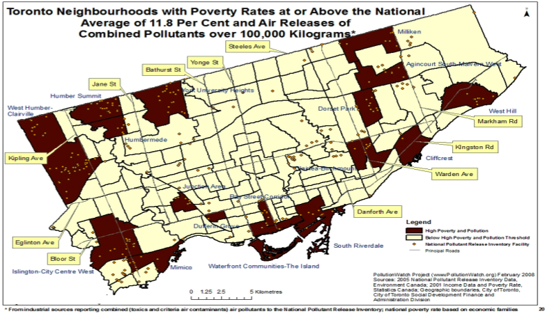
Finally, neighborhoods defined as high in both poverty and pollutants (in 2005):

picture-41

Again, there are other maps showing overlaps of poverty and pollution when pollution is measured somewhat differently–I chose a more conservative one.

Katherine says,

I would add that these areas are also ones with a high proportion of recent immigrants and racialized individuals/families, although this is not shown.

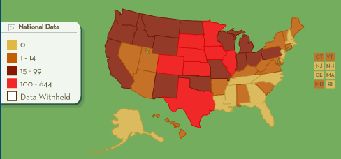
Food & Water Watch has an interesting interactive map that allows you to click on states and see how many factory farms it has per county, broken down into cattle (meaning beef, I assume), hogs, dairy, broilers, and layers (the last two are both chickens). You can look at number of facilities or number of animals. Here’s a screenshot of the number of cattle containment facilities in the U.S.:

picture-1

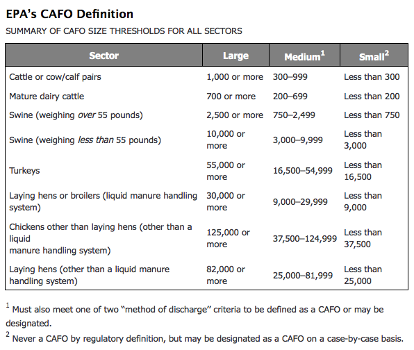
Factory farms were identified using Census of Agriculture data and counting those that “best match the Environmental Protection Agency’s definition for a confined animal feeding operation…” based on the following guidelines:

picture-11

There’s a very detailed description of the methodology available here and an explanation of the maps here.

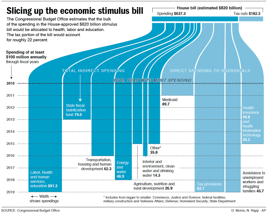
stimulus_large

(Found here, via Thick Culture.)

Miriam at The Oyster’s Garter offered a nice discussion about fragile ecosystems and human intervention.   She uses Macquarie Island (located between Antarctica and Australia) as an example (based on an article in the New York Times).  She writes:

Like on many isolated islands, the native birds evolved without predators and live in burrows.  Introduced cats were eating the birds and running amuck. So researchers embarked on an intensive cat-elimination program…  The only problem is that there [were] also introduced rabbits and introduced plants. With no more cats, the rabbits bred like rabbits and ate all the native plants. Introduced plants took over the bare slopes and prevented the native birds that this was all supposed to help in the first place from nesting in the best burrowing sites. 

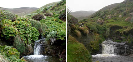
Human intervention, then, changed the landscape (before on the left, after on the right):

macquarie-island

(Of course, human intervention had also shaped the landscape on the left. )

This before and after picture is useful for thinking about the interaction of humans with their environment, the way in which humans are part of ecosystems, and the difficulty of figuring out how to manage environments once we’ve taken on the role of custodian.

(Image from Discover magazine.)


Amanda M. submitted this commercial for a bikini razor and trimmer. Notice how order, beauty, and civility in horticulture is linked with taking the razor and scissors to your pubic hair. God forbid it be unruly, as bushes are in nature.

I suppose I should be glad that none of the bushes just shriveled up and disappeared entirely. And I am.

Crazy Vet offers us this rather amazing commercial for BP as an example of “green-washing” or an effort to make a company appear environmentally friendly:

What I think is especially remarkable about this example is how entirely free of any content it manages to be.  The commercial combines pretty colors, animation, babies, cute music, and whistling gas pumps.  That alone, apparently, is effective in convincing us that BP is environmentally benign.  It is pure emotion, completely devoid of an argument.

—————————

Lisa Wade is a professor of sociology at Occidental College. You can follow her on Twitter and Facebook.