environment/nature

Hellman’s Mayonnaise, a brand owned by the multinational corporation Unilever, currently has an “eat local” campaign in Canada. As part of it, they put out this video (found at BrandFreak) highlighting how much food Canada imports:

Hellmann’s – It’s Time for Real from CRUSH on Vimeo.

What I find odd here is that Unilever owns a large number of food brands (as well as non-food ones), including Hellman’s, Wishbone, Ben & Jerry’s, Bertolli, Lipton, Knorr, and Slim-Fast (check here for some images of organic brands owned by Unilever). The Lipton web page notes that Lipton is “…making a big splash in the global beverages market…” The main Unilever food page announces,

We have the heritage and knowledge to move effortlessly between cuisines and countries.

So on the one hand, according to wikipedia,

The company promotes sustainability and started a sustainable agriculture programme in 1998.[7] In May 2007 it became the first tea company to commit to sourcing all its tea in a sustainable manner, employing the Rainforest Alliance, an international environmental NGO, to certify its tea estates in East Africa, as well as third-party suppliers in Africa and other parts of the world. It declared its aim to have all Lipton Yellow Label and PG Tips tea bags sold in Western Europe certified by 2010, followed by all Lipton tea bags globally by 2015.

Covalence, an ethical reputation ranking agency, placed Unilever at the top of its ranking based on positive versus negative news coverage for 2007.

Those are admirable goals by any standard, and food/globalization activists often push for that type of responsible corporate citizenship.

On the other hand…Unilever owns 400+ brands, many of which are dependent upon global sourcing and distribution; they in no way contribute to or encourage local eating, and if people really began eating locally, Unilever’s market share would suffer dramatically. And there are questions about how well it lives up to its sustainability goals.

We’ve seen these contradictions from Unilever before: the company owns both Axe and Dove, brands that are often marketed in ways that conflict with one another.

One way to look at this is that Unilever is making efforts to encourage sustainability and other policies that many critics would appreciate, within a global marketplace that constrains their efforts. The more cynical view is that such contradictory messages in effect allow corporations to “have it all.” Don’t care about sustainability, working conditions, and so on? Chances are you’re buying Unilever brands by default. But if you do care about such issues, you can feel good about buying at least some Unilever brands–those that have a marketing strategy designed to appeal to you. And doing so in no way threatens Unilever’s overall profitability.

So, readers, whatcha think?

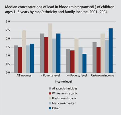
The figure below, borrowed from Matthew Yglesias, shows that poor children, especially poor black children, have higher concentration of lead in the blood than other middle class children.

reproductive_roulette-26

Lead poisoning is a serious problem, causing cognitive delay, hyperactivity, and antisocial behavior. If poor children do less well in school and on standardized tests, it may be, in part, because of the environmental toxins to which they are disproportionately exposed.

See also a previous post in which I argue that lead poisoning remained a mother’s problem until the China toy scandal put middle class children at risk, at which point the state stepped in to ensure children’s safety.

Also see this post on race and toxic release facilities.

—————————

Lisa Wade is a professor of sociology at Occidental College. You can follow her on Twitter and Facebook.

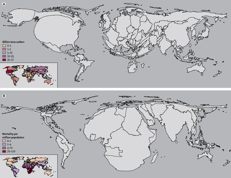
The two maps below are part of a series of maps that warp the size and shape of countries according to various international disproportions (see lots more here).

These two warp countries according to how much they are contributing to global warming and how much they are likely to suffer from global warming respectively.

globeadjustedclimate-thumb-453x348

Ezra Klein interprets:

The first shows the world in terms of carbon emissions. America, for instance, is huge. So is China. And Europe. Africa is hardly visible. The second map shows the world in terms of increased mortality — that is to say, deaths — from climate change. Suddenly, America virtually disappears. So does Europe. Africa, however, is grotesquely distended. South Asia inflates.

Kevin Drum summarizes:

Long story short, we spit out the carbon, but it’s people in Africa and South Asia who are mostly going to die because of it.

Thanks to Toban B. who linked to these maps in a comments thread.

—————————

Lisa Wade is a professor of sociology at Occidental College. You can follow her on Twitter and Facebook.
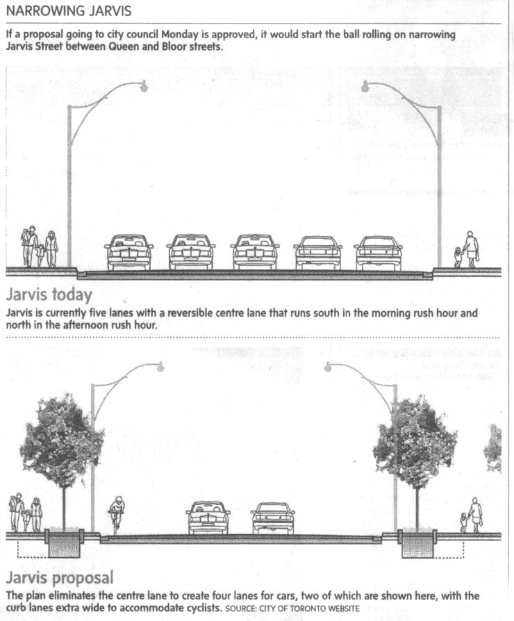
Jim C. sent us this graphic designed to illustrate a proposal to reduce the lanes on Jarvis Street in Toronto from five to four (Globe and Mail, May 22, 2009, p. A12).   As Jim points out, the text of the graphic describes the proposal accurately, and even points out that the graphic misrepresents the change, but the graphic itself still gives the impression that the reduction will be to two, not four lanes.

jarvisbikelanes2

It is a good example of how much graphics matter. Even with the text, it is potentially misleading.  Such misrepresentation can also be purposeful and political.  Jim speculates that this is the case here:

As is often the case whenever there are modest efforts to make space on city streets for pedestrians and cyclists, right-wing councillors (and affluent commuters) raised the spectre of traffic chaos and a ‘war on the car’.

If you’re interested in comparing the representation of this proposal by the Globe with its representation in the proposal itself, check out the final page of the proposal.  Thanks to Nick J. B. in the comments for the link.

—————————

Lisa Wade is a professor of sociology at Occidental College. You can follow her on Twitter and Facebook.
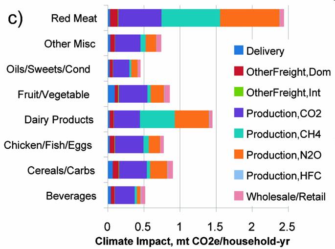
Reminiscent of work by Anna Lappé and the Small Planet Institute‘s “Take a Bite out of Climate Change” initiative, I stumbled across  Food-Miles and the Relative Climate Impacts of Food Choices in the United States by Christopher L. Weber and H. Scott Matthews in Environmental Science and Technology. Looking past the fancy equations you see data presented like this snippet of Figure 1, documenting the green house gas emissions associated with household food consumption, allowing for a comparison of impacts between food groups.

The article presents data that systematically compares the life-cycle greenhouse gas emissions associated with food production against long-distance distribution, aka “food-miles,” finding that the production cycle accounts for the majority of emissions. In other words, changing the type of food you eat (e.g., less red meat) does more good for the environment than buying local.

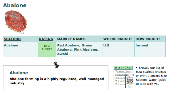
Mary M., of the fantastic blog Cooking with the Junior League, mentioned in one of her blog posts that the Monterey Bay Aquarium has a handy seafood guide that provides information on how various types are raised/caught, whether it is overfished, and the environmental impact. This page lets you click on different species and get detailed information about it; here’s a screenshot of part of the listing for abalone:

picture-1

Or you can go to their U.S. map and click on a region to download a pdf guide to buying seafood in your region.

Also see our post on the Consumer Reports eco-labeling website and the interactive map of factory farms.

Hans Rosling helps us understand country-by-country carbon dioxide emissions and talks about what we can expect, and hope, from China:

Found at GapMinder.

—————————

Lisa Wade is a professor of sociology at Occidental College. You can follow her on Twitter and Facebook.
Since I’m visiting my family in rural Oklahoma, I decided to post some pictures of dust storms during the 1930s. Almost everyone has seen some of the Dust Bowl-era photos of poor families, of houses covered in blown dirt, and so on, but fewer people have seen photos of actual storms blowing in. All of these are available from Kansas State University’s Wind Erosion Research Unit.

This one is from a storm that was widely considered the worst of all; April 14th, 1935 was referred to as “Black Sunday”:

dust103

dustbowlfollett

weokla

dustphoto1_2_a

Most people associate the Dust Bowl with Okies and The Grapes of Wrath. The Joads weren’t Dust Bowl refugees; most Okies were from eastern Oklahoma and lost their farms because they couldn’t pay the mortgages. Only a small part of the Dust Bowl was in Oklahoma, though my great-grandparents and their many children had the good luck to be living in it.

While a bad multi-year drought certainly set the stage for the Dust Bowl, it was really a social disaster, not a natural one. Semi-arid regions had been over-plowed, and no windbreaks were planted to help hold soil in place. And once the dust storms began, many farmers did about the worst thing they could have done: they went and plowed during it. My great-grandpa and his sons would go out with the horses and start plowing as a dust storm came in, hoping they could turn up moister soil from underneath that would be too heavy to blow away. But because of the drought there wasn’t any moist soil to turn up, so all they were doing was breaking up dry dirt, making it even more likely to blow away…and presumably so were thousands of other people. My great-grandma always told me the big joke was that if you had a bucket you could hold it up outside and catch yourself a farm.

Anyway, no huge sociological insight here, just some fascinating and creepy photos and a reminder that things we often refer to as “natural” disasters are either caused by human activity or greatly exacerbated by it.

And I have to drive 30 miles each way to get to the internet, so I’m not able to read comments or add commenter’s interesting links as much as I usually try to do, so be patient for the next couple of weeks.