environment/nature

Crazy Vet offers us this rather amazing commercial for BP as an example of “green-washing” or an effort to make a company appear environmentally friendly:

What I think is especially remarkable about this example is how entirely free of any content it manages to be.  The commercial combines pretty colors, animation, babies, cute music, and whistling gas pumps.  That alone, apparently, is effective in convincing us that BP is environmentally benign.  It is pure emotion, completely devoid of an argument.

—————————

Lisa Wade is a professor of sociology at Occidental College. You can follow her on Twitter and Facebook.

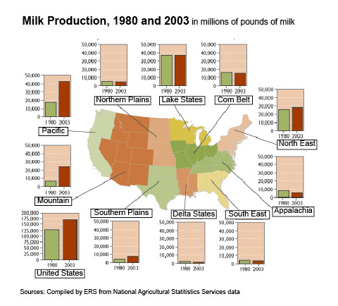
Fellow Contexts blogger Flaneuse over at Graphic Sociology posted this map showing increases in milk production by region:

milk_production_us

As we see, overall production has been more or less stable in most regions but has increased dramatically in the Pacific and Mountain regions.

This data hides another pattern, however: changes in average dairy herd size. Dairy operations in the West and Pacific regions tend to be significantly larger than dairy farms in the more traditional dairy states in the Great Lakes region and the Northeast. I went to the 2007 Census of Agriculture site and grabbed some data to do a few quick calculations. I chose two states in the western U.S. and two in the traditional Dairy Belt, just for illustrative purposes:

picture-18

All calculations use data available in Table 17 in the Census reports for the total U.S. and each individual state, which you can easily access at the link above if you want to check my numbers. I rounded everything off to the next highest whole number except for the two percentages in the lower right-hand cells, where doing so would greatly over-represent the percent of farms of that size.

In general, dairy farms with more than 500 milking cows are considered very large in the industry. Those with over 2500 cows are really extremely large, though there are dairies with more than 10,000 milking cows (including the Vander Eyk dairy, which supplies organic milk to be sold under the Horizon brand, as well as conventional, non-organic milk to other companies). But I digress.

Anyway, clearly we see that farms in California and Idaho (and the other Pacific/Mountain states) are larger, on average, than dairy farms in the traditional dairy states. The increase in milk production in the western U.S. is due predominantly to increases in the number (and herd sizes) of very large industrial dairies.

The growth of these large dairies depends on very cheap rates for water used to irrigate agricultural land. Those dairies have to grow lots of alfalfa and other feed crops to feed so many cows, since they certainly can’t afford enough land to have thousands of cows on pasture. And big dairies produce enormous amounts of manure that have to be carted off somewhere each day, meaning they often have big manure lagoons where they store it (as well as spraying as much as possible on fields). The lagoons are lovely, if you haven’t ever been really close to one, or perhaps nearly fallen into one while conducting research for your thesis. Not that I know anyone who has had such an experience. Point being, the competitive success of large western dairies is dependent on favorable political conditions (such as decisions to keep agricultural water rates lower than other water usage rates), and they have significant environmental consequences when we consider the use of water for irrigation in states that are often relatively arid and potential pollution from manure runoff.

I have some issues with Flaneuse’s implication that the growth of western dairies is a fairly natural result of population growth because milk is a localized commodity. I don’t know that you can really call milk a localized product these days–California milk is for sale in every state, and CA has aggressively marketed the state’s dairy industry with their “Happy cows” campaign. I can also buy milk from dairies in Minnesota here in Vegas, if I look a bit. So while I’m sure population growth has a role, I think it’s important to look at the political factors–particularly environmental laws as they apply to agriculture and local opposition to large dairies–that encourage the growth of huge industrial dairies in some regions more than others.

Also keep in mind, the production of milk when measured in pounds doesn’t just indicate there are more dairies or more dairy cows…it can also be the result of getting more pounds of milk per year per cow through the use of technologies such as bovine growth hormone (rBGH). I’m not up on rates of use of rBGH by region right at the moment, but I do know its use is nearly universal in industrial dairies; if smaller dairies in the midwest are less likely to use rBGH for various reasons (including concerns about customer opposition), that would also have an impact on where milk production is increasing most rapidly.

That was a lot of rambling to have just added one little image to what was in the original post at Graphic Sociology, but soc of ag is my specialty area and I geek out about it sometimes. You have no idea how much I reined myself in to tell you just this much about the dairy industry!

[Note: If you’re really super interested in this and don’t mind reading academic articles, I suggest an article by Jess Gilbert and Raymond Akor (1988) “Increasing Structural Divergence in U.S. Dairying: California and Wisconsin since 1950,” Rural Sociology 53(1): 56-72. They lay out some of the effects of politics, water subsidies, technological change, etc., and how they’ve favored a particular type of dairy system in the West. Also check out the Program on Agricultural Technology Studies at the University of Wisconsin, which has links to lots of easy-to-understand reports about trends in the dairy industry.]

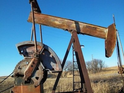
Recently Lisa posted some photos of what resource extraction looks like. I thought I would show a different side of this phenomenon: what an oil bust looks like. I grew up in the Middle of Nowhere, Oklahoma. The area has been through two oil booms, one in the 1920s and one in the 60s through the 80s.

But with any energy boom eventually comes the energy bust. I took some photos I took showing what communities looks like if their economy is disproportionately based on oil and the oil companies leave, which were reproduced at Business Insider.

Oil wells that have never been installed sit around on empty lots, slowly rusting. Many oil wells that were in use at one time now sit motionless. Because of high oil prices in the last few years, some oil wells have been put back in production; it’s the first time since I was a kid that you can look across pastures and see many of the oil wells actually pumping. Pipes crisscross the landscape, often slowly tumbling downhill from lack of maintenance. When they get old and rusty enough they start breaking apart, leaving jagged edges that occasionally lead to trips to the doctor for a tetanus shot. An old storage tank, long past any usefulness, slowly rusts.

In an energy bust, real estate prices plummet. If there aren’t many other industries in the area, there’s no way to attract buyers, and houses flood the market as people move looking for work. Houses, many of them perfectly serviceable, slowly decay from lack of upkeep. Families that became wealthy from oil lose their fortunes. The house below was owned by a family that became wealthy from the 1920s oil boom. When that oil bust hit, they lost everything. Their house sits far out in the country and slowly crumbles. Downtowns die and the buildings sit empty and deteriorate over time. Towns don’t have enough children to run independent schools, so rural school districts consolidate. This school was sold off and a local resident told me that it has been, at various times, a bed and breakfast, internet cafe, and beer-only bar, between bouts of sitting empty.

Ponca City is centered around the Continental refinery plant. Continental was owned by Conoco until 1984. There used to be a significant Conoco presence in the town, and as with Bartlesville, it has faced hard times since the Conoco-Phillips headquarters moved to Houston. Some neighborhoods were polluted by the refinery, leading the company to buy out homeowners and tear down the houses (some owned by private individuals, others by the Ponca tribe). In one area where this occurred, the land is now a park. Local residents have heard that Conoco is planning to tear down a lot of its old administrative buildings so it doesn’t have to pay insurance or maintenance costs, meaning there will be even more large swaths of empty land scattered around the city.

There’s nothing exceptional about the experience of these communities. They simply represent a story played out in many towns as oil booms fade and corporations move their headquarters to larger cities. Now, as the Keystone XL pipeline project goes forward, many such communities gear up for their next ride on the energy roller coaster.

Gwen Sharp is an associate professor of sociology at Nevada State College. You can follow her on Twitter at @gwensharpnv.

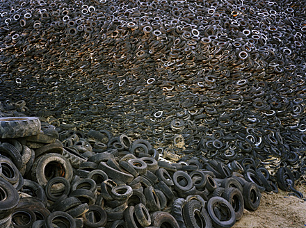
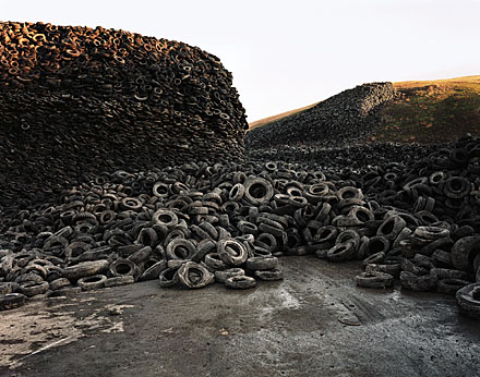
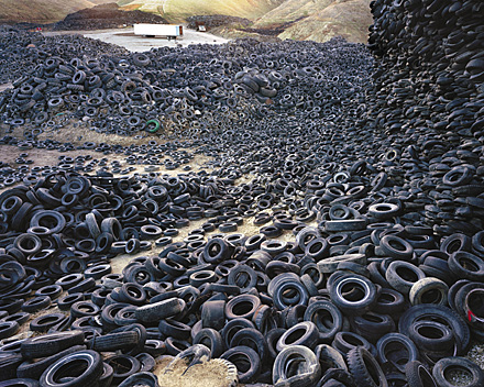
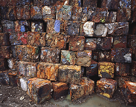
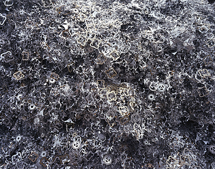
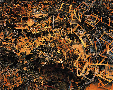
In a previous post, I shared some photographs by Edward Burtynsky of oil fields and mines.  Burtynsky takes pictures with an eye towards the modern global economy. This set documents massive piles of waste sorted for recycling:

Three pictures of the Oxford tire pile in Westley, California (1999):

Densified Oil Drums in Hamilton, Ontario (1997):

Metal for recycling in Hamilton, Ontario (1997):

Metal for recycling in Hamilton, Ontario (1997):

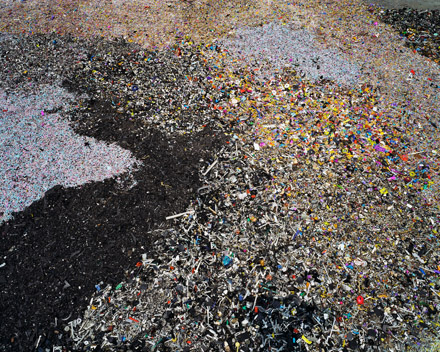
Plastic toy parts in Guiyu, Guangdong Province (2004):

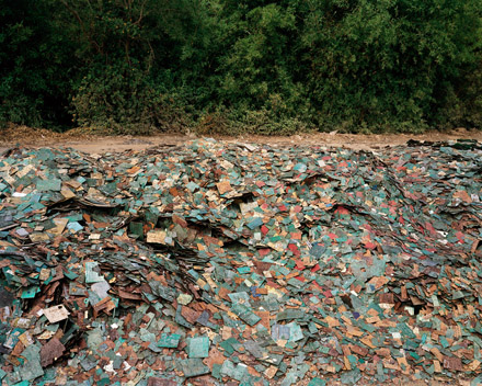
Circuit boards in Guiyu, Guangdong Province (2004):

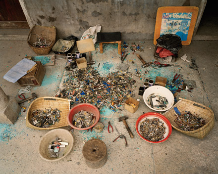
Recycling work station (I believe the worker is taking apart computers) in Zenguo, Zhejiang Province (2004):

Jo B. sent us a link to Icebreaker, a New Zealand clothing company. One of their products is wool underwear. As she pointed out, there are some distinct differences in how the men’s and women’s underwear lines are depicted.

The men’s line is called beast. When you go to the site, there’s a little intro part. The following phrase shows up on the banner at the top:

As Jo says,

The overall idea seems to be that men have some kind of innate, primordial aggression (thought I’m not sure how this is supposed to relate to woollen underwear).

Indeed, socialization “cages” men’s true nature, but just barely–its hold is “frail and fragile” and, I presume, could burst forth if you aren’t really careful. I don’t quite follow how the city “brings the beast alive,” or how reconnecting with nature “balances” the beast; since the beast is supposedly men’s real nature, I think reconnecting them with nature would bring out the beast, but whatever. I’m clearly applying too stringent a level of logic. Also, for the record, if all it takes to reconnect with nature is a natural material (made from a domesticated source), then cotton, angora, and mohair would work just as well.


The women’s line is called Nature. When you go to its site there’s also an intro, but without any useful summary of what women are like to compare to the Beast.

Again from Jo:

The female models are slim, delicate, and tend to pose in a way that suggests passivity (static poses, arms held behind body…) and instability (balancing on her toes).  The images in the female range focus more on being attractive, while the men’s range is about being active and aggressive.

The marketing campaign also reinforces the difference in the way we talk about men and women and their association with nature. When we connect men to nature, it’s in an aggressive, predatory sense (the beast). When women are associated with nature, it’s often in a way that implies harmony, an appreciation for the natural world, perhaps some intuitive sense that women have (or, you know, their connection to the moon and stuff because of menstrual cycles). The background is part of this; the grey background of the men’s line doesn’t look nearly as peaceful as the serene white background for the female models.

Thanks, Jo!

FYI:  Jo sent an email to the company complaining and this was their response:

Hi Josephine,

Apologies for the delayed reply. I am writing on behalf of Jeremy Moon to thank you for taking the time to give us your views about Icebreaker’s marketing of its underwear lines for men (Beast) and women (Nature). We understand your concerns, and we really appreciate the level of thought you have put into sharing them with us.

Gender representations are a sensitive issue in marketing, and Icebreaker certainly had no intention of promoting negative or damaging images of men or women in our Winter 08 campaign.

In most of our collections, our marketing approaches to men and women are almost identical. We aim to make Icebreaker garments as stylish as possible, but our clothes are based on performance above all – regardless of the gender of the wearer.

In our Bodyfit, Icebreaker_GT and Superfine collections, for example, women are photographed in exactly the same way as men – pushing their physical boundaries in the outdoors. Our marketing for the garments in these core collections centre on photographs of athletic-looking women skiing, hiking and climbing mountains. None of the images are of women in a passive or decorative role: they’re of women who are confident, independent, adventurous and strong.

We chose a different approach for our underwear ranges. For obvious reasons, we couldn’t adopt our usual approach of showing women taking part in outdoor sports – clearly they wouldn’t play sport in their underwear alone. The other factor we took into consideration is that Nature and Beast, although both underwear collections, are very different ranges.

Men tend to buy underwear for its practical benefits. Our aim was to position Beast as a premium range that has the same performance factors (such as breathability, a critical benefit for underwear) as Icebreaker’s outdoor clothing and yet is sufficiently stylish to be worn at work. Our marketing approach refers not to aggression, but to energy – the same energy (or performance benefits) that works equally well in both outdoor and urban environments. You’ll notice our marketing refers to “creative energy” and also the “harmoniousness” of nature.

The Nature range is our most feminine range by far, and much of our marketing focuses on the way it looks – its styles and its nature-inspired designs. Nature is made from the lightest, most luxurious grade of 100% pure merino, as we understand customers’ concerns against wearing traditional wool (rather than merino) against their skin, so our marketing talks about concepts like “100% pure”. While the photography for the rest of our collections is based around the outdoors, Nature images are designed to show off the styling and softness of the garments.

Our campaigns are designed to be edgy, and we’re very sorry if in this instance you feel our approach conveyed the wrong messages. Please be assured this was not our intention. Thank you for writing, and be assured we will bear your concerns in mind when planning future campaigns. I hope this email helps lesson your disappointment with our brand,

Regards
Alice

Gwen Sharp is an associate professor of sociology at Nevada State College. You can follow her on Twitter at @gwensharpnv.

Update: The confusion in the comments brought to my attention that I embedded the wrong commercial.  See!  I’m not crazy!  Just incompetent.

Enjoy the corrected post:

At least that’s the message I’m taking from this Utah Tourism advertisement featuring anthropomorphized snowflakes (found here):

[youtube]http://www.youtube.com/watch?v=78RZ-UgIMrM[/youtube]

Blanca M. sent in this clip by Penn and Teller, in which a woman gets people at a World Fest rally (which appears to be an environmental event of some sort) to sign a petition to ban dihydrogen monoxide…commonly known as water:

[youtube]http://www.youtube.com/watch?v=yi3erdgVVTw[/youtube]

You might use it in a discussion of social psychology and the way that people tend to go along with what they see other people doing and to do what they are asked or instructed to do without asking many questions (that is, if someone asks you to sign a petition, very often you will, whether or not you really know what it’s about). You could also use it to talk about perceptions of environmental risk, and how bad we are at evaluating it: if something has a chemical-sounding name, we tend to assume it’s bad (but if it sounds “natural,” we think it must be safe).

I think it would be a good clip for talking about political participation and the limitations of passive forms of participation such as these: the require very little of people, so while they might be quick to sign, they’re unlikely to know much about the issue or to follow up. My guess is that politicians keep this in mind, too. Burk M. was a Senate campaign consultant for a while and says that though written petitions are generally taken seriously by elected officials (particularly if signed by constituents and delivered personally in the presence of a media outlet), email petitions are completely ignored (I knew it!) because there’s no real concern that the people who signed it will ever check back in to see what happened (assuming they’re real people to start with). Government agencies, such as the EPA, may not show as much concern for even printed petitions, since they are not made up of elected officials who fear their constituents might be watching what they do. Thus, these forms of minimal-involvement political participation may make people feel like they’re doing something about an issue, when in fact there is little impact (particularly in the case of email petitions).

Thanks, Blanca!

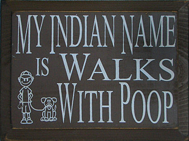
Recently I saw this wood sign for sale in a catalog (available here, if you really want one):

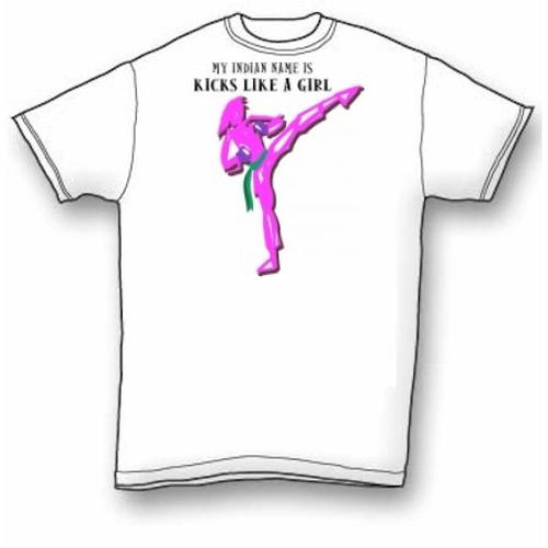
Looking around online I found this t-shirt here, which combines the “My Indian name is” element with a twist on “kicks like a girl”:

I have seen things like this before, and they always irritate me (and I blame the movie “Dances with Wolves” for the whole “Indian names always follow the pattern ‘Present-Tense Singular Verb + With + Noun'” idea). There’s an element of othering here–the idea that American Indian names are funny or weird. Part of what I think is considered funny is that the names are presumably tied to actual activities or things (for example, Mankiller or Redbird). Of course, many European surnames originated the same way (for instance, “Smith” was a surname often used to indicate the person was a blacksmith, silversmith, etc.), but they now hold the status of “normal” surnames that are unremarkable (although Smith has become somewhat remarkable as a symbol of White non-ethnic normality, such that it is often used in movies and TV shows as an alias by spies and others wishing to avoid attention).

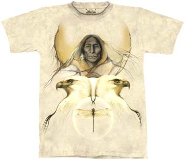
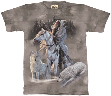
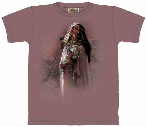
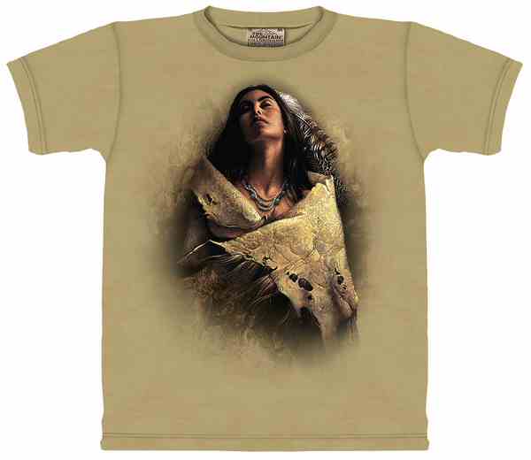
That website led me to this one, where there were lots of “Native American” t-shirts. As far as I can tell, it’s not a Native-owned company, it’s just a bunch of shirts with Native people or themes on them. Some, like these, associate American Indians with animals:

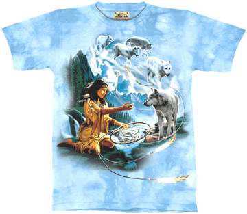
Whereas the t-shirts with men on them tend to show them in battle or hunting, those with women generally have romanticized, sometimes vaguely sexualized images. I noticed several have a common element: the upturned face, often with closed eyes, as well as stereotypically “Caucasian” features, except with darker skin and hair. This one is called “Purity”:

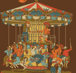
You might use these in a discussion of representations of Native Americans, particularly how they continue to be worn as symbols by other groups. The things associated with American Indians–wildlife (particularly wolves), nature, and the warrior tradition–tend to romanticize their connection to the natural environment and even portray them as part of nature themselves, able to communicate with the other “wild things.”

It’s a weird double bind: on the one hand, presumably American Indians are more “noble” than other groups–surely they wouldn’t have driven wolves, bald eagles, and bison to the verge of extinction, given their close connection to nature. But at the same time, they are depicted as relics of the past, brave fighters from the glory days. American Indians who drive cars and wear t-shirts and blue jeans (and have last names like Smith and Thomas) don’t have a place in our romanticized images of Native groups.

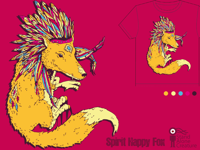
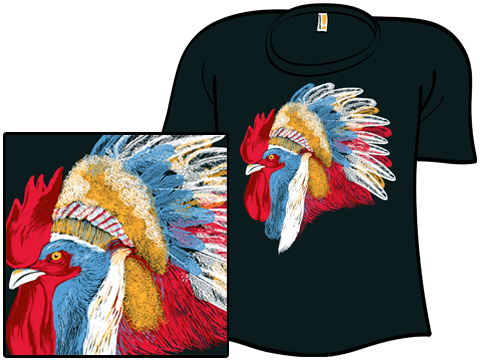
NEW! D. Cho sent in three more t-shirts that draw on Native American icons or images. Here is Spirit Happy Fox:

136230

Chief Many Feathers:

chief_many_featherske4standard

How the West Was Fun:

picture-16