Recently Lisa posted some photos of what resource extraction looks like. I thought I would show a different side of this phenomenon: what an oil bust looks like. I grew up in the Middle of Nowhere, Oklahoma. The area has been through two oil booms, one in the 1920s and one in the 60s through the 80s.
But with any energy boom eventually comes the energy bust. I took some photos I took showing what communities looks like if their economy is disproportionately based on oil and the oil companies leave, which were reproduced at Business Insider.
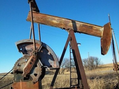
Oil wells that have never been installed sit around on empty lots, slowly rusting. Many oil wells that were in use at one time now sit motionless. Because of high oil prices in the last few years, some oil wells have been put back in production; it’s the first time since I was a kid that you can look across pastures and see many of the oil wells actually pumping. Pipes crisscross the landscape, often slowly tumbling downhill from lack of maintenance. When they get old and rusty enough they start breaking apart, leaving jagged edges that occasionally lead to trips to the doctor for a tetanus shot. An old storage tank, long past any usefulness, slowly rusts.
In an energy bust, real estate prices plummet. If there aren’t many other industries in the area, there’s no way to attract buyers, and houses flood the market as people move looking for work. Houses, many of them perfectly serviceable, slowly decay from lack of upkeep. Families that became wealthy from oil lose their fortunes. The house below was owned by a family that became wealthy from the 1920s oil boom. When that oil bust hit, they lost everything. Their house sits far out in the country and slowly crumbles. Downtowns die and the buildings sit empty and deteriorate over time. Towns don’t have enough children to run independent schools, so rural school districts consolidate. This school was sold off and a local resident told me that it has been, at various times, a bed and breakfast, internet cafe, and beer-only bar, between bouts of sitting empty.
Ponca City is centered around the Continental refinery plant. Continental was owned by Conoco until 1984. There used to be a significant Conoco presence in the town, and as with Bartlesville, it has faced hard times since the Conoco-Phillips headquarters moved to Houston. Some neighborhoods were polluted by the refinery, leading the company to buy out homeowners and tear down the houses (some owned by private individuals, others by the Ponca tribe). In one area where this occurred, the land is now a park. Local residents have heard that Conoco is planning to tear down a lot of its old administrative buildings so it doesn’t have to pay insurance or maintenance costs, meaning there will be even more large swaths of empty land scattered around the city.
There’s nothing exceptional about the experience of these communities. They simply represent a story played out in many towns as oil booms fade and corporations move their headquarters to larger cities. Now, as the Keystone XL pipeline project goes forward, many such communities gear up for their next ride on the energy roller coaster.
Gwen Sharp is an associate professor of sociology at Nevada State College. You can follow her on Twitter at @gwensharpnv.