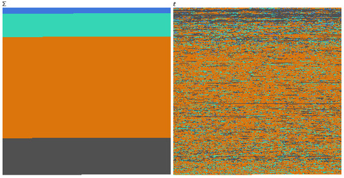
Gizmodo posted an image created by Kamel Makhloufi based on the most recent data on the war in Iraq posted at WikiLeaks. The image divides deaths into categories illustrated by colors. Blue = U.S./Coalition forces, light green = “host” deaths (that is, members of the Iraqi government), gold = civilians, and gray = insurgents. On the left they’re arranged by totals; on the right, as the deaths have been distributed over time:
Of course, as the Gizmodo post points out, this doesn’t tell us who did the killing, so we don’t know what % of the civilians were killed by Coalition forces vs. insurgents. But it is a stark reminder of how much of the burden of war generally falls on non-combatant civilians.
Thanks to Jeff H. for the link!


