Search results for pink

Ada A., Katrin, Filip S., and Missives from Marx all let us know about PinkStinks, a campaign in the UK that “challenges the culture of pink which invades every aspect of girls’ lives”.

The aim is a worthy one: the webpage discusses concerns about girls’ body image, self esteem issues, the sexualization of young women, and so on.

They link to this video, which I thought was neat:

While I totally get the idea and support the effort to provide girls with a wider set of images of what they can aspire to do or be like, the “pink stinks” name, and some of the t-shirts on the site, give me a some pause.

If you read different parts of the site, it’s clear that pink is a stand-in for the socialization of girls into a particular type of femininity, and the campaign is attempting to combat the narrowing of girls’ aspirations and role models. But it brings up an issue I face whenever I’m trying to pick out clothes for my 3-year-old niece: how do you reject the trappings of that socially-approved version of femininity without devaluing femininity, girls, and women themselves? All things equal, I’ll usually pick a green t-shirt instead of a pink t-shirt for my niece because I feel like giving her a pink t-shirt signals to her an approval of all the things we associate with “pink culture”–valuing looks over smarts, worrying about boys, and so on, and because I know she is frequently encouraged to declare pink her “favorite” color by those buying her gifts.

But we often see that in the attempt to provide girls with more options, those who accept elements of mainstream femininity are devalued. My students who are trying to distance themselves from ideas of passive femininity often disparage “girly-girls,” those they see as unambiguously accepting pink culture. Thus, wearing a sparkly barrette or painting your nails pink becomes inherently problematic, a sign that you must be boy-obsessed, dumb, superficial, and so on.

I don’t think this campaign overall is doing that–if you read through it, the message is more complex and clearly about giving girls a wider array of options to choose from as they construct their identities. But much of the online discussion of it seems to miss the nuance and veer more into the simplistic interpretation of “pink stinks” as “empowering girls means rejecting and devaluing everything currently associated with femininity, as well as those who do it,” and the t-shirts seem to play into that a little.

Many of the things associated with femininity–being nurturing, say, or liking to cook–are, in fact, quite lovely, and problematic only when we say that only girls can/should like them, that all girls ought to, and that they’re less worthwhile than things boys do. Adding to the devaluing of women and femininity in an attempt to resist gender norms is, ultimately, counter-productive.

Gwen Sharp is an associate professor of sociology at Nevada State College. You can follow her on Twitter at @gwensharpnv.

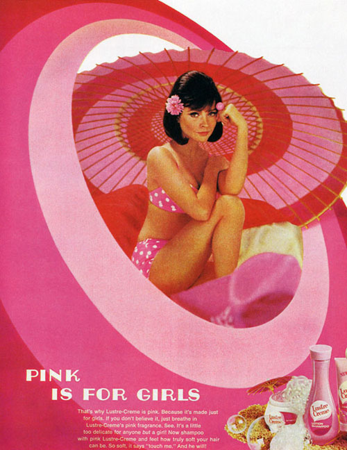
“Pink is for Girls” (found at Vintage Ads):

0_2520e_f01d0eb5_xl

Pink. Pink. Pink. Pink. Pink. Pink. Pink. Pink. Pink. Pink. Pink. Pink. Pink. Pink. Pink. Pink. Pink. Pink. Pink.

That is all.

Lisa Wade, PhD is an Associate Professor at Tulane University. She is the author of American Hookup, a book about college sexual culture; a textbook about gender; and a forthcoming introductory text: Terrible Magnificent Sociology. You can follow her on Twitter and Instagram.

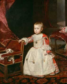
In a comment a while back, Elena pointed out that Diego Velázquez’s painting “Infante Felipe Próspero” (from 1659) provides a good example of how pink was acceptable for males to wear…as were, in some cases, dresses, which the young prince is wearing:

Elena says,

…until the late 1700s little boys would wear dresses or petticoats for as long as they could until they could dress as miniature adults…This was mainly for ease of bodily functions.

Of course, today most parents would be appalled at the idea of dressing toddler boys in dresses–dresses with frills and ribbons, at that.

The painting “Pope Innocent X,” also by Velázquez (1650) shows the Pope in light pink clothing:

Both images found at the National Gallery’s Velázquez page.

You might also check out Kent State University Museum’s Centuries of Childhood exhibit for examples of how children’s clothing has changed over time.

Thanks for the tip, Elena!

Muriel M.M. brought my attention to the catalog for Galls, a company that makes equipment and uniforms for public safety officers (military, police, firefighting, etc.). Muriel, an EMT, says,

The thing about their products is they don’t change much. Over the ten years I’ve received the catalog I can pretty much tell you what’s going to be in it: guns, batons, handcuffs, clothing such as boots, coats, uniforms, etc. Medical equipment and fire equipment are sold such as sirens, lights, latex gloves, breathing equipment. The list goes on and on.

But the newest version of the catalog Muriel received has something new: handcuffs now come in colors, not just silver. The options are blue, brown, gray, orange, yellow, and pink (light and bright!):

There are a couple of interesting things here. For one, it’s an attempt to provide a little (very limited) individualization to people who have to wear standard uniforms. Of course, it’s a superficial type of customization, similar to getting a cell phone of a particular color, but it provides at least some sense that the product reflects the personality or tastes of the user…something companies figured out long ago could boost sales (how many colors do cell phones come in these days?). Given that, I wonder how many police departments would allow officers to use brightly-colored handcuffs. Officers are allowed to buy customized items, but they can’t just go buy a different color of uniform; it may be that little personalized “touches” like this are allowed, though.

It’s also interesting to think about what the reaction might be to an officer who showed up at work with pink handcuffs. I wonder how many female officers would want to bring attention to their gender by using a product marked by the stereotypical feminine color. It also made me think of this post about cops in Thailand being punished by being forced to wear pink Hello Kitty armbands. I’m assuming a person would buy pink handcuffs to express their taste, but after looking at the old post, it made me wonder if anyone would ever put pink cuffs on male suspects just to try to annoy them. I bet one of my relatives who is a police officer would totally do that, except that it would require him to carry pink cuffs around all the time, which he would never, under any circumstances, do. He flipped out because his son liked a pink ball once.

NEW! Ben O. sent us a link to a similar product, Petals Workwear for Women.  The company makes pink products for female construction workers.

Hard hat:

cat_hard_hat_1335_normal1

Tool belt:

cat_toolbelt_79_normal

Protective ear wear:cat_hearing_protection_970_normal

Protective eye wear:cat_eye_protection_1455_normal

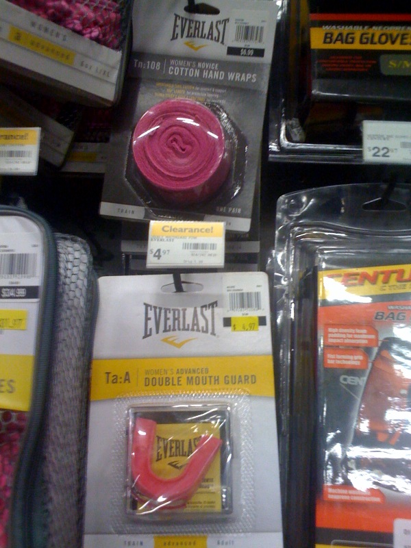
NEW (Aug. ’10)! Garland Walton sent along these pink boxing accessories: gloves, tape, and a mouth guard.  All in pink!

See also our post with a cartoon riffing on how people seem to think that pinkification is the answer to gender inequality.

The Pink Patch is similar to nicotine patches, except it’s a diet product aimed at young women. Here’s a photo from the website of a woman wearing it:

The website for this product clearly targets young women; it warns young women that they are at the time in their lives when their metabolism is highest, and refers to college weight-gain.

The product promises women a solution to their negative body image. Of course, the solution isn’t to think differently about their bodies; the solution is to use the Pink Patch to get skinny:

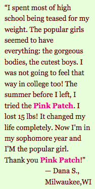
This quote from a supposed customer makes it clear that losing weight brings boys and popularity:

It also encourages competition and envy among girls:

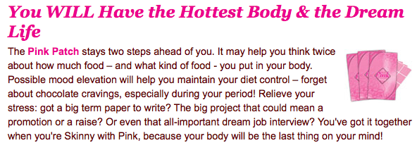
And apparently, it’s an upper. You might experience “possible mood elevation” and can “relieve your stress,” allowing you to get everything done:

So use the Pink Patch and you will lose weight, which will bring popularity and male attention. Girls will envy you. You’ll be happier, you’ll get a lot done, and that will help you graduate with that great job you always wanted.

It’s the overall message of the diet industry, condensed in one website: the answer to all your problems in a product that will help you melt the pounds away, thus transforming your life. And it’s pink! So feminine!

Via Big Fat Deal.

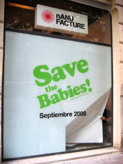
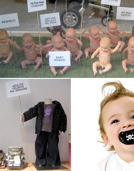
Miguel sent in these photos from nANUFACTURE, a children’s clothing store based in Valencia, Spain. The advertising campaign is “save the babies.” This first one was found at the company website:

This one was found here:

The babies in the top photo are holding signs in Spanish that say “there’s life beyond pink” and “no more teddy bears!” The sign in the lower left photo says “no sky blue, thanks.”

Given that the website includes photos of Angelina Jolie and Brad Pitt and of a scene from the “Sex and the City” movie that shows toys sold at the store, and the super-hipness of the clothing line (flared-leg kids’ jeans, anyone?), I assume the store sells expensive stuff. Their mission statement includes statements about supporting breastfeeding and natural childbirth, as well as selling children’s clothing. According to one of the owners (I think my translation is accurate enough),

Dads and moms…have their first son or daughter when they’re around age 30. That is, they’re young! But it appears that no other store owner in this sector [children’s clothes] has noticed this small detail.

They go on to talk about saving babies from ugly polka dots, teddy-bear stencils, and pastel pink and blue.

I think this is an interesting mixture of elements. It’s nice to see any store selling alternatives to the pink/blue dichotomy and providing forums for breastfeeding advocacy groups and such. But I also think the clear marketing to a certain type of parent is worthy of discussion. Obviously, kids don’t know whether they’re supposed to think polka dots are awesome or lame. This is about “saving” kids from things these young, hip parents think are lame or uncool. We’ve had a couple of posts recently about politically labeling kids (see here), but here we have an example of non-political labeling: as too hip and cool for the tastes of the masses. These images might be a useful addition to a discussion of how children’s clothing often reflects parents’ tastes and ideas about themselves (as cool, progressive, liberal/conservative, etc.), or about the rise in expensive children’s clothing marketed to the middle and upper-middle class.

Full disclosure: I do think many items of children’s clothing are hideous, but I’m probably in no position to judge, since my mom once made us shirts out of some rags she found in my grandpa’s shop that he planned to use to sop up oil. Yes, we actually wore rags.

Thanks, Miguel!

I just saw one of these signs in my neighbors’ yard (image found here):

The reason it struck me is that a) I’m quite certain it’s the first time I’ve ever seen a pink campaign sign and b) it made me remember the criticisms of the Kerry/Edwards yard signs from the 2004 campaign (see this post). The Democratic candidates’ signs were described as lacking confidence, whereas the Republicans’ logo exuded masculinity and assertiveness, which supposedly reinforced stereotypes of Democrats as weak and uncertain and Republicans as aggressive and strong. It’s a sign of the many unexpected events of this campaign season that just four years later Republicans would feel comfortable putting out a pink yard sign because they’re actively playing up the femininity of one of the candidates. It’s not just that they’re emphasizing that she’s female; I’m pretty sure if Hillary Clinton had won the Democratic nomination, she wouldn’t have pink yard signs. I have a feeling that the Democrats, facing the stereotype that they’re weak and uncertain, wouldn’t want to take the chance of having yard signs in a color associated with femininity, even if they had a female candidate, but that’s just a hunch.

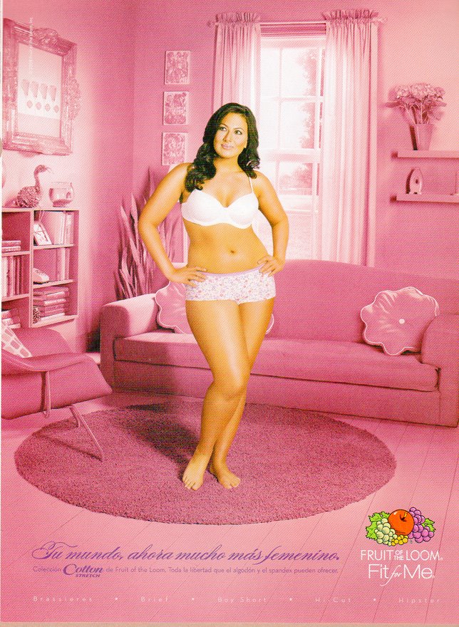
Multicult Classics posted these two Spanish-language Fruit of the Loom ads.  They are an extra nice example of the way that color is used to communicate gender:


Text: “Your world, now much more feminine.”

See also this post of kids with their stuff, these pictures of the Toys ‘R Us aisles, these breast cancer PSAs, and these guns marketed to women.

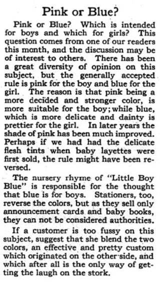
It’s obvious to us, today, that pink is for girls.  But it wasn’t until about the 1950s that our current gendered color scheme became widely accepted.  Before that, the colors were reversed.  In this excerpt for a vintage advice column (found here), we learn that:

“…the generally accepted rule is pink for the boy and blue for the girl.  The reason is that pink being a more decided and stronger color, is more suitable for the boy; while blue, which is more delicate and dainty is prettier for the girl.”