Speaking as a 30-year-old who still cherishes a threadbare, 29-year-old specimen, I can personally testify that teddy bears are objects highly charged with affect in modern U.S. bourgeois white society. Along with blankets, stuffed animals are frequently given to young children to play with. Many times, children grow attached to their animals and blankets, naming them, talking to them, sleeping with them and taking them everywhere.
In 1951, Donald Winnicott called such stuffed animals and security blankets “transitional objects.” I’m probably grossly simplifying this, but he posited that transitional objects occupy an important position in children’s emotional lives as mechanisms by which they soothe themselves as they differentiate their identities from those of their parents. Parenting advice emphasizes that transitional objects are part of a “normal and healthy phase of development” and even a “good thing” that parents may want to voluntarily introduce to anxious children.
In short, modern middle-class bourgeois white society associates teddy bears with a deep emotional connection between people. Teddy bears symbolize comfort and a nurturing parent-child bond. To many, they are images of love.
Over on its Web site for investors, Vermont Teddy Bear literally capitalizes on the “bears=love” connotations by couching its business in terms that suggest relationships and closeness. In this screenshot from the investor relations home page, for example, you can see that the over-the-phone sales staff are called “Bear Counselors,” suggesting that they give advice and mentoring about relationships.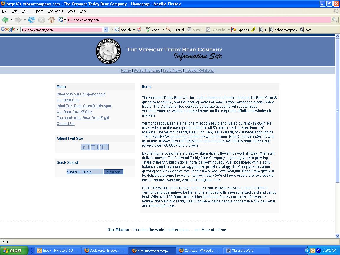
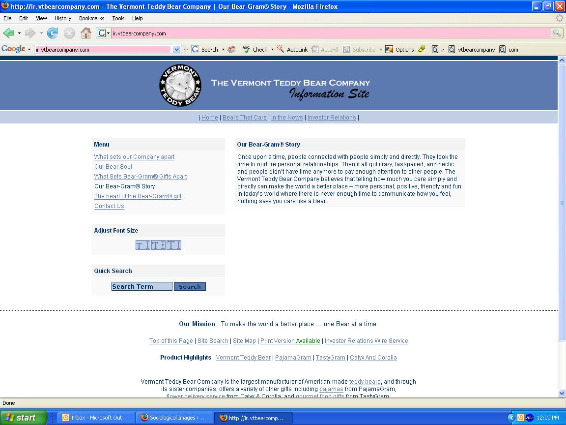
On the page entitled “Our Bear-Gram Story,” Vermont Teddy Bear positions its product as equivalent to the emotional work of creating and sustaining authentic relationships. The “story” says:
Once upon a time, people connected with people simply and directly. They took the time to nurture personal relationships. Then it all got crazy, fast-paced, and hectic and people didn’t have time anymore to pay enough attention to other people.
Of course, the thought that it was so good back in Ye Olde Non-Hectick Tymes is problematic, but so is the thought that teddy bears will suffice instead of “pay[ing] attention to other people.” Why expend all that effort relating to someone when you can just toss him or her a teddy bear instead?
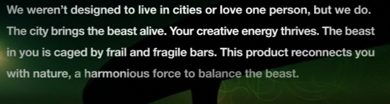
On the company’s site for customers, the same association between the toys and love appears, as evidenced by this banner proclaiming the teddy bears as “heartfelt,” an adjective usually used to describe significant declarations of sentiment:

For occasions that require difficult, emotionally draining “relationship work,” there’s even a whole category of “I’m Sorry/Apology” bears available to send.
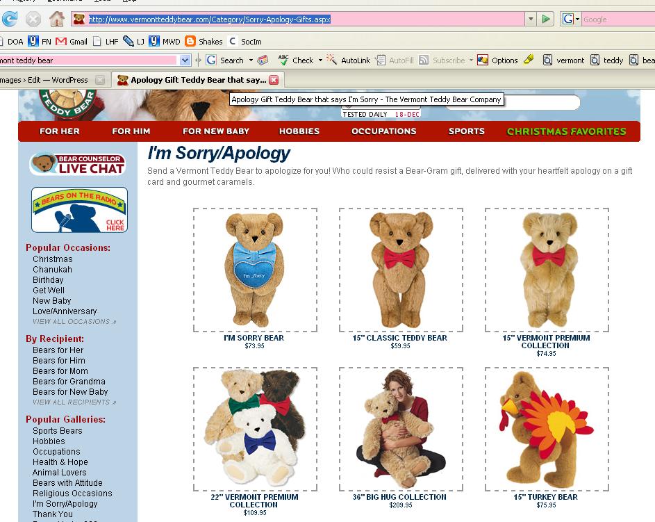
The I’m Sorry Bear comes with the following descriptive copy:
Whether you’ve broken their heart or their favorite coffee mug this Bear has got it covered. Holding a light blue pillow embroidered with the an “I’m Sorry” message and wearing a matching light blue bowtie, this Bear is a sure way to earn their forgiveness.
Ah, what price forgiveness?
Well, it’s $73.95. [Shipping and handling excluded. Insurance and rush orders extra. Please ask for international rates. Customs taxes may apply outside U.S. Order early to insure delivery by Christmas!]
I suppose that Vermont Teddy Bear’s deployment of a stuffed animal to do your emotional work for you is in the same category as ad campaigns for diamonds and credit cards that promise viewers intimacy through purchase of the products. However, Vermont Teddy Bear’s use of the “objects will fulfill you” trope is slipperier in part because a substantial number of potential consumers have experience with teddy bears as transitional objects that did [or still do] make them feel happy and calm.
In an amusing postscript, I grew up in Vermont, where we were kind of expected to support Vermont Teddy Bear Company. But when someone gave my younger brother a Vermont Teddy Bear as a gift, he never touched it. Finding the bear stiff and kind of lumpy, he preferred to drag around smaller and more squishable stuffed animals. No one else in the family was impressed with its cuddlability, not even me, and I was the one who collected stuffed animals to line the edges of my bed every night. The bear is now sitting on my mom’s desk as a display item, having not created an emotional connection at all.