Michael Kimmel argues that, for contemporary Americans, science is a superstition. Scientific explanations are comforting and often accepted without critical thought. The word “natural” rolls off our tongue and frequently gets conflated with “good.” We are obsessed with finding the biological origins of sexual orientation, gender difference, political proclivities, happiness… everything. Once a biological basis is found, it is considered the whole explanation. It is as if biology is more fundamental and more true than things like culture or society.
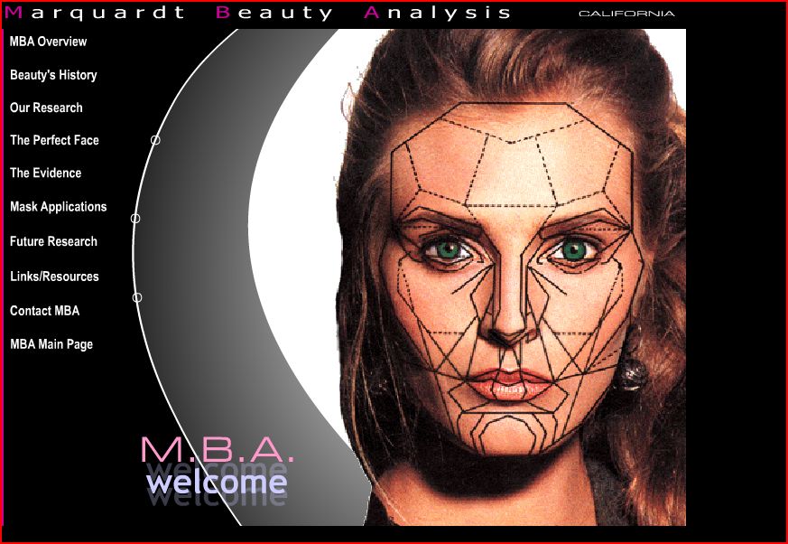
Our “faith” in science, then, is useful to marketers insofar as they can claim that their product is objectively tested, engineered, or otherwise scientifically sound. This brings me to this Marquardt Beauty Analysis website, sent in by Kiran D. The website explains the science behind beauty. The main page includes a woman’s face overlaid with complex geometric shapes:
Here is part of the mission statement (emphasis mine):
MBA is dedicated to proactively researching human visual aesthetics, including its biological and mathematical bases, and to utilizing the results of that research to develop and provide information and technology with which to analyze and positively modify (i.e. improve) human visual attractiveness.
MBA further is dedicated to tailoring and formatting this technology to specific uses for direct applications in the fields where human attractivenss is a factor or parameter (i.e. those fields interested in human visual attractiveness) including medicine, dentistry, psychology, anthropology, biology, anthropometry, the arts, cosmetic makeup, and fashion, as well as for direct use by the individual consumer.
Notice how they use scientific buzzwords like “bases,” “formatting,” “applications,” and “parameter.”
Here is a screenshot showing how they have tried to “scientize” beauty and make their endeavor look like legitimate science:
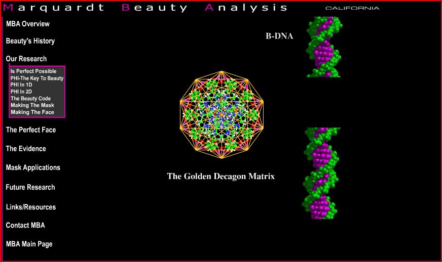
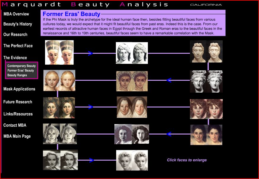
On the page below they claim that their formula works across history (elsewhere they also claim it works across race), so they argue that their science is objective and not culturally or historically contingent:
The website, of course, is not really about research on beauty; it’s a mechanism with which to sell make-up, cosmetic surgery, and other products. Here is a screenshot of the first part of the links page:
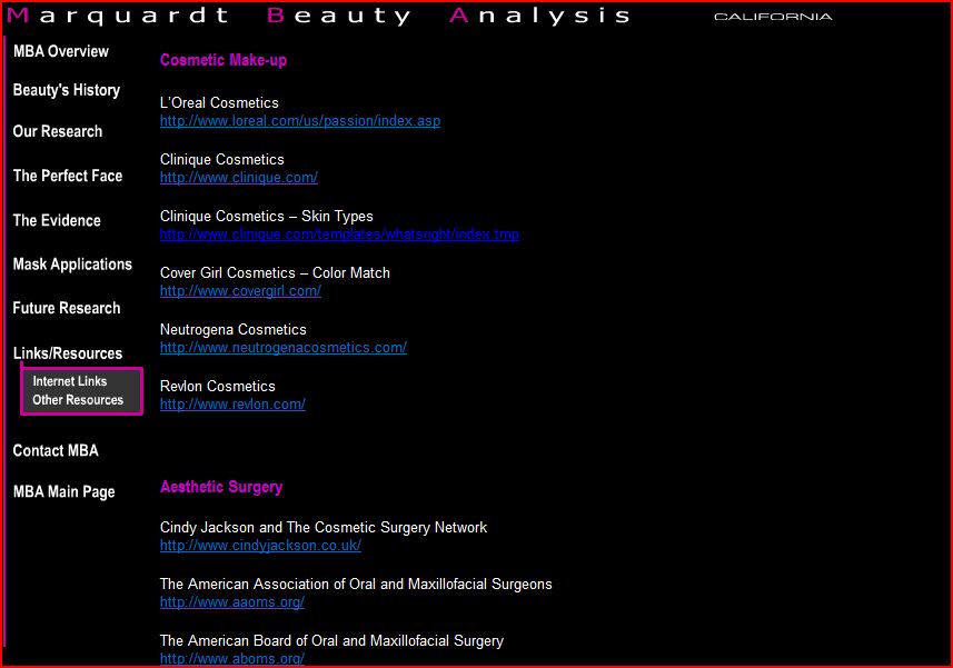
The page includes links to L’Oreal, Clinique, Cover Girl, Neutrogena, and Revlon; five “aesthetic surgery” links; three “aesthetic dentistry” links; and a handful of academic-y sounding links.
Thanks Kiran!