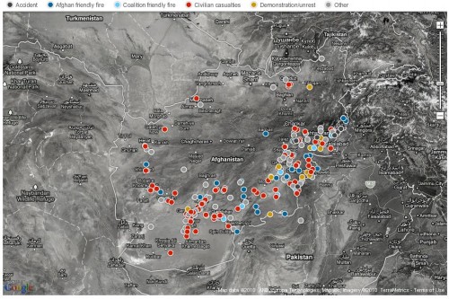
Henry H. sent in a link to an interactive map at the Guardian based on the recently leaked collection of over 92,000 records about the war in Afghanistan. The map shows the location of incidents in the reports broken down by category: accident, Afghan friendly fire, Coalition friendly fire, civilian casualties, demonstration/unrest, and other:

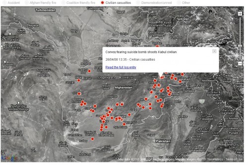
You can hide any of the categories you want to get a better picture of only some of them, and if you roll over a dot it will give you a brief summary with a link to the full report about it. Here’s the map with everything hidden except civilian casualties and the summary of one incident:

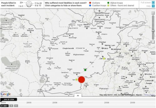
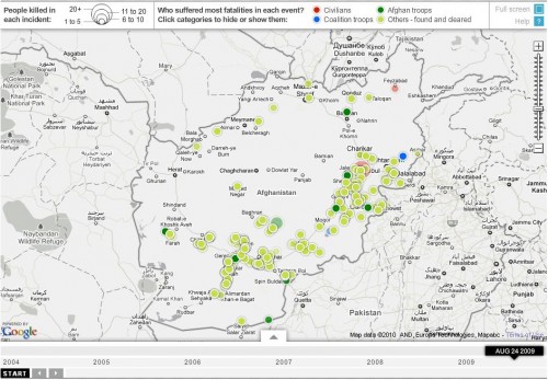
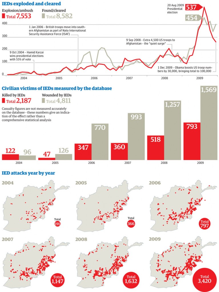
You can also see the locations of all IED attacks that occurred on any day between January 1st, 2004 and January 1st, 2010. The size indicates the number of people killed and the color tells you the category of most of the casualties (civilians, Afghan forces, etc.). Here’s the map from January 6th, 2004 (the light green indicates that an IED was planted but that it was found and defused without any casualties):

Compare to the map for August 24, 2009, which shows that the incidence of attempted IED attacks has gone up significantly, though most of them that day were discovered before they harmed anyone:

I can think of a possible explanation for the increase in the use of IEDs over time. One could be that their use diffused from other war zones, particularly Iraq, and were increasingly adopted as a technique in Afghanistan; perhaps Afghans opposed to the Coalition weren’t familiar with IEDs in the early years of the invasion and they were therefore relatively infrequent. The other, which doesn’t exclude the first, is that it indicates an increase in resistance to the Coalition forces and their Afghan allies over time.

The increase in the number of IEDs that are discovered and defused before they go off would seem to show how groups adapt to forms of warfare; presumably the Coalition forces have become more aware of the danger of IEDs and thus look out for them more and are more skilled at clearing them.

I might be totally wrong on both counts, so if you have other thoughts, please share them.

More data on IED attacks over time, including civilians wounded:

It’s a fascinating resource for information on the war. I think it’s really interesting as an illustration of the rationalization and bureaucratization of warfare by the U.S. military: that is, events are carefully categorized and described, and military leaders have an enormous amount of data them. While individual soldiers may very well experience war as chaotic or disorganized, those overseeing it have a wealth of information that methodically distills that chaos and disorganization into statistics associated with particular events whose location is clearly identified.


Danielle Q. sent us this gem, a 1980s commercial for a doll called My Child. It teaches girls all the important parts of being a mom:

  • Others will judge you as a mother based on how well-dressed and groomed your kids are.
  • Mothering requires a lot of repetitive, time-consuming work, but good moms think “it’s a pleasure.”
  • At age 8 or so, you should already be thinking of yourself as a “little mommy.”

Here you go:

The Washington Post recently posted a report called Top Secret America that looks at the proliferation of government organizations (many related to intelligence gathering) that require top-secret clearance and are largely unknown by the public and even many officials. Not surprisingly, the largest concentration is outside Washington, D.C.:

All of these places exist just outside Washington in what amounts to the capital of an alternative geography of the United States, one defined by the concentration of top-secret government organizations and the companies that do work for them. This Fort Meade cluster is the largest of a dozen such clusters across the United States that are the nerve centers of Top Secret America and its 854,000 workers.

Debate about the role of intelligence in protecting the country occurs only when something goes wrong and the government investigates, or when an unauthorized disclosure of classified information turns into news.

The existence of these clusters is so little known that most people don’t realize when they’re nearing the epicenter of Fort Meade’s, even when the GPS on their car dashboard suddenly begins giving incorrect directions, trapping the driver in a series of U-turns, because the government is jamming all nearby signals.

The site has an interactive map where you can see the locations of government (red) and associated private company (blue) locations:

You can also look at networks between agencies and companies working on different programs. Here’s some info on top-secret weapons development:

Types of work the CIA does:

There’s a database where you can look up contracted companies for each program or type of work, including location, who they work with, annual revenues, and more.

According to the editor, they spent two years on the investigation and each location is corroborated by at least two public records. They also talked to government officials about security concerns:

Because of the nature of this project, we allowed government officials to see the Web site several months ago and asked them to tell us of any specific concerns. They offered none at that time. As the project evolved, we shared the Web site’s revised capabilities. Again, we asked for specific concerns. One government body objected to certain data points on the site and explained why; we removed those items. Another agency objected that the entire Web site could pose a national security risk but declined to offer specific comments.

We made other public safety judgments about how much information to show on the Web site. For instance, we used the addresses of company headquarters buildings, information which, in most cases, is available on companies’ own Web sites, but we limited the degree to which readers can use the zoom function on maps to pinpoint those or other locations.

I would think there would be ultra-super-mega top-secret locations that their investigation couldn’t uncover because there wouldn’t be public records about them.

Re-posted at Drawing On Indians.

Rob Walker (author of the fascinating book Buying In: What We Buy and Who We Are) sent me a link to a post at Drinkin’ and Dronin’ of a 1954 Levi Strauss brochure about “western Indian lore.” It’s a nice round-up of stereotypes and appropriations of Native Americans. We start off with an angry, bare-chested (and Levis-clad) man with a tomahawk, shield, moccasins, and headdress; I’d guess he’s supposed to be a warrior doing a war dance:

Then some descriptions of items associated with different tribes and the obligatory broken English (“just want ‘um”) familiar to anyone who watched The Lone Ranger and paid attention to Tonto:

I have no idea how accurate their descriptions of “unusual Indian weapons” are, but the overall tone of the brochure doesn’t inspire a lot of confidence.

And we have a lesson on “the Indian sign language,” the origins of which are “lost in the mists of time”:

Related posts: Potowatamis didn’t have a word for “global business center,” “discovering” Newfoundland, appropriation of Native Americans in fashion, teaching kids how to be American Indians, marketing the Vancouver Olympics, ice skaters dress up like Australian aborigines, native cultures in Avatar, Poca-Hotness, Indian costume for your dog, Indian Halloween costumes, Disney depicts Native Americans, “my skin is dark but my heart is white,” American Indians on t-shirts, sports mascots, Playmobil’s American Indian family, Howe Nissan’s American Indian statue, the “crying Indian” anti-litter PSA, Native Americans in Italian anti-immigration posters, and more American Indian dolls.

Also check out Adrienne K.’s blog Native Appropriations for lots of examples.

Two friends of mine recently had a baby and the hospital sent home all kinds of instructional packets, all of which included product sample, advertising materials, etc. One item they found was this advertisement for the U.S. Career Institute’s program to become a medical claims processor who works from home. The ad plays on the guilt mothers often still have about working outside the home:

I don’t have a problem, in and of itself, with suggesting that a job provides options for parents who want to be home full-time but also work. Given the fact that women still bear the primary responsibility for childcare even though most want or need to provide financial support to the family, I’m sure many women (and for that matter, a lot of men) would find them appealing (in theory, anyway; I have my doubts about a lot of the “work at home and make a gazillion dollars a week!” pitches, but I have no knowledge of this one in particular).

What bothers me is the way the ad is written to not just say, “Hey, if you are staying home with the kids but would like to work for pay as well, this is a great opportunity.” Instead, the blaring headline “I’m glad you work at home Mommy” ties into the idea that children desperately want their moms (but apparently not dads) to stay home with them, and moms who do so are being the best moms. Even among women who value their careers and always planned to return to the paid workforce, many are surprised by how much guilt they feel when they do so. They may feel guilty for leaving their child with another childcare provider, but if they actually look forward to going back to work and are excited or relieved to be there, they often feel guilty for that, too. This is a burden of guilt that new fathers do not generally share; while they may wish they could be home more with their children, they usually don’t express guilt for not doing so, largely because by working outside the home, they are actually fulfilling the normative role of what a good father does, whereas working outside the home, particularly when children are young, it incompatible with ideals of good mothering.

On the very bottom of pg. 2 it does say, “USCI is nationally accredited and approved for veterans’ education benefits!” That’s an interesting line, since the majority of people would would qualify for veterans’ educational benefits would be men (for instance, women currently make up only 15.5% of the U.S. Army). There are other elements on the brochure that seem gender-neutral — being your own boss, setting your own hours, increasing job opportunities in the field — but that line seems to be the one part that is more tailored to a male audience.

On an unrelated topic, I love the totally meaningless graph at the top right of the 2nd page: look! This one column is way bigger than the others! It is entirely lacking in any useful information — how are they defining “growth”? What is 0% referring to? What level of growth are we talking about here? For all we know, the health/medical services bar could indicated 0.000001% growth.

And just out of interest, do any of you have any experience with these types of jobs? Did it live up to the claims (particularly flexibility and the amount of money you can make)?

Way back in June my friend Abby Kinchy let me know about an article in the New York Times by Stephanie Coontz, a scholar best known for her book The Way We Never Were, which addresses myths about the “traditional” family. The article is about no-fault divorces and their pros and cons. What struck Abby were the accompanying images, which depict two hypothetical break-up letters (to “John” and “Jane”) that include a list of stereotypes about men and women, what they want out of marriage, and why they fight.

The Dear John letter:

So women want to break up because they feel stunted in their marriage (they miss out on experiences, they’re bored, they want to travel), they are still hung up on old flames, they want kids and their male partners (of course) don’t, and they just might be lesbians.

The Dear Jane letter:

What do men stereotypically want to leave their female partners for? Being emasculated (“you make me feel like less of a…”), men aren’t supposed to be monogamous (“it’s not natural for a man to be mono…”), they want more sex with more people, women spent too much money shopping, or their wives get stupid haircuts.

There is some gender agreement, though; neither men nor women can take a spouse who gets fat.

UPDATE: Citizenparables thinks the images are more playing on those still-existing stereotypes:

Perhaps the point of the images is rejecting – crossing out – those cliche stereotypical excuses, which are by implication false (because surely they can’t all be true!), leaving the essential idea that when someone leaves a relationship it’s a choice, pure and simple, which they ought to own rather than blame on either themselves or the partner.

The New York Times has a neat interactive graph based on data from the American Time Use Survey that lets you look at hour-by-hour time use broken down by sex, employment status, 3 racial/ethnic groups (White, Black, Hispanic), age, education, and number of children (though, unfortunately, you can’t search by more than one category at once). Here is the breakdown for the entire sample:

For people age 15-24:

Watching TV and movies takes up a lot of the time of those over age 65:

You can also click on a particular activity to get more information about it:

Those with advanced degrees spent the most time participating in sports or watching them in person; I suspect that the data might look a bit different if time spent watching sports on TV went in this category instead of the TV category:

Just a note, the averages for time spent at work seem pretty low, but that’s because they’re averaged over all days of the week, including any days off, rather than only days a person actually went to work.

Presumably the amount of time you’ll spend playing around with the site goes under computer use.

Nia A. sent in a chart from an article in the Revista Española de Cardiología about gender in medical schools in Spain. Overall, the medical field is increasingly feminized. In 2008, 73% of new medical school graduates (licenciadas en medicina) were female (note that in Spain they use commas where we would use a decimal in a number in the U.S., so 73,04 = 73.04):

It’s a significant increase, but women also earned a significant majority of medical degrees by 1998, so this isn’t a new phenomenon. Women also earned just over half (52%) of Ph.D.s in 2008 (tesis doctorales aprobadas).

When we look at faculty (docentes en la universidad, total), women are a distinct minority, making up only 20%. This varies quite a bit by position (I’m relying on Nia’s comments and Wikipedia to translate Spain’s academic ranks to the U.S. equivalent; please let me know if I’ve misunderstood a category):

  • The percentage of women serving as teaching assistants (profesoras ayudantes) has gone down from 72% in 1998 to 50% in 2008 (the only area where the percentage of women decreased).
  • Women make up 22% of lecturers (profesoras asociadas, who may or may not be tenured) and 9% of titulares de universidad (which I think are what we would call associate professors in the U.S.). They make up a sizable minority of contratadas doctoras, a tenured position similar to a professor (42%).
  • Women made up a larger percentage of titulares de escuela universitaria (53%), a position at non-Ph.D. granting and technical colleges; however, this position was abolished in some academic restructuring in 2007. Those holding it keep their jobs, but no new hires will be made.
  • However, women make up only a tiny portion (4%) of catedráticas de universidad (roughly the same as a full professor — received tenure and then met a number of other requirements for promotion). Only this group is eligible to become a rector (university president)

This pattern is widespread in universities (see our post on engineering and tech faculty), and likely due to a number of factors. There is always lag time between demographic changes in a field and changes in faculty, since unless a lot of new positions are created, potential faculty have to wait until current ones retire. All things being equal, we’d expect the % of women faculty to go up steadily over time as more female Ph.D. candidates apply for positions previously held by men. Of course, women have been earning the majority of medical degrees since before 1998, so there’s been sufficient time for gender changes in the field to affect the composition of faculty.

But all things aren’t equal in university hiring. Historically women have faced significant gender discrimination, and this continues to occur. However, a large body of evidence indicates that family/work conflicts play a huge role. Because women still, as a group, have primary responsibility for childcare, they are more likely than men to face difficulties balancing family time with work requirements, such that they are less likely to advance to tenure or promotions. They are more likely to opt out of more demanding positions — applying to be Dean, say, or accepting a position at a research-heavy university as opposed to a community college — but also find that they may be “mommy tracked” by hiring committees who assume they’ll be taking too much time out of the paid workforce to raise their kids (and often make these assumption whether or not the woman has or plans to have kids or stay home with them).

I also suspect that if the data were broken down into specialty, we’d see more women earning degrees or teaching in areas associated with women or the family (ob/gyns, for example) as opposed to more masculinized specialties, often perceived as very high-status, like neurosurgery (we see more women than men in pediatrics and ob/gyn in the U.S., for instance).

Will the percent of female med school faculty in Spain and elsewhere increase? Undoubtedly over time it will. But due to factors including those I just discussed, it’s also likely that the increase will lag significantly behind what we’d expect just based on the number of women earning medical degrees.