[Note: A couple of readers have sent in info that calls into question the graphic below — not the relative sizes and such, but the specific numbers cited for the size of various spills (making them look larger than other reports). This may be a reflection of how the organization defines “spilled” oil (they say “lost to the environment”), and I provide their definition below. Thanks to T for providing a list of generally accepted estimates of major spills. Given that the organization providing the data is an association of oil tanker owners, it seems unlikely that they would be intentionally exaggerating the sizes of spills for political purposes or something. So while the graphic’s illustration of the relative size of these spills is still accurate in a general sense, unless I can track down a clear explanation for the cited numbers, I wouldn’t rely on them. Sorry for the confusion, and I’ll continue updating if I can figure out what’s going on.]

———-

Allie B. sent in a graphic comparing the BP leak to major tanker oil spills (and I forgot to add the numbers reported are in tonnes, which is about 2,240 pounds each):

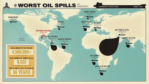
The info is based on data from The International Tanker Owners Pollution Federation Limited, an industry group that provides a lot of data on spills from oil tankers (so that doesn’t include leaks or spills from pipelines, wells, and so on). From the website:

It should be noted that the figures for the amount of oil spilt in an incident include all oil lost to the environment, including that which burnt or remained in a sunken vessel. There is considerable annual variation in both the incidence of oil spills and the amounts of oil lost. Consequently, the figures in the following tables, and any averages derived from them should be viewed with caution.

UPDATE: Commenter T points out that some of the numbers here (especially the Gulf War spill) don’t match up with more widely-reported data and seem to exaggerate the size of some of the spills. The relative sizes still hold up in general, but be cautious with the actual reported sizes of the spills. It may be that their way of defining spills (all oil “lost to the environment”) includes significantly more oil than what is traditionally counted as being part of a spill. I’m trying to track down exactly what’s going on here.

Given how much media coverage BP leak is getting, it’s a bit shocking to see it in comparison to the tanker spills represented here. That isn’t to say that somehow by comparison the BP leak isn’t that bad; rather, it made me aware of how little I usually hear about the environmental impacts of the global petroleum industry as long as they don’t happen along the U.S. coastline.

For instance, a recent NYT article discusses the impacts of oil leaks and spills in Nigeria:

The Niger Delta…has endured the equivalent of the Exxon Valdez spill every year for 50 years by some estimates. The oil pours out nearly every week, and some swamps are long since lifeless…leaving residents here astonished at the nonstop attention paid to the gusher half a world away in the Gulf of Mexico. It was only a few weeks ago, they say, that a burst pipe belonging to Royal Dutch Shell in the mangroves was finally shut after flowing for two months…

I think the illustration brings into perspective how our perceptions of environmental disasters are shaped (not surprisingly, I know) by the amount of media coverage it gets and whether it occurs in a place we’re familiar with. Some pollution gets national and international media attention (at least for a while), and some is largely ignored outside the local area directly affected. The BP leak is by no means the largest oil-related ecological disaster in history — not even close yet, and hopefully it won’t get there — but media coverage and clean-up efforts aren’t distributed equally. And, again, I’m not saying that somehow this means we shouldn’t be too concerned about the Gulf leak. But it does make clear that we’re not equally concerned about, say, all people whose livelihoods are devastated by petroleum leaks/spills in waterways.

And just out of curiosity about the link between U.S. oil consumption and Nigerian oil production, I went to the webpage of the U.S. Energy Information Administration to see how much oil the U.S. imports from Nigeria. It’s currently our 4th-largest source of crude imports, and our daily Nigerian imports are up quite a bit over a year ago (about 1.1 million barrels in April ’10 compared to 673,000 a day in April ’09):

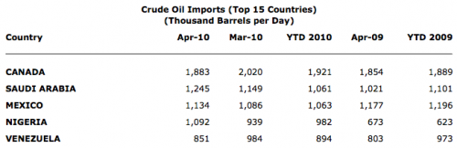
And I’m a bit embarrassed to admit that I had no idea Canada is currently our biggest source of imported crude oil (and total petroleum imports as well).

Gwen Sharp is an associate professor of sociology at Nevada State College. You can follow her on Twitter at @gwensharpnv.

Fox sent us this image from a Sephora email; clicking on the various skin tones would take you to a section on makeup for your complexion:

What struck Fox is how light all three skin tones are. I’m pretty pale — I often match shades with names like “ivory” — and I think I’d still be “medium” toned according to this graphic. Also, all three women have pretty similar, stereotypically Caucasian, facial features.

And while any skin tone categorization is going to throw together a wide array of shades, in this case, it seems like a lot more skin tones are going to be subsumed under the “dark” category than the others, since it starts out at a pretty light shade and contains every shade darker than that. The options here separate out lighter skin tones from one another pretty finely while throwing an enormous range of skin types together under “dark.” Presumably Sephora conducted intensive research and discovered that while lighter-skinned women required carefully customized makeup color schemes, women with even slightly darker skin can all make do with the same one.

Diego Costa recently pointed out to us the sexualization of Jaden Smith. In that post, I wondered if race played much of a part in this process; while non-White boys are often adultified, it wasn’t clear to me that it was a major factor in this case. Diego followed up by sending along some photos of White teen heartthrob/pop star Justin Bieber, who you may know better as that kid on the cover of magazines whose hair you desperately want to brush out of his eyes. He’s a bit older than Jaden, so the idea of him dating or talking about girls isn’t surprising, but the specific example Diego sent in is.

Apparently Justin Bieber, who is 16, met Kim Kardashian, the 29-year-old reality-TV personality and model, earlier this year at the White House Correspondents’ Dinner (and no, I didn’t know teen pop stars go to the Correspondents’ Dinner, either). Apparently after she Tweeted that she had “Bieber fever” and he joked about her being his “girlfriend,” Bieber fans flipped out and sent her death threats and such.

Following this, the two recently posed together for a fashion shoot for Elle, presumably making fun of and capitalizing on the earlier frenzy and publicity regarding their friendship. The photo shoot had them walking on the beach, in the water, holding hands, and in other ways hinting at romance; in some cases, Bieber’s light-colored shirt is wet and you can see his entire chest through it:

Diego asks how this would go over if the roles were reversed: if Elle had images of a 16-year-old female teen star in a see-through shirt walking on the beach with, or getting a flower from, a 29-year-old male celebrity “mostly known for…posing nude several times and making money off of his condom-free sex tape…” (after a sex tape of Kardashian with her ex-boyfriend appeared, she sued and settled with the company distributing it for $5 million).

I’m not trying to stigmatize Kardashian; I’m not interested in her, or why she’s famous, here. But I think Diego has a very good point: it’s unlikely many people will think this is an inappropriate sexualization of Bieber (though perhaps Kardashian will need some extra security guards when Bieber’s fans see these). As the reaction to Jayden Smith indicates, we accept the idea of boys being sexual, or sexually interested, at younger ages than girls, and any interest they show in older girls or women is a sign of their sexual precocity — and, of course, heterosexuality — not a sign that they are either in danger of being preyed upon or that they are tempting Lolitas (and thus dangerous to men). We simply don’t worry as much about a 16-year-old teen boy shown in a photo like this because we don’t think of sexuality being dangerous for them in the way we think it is for girls.

UPDATE: Sorry comments were previously turned off — some type of glitch.

Andrew M. sent us a link to an interesting post by Lewis Denby at Beef Jack about the video game APB. The game lets you customize the characters in a variety of ways, including height and weight. Denby noticed something interesting about the customization, however. Here’s a male figure with the weight at the maximum level:

As Denby points out, it’s pretty unusual to have main characters that give the option of not being super muscular and slim, so this is pretty surprising. Perhaps less surprising is what he found when he maxed out the weight scale for a female character:

While she’s certainly larger than most women in video games, the maximum body proportion for her seems quite a bit thinner than the maximum allowed for the male character, and she still has an hourglass shape. So you’re given the option to customize the characters’ bodies, but it appears you get less choice for the female figures than the male ones. The question is why; did the designers think this is as large as anyone was likely to ever want a female character to be? Were they, for whatever reason, more concerned about female than male characters being too much outside the video game norm, to the point of limiting customization options? Some other reason for this disparity? If it were due just to technical design issues, I don’t see why it would be possible to give more weight range for the male character than the female one.

Beef Jack contacted the company for comment but, it being the weekend, they’re still waiting to hear back.

The website If It Was My Home (and yes, they know about the grammar error) allows you to get a better grasp on the size of the area affected by the BP oil leak.  They use National Oceanic and Atmospheric Administration’s daily updates on where the oil will reach in the next 24 hours and allow you to use Google Maps to position it anywhere you want. It’s easier for me, at least, to get an idea of the dimensions of the area we’re talking about when I can imagine it on an area I’m familiar with than seeing it on a map of the ocean.

Here’s the oil leak area centered over Las Vegas, where I live:

The darker the shade of gray, the denser the oil. Here is the current NOAA surface oil projection for the next 24 hours; red indicates places oil may hit shores:

Today’s 72-hour projection, which shows the range extending qute a bit to the west, and more affected shoreline:

Thanks to Kate W. for the link!

Related posts: using the oil spill to advertise cheap flights, should we clean up oil-soaked wildlife?, the Gulf oil industry, BP buys Google search terms, BP gives Florida money for advertising tourism, protesting BP, and the power of images of environmental disasters.

Dmitriy T.M. sent us a link to a story at Slate about (mostly European) “national personifications” — that is, human figures used to represent particular countries, their citizens, or ideas of the national character.  Personification is contentious in that it aims to represent a diverse society with a single person, often representing a simple idea.  Accordingly, we sometimes see divergent, or even conflicting, personifications.

Many personifications in Europe and areas once colonized by them connect the nation to noble ideas and values through the use of Latin-derived names and the use of robes, poses, and other elements of classic statues and paintings to adorn a female figure. For instance, the United Kingdom’s Britannia (an emblem that first emerged when Britain was still ruled by Rome) is a goddess-like figure wearing a Roman-style helmet who has, over time, come to represent the nation and the idea of liberty:

The U.S. has a similar figure, Columbia:

More popular characterizations also emerge, often representing the national character not through goddess-like imagery but as an Average Citizen.  For instance, much more familiar in the U.S. than Columbia is Uncle Sam. He differs from many other national personifications in that he doesn’t represent the U.S. citizenry or the idea of the nation in general; he specifically represents the U.S. government and is best known for wanting “you” to join the military, buy war bonds, and such:

And in addition to Brittania, the U.K. is also personified by John Bull:

According to the Slate article, John Bull presents the British people as middle-class, smart in a common-sense way, and also somewhat suspicious of authority — that is, John Bull is a personification that separates the citizenry from government (the source of authority) to some extent, and thus has been used in many political cartoons to question government policies (whereas Uncle Sam has often been used to advocate them, since he represents the government itself).

Going a step further, Portugal’s Zé Povinho, a working-class personification, actively mocks the powerful, including political elites:

Competing personifications may be used by different political factions. For instance, those in favor of and opposed to Irish independence used female emblems of Ireland. Opponents of Irish nationalism used the figure of Hibernia, represented as the younger sister of Brittania and in need of her sister’s protection from the brutish (male) nationalist forces:

Nationalists responded with Kathleen Ni Houlihan, “generally depicted as an old woman who needs the help of young Irish men willing to fight and die to free Ireland from colonial rule, usually resulting in the young men becoming martyrs for this cause”:

The gender element in these competing personifications is interesting: in both cases Ireland is a woman in need of protection, but who see needs protected by (a stronger sister or men) and from (men in both cases) differs.

So here we have just a small handful of national personifications that may coexist fairly harmoniously while serving different purposes (say, Brittania and John Bull) or actively conflict (representations of Ireland). Various groups in a nation (political elites, different social classes, rebels, etc.) are unlikely to identify equally with a single personification; thus, the figures used to represent a country or its citizens can become sites of political or cultural contention, defining who has the most legitimate claim to being the backbone of the nation (the middle-class John Bull, the working-class Zé Povinho) or framing independence or other political movements.

Kristi P. sent us a link to a story at OMG! from Yahoo! about Christina Hendricks, who is famous for playing the curvaceous Joan on Mad Men. The article title includes “‘I Felt Beautiful’ Gaining ’15 Pounds’,” and the article discusses how Hendricks feels about her body.

Notice the contradiction in this screencap?

That’s right: throughout the article on how Christina Hendricks loves her non-waifish body there are links to stories about “incredible star slim-downs,” getting a “celebrity six-pack,” and how to get a “last-minute bikini bod.” So even in a story about a person reveling in her body, the message is clearly conveyed that your own body is not good enough, and to make it better, you probably need to make it thinner.

Kelly sent in a photo she took of a flyer she found on her car windshield recently. The flyer advertised an event at a local bar:

Notice that women ladies paid no cover all night, but men paid $5. In addition, men had to be 21 to get in, but women only had to be 18. And from 8-10 p.m. Sex on the Beach drinks, stereotyped as girly, were free.

It’s a particularly striking example of how bars use women as lures to get men in to buy lots of drinks. Ladies’ nights technically discriminate against men, who have to pay a cover while women don’t. But at the same time, women are being used by the bars letting them in for free.

Why let in women who can’t legally drink but not men of the same age? Because these establishments don’t see women as the real money-making customers. Letting some women in who might take up tables without buying expensive drinks is worth it if it gives the bar a reputation for having hot female patrons and, as a result, draws in men who will buy drinks, both for themselves and for women.

This works because of gendered norms in which men actively pursue and buy things for women they’re interested in, but not vice versa, and that men date younger women more than women date younger men. Given these assumptions, there’s no point in (intentionally) allowing underage men in or to let men in for free while charging women. The norms of dating make it unlikely that groups of women would show up and buy enough drinks for themselves and the men in the bar to make up for the free drinks the guys drank or the waived cover charges.

We see ladies’ nights much more frequently than guys’ nights or whatever the equivalent would be because patterns of dating and sexual interest make women passive players whose job is to attract male attention, largely by paying attention to how they look and dress. Men’s job is to see a woman they find attractive and then pursue her, partially by paying for drinks, dinner, movies, etc.

And bars such as this one capitalize on this by sacrificing some profits (through free drinks and no cover) to get more women to come in and as a result attract the male customers they count on to spend the majority of the money. Gendered norms of dating thus provide a pretty good marketing strategy for bars.