Oh, man. As if we needed another reminder as to why cartoon art is a medium that can be used for evil as easily as good, comes now the next installment in a series of racist National Review covers trafficking in Asian stereotypical imagery.
You’ll remember, of course, that back in March 1997, the National Review released the infamous “Manchurian Candidates” cover seen here (which, due to the fact that the Internet was just a tot when that slice of tripe hit the newsstands, I was only able to find in embedded in a journal article written by Darrell Hamamoto, w00t!).
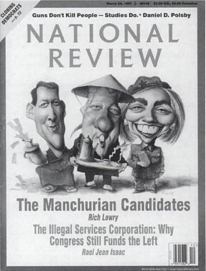
Asian Americans understandably reacted with stunned rage at the depiction of then-President Bill Clinton, First Lady Hillary Clinton, and Vice-President Al Gore in stereotypical Chinese garb, their features warped into exaggerated Asian caricatures (slanted eyes, buck teeth).
The National Review was unrepentant in the face of charges that the cartoon was offensive and inflammatory, responding, in part, that:
Caricatures and cartoons …require exaggerated features and, where a social type is portrayed, a recognizable stereotype. Thus, a cartoonist who wants to depict an Englishman will show him wearing a monocle and bowler hat, a Frenchman in beret and striped jersey, a Russian in fur hat, dancing the gopak, etc.
The first point can’t entirely be disputed: The cartoon medium often uses simplified, exaggerated features for emphasis, for satirical purpose and for ease in depicting broad emotion.
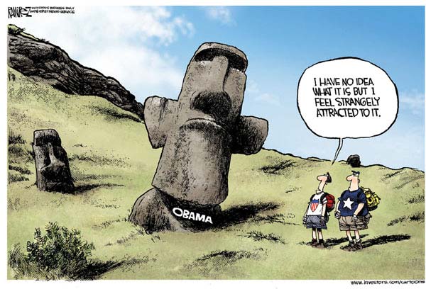
But it’s one thing to exaggerate features — Obama’s protruding ears invariably become giant jug-handles when he’s rendered, for instance. The Mike Ramirez cartoon below actually essentializes Obama’s appearance down to his ears — and still manages to make its point clear.
It’s another to incorporate racialized features that weren’t there to begin with: For instance, consider these images — a caricature of Obama from an “Obama Waffles” package, as gleefully sold during the right-wing ” Values Voters Summit,” and a close-up of Obama’s official portrait from his days as Senator from Illinois.
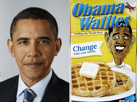
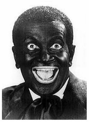
Apart from being overtly racist, the caricature on the box doesn’t remotely resemble Obama — with its pop-eyed expression, darkened skin, enormous, toothy grin and thick lips, it looks a lot more like…well, the picture below can speak for itself, I guess.
Going back to the National Review “Manchurian Candidates” cover now, what you see is that there’s more going on in the images of the Clintons and Gore than the typical flamboyant exaggeration used in cartooning. In addition to Bill’s bulbous nose and Gore’s pursed, almost sneering lips (both typical of their respective caricatures), you see…hmm…narrowed eyes… oversized, bucked teeth… a Fu Manchu moustache– hey, just about every racist synecdoche in the anti-Asian propaganda library! (At least the stuff that belongs above the waist.)
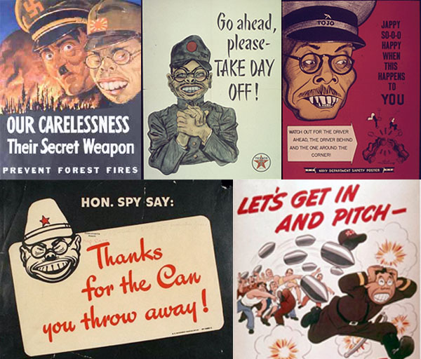
Just to be clear here: It’s one thing if they were simply drawn in Chinese clothing or doing quaint folkdances, as suggested by the National Review in its disgenuous response. That would arguably be in-bounds satirically (regardless of whether you find the political point being made to be fair or accurate).
But layering yellowface-propaganda memes into the picture transforms the caricature from an act of humor into an act of war. The images to the right are examples of what I’m talking about.
Even if you’re insensitive enough to racial propriety to want to give white people Asian features in order to prove a political point, that simply isn’t what Asian people look like, and never has been. The squinty, buck-toothed Asian person with bright yellow skin and eyes angled at ten minutes to two does not exist in nature. However much you soften it, those false features are in fact weapons of mass destruction, artifacts of an era where it was used to dehumanize the enemy enough so they could be killed without compunction.
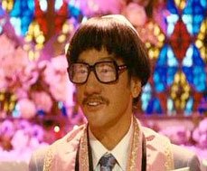
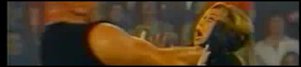
For that reason, there’s no acceptable way they should be invoked in a casual popular context, any more than minstrel stereotypes or anti-semitic “Elders of Zion” caricatures have a place in everyday culture. Discouragingly, they remain persistent in media today — from entertainment (see left: Rob Schneider in 2007’s “I Now Pronounce You Chuck and Larry“) to news and commentary. Well, actually not most news and commentary — it’s really only the profoundly racist right-wing organs that still blithely fart out the yellowface imagery. Like, for instance…the National Review.
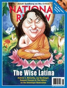
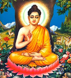
This cover to the right is the current issue of the magazine, on stands now. As you can see, it depicts Supreme Court nominee Sonia Sotomayor as the Buddha. Despite the fact that Sotomayor is Catholic and a Latina woman. While the historical Buddha, Siddhārtha Gautama, was Hindu (before the whole Bodhi tree thing), and an Asian man.
The caption, “The Wise Latina,” frankly offers no real f*cking explanation for the image. I suppose it’s because the Buddha was wise, although you could just as easily have depicted Sotomayor as King Solomon if you’re looking for a legendary figure of wisdom; maybe it’s because to the raving radical Right, Buddha is seen as a proto-hippie and probably a pansy too, while King Solomon, that guy threatened to cut babies in half — not very pro-life, but not “empathetic” either. Badass!
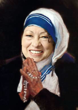
But seriously: If they wanted a figure of wisdom and empathy, why not caricature Sotomayor as someone who’s of the right gender and a coreligionist, at least: Mother Teresa? That would have preserved the necessary level of corrosive offensiveness, right? Too close to home?
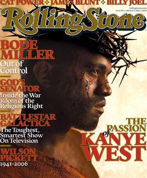
Whatever. As it is, the cover is just stupid and meaningless, as well as offensive — to women, to Latinas, to Buddhists of all backgrounds (note: The National Review guys are of the same ilk that went ballistic when Rolling Stone depicted Kanye as Jesus)…
…and yes, to Asians. But it bears mentioning that it registers as EPIC FAIL even in the offending Asians category.
Because, unlike their “Manchurian Candidates” cover, where at least they picked the correct racist stereotypes to parade, the “Wise Latina” cover puts the hideously slanted eyes and bucked teeth of East Asian yellowface stereotype onto an image inspired by a Northern Indian man of Brahmin descent.
In fact…. you can see the original image of Siddhārtha Gautama Buddha that the artist used as a reference (it’s actually quite a popular icon). Notice any differences?
As usual, National Review has been quick with a completely absurd and totally disingenuous retort to the appalled reactions they’ve been getting from, you know, everyone. From editor-in-chief Rich Lowry:
I take it the theory is that we don’t think Latinas can be wise so we had to make her look somewhat Asian. Or something like that. What these people don’t understand is the entire concept of caricature (or of a joke). Caricature always involves exaggerating someone’s distinctive features, which is all that our artist Roman Genn did with Sotomayor. Oh, well. Keep it humorless, guys, keep it humorless.
No, Rich, the theory is that you took a Latina woman and turned her into a North Indian man with horribly racist East Asian-stereotypical features because you guys are clueless morons. And actually, that’s kind of funny, in that Lowry and the National Review don’t quite get that the joke, ultimately, is on them.
NEW! Kate M. pointed out an image similar to the one of Sotomayor as the “wise Latina.” This one is of Newt Gingrich as a “guru” and ran in the liberal magazine Mother Jones:
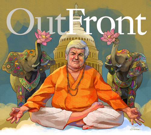
Is this more or less offensive than the Sotomayor example cover? The thing that I think distinguishes the two is that Gingrich’s features are not exaggerated into a warped stereotype of Asian features, possible the most offensive element of the Sotomayor caricature.
——————————-
Jeff Yang is the editor-in-chief at Secret Identities: The Asian American Superhero Blog and the Asian Pop columnist for the San Francisco Chronicle. You can follow him on Twitter and friend him on Facebook.
If you would like to write a post for Sociological Images, please see our Guidelines for Guest Bloggers.


