geography/maps

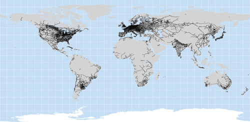
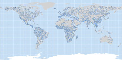
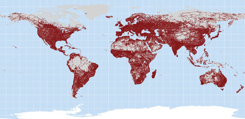
How much of the earth can humans now access?  Some images developed by the New Scientist (via ChartPorn) give us some great visuals showing just how thoroughly we’ve colonized the (non-ocean) planet.

A map of all roads:
roads

A map of all railroads:

railways

A map of all navigable rivers:

major_rivers

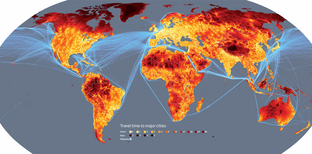
Considering all of these modes of transportation and the type of terrain, the New Scientist calculated how long it would take, from everywhere on the planet, to get to a city of 50,000 people or more:
mg20227041_500-1_1000

They estimate that less than 10% of the world is more than two days from the nearest city. The most remote place, they calculate, is the Tibetan plateau.

—————————

Lisa Wade is a professor of sociology at Occidental College. You can follow her on Twitter and Facebook.

U.S. civilians, by virtue of geography and geopolitics, have rarely experienced war firsthand. The possibility of the destruction of our infrastructure or civilian casualties on our land has remained remote. Today, for example, though we are waging war in Iraq and Afghanistan, non-military Americans do not expect to personally suffer (with the significant exception of harm to and the loss of loved ones).

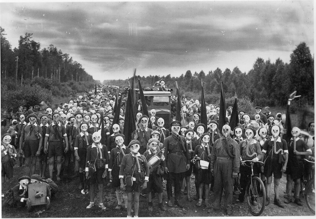
That civilian populations can experience war in vastly different ways is illustrated by this photograph:

MaskedPioneers

It is the early 1920s and the Soviet Union has been at war with much of Europe for several years. In the photograph, children practice their response to being gassed in an attack.

The Vietnam War was the first televised war and some sociologists credit the visual images returning from the war for increasing opposition.  But the idea that an understanding of the horrible, destructive, and deadly effects of war would require the mass media is predicated on U.S. geographical detachment.  That is, the mass media would be less necessary if the war was happening on our soil.

Earlier this month, the U.S. military hardened its rule against publishing photographs of dead or dying U.S. soldiers.  The rule for embedded journalists states that:

Media will not be allowed to photograph or record video of U.S. personnel killed in action.

This separates U.S. civilians from war in a second way, by politics.  So a civilian population can be isolated from its own wars by geography or by politics and, largely, the U.S. is separated by both.

Thanks to Dmitriy T.M. for this great photograph.

For more posts discussing the impact of war on civilians, see license plate patriotismsex protestwar is boring, WWII civilian sacrifices (carpooling and staying off the phone), war and euphemism, framing “their” deathsthe silent ranksU.S. non-news about war, and reframing the “atomic bomb” (the evolution of the term and mushroom clouds have a silver lining).

—————————

Lisa Wade is a professor of sociology at Occidental College. You can follow her on Twitter and Facebook.
The idea that work and home are in different places was institutionalized only recently in human history (and is still not reality everywhere).  In early American history, most people were farmers.  Both men and women worked at home.  The technological advances that brought industrialization removed work from home.  The factory was invented to house large machinery and many workers.  Enter: wage work, the commute, and wives that “just” stayed home.

Today, the idea that work and home are separate places is largely taken for granted (though this may be reversing a bit) and is, in fact, institutionalized with zoning laws that specify whether space is to be used for work (and what kind), living, or both.

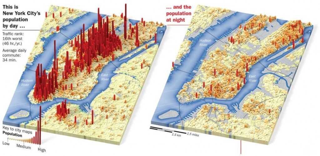
Dmitriy T.M. sent us a link to the images below.  They compare the population of New York City and its boroughs the bottom two-thirds of Manhattan and parts of New Jersey, Brooklyn, and Queens during the day and night.  It reveals nicely how we are organized so as to use different spaces differently.

8GFwg

—————————

Lisa Wade is a professor of sociology at Occidental College. You can follow her on Twitter and Facebook.
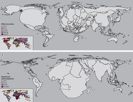
The two maps below are part of a series of maps that warp the size and shape of countries according to various international disproportions (see lots more here).

These two warp countries according to how much they are contributing to global warming and how much they are likely to suffer from global warming respectively.

globeadjustedclimate-thumb-453x348

Ezra Klein interprets:

The first shows the world in terms of carbon emissions. America, for instance, is huge. So is China. And Europe. Africa is hardly visible. The second map shows the world in terms of increased mortality — that is to say, deaths — from climate change. Suddenly, America virtually disappears. So does Europe. Africa, however, is grotesquely distended. South Asia inflates.

Kevin Drum summarizes:

Long story short, we spit out the carbon, but it’s people in Africa and South Asia who are mostly going to die because of it.

Thanks to Toban B. who linked to these maps in a comments thread.

—————————

Lisa Wade is a professor of sociology at Occidental College. You can follow her on Twitter and Facebook.
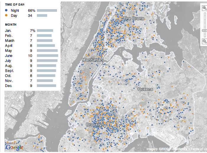
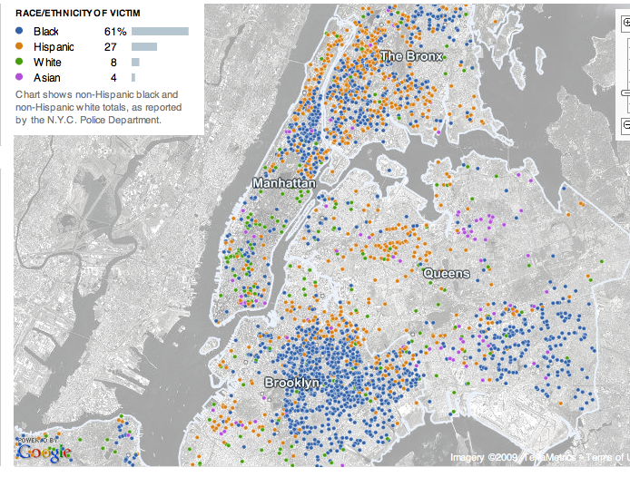
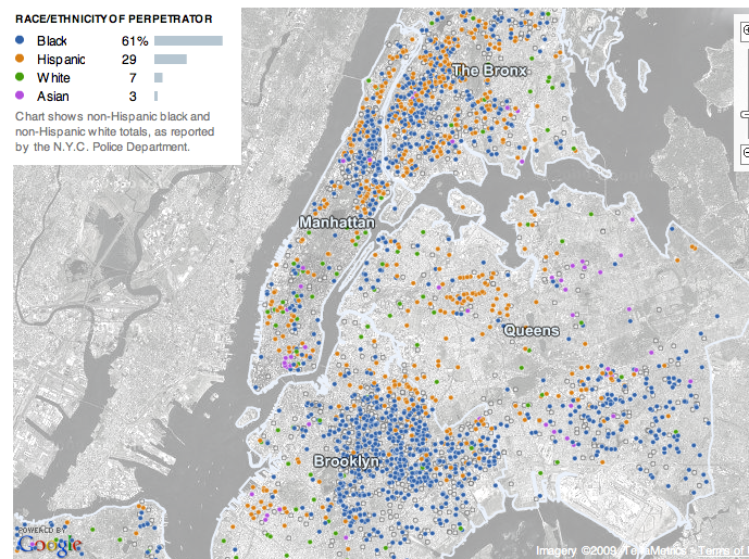
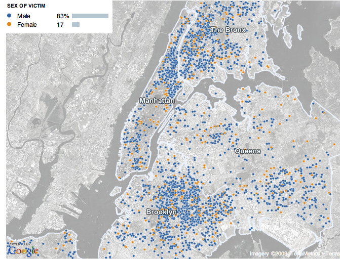
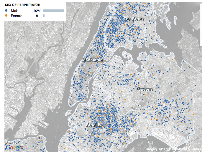
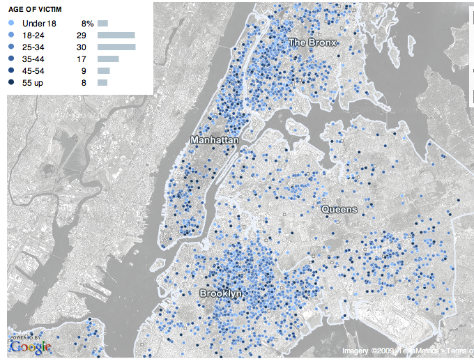
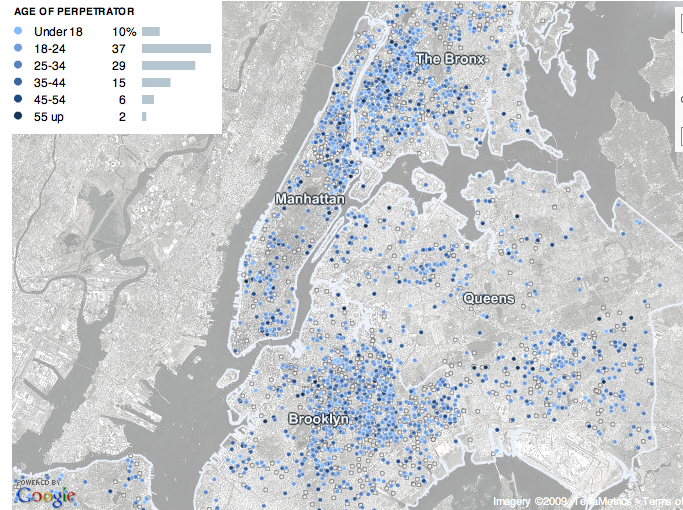
Miguel of El Forastero told us about an interactive map at the New York Times that presents data on murders in New York City from 2003 to today, broken down in various ways. The data come from NYPD reports, and of course there are definitely issues with taking police reports as a measure of actual crime, but my understanding is that while police reports on things like theft and rape are a poor measure of how often those crimes actually occur, they’re considered much more accurate regarding murder. In each map below, I include all murders from 2003 to 2009, but you can select particular years as well.

As many of us would suspect, the majority of murders occur at night (though the site didn’t specify exactly what hours are defined as “night” and “day”):

 picture_1

The racial breakdown of both victims and perpetrators are extremely similar:

picture_2

picture_3

The next two maps show that murder is an overwhelmingly male activity. When I discuss crime with my students, they usually assume most perpetrators are male, but because their ideas of assult and murder often relate to domestic violence or rape, they are always very surprised to find out that most victims of murder are also male. As we see, women are more likely to be victims than they are to be perpetrators, but still, the vast majority of murder victims are men:

picture_4

picture_5

Murder is also linked to age, with 18 to 34 year olds being most likely to be murdered or to murder someone else:

picture_6

picture_7

I found the accompaning article in the NYT rather interesting as an example of overemphasizing the likelihood of murder. Here are the first two paragraphs:

A young boxer was shot dead outside a Bronx bodega at 3:30 a.m. on a Saturday last August. Weeks later, a 59-year-old woman was beaten to death on a Saturday night on the side of a Queens highway. On the last Sunday in September, violence exploded as five men were killed in a spate of shootings and stabbings between midnight and 6 a.m.

Seven homicides in New York City. None connected in any way but this: They happened during the summer months, when the temperatures rise, people hit the streets, and New York becomes a more lethal place.

A few paragraphs down:

Still, the prime time for murder is clear: summertime. Indeed, it is close to a constant, one hammered home painfully from June to September across the decades. And the breakdown of deadly brutality can get even more specific.

Only in paragraph 6 do we get this information:

Of course, the dominant and most important trend involving murder in New York has been the enormous decline in killings over the last 15 years, to levels not seen since the early 1960s.

From reading the first several paragraphs, the impression is that NYC is awash in a “spate” of murders, making it a “lethal” place full of “deadly brutality.” Only in one small section do they acknowledge that, in fact, murders are down significantly. Now, of course, that doesn’t take away from the horror of the murders that do occur, but it feels like a bit of fear-mongering. This is a common trend in the mass media–newscasts often give a lot of coverage to crimes, particularly murders and assaults, for instance–and it gives the public the idea that crime is common (and increasing) and the world is a dangerous place.

The emphasis on how dangerous summer is also seemed a bit disproportionate. As the first map above illustrates, yes, a higher percentage of murders occur June through September, but given the language of the article, you’d expect a much bigger difference between those months and other times of year.

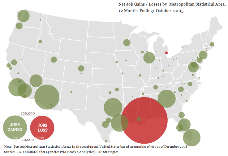
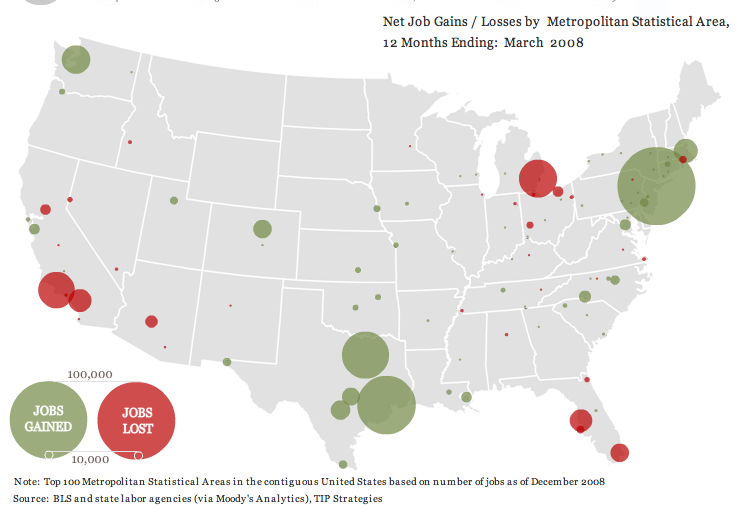
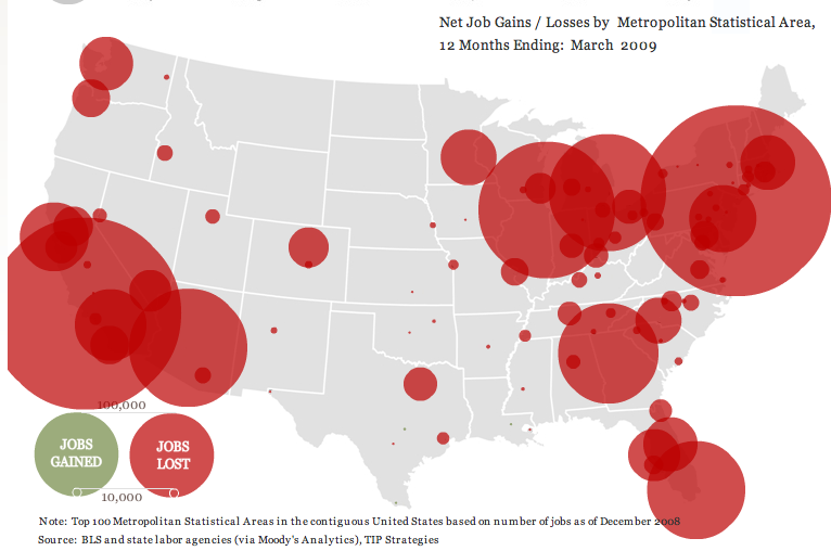
thewhatifgirl let us know about a really interesting interactive website that shows job gains and losses for the 100 largest metropolitan areas in the U.S. from the beginning of 2004 until March 2009, based on Bureau of Labor Statistics data. I took a few screenshots.

Right after Hurricane Katrina:

picture-4

From April 2006 to March 2007, the economy’s looking good for everybody but beleaguered Detroit:

picture-3

We start seeing a few more problem areas and a lot less job growth from April 2007 to March 2008:

picture-2

And then things go really badly. Notice the job loss circle in L.A. is so big that it got cut off on the website, and there’s not a single job growth circle [Note: eagle-eyed commenter Ali points out there are a few teensy job-gain circles, one in Louisiana, one around Austin, TX, and one way down at the tip of Texas along the border, and it’s possible there are some other small ones covered by the red]:

picture-11

UPDATE: Commenter Miss Prism cautions,

The maps could be straight out of “How to Lie with Statistics”, though.  The diameter (rather than the area) of the circles increases linearly with jobs lost, so a ten times bigger job loss gives the visual impression of being 100 times worse.

So just be aware that it’s how wide the circles are that indicates job loss.

Other posts on the economic meltdown: a county-level map, duplexes and home foreclosures, state budget shortfalls, who feels the recession?, Michigan’s economy, where stimulus money is going, U.S. household income and debt, defending private jet travel, all kinds of data from The Guardian, average stimulus dollars per person by state, unemployment rates by county, video on the credit crisis, framing the stimulus package, beer consumption, the New York Post monkey cartoon, a graph of job losses, gender and job loss, unsold cars, Hyundai’s job-loss insurance program, the economic downturn at the mall, employment/population ratio, home equity as a percent of net worth, advice to the rich: be discreet during a recession, different measures of joblessness, and changes in wages.

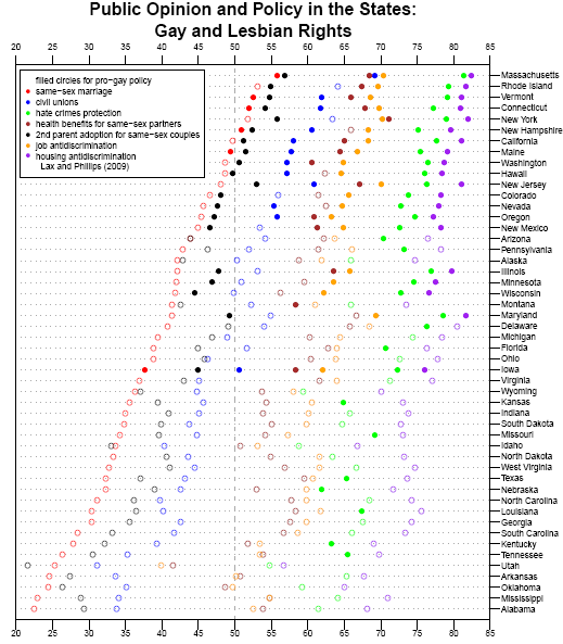
Andrew Gelman, over at FiveThirtyEight, presents a graph from data put together by Jeff Lax and Justin Phillips regarding opinions about various policies affecting gays and lesbians:

gay1

In another post, Nate Silver asks how public opinion about same-sex marriage might change if polls worded the question somewhat differently. Instead of asking “should the government allow same-sex couples to marry?”, we could just as well ask “should the government prevent same-sex couples from marrying?” He suggests that pro-gay-marriage groups might also frame the issue in this way–of keeping the government from taking away rights that people presumably already have rather than as the government giving new rights. It’s an interesting thought, and illustrates the role that question wording can play in affecting how survey respondents think about an issue.

UPDATE: Well, I was taken to task for not providing a better explanation of the graph. However, commenter Christopher explains it pretty well:

For each state, the status of seven public policies is listed as either pro- or anti-gay with seven colored circles which are either filled or empty with respect to the status. In addition, the position of the circle reflects the status of public opinion for each policy.

That is, each color represents one of the policies listed in the legend in the upper-left corner, so, for instance, red = public support for same-sex marriage. If the dot is filled in, it means gay-friendly legislation about the issue was actually passed in the state. If the dot is an empty circle, it means no gay-friendly legislation exists in the state. And the position of the circle tells you what percent of people in each state support each policy.

From the folks at Good Magazine, a “look at the 20 countries from which the most people came to America in 2008,” including how many were immediate relatives of US citizens, and how many received asylum, based on data from the Department of Homeland Security.

trans0509whoiscomingtoamerica

Does anyone know why data from North Korea and South Korea is combined? How can country be “unknown” for so many?