geography/maps

The U.S. population is becoming less and less overwhelmingly white. Projections suggest that, by 2050, whites will compromise less than half of the population. This trend, according to the New York Times today, is being driven by our kids. Below, a map shows the percentage of non-white children in each state of the Union.
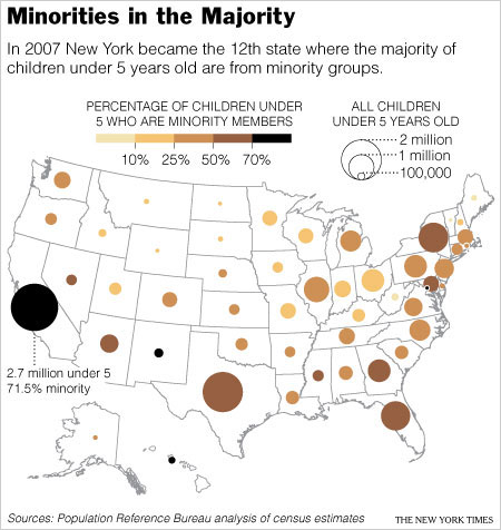
race-minority-children.jpg

Among other things interesting to me about this discussion is the tendency to compare the proportion of the population that is “white” with the proportion of the population that is “not white.” This reinforces the notion that white is somehow pure and important, and everything else is just… something else. While some say that we will no longer be a “white nation” (for better or worse) when whites are outnumbered by non-whites, whites will still be the majority insofar as the non-white group is comprised of an incredibly diverse group of people by race, ethnicity, and immigration-status.

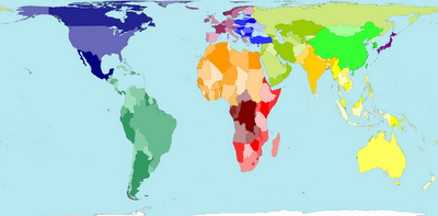
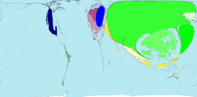
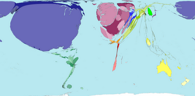
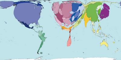
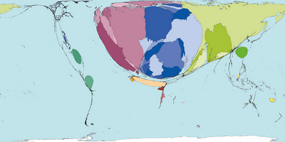
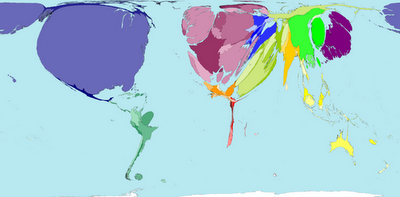
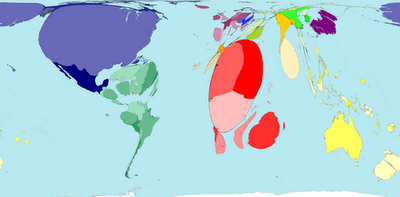
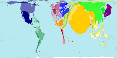
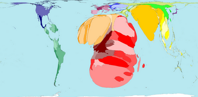
Worldmapper offers maps in which the actual land area is morphed to represent various disproportionalities across the globe. The website has over 300 maps! Thanks 73man for the tip!

I borrowed a few examples and pasted them in below. The first map is an actual land area map for reference.

Territory size shows the proportion of worldwide net exports of toys (in US$) that come from there. Net exports are exports minus imports. When imports are larger than exports the territory is not shown.

Territory size shows the proportion of worldwide net imports of toys (in US$) that are received there. Net imports are imports minus exports. When exports are larger than imports the territory is not shown.

Territory size shows the proportion of carbon dioxide emissions in 1980 that were directly from there.

Territory size shows the proportion of all territory level decreases in carbon dioxide emissions between 1980 and 2000, that occurred there.

Territory size shows the proportion of state military spending worldwide that was spent by that territory in 2002.

Territory size shows the proportion of species worldwide that became extinct between 1500 current era and 2004, that became extinct there.

Territory size shows the proportion of all people over 15 in the world living with diabetes who live there.

Territory size shows the proportion of all people aged 15-49 with HIV (Human Immunodeficiency Virus) worldwide, living there.

See more alternative maps here.

.

When I was in grade school, I remember having one of my first sociological “aha moments” during geography. We were starting a unit on Latin and South American countries and each of us had to draw a map showing the countries and capitals to show how much we already knew. We all had those school issued atlases of the world, but we had to draw the map of Latin and South America without using the atlas.

What I ended up with was similar to most kids at my table– a huge United States with a skinny little piece of land under it, just barely larger than Florida and then a larger piece of land under that about the size of Alaska. As elementary school kids in Maine we obviously knew very little about anything south of say, Washington D.C. and this was reflected in the little pieces of land we drew. I opened up my atlas and looked at how large Latin and South America really were and was shocked. It was nearly as large as Africa, and certainly larger than the the U.S.

How things are measured makes all the difference and cartography (map making) has a fascinating history in colonial empires and imperialism (charting “unknown” far off lands filled with “savages” etc.). So when SWS member Jeanne Flavin sent me a link to the ODT Maps website I had to share some of them here.

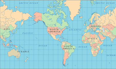
Let’s start with a pretty “typical” North America-centered map of the world–

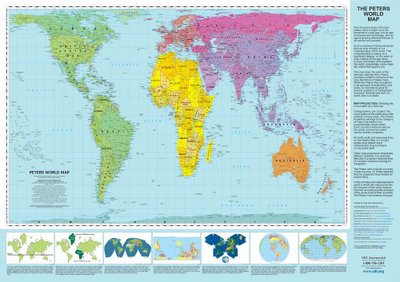
Now how about this equal area ODT map?

© www.ODTmaps.com

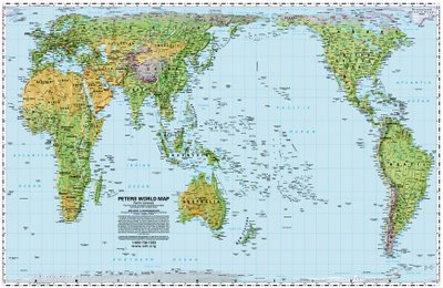
And how about an actual equal area Pacific-centered map from ODT?

© www.ODTmaps.com

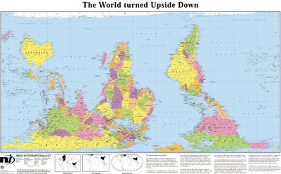
And how about this South-up map, challenging North-South perceptions (how do we know which end of the world is “up” anyway– who decides that?).

© www.ODTmaps.com

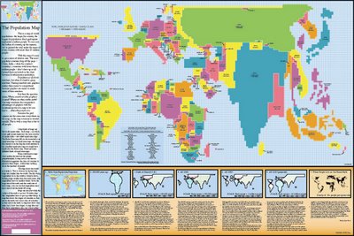
And my favorite– the population map.

© www.ODTmaps.com

There are more maps and resources for the classroom on the ODT website. Thanks Jeanne!