race/ethnicity: Latinos

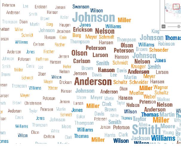
Sara P. let us know about a map at National Geographic that shows the distribution of surnames in the U.S.

The names are color coded by region of origin of the name:

A note on methodology: geographers looked at the most common by counting the most common last names in phone books and selecting the most common names in each state. This hides significant diversity in names in large cities that may have had a greater mix of immigrant groups that the state overall; for instance, a map of the most common names just in New York City might look quite a bit different than the most common names in New York state.

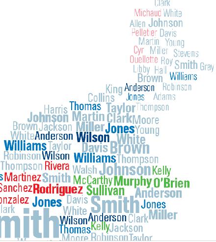
Nonetheless, the concentration of last names serves as an echo of immigration and settlement patterns. British-origin names tend to dominate across the U.S., unsurprisingly, particularly Smith, Johnson, and Williams. Because slaves were often given the last names of their owners, a significant proportion of individuals with British last names are African American — for instance, African Americans are about 20% of people named Smith.

Several Irish-origin names stand out in Massachusetts, as well as some French surnames in Maine:

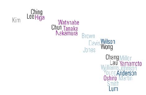
The map of Hawaii reflects the significance of the Asian population there:

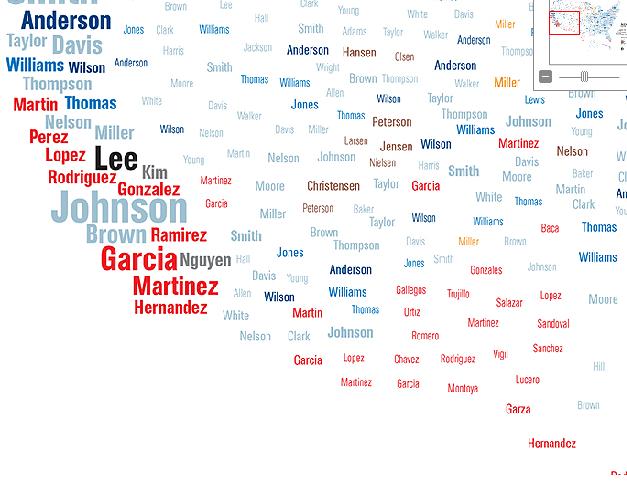
Spanish-origin names in the Southwest:

The names common in the Great Lakes/upper plains region reflects the fact that the area was a common destination for immigrations from Germany and Scandinavia:

I looked up the geographers who created the maps (James Cheshire, Paul Longley, and Pablo Mateos at University College London) and that led me to an interesting website sponsored by UCL, the World Names Project. If you type in a surname, it will show where on the globe it is most common. You can also zoom in on individual nations and see the distribution within them. Here’s the global distribution of my last name, Sharp:

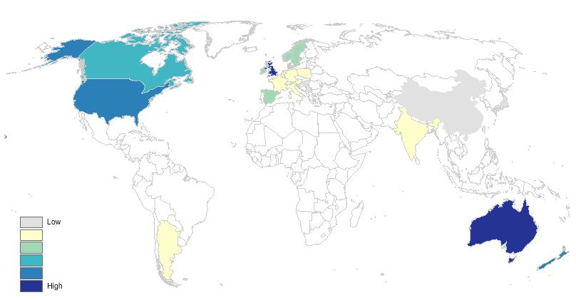
You also get some data about the name: its origin, the top 10 regions and individual cities for that name, and the most common first names that go with it (which, in all the names I tried, were overwhelmingly male, so I don’t know what to make of that).

As Sara said of the National Geographic map, many of the results are predictable, but that doesn’t mean it’s not fun to look at them.

UPDATE: Reader Kristina provides an explanation for why male names dominate the most common first names lists:

My explanation for Gwen’s finding that the most common first names are overly represented by male names is that names for boys are less variable than names for girls.

Interesting post on that here, which notes, “it [natural language geocoder] needs 4200 first names for girls to cover 90% of the population, but it only needs 1200 boy’s names to reach a 90% coverage. The reason for this huge difference is mainly found in the top positions. The ten most popular male names reach 23% whereas the ten most popular female names reach a comparatively meager 10%.”

On January 30th a video was uploaded to youtube featuring among the most blatantly racist banter I have ever heard on or off screen.   The conversation occurred among the hosts of a BBC program called Top Gear: Jeremy Clarkson, Richard Hammond, and James May.  They discuss a new sports car made in Mexico and the racist “hilarity” ensues.  It is pretty damn horrible… and it goes on and on… so, trigger warning.

There’s a full transcript after the jump, but here are some high points:

They say the car is like the Mexican people: “lazy, feckless, flatulent, [indecipherable] leaning against a fence asleep”

They call Mexican food “sick with cheese on it.”

Hammond says, “Just imagine waking up and remembering that you’re Mexican.” Everyone laughs. Clarkson replies, “It’d be brilliant because you could just go back to sleep again.”

Hammond is the ring leader in this example, but Clarkson appears to make a habit of racist commentary. Here’s just a sampling from Wikipedia:

In October 1998 Hyundai complained to the BBC about what they described as “bigoted and racist” comments he made at the Birmingham Motor Show, where he was reported as saying that the people working on the Hyundai stand had “eaten a dog” and that the designer of the Hyundai XG had probably eaten a spaniel for his lunch…

In April 2007 he was criticised in the Malaysian parliament for having described one of their cars, the Perodua Kelisa, as the worst in the world, built “in jungles by people who wear leaves for shoes”…

This clip reminds us that there are still people out there who will make race-based attacks and plenty of people, note the audience, who will laugh.  Many white people truly do oppose racism and they want people of color to trust them; they want the benefit of the doubt.  But occasional exposure to people like this, even if just on television, and the ongoing daily experience of prejudice, some mild, some severe, plus the hundreds of things that happen every week that may have been racism or may have been somebody having a bad day, add up.  This makes it very scary to trust white people.  Every “benefit of the doubt” has the potential to backfire.

Given the daily experience of race that most people of color must endure, blind trust is too much to ask for.

(Transcript after the jump, borrowed from Racialicious.)

more...

The CDC has just released a Health Disparities and Inequalities Report with new numbers detailing the uneven mortality and morbidity in the U.S.  Family Inequality‘s Philip Cohen highlighted the data on pre-term birth among whites, blacks, Asians/Pacific Islanders, Hispanics, and some Hispanic subgroups.  It’s nice to see data that includes more than just whites and blacks; studies often do not report data on Hispanics, Asian/Pacific Islanders, and especially American Indians because the number of respondents is considered too low (and they do not over sample these groups).  More, breaking out the different Hispanic sub-groups is also rare.  As Cohen said, it’d be nice to see such detail for other groups as well (though it’s tough to do so for black Americans because those who arrived in the slave trade have often lost track of their national/ethnic origin).

In any case, the data both confirm previous findings and offer an important insight.  In the confirmatory case, it shows that Asians and whites are less likely to give birth to pre-term babies than other groups, with blacks suffering the worst outcomes.  As for the interesting finding: notice the wide range of outcomes for Hispanics of different origin.  Reporting only “All Hispanic” hides important variation. We can be assured that that variation is true for the other racial groups as well.

Lisa Wade, PhD is an Associate Professor at Tulane University. She is the author of American Hookup, a book about college sexual culture; a textbook about gender; and a forthcoming introductory text: Terrible Magnificent Sociology. You can follow her on Twitter and Instagram.

On the heels of our post on food desertsFamily Inequality‘s Philip Cohen posted about “care vacuums.”  In this case the research is referring to the shrinking number of nursing homes in the U.S., leaving people farther and farther away from the nearest nursing home.

Zhanlian Feng and colleagues found that between 1999 and 2008 we lost about 5% of all nursing home beds and these losses were disproportionately in neighborhoods populated by Blacks and Latinos. The maps below overlays the racial composition of neighborhoods (darker = higher percent minority) with open nursing homes (in black) and nursing home closures (in red). Both seem to be disproportionately in minority neighborhoods, but Feng et al. showed that the closures are even more so.

Here’s Chicago as an example:


Just as food deserts make it more difficult for people without access to personal, reliable transportation to get fresh, affordable food, care vacuums make it more difficult for those same people — disproportionately Black and Latino, and disproportionately poor — to visit loved ones in nursing homes.  Ironically, this is despite the fact that use of nursing homes by minorities is rising and, among whites, falling.

Lisa Wade, PhD is an Associate Professor at Tulane University. She is the author of American Hookup, a book about college sexual culture; a textbook about gender; and a forthcoming introductory text: Terrible Magnificent Sociology. You can follow her on Twitter and Instagram.

Lee D.T. sent in an Australian ad for Fernwood Fitness. It’s a great example of the sexualization of women of color, specifically (compared to white women). Notice that the white women in the ad simply exercise, but the ambiguously-raced woman with darker hair and skin gyrates, pumps, and poses.

See also a history of the hypersexualization and exploitation of black women by white people, the hot Latina, the fetishization of black women’s butts as symbolic of their (supposed) hypersexuality, the only thing important about black people is their butts, and the frequent exposure of black women’s bodies.

Lisa Wade, PhD is an Associate Professor at Tulane University. She is the author of American Hookup, a book about college sexual culture; a textbook about gender; and a forthcoming introductory text: Terrible Magnificent Sociology. You can follow her on Twitter and Instagram.

Back in September, I posted about some maps put together by Eric Fischer, using 2000 Census data, showing the racial/ethnic makeup of selected cities. As Jeff H., Eluned J., and Dmitriy T.M. pointed out, the NYT now has up an interactive map where you can see the racial/ethnic composition of any Census tract, using more updated Census Bureau data from 2005 to 2009. For instance, here’s a map of the neighboring cities of Midland and Odessa, Texas, which I picked for no reason other than that I just watched an episode of Friday Night Lights, which is set in a fictionalized version:

Color key:

You can zoom in to get quite detailed information about individual neighborhoods. I zoomed in as far as I could on Miami (each dot now represents 50 people):

There’s also a tab that says “View More Maps.” It allows you to select to see just the distribution of Whites, Blacks, Hispanics, Asians, or the foreign-born population. Here’s the map of the Hispanic population of Las Vegas:

As you can see, if you hover over a Census tract, you can get specific data on its racial/ethnic makeup.

The foreign-born population of Seattle (if you hover over a tract, it will tell you the % foreign-born, as well as the % increase in the foreign-born population since 2000):

A great resource. Although I tried to look up my home town, and even zooming in to the smallest scale, it’s too small to have any data available.

The Centers for Disease Control report that pregnancy rates for U.S. girls age 15-19 vary quite significantly by state: from 66/1,000 in Mississippi to 20/1,000 in New Hampshire (dark and light green represent states with teen pregnancy rates lower than the U.S. average; dark and light purple represent states in which it is higher):

The map shows that, on average, southern states tend to have higher teen pregnancy rates than others.

The Centers for Disease Control reports that the disparity can be explained, in part, by the fact that Blacks and Latinos tend to have higher rates of teen pregnancy than other racial groups such that states with higher proportions of Blacks and Latinos would have higher rates.  However, rates among different racial/ethnic populations also vary quite tremendously by state.  Among white teenagers the teen pregnancy rate ranged from 4/1,000 (in the District of Columbia) to 55/1,000 (in Mississippi), among Black teenagers, it ranged from 17/1,000 (in Hawaii) to 95/1,000 (in Wisconsin), and among Latinas it ranged from 31/1,000 (in Maine) to 188/1,000 (in Alabama).

Race, then, doesn’t predict differences in rates of teen pregnancy all by itself.  In fact, White teenagers are more likely to get pregnant in some states than Black and Latina teenagers in others.  There must be something region- or state-specific driving teen pregnancy rates.

The CDC doesn’t mention sex education, but Mike Lillis at The Hill compared teen pregnancy rates to a sex education policy report by the Guttmacher Institute.  He writes:

All five states with the highest teen birth rates have adopted policies requiring that abstinence be stressed when taught as part of sex education, HIV education or both, the group found. Only one of the five states (New Mexico) mandates that sex education be a part of students’ curriculum.

Of the four states with the lowest teen birth rates, none requires that abstinence be stressed to students, according to Guttmacher.

For your perusal, the CDC data, by state and race (# of pregnancies/1,000 girls 15-19):

Hat tip to Annie Shields at Ms. magazine.

Lisa Wade, PhD is an Associate Professor at Tulane University. She is the author of American Hookup, a book about college sexual culture; a textbook about gender; and a forthcoming introductory text: Terrible Magnificent Sociology. You can follow her on Twitter and Instagram.

Black women and Latinas are more likely to die from breast cancer than white women.  This is, in part, because white women are more likely to have health insurance.  New research, however, illustrated by Philip Cohen at Family Inequality, suggests that even we control for types of insurance and whether women are insured, black women and especially Latinas wait longer than white women for a diagnosis of cancer after the discovery of a breast abnormality:

The authors of the study, Heather Hoffman and colleagues, did not attempt to explain the cause of the disparity.

See also our posts on racial disparities in life expectancy for people with Down’s Syndrome, rates of asthma, and kidney failure.

Lisa Wade, PhD is an Associate Professor at Tulane University. She is the author of American Hookup, a book about college sexual culture; a textbook about gender; and a forthcoming introductory text: Terrible Magnificent Sociology. You can follow her on Twitter and Instagram.