politics

Over at the University of North Carolina at Chapel Hill, sociologist Neal Caren and a team of graduate students have worked up on image showing the locations of people signing secession petitions on the White House website in the wake of Obama’s reelection.

For context, here’s the text of one such petition, from Alaska:

ALLOW ALASKA TO SECEDE FROM A DYSFUNCTIONAL UNION.

As an American Veteran on behalf of the U.S. Constitution, the Republic, the Rule of Law, and equal justice for all freedom loving citizens of the United States of America hereby declare that the Federal Government allow Alaska to peacefully secede from a dysfunctional Union that is run by corrupt politicians who buy the votes of individuals who can no longer be seen as American citizens but rather, slaves to a tyrant. We who took the oath to protect and defend the Constitution of the United States of America against all enemies, foreign and domestic, now declare Washington D.C. to be the domestic enemy to the freedom and liberty of all Alaskans and indeed, 50% of the free citizens of the USA. Therefore, we declare our secession in support of the U.S. Constitution. LET MY PEOPLE GO!

Almost all states have an active petition now. Here’s the map of signers from around the country, shaded according to the proportion of each county’s residents who signed a secession petition. If you click on the image you go to the site, which allows you to hover over each county and see the counts:
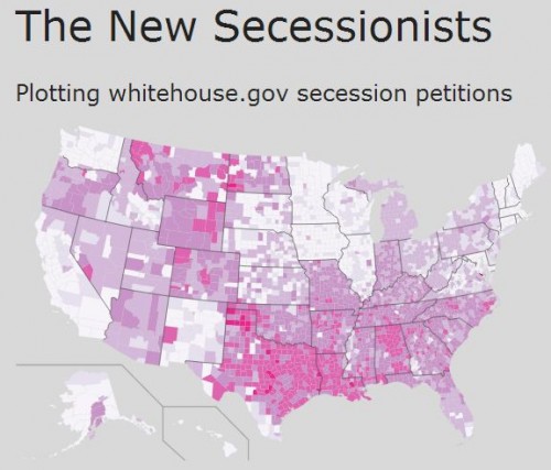
Neal Caren writes:

In total, we collected data on 702,092 signatures. Of these, we identified 248,936 unique combinations of names and places, suggesting that a large number of people were signing more than one petition. Approximately 90%, or 223,907, of these individuals provided valid city locations that we could locate with a U.S. county.

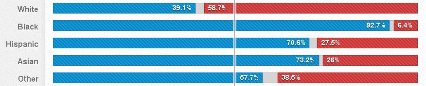
Using a first-name algorithm, they estimate that 62% of those signing are men.

Philip N. Cohen is a professor of sociology at the University of Maryland, College Park, and writes the blog Family Inequality. You can follow him on Twitter or Facebook.

Barack Obama won just over 50% of the popular vote last week, but he earned 80% of non-white votes.  According to USA Today exit poll data, he secured 93% of the Black vote, 73% of the Asian vote, 71% of the Hispanic vote, and 58% of the non-white Other vote.

This data suggests are real and palpable difference between how (some) Whites and (most) non-Whites see the world, a difference that will become increasingly influential.

Earlier this month the Pew Research Center released an updated prediction for the racial/ethnic composition of the U.S. in 2050.  They expect that, by 2050, Whites will be a minority, adding up to only 47% of the population.  By that time, they expect Hispanics to account for 29% of the population, and Blacks and Asians to account for 13% and 9% respectively.

Paul Taylor and D’Vera Cohn, at Pew, observe that the demographics of the voting population will change a bit slower since the majority of the demographic change is from births and deaths, not immigration.  In 2011, for example, whites were 66% of those ages 18 and older, but only 56% of 18-year-olds.  In other words, it takes 18 years to grow a voter.

Whatever the pace of change, the era of winning U.S. elections by pandering to the worldview of a single group is ending.  Future politicians will likely have to put effort into attracting a wide range of voters, as Obama did on Tuesday.

Lisa Wade, PhD is an Associate Professor at Tulane University. She is the author of American Hookup, a book about college sexual culture; a textbook about gender; and a forthcoming introductory text: Terrible Magnificent Sociology. You can follow her on Twitter and Instagram.

Cross-posted at Montclair SocioBlog.

In a democracy, all votes are created equal — one person, one vote -– but apparently some votes are more equal than others.  Obama won the electoral college vote 62% – 38%, though his margin in the popular vote was much smaller: 51% – 48%.

A similar discrepancy happened in the vote for Congressional representatives.  The Republicans control the House of Representatives, where they have 54% of the seats. But if you add up all the votes for those seats, the Democrats come out slightly ahead (by about 500,000 votes).  More votes but fewer seats.

That discrepancy arises from the distribution of Democrats and Republicans in a state’s Congressional districts.  Take a hypothetical state with four districts, each with 200 people.  The popular vote splits evenly –- 400 Democrats, 400 Republicans. Here are the election results:

The Republicans have 50% of the popular vote but get 75% of the seats.
Less hypothetically, in North Carolina, Democratic candidates outpolled Republicans 2.22 million to 2.14 million.  But Republicans won 10 of the 14 seats.  The Democratic votes were crowded into four districts.  In three of those four districts, the Democrats won big – by an average of 133,000 votes.  (If the 7th district, where Democrats now have a slim lead, goes Republican, that average margin will be 177,000.)  Had some of the Democrats from one of those districts been mapped into the neighboring district, they might have won both, though by smaller margins.  The Republican districts had secure but smaller majorities.  Republican winning margins averaged 50,000 votes, less than half the margin where Democrats won.

My first thought was that this was pure Gerrymandering.  State legislatures get to draw the maps of their Congressional districts.  And many more state legislatures are controlled by Republicans.  In fact, some of the North Carolina districts have unusual shapes.  The NC-12, the thin blue line along Interstate 85 stretching nearly to the border, was created as a “majority-minority” district so that Black votes would not be diluted.  The downside for Democrats is that it packs those votes into that narrow corridor.  So the Democrats take that district by over 180,000 votes.  The Republicans with the neighboring districts but by much smaller margins – 23,000, 25,000, and 53,000.  In those four districts, the Democrats got 53% of the vote, but Republicans took three of the four seats.

The Democratic district snaking down through the middle of the state is the 4th, which contains “the Triangle” to the north, but now has that tail stretching down.  Democrats carried the district  by 170,000 votes.  Surrounding it is the 2nd (in pink), which Republicans carried by only 45,000 votes.

Similar differences crop up in Ohio and Pennsylvania. The popular vote is close, and in two of these states it goes to the Democrats.  But Republicans get most of the seats.  Republicans win their seats by less than half the margin of Democratic winners.  Here is a graph of the actual returns from Ohio, Pennsylvania, and North Carolina. (The Ohio total does not include the vote from the two uncontested districts, one Democrat, one Republican.  For the maps and election results, check out Politico.)

The Republican share of Congressional seats is far out of proportion to its share of the vote.  In Ohio and North Carolina, Democrats received more votes, but Republicans got 70-75% of the House seats.  It certainly is possible that Republican-dominated state legislatures drew the districts so as to cram Democratic voters into electoral ghettos.

I don’t know enough about the demography and geography of these states, but I do wonder why the districts are drawn this way.  A paper by Chen and Rodd (here) that uses 2000 election data argues that what looks like gerrymandering is in fact the result of “human geography.”  It’s not the legislatures that pack Democrats together, it’s the Democrats themselves.  They cluster in cities.  As for Democrats outside of cities,

many rural, small-town, and suburban precincts that lean Democratic are often subsumed into moderately Republican districts. . . . There are isolated pockets of support for Democrats in African-American enclaves in the suburbs of big cities and in smaller towns with a history of railroad industrialization or universities. However, these Democratic pockets are generally surrounded by Republican majorities, thus wasting these Democratic votes. As a result, the Democrats are poorly situated to win districts outside of the urban core.

Regardless of intent, the effect is to keep Democratic votes concentrated in the 4th.  If that blue tail of the NC-04 were subsumed into the pink NC-02, both districts might be blue.

In any case, Democrats have not always been on the wrong side of the seat/vote discrepancy.  John Sides at The Monkey Cage posted this graph showing the ratio for the last twenty-six elections.

Sides quotes Matthew Green on the general trends:

  • the winning party usually gets a “boost” in the number of seats
  • that boost used to be much larger

That trend might fit with the deliberate-gerrymander explanation, provided that in the earlier decades more state legislatures were controlled by Democrats.  But I’m not sure how it fits with Chen and Rodden’s human geography idea of “unintentional gerrymandering.”

—————————

Jay Livingston is the chair of the Sociology Department at Montclair State University.  You can follow him at Montclair SocioBlog or on Twitter.

Jay Livingston is the chair of the Sociology Department at Montclair State University. You can follow him at Montclair SocioBlog or on Twitter.

I know everyone is tired of hearing or thinking about the U.S. presidential election, but Latino Decisions has released an interactive website that shows how Latinos/as in the U.S. voted, as well as the issues they found particularly important.

In many of the swing states, Latinos formed an essential part of President Obama’s winning coalition of voters. As you may have heard by now, Latinos voted overwhelmingly Democratic, with about 3/4 voting for President Obama:

But this varied by ancestry. Among Cuban Americans, only 44% supported Obama, while he received 96% of votes cast by Dominican Americans, 78% by Mexican Americans, 83% by Puerto Ricans, 76% by Central Americans, and 79% by South Americans (hover over the graph here to see the %s):

Language also made a difference. Among those who speak primarily English, Obama got 70% of the vote; among those who speak Spanish, it was 83%:

Religion was an even bigger factor. While 81% of Catholic Latinos voted for President Obama, he got a much smaller majority — 54% — among those who identified as born-again Christians:

The website also lets you get specific data on a number of swing states or states with large or growing Latino populations, as well as breakdowns of the issues that Latino voters said were most important to them. It’s an interesting website with a lot of breakdowns, so it’s worth clicking over and looking around.

Gwen Sharp is an associate professor of sociology at Nevada State College. You can follow her on Twitter at @gwensharpnv.

…voting rights still excluded certain groups?

Buzzfeed has put together a great collection of U.S. maps showing what last Tuesday’s election would have looked like if women, non-whites, and 18- to 23-year-olds had never been given the vote.

Actual results:

Results with just white men:

Results with only men, all races:

Results with only white people, men and women:

Results excluding people 18- to 23-years-old:

The results are stunning and are a hint of just how consequential the ongoing voter suppression and disenfranchisement can be.

Lisa Wade, PhD is an Associate Professor at Tulane University. She is the author of American Hookup, a book about college sexual culture; a textbook about gender; and a forthcoming introductory text: Terrible Magnificent Sociology. You can follow her on Twitter and Instagram.

Last spring I posted a map of the legal status of same-sex marriage in the U.S. Given the results of the election, it’s time to update that map.

Greg Stoll posted an interactive map that lets you look at changes in in statutes regarding same-sex marriage from 1990 to now. On Tuesday, voters in Maine and Maryland approved referendums legalizing same-sex marriage, reaffirmed marriage equality in Washington, and defeated an effort to put a ban on same-sex marriages in the Minnesota constitution. That makes this this first time same-sex marriage was legalized by voters, rather than a legislature or the courts. (NOTE: As a reader pointed out, there’s an error in the map; Maryland should be colored blue now.)

Here’s the current map, with blue states having full marriage equality and red states banning both same-sex marriage as well as civil unions in their constitutions:


Gwen Sharp is an associate professor of sociology at Nevada State College. You can follow her on Twitter at @gwensharpnv.

Last week I posted about voter turnout patterns. In 2008, about 64% of eligible citizens voted. So what reasons do non-voters give for not taking part in the election? The Census Bureau asked. I created a chart of the data found on p. 14 of the report by Thom File and Sarah Crissey.

UPDATE: Please note this data is for registered non-voters; about 89% of this group votes, significantly higher than that for eligible citizens overall. I apologize that I didn’t make the distinction clearer in my initial post.

Here are the reasons registered non-voters gave:

So the single most common reason (17.5%) for not voting was that the person was too busy or their schedule conflicted with available voting hours (at least those the respondent was aware of). Other common reasons were illness or disability (14.9%), the person just wasn’t interested in the election (13.4%), didn’t like the candidates or issues (12.9%), and other (11.3%).

Many of these barriers to voting could likely be addressed by the same basic changes: expanding voting options. Scheduling conflicts, being too busy or out of town, lack of transportation, and problems caused by illness or disability might all be ameliorated by expanded early voting and/or making it easy to vote by mail.

These issues were not equally problematic for all racial/ethnic groups. For instance, Asian-Americans and Hispanics (of any race) were more likely to report being too busy or that voting conflicted with their schedule than were White non-Hispanics or African Americans:

White non-Hispanics were more likely than other groups to say they didn’t vote because they didn’t like the candidates or issues:

The report also breaks responses down by age and education, so check out p. 14 if you’re interested in the patterns based on those demographics. It also includes data on why people don’t register, either — the most common being lack of interest or involvement in politics.

Gwen Sharp is an associate professor of sociology at Nevada State College. You can follow her on Twitter at @gwensharpnv.

Over at his blog, Made in America, Claude Fischer discusses data showing that the percentage of (White) Americans who say that they will vote for a qualified Black president has been rising since the 1950s. Today it sits at about 96%.

Fischer rightly observes that it’s difficult to know exactly what to make of this information. The trend likely reflects a combination of a real decrease in prejudice and a rising appreciation for the fact that it’s unpopular to admit that you wouldn’t vote for a Black person, even on a survey.

Still, assuming for the moment that it represents real attitudinal change, Fischer asks, is “the glass 96 percent full or is it 4 percent empty?”  Given our two-party partisan political system, elections are frequently decided by margins this narrow.  Obama won with just 53% of the popular vote in 2008.  Political scientists estimate that there was a 5 point racial penalty (that is, if he had been White, he would likely have won 58% of the vote).

Tomorrow is election day and it’s difficult to know if race will play more or less of a role than it did in the last election.  On the one hand, most people who were worried that Obama would be a racially radical President now know that he is not (some people will never be convinced) and others may have become more used to seeing an African American face in the White House.  On the other hand, racial progress usually incites a backlash.  That face in such a venerated position of power may have aggravated people who are now actively racist instead of complacently so.

Finally, as Fischer observes, we have absolutely no data on the penalty Romney will pay for being Mormon.

Happy election day eve, America. May we all end tomorrow with a strong beverage of consolation or celebration.

Lisa Wade, PhD is an Associate Professor at Tulane University. She is the author of American Hookup, a book about college sexual culture; a textbook about gender; and a forthcoming introductory text: Terrible Magnificent Sociology. You can follow her on Twitter and Instagram.