nation: United States

Cross-posted at Neuroskeptic.

“Personality differences” between people from different countries may just be a reflection of cultural differences in the use of “extreme” language to describe people.

That’s according to a very important paper just out from an international team led by Estonia’s René Mõttus.

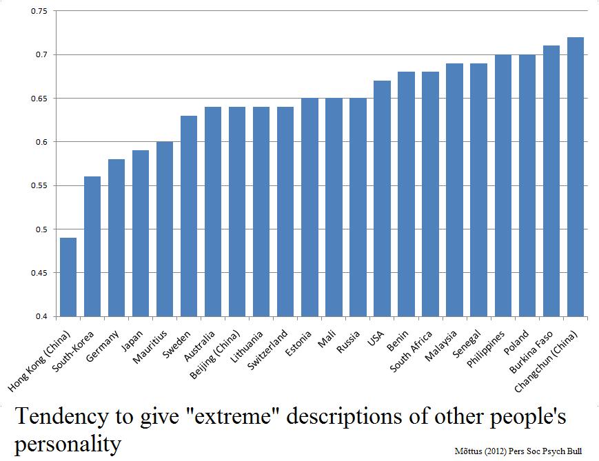
There’s a write up of the study here. In a nutshell, they took 3,000 people from 22 places and asked them to rate the personality of 30 fictional people based on brief descriptions (which were the same, but translated into the local language). Ratings were on a 1 to 5 scale.

It turned out that some populations handed out more of the extreme 1 or 5 responses. Hong Kong, South Korea and Germany tended to give middle of the road 2, 3 and 4 ratings, while Poland, Burkina Faso and people from Changchun in China were much more fond of 1s and 5s.

The characters they were rating were the same in all cases, remember.

Crucially, when the participants rated themselves on the same personality traits, they tended to follow the same pattern. Koreans rated themselves to have more moderate personality traits, compared to Burkinabés who described themselves in stronger tones.

Whether this is a cultural difference or a linguistic one is perhaps debatable; it might be a sign that it is not easy to translate English-language personality words into certain languages without changing how ‘strong’ they sound. However, either way, it’s a serious problem for psychologists interested in cross-cultural studies.

I’ve long suspected that something like this might lie behind the very large differences in reported rates of mental illness across countries. Studies have found that about 3 times as many people in the USA report symptoms of mental illness compared to people in Spain, yet the suicide rate is almost the same, which is odd because mental illness is strongly associated with suicide.

One explanation would be that some cultures are more likely to report ‘higher than normal’ levels of distress, anxiety — a bit like how some make more extreme judgements of personality.

So it would be very interesting to check this by comparing the results of this paper to the international mental illness studies. Unfortunately, the countries sampled don’t overlap enough to do this yet (as far as I can see).

Source: Mõttus R, et al (2012). The Effect of Response Style on Self-Reported Conscientiousness Across 20 Countries. Personality and Social Psychology Bulletin PMID: 22745332

————————

Neuroskeptic blogs anonymously here.  You can also follow him on Twitter.

Cross-posted at Reports from the Economic Front.

It’s election season and Republicans and Democrats are working hard to demonstrate that they support dramatically different policies for rejuvenating the economy.

While the Democratic Party’s call for more government spending makes far more sense than the Republican Party’s call for cuts in government spending (see below), the resulting back and forth hides the far more serious reality that our existing economic system no longer appears capable of supporting meaningful social progress for the great majority of Americans.

The chart below helps to highlight our economy’s worsening stagnation tendencies.  Each point shows the 10 year annual average rate of growth and the chart reveals a decade long growth trend that is moving sharply downward.

As David Leonhardt explains:

The economy’s recent struggles arguably began in late 2001, when a relatively mild recession ended and a new expansion began. The problem with this new recovery was that it wasn’t especially strong. From the fourth quarter of 2001 through the fourth quarter of 2007 (when the financial crisis began), the economy grew at an average annual rate of only 2.7 percent. By comparison, the average annual growth rate of both the 1990s and 1980s expansions exceeded 3.5 percent.

This mediocre expansion was followed by the severe recession and weak recovery brought on by the financial crisis. The combined result is that, in recent years, the economy has posted its slowest 10-year average growth rates since the Commerce Department began keeping statistics in 1947.

In fact, the economic growth figures for the period 1995 to 2007 were artificially propped up by a series of bubbles, first stock and then housing.  Once those bubbles popped, average growth rates began steadily falling.

The weakness (and unbalanced nature) of our current weak recovery is well captured in the following chart from Catherine Rampell, which compares the percent change in various indicators in the current recovery (which began in June 2009) with previous post-war recoveries.  The first point to stress is that the current recovery lags the average in all indicators but one: corporate profits.  The second is that government spending has actually been falling during the current recovery, no doubt one reason that the percent increase in so many indictors remains below the average in previous recoveries; the public sector is actually smaller today than it was three years ago.

The relative strength in the performance of corporate profits helps to explain why the two established political parties feel no real pressure to focus on our long term economic problems; corporations just don’t find the current situation problematic despite the economy’s weak overall economic performance.

Even more telling of the growing class divide is the explosion in income inequality over the last thirty years, which is illustrated in the following chart.

In other words, while corporations have succeeded in raising profits at the expense of wages, those in the top income brackets have been even more successful in raising their income at the expense of almost everyone else.  Notice, for example, that median household income in 2010 is roughly where it was in the late 1980s while the median income of the top households racked up impressive gains. Thus, the very wealthy have every reason to do what they are currently doing, which is using their wealth to ensure that candidates restrict their economic proposals to reforms that will do little to change the existing system.

The takeaway: without a mass movement demanding change, election debates are unlikely to seriously address our steady national economic decline.

Cross-posted at Reports from the Economic Front.

The Pew Research Center recently published a report titled “Pervasive Gloom About the World Economy.” The following two charts come from Chapter 4 which is called “The Causalities: Faith in Hard Work and Capitalism.”

The first suggests that the belief that hard work pays off remains strong in only a few countries: Pakistan (81%), the U.S. (77%), Tunisia (73%), Brazil (69%), India (67%) and Mexico (65%). The low scores in China, Germany, and Japan are worth noting. This is not to say that people everywhere are not working hard, just that many no longer believe there is a strong connection between their effort and outcome.

The second chart highlights the fact that growing numbers of people are losing faith in free market capitalism.  Despite mainstream claims that “there is no alternative,” a high percentage of people in many countries do not believe that the free market system makes people better off.

GlobeScan polled more than 12,000 adults across 23 countries about their attitudes towards economic inequality and, as the chart below reveals, the results were remarkably similar to those highlighted above.  In fact, as GlobeScan noted, “In 12 countries over 50% of people said they did not believe that the rich deserved their wealth.

It certainly seems that large numbers of people in many different countries are open to new ways of organizing economic activity.

Martin Hart-Landsberg is a professor of economics at Lewis and Clark College. You can follow him at Reports from the Economic Front.

Cross-posted at Reports from the Economic Front.

The Supreme Court has ruled favorably on the legality of the Affordable Care Act.  Actually, despite its name, the Act has more to do with extending and attempting to improve private health insurance coverage than it does with improving care or reducing its cost.

Unfortunately for us, the effort to improve our health care system has remained within bounds set by the needs of private health care providers and insurers.  As President Obama made clear from the start of his push for health care reform, there would be no consideration of a universal system.

Critics of such a universal system are always quick to argue that only market forces driven by the private pursuit of profit can ensure an efficient health care system.  Of course, in determining whether this is true, we need to recognize that efficiency is a complex term and that our health care system, like all systems, produces multiple outcomes.  The most obvious ones are private profit as well as the quality and cost of the relevant health care.

In terms of private profit there can be no doubt that our health care system functions well.  However, the story is quite different if we evaluate it in terms of quality and cost.  The fact that we continue to embrace a private health care system makes clear which measures of efficiency are considered most important and by whom.

The following map shows the countries, colored green, that have adopted a universal health care system.

mf-healthcaremap-p-thumb-615x314-91612.jpg

As Max Fisher explains:

What’s astonishing is how cleanly the green and grey separate the developed nations from the developing, almost categorically. Nearly the entire developed world is colored, from Europe to the Asian powerhouses to South America’s southern cone to the Anglophone states of Australia, New Zealand, and Canada. The only developed outliers are a few still-troubled Balkan states, the Soviet-style autocracy of Belarus, and the U.S. of A., the richest nation in the world.

The handful of developing countries that provide universal access to health care include oil-rich Saudi Arabia and Oman, Latin success story Costa Rica, Kyrgyzstan, and, famously, Cuba, among a few others. A number of countries have attempted universal health care but failed, such as South Africa, which maintains a notoriously inefficient and troubled public plan to complement the private plans popular among middle- and upper-class citizens…

That brings us to another way that America is a big outlier on health care. The grey countries on this map tend to spend significantly less per capita on health care than do the green countries — except for the U.S., where the government spends way more on health care per person than do most countries with free, universal health care. This is also true of health care costs as a share of national GDP — in other words, how much of a country’s money goes into health care.

The OECD just published a major study on the health care systems of its 34 member nations.  It found that:

 Health spending accounted for 17.6% of GDP in the United States in 2010, down slightly from 2009 (17.7%) and by far the highest share in the OECD, and a full eight percentage points higher than the OECD average of 9.5%. Following the United States were the Netherlands (at 12.0% of GDP), and France and Germany (both at 11.6% of GDP).

The United States spent 8,233 USD on health per capita in 2010, two-and-a-half times more than the OECD average of 3,268 USD (adjusted for purchasing power parity). Following the United States were Norway and Switzerland which spent over 5,250 USD per capita. Americans spent more than twice as much as relatively rich European countries such as France, Sweden and the United Kingdom.

combined1.jpg
What does all of this mean in terms of health outcomes?  According to the OECD report:

Most OECD countries have enjoyed large gains in life expectancy over the past decades. In the United States, life expectancy at birth increased by almost 9 years between 1960 and 2010, but this is less than the increase of over 15 years in Japan and over 11 years on average in OECD countries. As a result, while life expectancy in the United States used to be 1½ year above the OECD average in 1960, it is now, at 78.7 years in 2010, more than one year below the average of 79.8 years. Japan, Switzerland, Italy and Spain are the OECD countries with the highest life expectancy, exceeding 82 years.

One possible explanation for this lagging performance, highlighted in an earlier OECD report, is that the U.S. ranked 26th in terms of the number of practicing physicians relative to its population, 29th in terms of the number of doctor consultations per capita, 29th in terms of the number of hospital beds per capita, and 29th in terms of the average length of hospital stay.  At the same time, the “U.S. health system does do a lot of interventions… it has a lot of expensive diagnostic equipment, which it uses a lot. And it does a lot of elective surgery — the sort of activities where it is not always clear cut about whether a particular intervention is necessary or not.”

Private health care providers and insurers are clear about how they measure health care efficiency.  And as long as we rely on them to set the terms of the debate we will continue to suffer the consequences.

The term glocalization — a combination of globalization and local — refers to the tendency of globalizing processes to have to adapt to local peculiarities.  McDonalds is a great example.  It’s a brand recognized around the world, but it responds to local tastes in developing its menu.  So, you can buy a McItaly burger, a Maharaja Mac in India, a McLobster in Canada, and an Ebi Filit-O with Seaweed Shaker fries in Japan (source).

I thought of the concept of glocalization when I came across a set of publicity photos for TV programs in 13 different countries, all modeled after America’s Married with Children.  Each has its own flavor (e.g., the parrot replacing the dog in Chile) and I imagine if we were able to watch them all we’d see great examples of the phenomenon.

The original:

Bulgaria:

Chile:

Croatia:

Germany:

More examples at Neatorama.

UPDATE: Dmitriy T.C. sent me this trailer for a movie called Exporting Raymond, about making a Russian version of Everybody Loves Raymond. It’s along the same theme and looks quite good:

Lisa Wade, PhD is an Associate Professor at Tulane University. She is the author of American Hookup, a book about college sexual culture; a textbook about gender; and a forthcoming introductory text: Terrible Magnificent Sociology. You can follow her on Twitter and Instagram.

In a previous post I discussed how the U.S. became more religious in the 1950s, in part in response to its the Cold War enemies (atheist communists).  In fact, the U.S. is among the most religious countries in the world.  Using data from the International Social Survey Programme, Sociologist Tom Smith paints wildly different religious portraits of 28 nations (full text).

When asked whether they “know that God really exists and… have no doubt about it,” 61% of Americans say “yes.”  Of the 28 nations studied, only four were more likely to say “yes” to this question: Poland, Israel, Chile, and the Philippines. Here’s how we look compared to similar countries:

Here’s all 28 in rank order (borrowed from LiveScience).  Notice how wide the divergence is.  In Japan, the least religious country according to this measure, only 4% say they have no doubt God exists.  In The Philippines, 84% have no doubt.

% Have No Doubt God Exists:

  • Japan: 4.3 percent
  • East Germany: 7.8 percent
  • Sweden: 10.2
  • Czech Republic: 11.1
  • Denmark: 13.0
  • Norway: 14.8
  • France: 15.5
  • Great Britain: 16.8
  • The Netherlands: 21.2
  • Austria: 21.4
  • Latvia: 21.7
  • Hungary: 23.5
  • Slovenia: 23.6
  • Australia: 24.9
  • Switzerland: 25.0
  • New Zealand: 26.4
  • West Germany: 26.7
  • Russia: 30.5
  • Spain: 38.4
  • Slovakia: 39.2
  • Italy: 41.0
  • Ireland: 43.2
  • Northern Ireland: 45.6
  • Portugal: 50.9
  • Cyprus: 59.0
  • United States: 60.6
  • Poland: 62.0
  • Israel: 65.5
  • Chile: 79.4
  • The Philippines: 83.6

Americans are also particularly likely to believe in a “personal God,” one who is closely attentive to the lives of each and every person.

Quite interestingly, the U.S. is in the minority in that Americans tend to become increasingly religious as they age.  In most countries, people become less religious over time.  This graph (confusingly labeled), shows changes in DISbelief over the life course.  The U.S. is the only country among these in which disbelief declines:

Lifetime Change in Religiosity (from increase in disbelief to increase in belief):

  • The Netherlands: -14.0
  • Spain: -12.4
  • Australia: -12.0
  • France: -11.3
  • Norway: -11.0
  • Great Britain: -10.1
  • Switzerland: -8.2
  • Germany (East): -6.9
  • Denmark: -6.1
  • Czech Republic: -5.5
  • Sweden: -5.5
  • Germany (West): -5.4
  • New Zealand: -4.0
  • Italy: -2.7
  • Poland: -1.8
  • Japan: -1.5
  • Ireland: -0.9
  • Chile: +0.1
  • Cyprus: +0.2
  • Portugal: +0.6
  • The Philippines: +0.8
  • Hungary: +1.0
  • Northern Ireland: +1.0
  • United States: +1.4
  • Israel: +2.6
  • Slovakia: +5.6
  • Slovenia: +8.5
  • Latvia: +11.9
  • Russia: +16.0

Rates of atheism — a strong disbelief in God — also vary tremendously.  East Germany is the most atheist, with more than half of citizens claiming disbelief.  The country is a stark contrast to the atheist among them, Poland and the U.S. (only 3% atheist), Chile and Cyprus (2%), and The Phillipines (1%).

% Atheist:

  • East Germany: 52.1
  • Czech Republic: 39.9
  • France: 23.3
  • The Netherlands: 19.7
  • Sweden: 19.3
  • Latvia: 18.3
  • Great Britain: 18.0
  • Denmark: 17.9
  • Norway: 17.4
  • Australia: 15.9
  • Hungary: 15.2
  • Slovenia: 13.2
  • New Zealand: 12.6
  • Slovakia: 11.7
  • West Germany: 10.3
  • Spain: 9.7
  • Switzerland: 9.3
  • Austria: 9.2
  • Japan: 8.7
  • Russia: 6.8
  • Northern Ireland: 6.6
  • Israel: 6.0
  • Italy: 5.9
  • Portugal: 5.1
  • Ireland: 5.0
  • Poland: 3.3
  • United States: 3.0
  • Chile: 1.9
  • Cyprus: 1.9
  • The Philippines: 0.7

As a post-9/11 American watching another election cycle, I can’t help but notice how so much of our rhetoric revolves — sometimes overtly and sometimes not — around people who are the wrong religion.  Notably, Muslims.  And yet, the U.S. and many Muslim countries are alike in being strongly religious, at least in comparison to the many strongly secular countries.

This is odd because stands in contrast to recent data on American attitudes.  Within the U.S., people express much less tolerance for atheists than they do Muslims (homosexuals, African Americans, and immigrants). Weirdly, we think we have more in common with more secular nations like Great Britain than we do with countries like Pakistan or Saudi Arabia. In certain ways, the opposite might be true.

Thanks to Claude Fischer for the graphs.  Fischer, a sociologist at UC Berkeley, is the author of Made in America: A Social History of American Culture and Character.

Lisa Wade, PhD is an Associate Professor at Tulane University. She is the author of American Hookup, a book about college sexual culture; a textbook about gender; and a forthcoming introductory text: Terrible Magnificent Sociology. You can follow her on Twitter and Instagram.

Cross-posted at Global Policy TV.

Title IX, an amendment to the Civil Rights Act of 1964, stated that “No person in the United States shall, on the basis of sex, be excluded from participation in, be denied the benefits of, or be subjected to discrimination under any education program or activity receiving Federal financial assistance…”  Passed on this day in 1972, this policy meant that schools and colleges receiving federal funding could not legally give preference to men.  Instead, they had to allocate their resources to men and women in proportion to their interest and enrollment.

The intention of the policy was to change the norms that gave preference to men in all sorts of fields, from medical schools to sports teams.  Because most schools and colleges have extensive athletics departments, sports was included among the resources that the schools were required to dole out fairly.

Accordingly, even grudging and partial compliance with the requirements of Title IX dramatically increased the opportunity for women to play sports.  In the next 35 years, women’s participation in high school and college sports would increase by 904% and 456% respectively (source).  Today, 42% of high school athletes and 45% of college athletes are women (source).

Title IX is often mistakenly accused of forcing schools to cut funding for men’s athletics.  In fact, funding for men’s athletics, as well as the number of men who play sports in school, has increased since Title IX.  The chart above also shows that men’s participation has increased by 15% in high school and 31% in college.  It’s not true, then, that Title IX has led to fewer male athletes (especially because some colleges count men as women).  Still, there is great resistance to the Amendment, with a particular emphasis on sports.  Many schools are only marginally compliant, and then only because (tireless) Title IX Officers keep pressure on institutions to follow the law.

It will be fascinating to see how changing college demographics affect the politics around Title IX.  After all, forty years later, people still argue that it’s not right that women’s sports get (almost) as much funding men’s.  Now there are more women on college campuses than men, so proportional funding may mean spending more money on women’s sports than men’s.  Fire and brimstone upon us.

Lisa Wade, PhD is an Associate Professor at Tulane University. She is the author of American Hookup, a book about college sexual culture; a textbook about gender; and a forthcoming introductory text: Terrible Magnificent Sociology. You can follow her on Twitter and Instagram.

The phrase “service economy” — commonly used to describe the U.S. economic profile these days — refers to a decrease in manufacturing (where we make things for people) and an increase in the service sector (where we do stuff for people).

Planet Money put together stacked bar graphs to illustrate the increasing importance of service in our economy (1972 on the left, 2012 on the right).  Manufacturing (making things) is in yellow, so you can clearly see its decline in prominence.  Service sectors include “professional and business services,” “leisure and hospitality,” and “education and health services.”

So, when people talk about the move to a service economy, these are the changes they’re talking about.  We also see the “servitization of products” (don’t you love academics?), or a tendency for products to come with more and more service.  A restaurant, for example, offers a product (made by the chef), but also a degree of service (offered by the wait staff).  Both the quality of the food and the service vary as you move from fast food restaurants to high end eateries. When we see a servitization of products, we see a ratcheting up of the level of expected service that attends any given product.

The U.S. economy, by the way, is more heavily characterized by service than most of the world.  The map below is colored to indicate the relative balance between service (blue), manufacturing (red), and agricultural (green) industries in each state.  You can see that the U.S. is among the bluest country on the map:

One of the concerns with the move to a service economy is that service jobs on the low end of the occupational hierarchy tend to be “bad” jobs, while manufacturing jobs, even when they’re on the low end, tend to be “good.”  Service jobs are “bad” in the sense that they tend to have low wages, underemployment, little chance for advancement, and poor or no benefits.  We’re talking, here, about jobs in sales, cashiering, food preparation, and the like.  Because of this tendency, the move to a service economy is taking some of the blame for the shrinking of the middle class.

Lisa Wade, PhD is an Associate Professor at Tulane University. She is the author of American Hookup, a book about college sexual culture; a textbook about gender; and a forthcoming introductory text: Terrible Magnificent Sociology. You can follow her on Twitter and Instagram.