nation: United States

Cross-posted at Montclair SocioBlog.

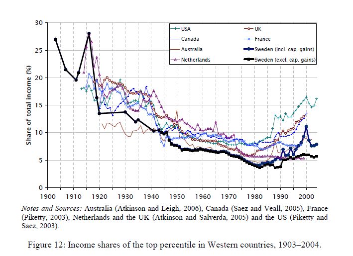
This graph tracks the share of income going to the top 1% in seven countries.  It’s from a paper by two Swedish economists, Jesper Roine and Daniel Waldenström (pdf).”’

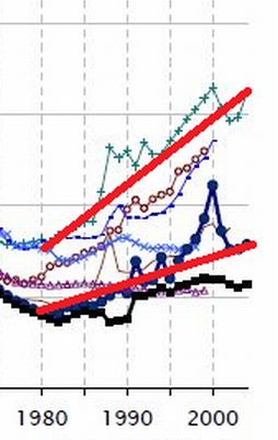
The trend was towards greater equality up to 1980 — the share of the 1% was shrinking.    Since then, the 1% have increased their share of the income pie in all seven countries.  But the graph seems to show important differences, especially in recent decades.  Here is a  cropped version of the graph showing the 1980-2004 years.  I have added straight lines connecting those two points for Sweden and for the U.S.
Both changes are increases, but are they the same or are they different?  The answer is crucial.  The U.S. and Sweden have different economic policies.  If the changes are no different between countries, then inequality is just one of those inevitable things that’s happening no matter what governments do.  But if the growth of inequality in the US is much greater than in Sweden, maybe government policy can in fact mitigate the trend towards inequality.
The Swedish 1% share went from a little under 5% to about 7.5%.  In the U.S., the 1% share increased from about 7% to 16%.* You might see those increases as very similar.
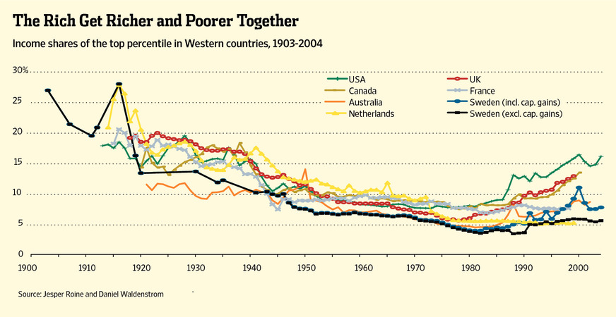
In fact, Allan Meltzer in the Wall Street Journal takes precisely that view.  He stretches out the graph to de-emphasize the vertical differences, and adds a title implying that all countries are “together” in this shift of income to the top 1%.
He adds this explanation:
As the . . . chart . . . shows, the share of income for the top 1% in these seven countries generally follows the same trend line. That means domestic policy can’t be the principal reason for the current spread between high earners and others. Since the 1980s, that spread has increased in nearly all seven countries. The U.S. and Sweden, countries with very different systems of redistribution, along with the U.K. and Canada show the largest increase in the share of income for the top 1%. [emphasis added]
If your pay went from $5 an hour to $7.50 an hour while your co-worker’s went from $7 to $16, you might think that your co-worker had gotten a substantially heftier raise.  But if so, that’s because you’re not the Wall Street Journal.
Meltzer’s main point in the article is that we should not raise taxes on the very wealthy.  However, as Bruce Barlett points out (here), if the rich are getting just as rich in high-tax countries like Sweden and the Netherlands as they are in low-tax countries like the U.S., we may as well raise taxes on them. They’ll be doing just as well, like their Swedish and Dutch counterparts, and the nation will have more revenue to put towards Medicare, education, deficit-reduction, etc.But Meltzer is wrong.  Sweden and the Netherlands are very different from the U.S.  As the graph shows, the income share of the 1% in the U.S. is twice that of the 1% in Sweden and 3 times that of the 1% in the Netherlands.  And it has risen more rapidly.  Yet Meltzer claims that inequality trends are similar everywhere.

So who are you going to believe – the Wall Street Journal or your lying eyes?

Cross-posted at Reports from the Economic Front.

The Great Recession ended in June 2009, which means we have been in economic expansion for almost 3 years.  Lately the news has been filled with reports of positive economic trends, but how seriously should we take these reports?

One indicator worth looking at is median household income (the red line below).  Unfortunately its trend suggests little reason for cheer. In January 2012, median household income was $50,020.  That was 5.4% lower than it was in June 2009.  Even worse, as the chart below reveals, after a brief uptick it headed back down again.

untitled.jpg

It is true that employment is finally growing, a development reflected in the decline in the unemployment rate (the blue line above).  Unfortunately, this has done little to boost wages.  In fact, real wages actually fell in 2011.  The first chart below highlights the downward turn.  The second chart reveals just how far per capita earnings remain below historical trend.

us-real-wages_thumb.gif

real-wage-and-salary-disbursements-per-capita.jpg

This situation helps to explain why growth has been so anemic.  As the Wall Street Journal wrote:

Many economists in the past few weeks have again reduced their estimates of growth.  The economy by many estimates is on track to grow at an annual rate of less than 2% in the first three months of 2012.  The economy expanded just 1.7% last year.  And since the final months of 2009, when unemployment peaked, the economy has expanded at a pretty paltry 2.5% annual rate.

Without a dramatic change in median household income, growth will remain slow and even the limited employment gains we currently celebrate will likely prove impossible to sustain.  Given the current political climate, it is hard to see how this expansion will be either long lasting or bring meaningful improvements in majority living and working conditions.

Cross-posted at Family Inequality.

The Carsey Institute’s Kristin Smith has written a brief on the plight of home care workers — the home health aides and personal care aides that play a growing role in our patchwork network of care work.

The news now is that these workers are not covered by the Fair Labor Standards Act — which offers the protection of minimum wage and overtime pay — but the U.S. Labor Department has proposed to bring them under its aegis.

According to the Department of Labor:

Many of these workers are the primary breadwinners for their families. Of the roughly 2 million workers who will be affected by this rule, more than 92 percent are women, nearly 50 percent are minorities, and nearly 40 percent rely on public benefits such as Medicaid and food stamps. According to the Bureau of Labor Statistics, home health care aides earn about $21,000 a year and many lack health insurance.

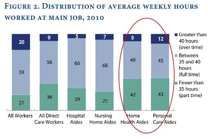
Smith’s analysis uses 2011 federal data. She shows that home care workers are more likely to work overtime, and more likely to work part time, than direct care workers in hospitals and nursing homes:

And they are more likely to be working part time for involuntary reasons:

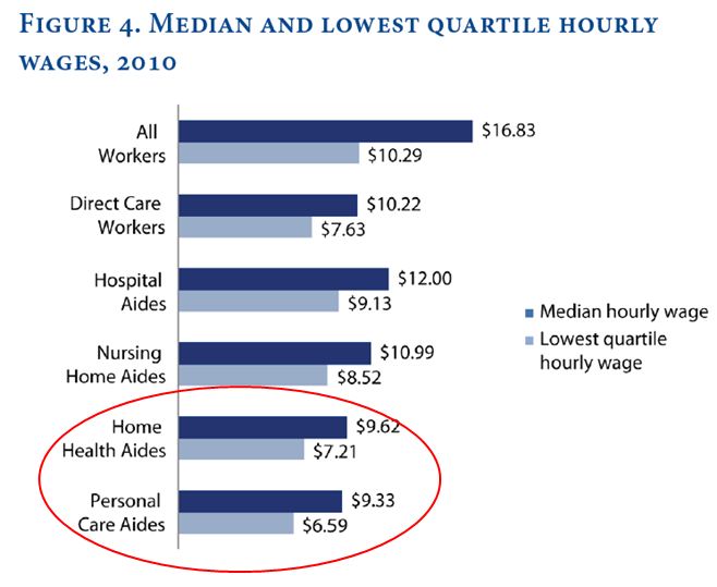
Finally, their median wages — and the wages of those in the bottom quartile of the occupation — are lower than those of hospital and nursing home workers:

As Nancy Folbre as explained, the economics are bad here. Besides the bad hours, bad pay, bad working conditions, lack of unions and lack of state protections, there are some structural problems. Paid home health care is competing with unpaid family care. That means the decision about whether to pay for professional care weighs against the value of a (usually female) family member’s unpaid work. That drives down the cost of home health care — which means more than a million women get lower wages, and women’s work is devalued. And so on. Breaking that cycle requires either a wage increase (sadly, that includes bringing them under the minimum wage law) or government subsidies.*

——————————

*One attempt to beat these economic odds and support long-term care, the Community Living Assistance Services and Supports Act (CLASS Act), was supposed to be a premium-based long-term care support program, and it was passed as part of Obamacare. However, with the rule that it be self-funding, and solvent, while paying a cash benefit for life to eligible beneficiaries, theadministration said it couldn’t be done after all. Actually paying for care isn’t cheap.

Philip N. Cohen is a professor of sociology at the University of Maryland, College Park, and writes the blog Family Inequality. You can follow him on Twitter or Facebook.

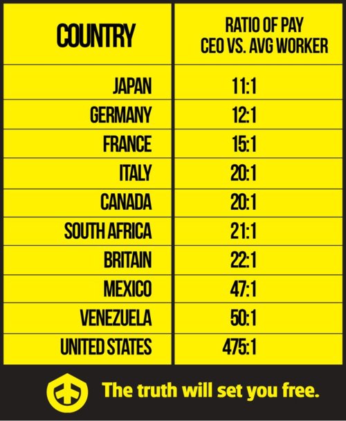
UPDATE:  Since posting this, I’ve discovered that the numbers do not accurately reflect the ratio of CEO vs. worker pay.  Writes PolitiFact:

We don’t doubt the chart’s underlying point that the ratio of CEO pay to worker pay is high in the United States, and is likely higher in our free-wheeling economy than it is in the historically more egalitarian nations of Europe.

But in its claim that the U.S. ratio is 475 to 1, the chart conveys a sense of certitude and statistical precision that simply isn’t warranted — and which is contradicted by the facts. The latest number for the U.S. is 185 to 1 in one study and 325 to 1 in another [though in previous years, those ratios have reached as high as 525 to 1] — and those numbers were not generated by groups that might have an ideological interest in downplaying the gaps between rich and poor. We rate the claim on the U.S. ratio False.

I apologize for not vetting this more carefully.

H/T KeepYourHopesUpHigh via GlobalSociologyBlog.

Lisa Wade, PhD is an Associate Professor at Tulane University. She is the author of American Hookup, a book about college sexual culture; a textbook about gender; and a forthcoming introductory text: Terrible Magnificent Sociology. You can follow her on Twitter and Instagram.

Cross-posted at Family Inequality.

In 1994, Sara McLanahan and Gary Sandefur published, Growing Up With A Single Parent: What Hurts, What Helps. The growth of children living with only their mothers was — then as now — a matter of concern not only for children’s well-being, but for intergenerational mobility. One of their empirical conclusions was this:

For children living with a single parent and no stepparent, income is the single most important factor in accounting for their lower well-being as compared with children living with both parents. It accounts for as much as half of their disadvantage. Low parental involvement, supervision, and aspirations and greater residential mobility account for the rest.

The biggest problem, in other words, is economic. The other factors —  involvement, supervision, aspirations, mobility — are related to social class and the time poverty that economically-poor parents experience.

Examples

Here are some bivariate illustrations — that is, head-to-head comparisons of the difference between children of poor and non-poor versus single and married parents.

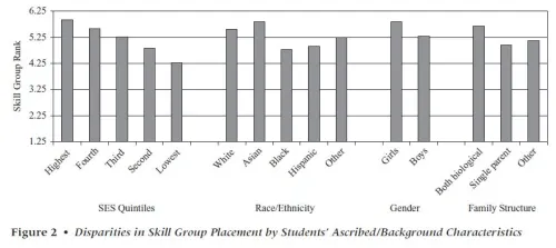
These are the “skill group” rankings by teachers of children by socioeconomic status (or SES, a composite of parents’ education, occupational prestige and income) versus race/ethnicity, gender and family structure. SES shows the widest spread in reading teachers’ group placement of first graders.

Source: Condron (2007)

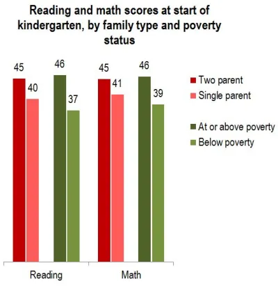
Similarly, the poor/nonpoor difference is greater than the two-parent/single-parent difference in kindergarten entry scores:

Source: Early Childhood Longitudinal Study (2009)

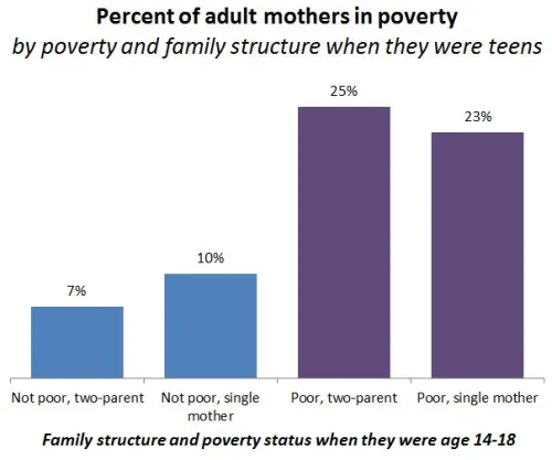
Those are just two examples from early-childhood assessments. More importantly, here is the breakdown seen in a longitudinal study of children growing up. When women grow up to be mothers, their poverty level in childhood is more important than their family structure for predicting whether they will be in poverty themselves. The poverty difference is large, the family structure difference is not:

Source: Musik & Mare (2006)

This study included a more sophisticated set of multivariate analyses than this simple graph, but the author’s conclusion fits it:

Net of the correlation between poverty and family structure within a generation, the intergenerational transmission of poverty is significantly stronger than the intergenerational transmission of family structure, and neither childhood poverty nor family structure affects the other in adulthood.

That is, childhood poverty matters more.

Fewer single parents, or less poverty?

But if single parenthood and poverty are so closely related, some people say, we should spend hundreds of millions of dollars promoting marriage to help children avoid poverty (and other problems). That’s what the government has done, with money from the welfare budget. Even if it worked, which it apparently doesn’t, it’s only one approach. What about reducing poverty? And, more specifically, reducing the relative likelihood of poverty in single-parent families versus those with married parents. That is, address the poverty gap between the two groups, rather than the size of the two groups. This has the added advantage of not singling out one group — single mothers — for social stigmatization (of the kind I mentioned here). And, because it defines the problem as economic rather than moral, may make it easier to build public support for helping the poor.

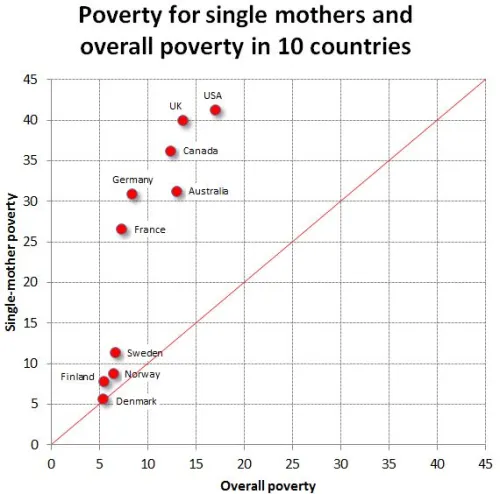
Consider a recent paper by David Brady and Rebekah Burroway, which will be published in Demography. They analyzed the relative poverty of single mothers versus the total population — that is, what percentage had incomes below half the median (per person, after accounting for taxes and government transfers). Such a relative poverty measure is really a measure of inequality, but specifically inequality at the low end. (Regardless of how rich the rich are, it’s theoretically possible to have no one below half the median income). Here is my graph showing that result, with only the countries that have reliable sample sizes in the survey:

The Nordic countries have the lowest overall poverty rates. But in absolute terms their advantage is much bigger for single mothers. (The red line shows equal poverty rates for single mothers and the total population.) The US and UK have the largest difference in poverty rates between single mothers and overall poverty. That is, we have the largest poverty penalty for single motherhood. If the relative poverty rates for single mothers were lower in the US, we might spend more time and money addressing poverty and less trying to change family structures.

Cross-posted at Reports from the Economic Front.

There is big trouble brewing in Europe.  John Ross, in his blog Key Trends in the World Economy, highlights this brewing crisis in a series of charts, some of which I repost below.

This first chart shows the extent of the recovery from the recent economic crisis in the U.S., the EU, and Japan.  While the U.S. GDP has finally regained its past business cycle peak, the same cannot be said for Europe (or Japan).  As of the 3rd quarter 2011, EU GDP was still 1.7% below its previous business cycle peak.  The Eurozone was 1.9% below.

Recent GDP estimates for the 4th quarter show European GDP once again contracting, which strongly suggests that the region is headed back into recession without having regained its previous business cycle peak.  This development implies that Europe faces serious stagnationist pressures.

gdp1.jpg

This chart looks at the growth record for the 5 largest European economies.  Germany has regained its previous GDP peak.  France is making progress toward that end.  These two countries account for 36.2% of European GDP.  However, things are quite different for the UK, Italy, and Spain.  These three countries account for 34.7% of European GDP and not only do they each remain far below their respective previous GDP peaks, their economies are once again heading downward.

gdp2.jpg

The third chart highlights the economic performance of the three countries which have received the most media attention because of fears that their governments will be unable to repay their respective debts.  They are clearly in trouble, adding to the downward pressure on European GDP.  However, despite all the attention paid to them, their combined economies are only one-eighth the size of the combined economies of the UK, Italy and Spain.

gdp3.jpg

The next two charts highlight the fact that economic trends are also dire throughout much of Eastern Europe.

gdp4.jpg

gdp5.jpg

The take-away is that European economic problems are not limited to a few smaller countries.  Some of the largest are also performing poorly and apparently headed back into recession without ever having regained their past business cycle peaks.  It is hard to see Europe escaping recession.  And it is hard to see the U.S., Asia, and Africa escaping the consequences.

Cross-posted at Jezebel.
American Studies professor Jo B. Paoletti has announced the publication of her book, Pink and Blue: Telling the Boys from the Girls in America.  I’ve been eagerly anticipating getting my hands on a copy. It was from Paoletti that I learned that the idea that pink was a feminine and blue a masculine color was a relatively new invention in American history (one that even now does not necessarily extend to other countries).  See, for example, this pink 1920s birthday card for a man (with a pre-Nazi swastika too).

The book asks “When did we startdressing girls in pink and boys in blue?”  To answer this question:

She chronicles the decline of the white dress for both boys and girls, the introduction of rompers in the early 20th century, the gendering of pink and blue, the resurgence of unisex fashions, and the origins of today’s highly gender-specific baby and toddler clothing.

In an analysis of baby cards from the 1960s, she notes that many of the cards are gender-neutral and include both pink and blue, but that even the gender-specific cards (this particular baby was a girl) use both colors. These cards, then, reveal that pink and blue had emerged as recognizable baby colors by the 1960s, but the use of blue in the “for girl” cards and the preponderance of gender-neutral cards suggests that the importance of gender differentiation hadn’t taken hold.

She has a large collection of examples.

At her website Paoletti says she has a book planned on “old lady clothes, mother-of-the-bride dresses, cougars and other age-appropriate nonsense.” I can’t wait.

Lisa Wade, PhD is an Associate Professor at Tulane University. She is the author of American Hookup, a book about college sexual culture; a textbook about gender; and a forthcoming introductory text: Terrible Magnificent Sociology. You can follow her on Twitter and Instagram.

Cross-posted at Caroline Heldman’s Blog.

In early 2009, I had dinner with a prominent, conservative political operative. He calmly (and accurately) predicted that the 2010 mid-term election would see the largest Republican gains in half a century. He then leaned in and half-whispered, “but you haven’t seen anything yet. Just wait until 2012 .” I pressed him on specifics, but he would only allude to a campaign that would rewrite the political rules. With the revelation that a centralized, state-by-state voter suppression campaign is underway, I now know what he was alluding to.

The New Voter Restriction Laws

In 2011, a sudden wave of state-level voter restrictions in Republican-controlled states has swept the nation, just in time for the 2012 election, with 19 new laws and two executive actions on the books. Some of these laws reduced or eliminated early voting, while others did away with weekend voting and same-day registration. All 50 states require voters to prove their identification at the polls, but 17 states have pending or approved law mandating government-sponsored IDs in order to vote, despite the fact that approximately 11% of citizens don’t have such IDs (for various reasons). For some Americans, even those with ample resources, getting an ID can be quite a challenge (even for nuns!).

The Brennan Center for Justice estimates that 5 million eligible voters face disenfranchisement from these new voter ID laws.


Voter ID laws disproportionately affect Black AmericansLatino/a voters, U.S. citizens who were born in other countrieselderly peoplepeople with disabilitiestransgendered people, and students — all of whom are less likely to have the required ID for different reasons. A 2006 Brennan Center study finds that 25% of Black , 16% percent of Latino/s, and 18% percent of elderly Americans lack the necessary ID. Some on the left have accurately likened these new laws to Jim Crow Era poll taxes because the expense involved in obtaining an ID place a disproportionate burden on many groups that have been historically disenfranchised.

What do all of these groups have in common? With the exception of elderly Americans who have shifted Republican in recent years (although they still comprise the most active voting group for Democrats), the Americans who will be disproportionately affected by voter ID laws all vote overwhelmingly Democratic.

There is little doubt, then, that voter ID efforts will affect the upcoming presidential election. The states that have restricted voting rights also have 185 Electoral College votes, two-thirds of the 270 needed to win the presidency. Out of the twelve battleground states in the upcoming election, five have already restricted voting rights and two others are considering new limitations.

Who’s Behind the New Laws?

The corporate organization behind the new spate of voter ID laws is the American Legislative Exchange Council (ALEC), which claims to be a “nonpartisan public-private partnership” between legislators, the private sector, and the general public to promote “principles of free markets, limited government, federalism, and individual liberty.” (How is requiring government-issued ID to vote a promotion of “limited government” and “individual liberty”?) In actuality, ALEC is a hyper-conservative Republican organization that receives 98% of its funding from corporate entities, such as Exxon Mobil, Atria (formerly Phillip Morris tobacco), AT&T, Coca-Cola, and the Charles G. Koch Charitable Foundation.

And ALEC is more than just a corporate lobbying organization. They work directly with legislators (who are ALEC members) to craft model legislation that is then introduced in statehouses across the country without acknowledging that corporations drafted the bill. ALEC drafted model ID voter legislation, and every single new voter ID law was passed with ALEC member involvement. ALEC’s policy agenda for 2011 included bills to deregulate polluting industries, privatize education, eliminate unions, and voting restrictions.

David and Charles Koch, two brothers who have quietly promoted their radical, free-market agenda with $100 million in contributions to conservative causes, including bankrolling Scott Walker’s election and subsequent recent assault on public unions in Wisconsin, have long ties to ALEC. Koch Industries has been one of a select group of members on ALEC’s governing board for nearly two decades, and from what little financial information is available, the Koch contribution to ALEC likely exceeds $1 million. The lead lobbyist for Koch Industries formerly chaired ALEC. Koch brother involvement in voter ID laws should be of particular interest for the Occupy Movement considering that David Koch’s project, Citizens for a Sound Economy, spearheaded the effort to repeal Glass-Steagall that enabled banking institutions to gamble in securities and tank the economy in 2008.

The purpose of new voter ID laws is to demobilize certain portions of electorate who are more likely to vote for Democrats, a goal laid out by ALEC founder, Paul Weyrich many decades ago who stated that “I don’t want everybody to vote… Our leverage in the elections goes up as the voting populus goes down.”

In short, this is a corporate-sponsored attack on democracy, spearheaded by Republicans intent on disenfranchising certain groups in the electorate in order to gain political control.

But Don’t We Need to Enhance Voting Security?

No. The voter ID movement is based on a bald-faced lie that voter impersonation is an issue. It’s not. As the DNC humorously notes, a person is 39 times more likely to be struck by lightning than to engage in voter impersonation, and 3,600 times more likely to report a UFO.

This voting fraud figure is based on a Bush Administration investigation into the matter that involved only 70 prosecutions nationwide, some of which were honest mistakes.

The Real Problem: Voter Turnout

We don’t have a voter impersonation fraud problem in the U.S., but we do have a voter turnout problem. Turnout in presidential years has declined since 1960, and pitifully hovers below 60% of the eligible electorate. We should be undertaking Herculean efforts to increase voter turnout, not erecting barriers to voting based on trumped-up problems to serve partisan ends. Yet, despite the data, untold resources are being spent to “correct” a problem that simply doesn’t exist. These new laws will cost taxpayers millions of dollars annually to implement, not including the cost of certain litigation. When a situation like this arises in politics, it means there are other motives at play.

We don’t need new barriers to voting, we need a state-by-state response with the concrete goals of getting people ready to vote, registering new voters, and overturning these laws.