nation: United States

Still from a 2013 Red Bull commercial:

Red Bull TV Commercial

The winter of 1620 was a devastating one for the colonists who had just arrived from England in New Plymouth.  They suffered from scurvy, exposure to the elements, and terrible living conditions.  Almost half (45 out of 102) died; only four of the remaining were women.

They made contact with the Wampanoag tribe in March.  The tribe taught them how to grow corn and donated food to the colony.  Thank to their help, the pilgrims were able to celebrate a harvest, or thanksgiving, that fall.  It was attended by the 53 remaining pilgrims and 90 indigenous Americans.

That’s why this Red Bull commercial is so annoying.  In the final 12 seconds, you see four pilgrims and two Indians, three women and three men. So, by pure numbers, reversed and heavily female.  The turkey is served by a pilgrim, sending the message that the pilgrims were feeding the Indians and not vice versa.  It’s a woman, of course, but likely most of the food preparation would have done by men, since they were 77% of the colonist population.

But, it nicely lines up with how we apparently think the world should be today: multicultural but majority white, with women cooking, and everyone paired up in same-race, heterosexual monogamy.

It’s the little things, you know.

Thanks to Jeff S. for the tip!

Lisa Wade, PhD is an Associate Professor at Tulane University. She is the author of American Hookup, a book about college sexual culture; a textbook about gender; and a forthcoming introductory text: Terrible Magnificent Sociology. You can follow her on Twitter and Instagram.

The dominant firms in the U.S. and other major capitalist counties are happily making profits, but they aren’t interested in investing them in new plants and equipment that increase productivity and create jobs.  Rather they prefer to use their earnings to acquire other firms, reward their managers and shareholders, or increase their holdings of cash and other financial assets.

The chart below, taken from a Michael Burke post in the Irish Left Review, shows trends in both U.S profits and investment .

1

As you can see the increase in profits (in orange) has swamped the increase in investment (in blue) over the relevant time period; in fact, investment in current dollars has actually been falling.

Looking at the ratio between these two variables helps us see even more clearly the growth in firm reluctance to channel profits into investment.  The investment ratio (investment/profits) was 62% in 1971, peaked at 69% in 1979, fell to 61% in 2000 and 56% in 2008, and dropped to an even lower 46% in 2012.

According to Burke,  if U.S. firms were simply to invest at the level they did in 1979, not even the peak, the increase in investment in the American economy would exceed $1.5 trillion, close to 10% of GDP.

The same dynamic is observable in the other main capitalist economies:

In 1995 the investment ratio in the Euro Area was 51.7% and by 2008 it was 53.2%. It fell to 47.1% in 2012. In Britain the investment ratio peaked at 76% in 1975 but by 2008 had fallen to 53%. In 2012 it was just 42.9% (OECD data).

So what are firms doing with their money? As Burke explains:

The uninvested portion of firms’ surplus essentially has only two destinations, either as a return to the holders of capital (both bondholders and shareholders), or is hoarded in the form of financial assets. In the case of the U.S. and other leading capitalist economies both phenomena have been observed. The nominal returns to capital have risen (even while the investment ratio has fallen) and financial assets including cash balances have also risen.

So, with firms seeing no privately profitable outlet for their funds, despite great societal needs, their owners appear content to reward themselves and sock away the rest in the financial system.  In many ways this turns out to be a self-reinforcing dynamic.  No wonder things are so bad for so many.

Cross-posted at Reports from the Economic Front.

Martin Hart-Landsberg is a professor of economics at Lewis and Clark College. You can follow him at Reports from the Economic Front.

Many critics are praising 12 Years a Slave for its uncompromising honesty about slavery. It offers not one breath of romanticism about the ante-bellum South.  No Southern gentlemen getting all noble about honor and no Southern belles and their mammies affectionately reminiscing or any of that other Gone With the Wind crap, just an inhuman system. 12 Years depicts the sadism not only as personal (though the film does have its individual sadists) but as inherent in the system – essential, inescapable, and constant.

Now, Noah Berlatsky at The Atlantic points out something else about 12 Years as a movie, something most critics missed – its refusal to follow the usual feel-good cliche plot convention of American film:

If we were working with the logic of Glory or Django, Northup would have to regain his manhood by standing up to his attackers and besting them in combat.

Django Unchained is a revenge fantasy. In the typical version, our peaceful hero is just minding his own business when the bad guy or guys deliberately commit some terrible insult or offense, which then justifies the hero unleashing violence – often at cataclysmic levels – upon the baddies. One glance at the poster for Django, and you can pretty much guess most of the story.

1

It’s the comic-book adolescent fantasy – the nebbish that the other kids insult when they’re not just ignoring him but who then ducks into a phone booth or says his magic word and transforms himself into the avenging superhero to put the bad guys in their place.

This scenario sometimes seems to be the basis of U.S. foreign policy. An insult or slight, real or imaginary, becomes the justification for “retaliation” in the form of destroying a government or an entire country along with tens of thousands or hundreds of thousands of its people. It seems pretty easy to sell that idea to us Americans – maybe because the revenge-fantasy scenario is woven deeply into American culture –  and it’s only in retrospect that we wonder how Iraq or Vietnam ever happened.

Django Unchained and the rest are a special example of a more general story line much cherished in American movies: the notion that all problems – psychological, interpersonal, political, moral – can be resolved by a final competition, whether it’s a quick-draw shootout or a dance contest.  (I’ve sung this song before in this blog, most recently here after I saw Silver Linings Playbook.)

Berlatsky’s piece on 12 Years points out something else I hadn’t noticed but that the Charles Atlas ad makes obvious: it’s all about masculinity. Revenge is a dish served almost exclusively at the Y-chromosome table.  The women in the story play a peripheral role as observers of the main event – an audience the hero is aware of – or as prizes to be won or, infrequently, as the hero’s chief source of encouragement, though that role usually goes to a male buddy or coach.

But when a story jettisons the manly revenge theme, women can enter more freely and fully.

12 Years a Slave though, doesn’t present masculinity as a solution to slavery, and as a result it’s able to think about and care about women as people rather than as accessories or MacGuffins.

Scrapping the revenge theme can also broaden the story’s perspective from the personal to the political (i.e., the sociological):

 12 Years a Slave doesn’t see slavery as a trial that men must overcome on their way to being men, but as a systemic evil that leaves those in its grasp with no good choices.

From that perspective, the solution lies not merely in avenging evil acts and people but in changing the system and the assumptions underlying it, a much lengthier and more difficult task. After all, revenge is just as much an aspect of that system as are the insults and injustices it is meant to punish. When men start talking about their manhood or their honor, there’s going to be blood, death, and destruction – sometimes a little, more likely lots of it.

One other difference between the revenge fantasy and political reality: in real life results of revenge are often short-lived. Killing off an evildoer or two doesn’t do much to end the evil. In the movies, we don’t have to worry about that. After the climactic revenge scene and peaceful coda, the credits roll, and the house lights come up. The End. In real life though, we rarely see a such clear endings, and we should know better than to believe a sign that declares “Mission Accomplished.”

Cross-posted at Montclair SocioBlog.

Jay Livingston is the chair of the Sociology Department at Montclair State University. You can follow him at Montclair SocioBlog or on Twitter.

The phrase “economic mobility” refers to the likelihood that a child will end up in the same or a different economic strata than their parent.  Education is usually cited as a key to improving economic well-being intergenerationally. Conversely, but often unstated, is the idea that if a child of college graduates doesn’t attend college, than they should perhaps do worse than their parents.

What does the data say?

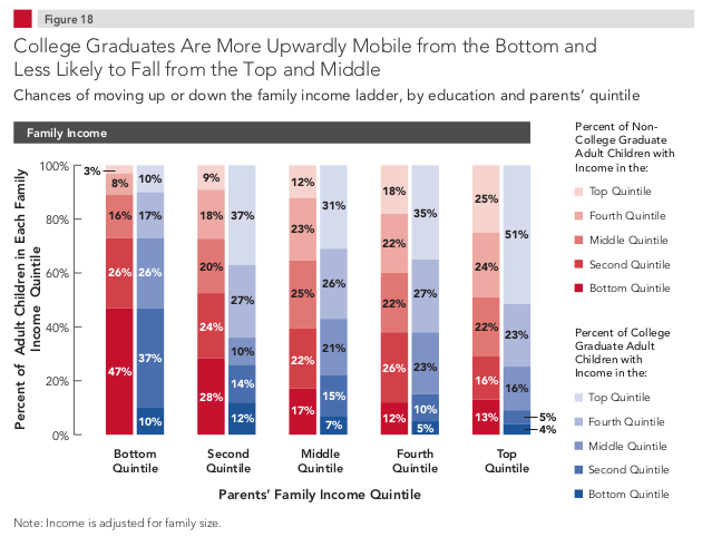
The figure below is from the Pew Economic Mobility Project.  Along the horizontal axis is the parent’s household income quintile: economic strata broken up into fifths from the lowest (left) to highest (right).  The bars represent the adult child’s income for those who didn’t graduate from college (red) and those that did (blue).

1

Often we focus on the left side.  Does attending college help poor and working class Americans?  The answer is yes. Only 10% of children born into the bottom 20% of household incomes will grow up and stay in the bottom 20%, compared to almost half of people who don’t go to college.    It’s similar, if less stark, for those in the 2nd to bottom quintile.

But what about the rich kids?  I want to look at the right side.  Notice that a quarter of kids born into the top quintile stay there even if they don’t get a college degree.  Half of non-degree earning children will stay in the top 40% of income earners.

Among the richest kids who do go to college, about 50% will remain in the top quintile.  There are lots of reasons for this, but one is paternal connections.  One study found that a whopping 70% of sons of the 1% had worked for the same employer as their father.  I wonder how high that number would be if we added daddy’s friends?

In sum, it’s hard to go up from down below, but it’s also relatively easy to stay sitting pretty if you’re already way up there.

Via Matthew O’Brien at The Atlantic. Cross-posted at Pacific Standard.

Lisa Wade, PhD is an Associate Professor at Tulane University. She is the author of American Hookup, a book about college sexual culture; a textbook about gender; and a forthcoming introductory text: Terrible Magnificent Sociology. You can follow her on Twitter and Instagram.

Two recent events had a strikingly similar theme.  Kenichi Ebina won America’s Got Talent and Nina Davuluri won Miss America.  In both instances, other Americans objected to their victories, claiming that they were not really American because Ebina and Davuluri are of Japanese and Indian origin respectively.   Still other Americans objected to this reaction.  And yet, as I’ll argue below, most of us share their bias.

First, thanks to Public Shaming, we have examples of the reaction on Twitter.  Reactions to Ebina’s win:

1 2 4

Reactions to Davuluri’s win:
14 12 13

These are stark examples of people who believe that only white people count as American.  It’s a bizarre position, of course, because people of European descent are immigrants to America, and an overtly racist one as well.  I don’t lose any sleep over publishing their identities on this blog.

But, the truth is, the majority of us — even those of us who oppose racism and embrace the idea that the U.S. is a nation of immigrants — hold the belief that America = white.  We just believe this subconsciously.

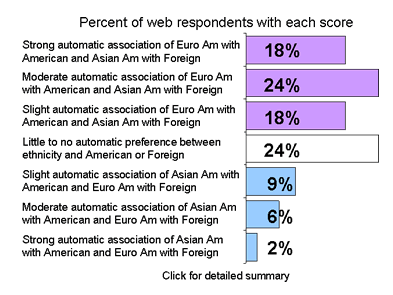
Project Implicit is an online psychological test that measures implicit beliefs, ones we hold that we’re not necessarily conscious of holding.  One test is of the association of Asian-ness with American-ness.  It works by measuring how long it takes us to sort Asian and European faces and American and Foreign famous sites into the proper categories.

First they ask you to sort faces and places with Asian and Foreign together on the left and European and American together on the right. Like this:

Screenshot_2Then they switch the bottom designations so that Asian and American are on one side and European and Foreign are on the other.  For most people, the harms their ability to sort faces and places: it slows down and includes more errors, revealing that their brain implicitly sees Asian and foreign as one category and American and European as another.

Here’s the aggregate data.  Almost a quarter of people make no association either way, 60% implicitly believe that Asians are less American than Europeans, and 17% think the opposite.

Screenshot_3The take home message is: even though it’s easy to condemn the twits making overtly racist comments, this is a problem that is much more pervasive and pernicious.  Even those of us who are horrified by those tweets likely carry the bias behind them.

Cross-posted at Pacific Standard.

Lisa Wade, PhD is an Associate Professor at Tulane University. She is the author of American Hookup, a book about college sexual culture; a textbook about gender; and a forthcoming introductory text: Terrible Magnificent Sociology. You can follow her on Twitter and Instagram.

Screen Shot 2013-09-19 at 8.08.15 AM

Earlier this week, Marty posted about the increasingly huge share of income going to the richest Americans. And as we’ve seen in the past, Americans tend to way — way — underestimate how unequal the U.S. is.

This video (via Upworthy) does a great job illustrating the distribution of wealth, and how it compares to Americans’ perceptions of both the real and ideal distribution. Even if you know all this stuff, and can recite the statistics, the visual representation of exactly what that means is still jarring.

Gwen Sharp is an associate professor of sociology at Nevada State College. You can follow her on Twitter at @gwensharpnv.

The great majority of Americans might find the post-recession expansion disappointing, but not the top earners.

The following table reveals that our economic system is operating much differently than in the recent past.  The rightmost column shows that the top 1% captured 68% of all the new income generated over the period 1993 to 2012, but a full 95% of all the real income growth during the 2009-2012 recovery from the Great Recession.  In contrast, the top 1% only captured 45% of the income growth during the Clinton expansion and 68% during the Bush expansion.

piketty_saez

Of that weren’t enough, the next chart offers another perspective on how well top income earners are doing. In the words of the New York Times article that included it:

…the top 10% of earners took more than half of the country’s total income in 2012, the highest level recorded since the government began collecting the relevant data a century ago… The top 1% took more than one-fifth of the income earned by Americans, one of the highest levels on record since 1913 when the government instituted an income tax.

We have a big economy.  Slow growth isn’t such a big deal if you are in the top 1% and 22.5% of the total national income is yours and you can capture 95% of any increase.  As for the rest of us…

One question rarely raised by those reporting on income trends: What policies are responsible for these trends?

Cross-posted at Reports from the Economic Front.

Martin Hart-Landsberg is a professor of economics at Lewis and Clark College. You can follow him at Reports from the Economic Front.

Excess under age-60 female mortality in less developed countries is estimated to add up to 3.9 million missing women worldwide (World Bank, 2011).  A large proportion of this is due to sex-selective abortion practices.  The practice occurs most commonly among poorer families in societies where boy children are given greater economic and social status than girl children. In such a context, the transition to smaller families can lead parents to choose boys over girls. Notably, female fetuses are most likely to be aborted when the first child born is a girl.

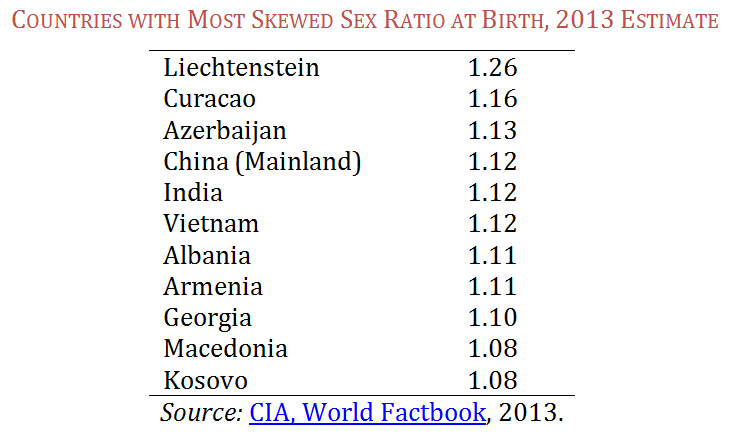
The table below shows the countries with the most skewed ratios at birth in the world. While there is naturally a slightly higher sex ratio of boys to girls — between 1.04-1.06 — ratios above that are considered to be altered by technology due to gender preferences for boy children.

Screenshot_1

The reason we find this newest 2013 data of particular interest is that, despite the popular Western focus on Asia, the practice occurs in more European countries. Perhaps most striking is the central European country that ranks at the top of the list—Liechtenstein. This strikes us as odd, given that Liechtenstein has never made this list in the past. Perhaps this is a data collection error (in very small populations, as also in Curacao, the results can be skewed). But we are surprised that no journalists have picked up on the fact that the worst offending son-preference country in the world is now, allegedly, a European country.  We contacted the CIA to ask them about this possible data anomaly but have not yet heard back.*

On the other hand, if the Liechtenstein data is accurate, this would be a very interesting story indeed, especially since Liechtenstein has the most restrictive laws against abortion in Europe.  A quick scan of gender equity policies in Liechtenstein shows that women there were not legalized to vote until 1984, indicating that it is not the most gender egalitarian of European countries.

In any case, whether Liechtenstein’s inclusion in this disreputable list is a data error or not, the other European countries on the list are legitimate.  They have been high for many years, and a recent report on Armenia, for example, documents longstanding norms in gender preference.  The disproportionate focus on birth sex ratios in China and India no doubt reflects their status as the #1 and #2 most populous countries, which means a much greater overall impact in sheer numbers.  Nevertheless, our point stands.  Why has the disproportionate inclusion of non-Asian countries on the above-list gone virtually unmentioned by journalists?

Do Developed Western Countries Prefer Boys?

Americans often think of parental sex preference as a thing of the past, or a problem in developing countries. After all, the U.S. sex ratio at birth falls in the normal range, at 1.05. This is in spite of the curious American cottage industry in sex-identification home use kits, such as the Intelligender, the GenderMaker and the Gender Mentor.

Screenshot_2

In surveys, American parents report an ideal of two children and equal preference for boys and girls. However, American gender preferences manifest themselves in more sneaky ways. A 2011 Gallup poll showed that, if they were only able to have one child, the highest preference was for a boy.  These results are little changed from the same Gallup question asked of Americans in 1941.

To return to a point made in an earlier post on skewed sex ratios, Americans may not be so different, after all, in their gender preferences from the countries in the above table.  The crucial difference, she noted, is that some Asian countries are more enabled to act on their boy preference than others. It appears we should now be including some European countries in that “enabled” group as well.

* Neither the United Nations, Population Reference Bureau, nor the World Bank have published 2013 statistics yet for comparison to the CIA data.

Jennifer Lundquist is an associate professor of sociology at the University of Massachusetts, Amherst who specializes in stratification and social demography.
Eiko Strader is a PhD student in sociology at the University of Massachusetts, Amherst who studies inequality in labor markets and the welfare state.