nation: India

Cross-posted at Family Inequality.

The other day I was surprised that a group of reporters failed to call out what seemed to be an obvious exaggeration by Republican Congresspeople in a press conference. Did the reporters not realize that a 25% unemployment rate among college graduates in 2013 is implausible, were they not paying attention, or do they just assume they’re being fed lies all the time so they don’t bother?

Last semester I launched an aggressive campaign to teach the undergraduate students in my class the size of the US population. If you don’t know that – and some large portion of them didn’t – how can you interpret statements such as, “On average, 24 people per minute are victims of rape, physical violence, or stalking by an intimate partner in the United States.” In this case the source followed up with, “Over the course of a year, that equals more than 12 million women and men.” But, is that a lot? It’s a lot more in the United States than it would be in China. (Unless you go with, “any rape is too many,” in which case why use a number at all?)

1

Anyway, just the US population isn’t enough. I decided to start a list of current demographic facts you need to know just to get through the day without being grossly misled or misinformed – or, in the case of journalists or teachers or social scientists, not to allow your audience to be grossly misled or misinformed. Not trivia that makes a point or statistics that are shocking, but the non-sensational information you need to know to make sense of those things when other people use them. And it’s really a ballpark requirement; when I tested the undergraduates, I gave them credit if they were within 20% of the US population – that’s anywhere between 250 million and 380 million!

I only got as far as 22 facts, but they should probably be somewhere in any top-100. And the silent reporters the other day made me realize I can’t let the perfect be the enemy of the good here. I’m open to suggestions for others (or other lists if they’re out there).

They refer to the US unless otherwise noted:

Description Number Source
World Population 7 billion 1
US Population 316 million 1
Children under 18 as share of pop. 24% 2
Adults 65+ as share of pop. 13% 2
Unemployment rate 7.6% 3
Unemployment rate range, 1970-2013 4% – 11% 4
Non-Hispanic Whites as share of pop. 63% 2
Blacks as share of pop. 13% 2
Hispanics as share of pop. 17% 2
Asians as share of pop. 5% 2
American Indians as share of pop. 1% 2
Immigrants as share of pop 13% 2
Adults with BA or higher 28% 2
Median household income $53,000 2
Most populous country, China 1.3 billion 5
2nd most populous country, India 1.2 billion 5
3rd most populous country, USA 315 million 5
4th most populous country, Indonesia 250 million 5
5th most populous country, Brazil 200 million 5
Male life expectancy at birth 76 6
Female life expectancy at birth 81 6
National life expectancy range 49 – 84 7

Sources:
1. http://www.census.gov/main/www/popclock.html
2. http://quickfacts.census.gov/qfd/states/00000.html
3. http://www.bls.gov/
4. Google public data: http://bit.ly/UVmeS3
5. https://www.cia.gov/library/publications/the-world-factbook/rankorder/2119rank.html
6. http://www.cdc.gov/nchs/hus/contents2011.htm#021
7. https://www.cia.gov/library/publications/the-world-factbook/rankorder/2102rank.html

Philip N. Cohen is a professor of sociology at the University of Maryland, College Park, and writes the blog Family Inequality. You can follow him on Twitter or Facebook.

Cross-posted at Montclair SocioBlog.

Forty years ago Richard Easterlin proposed the paradox that people in wealthier countries were no happier than those in less wealthy countries.  Subsequent research on money and happiness brought modifications and variations, notably that within a single country, while for the poor, more money meant fewer problems, for the wealthier people — those with enough or a bit more — enough is enough.  Increasing your income from $100,000 to $200,000 isn’t going to make you happier.

It was nice to hear researchers singing the same lyrics we’ll soon be hearing in commencement speeches and that you hear in Sunday sermons and pop songs (“the best things in life are free”; “mo’ money mo’ problems”).  But this moral has a sour-grapes taste; it’s a comforting fable we non-wealthy tell ourselves all the while suspecting that it probably isn’t true.

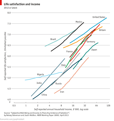
A recent Brookings paper by Betsey Stevenson and Justin Wolfers adds to that suspicion.  Looking at comparisons among countries and within countries, they find that when it comes to happiness, you can never be too rich.

1

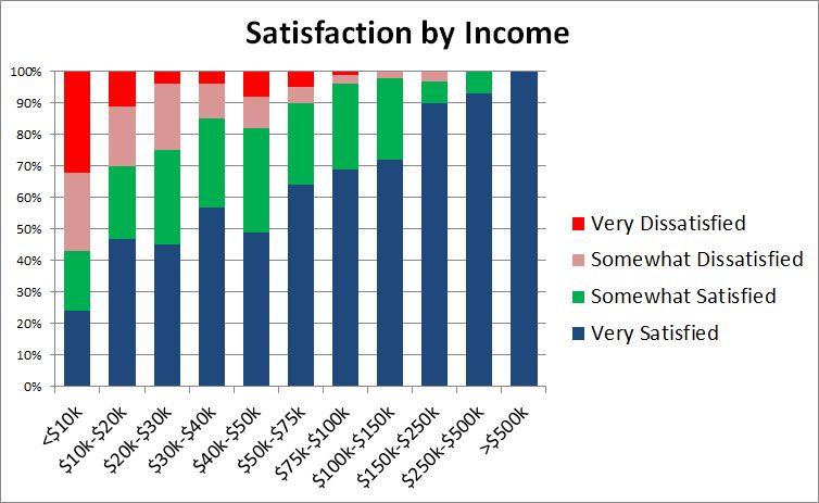
Stevenson and Wolfers also find no “satiation point,” some amount where happiness levels off despite increases in income.  They provide US data from a 2007 Gallup survey:

2

The data are pretty convincing.  Even as you go from rich to very rich, the proportion of “very satisfied” keeps increasing.  (Sample size in the stratosphere might be a problem: only 8 individuals reported annual incomes over $500,000;100% of them, though, were “very happy.”)

Did Biggie and Alexis get it wrong?

Around the time that the Stevenson-Wolfers study was getting attention in the world beyond Brookings, I was having lunch with a friend who sometimes chats with higher ups at places like hedge funds and Goldman Sachs.  He hears wheeler dealers complaining about their bonuses. “I only got ten bucks.”  Stevenson and Wolfers would predict that this guy’s happiness would be off the charts given the extra $10 million.  But he does not sound like a happy master of the universe.

I think that the difference is more than just the clash of anecdotal and systematic evidence.  It’s about defining and measuring happiness.  The Stevenson-Wolfers paper uses measures of “life satisfaction.”  Some surveys ask people to place themselves on a ladder according to “how you feel about your life.”  Others ask

All things considered, how satisfied are you with your life as a whole these days?

The GSS uses happy instead of satisfied, but the effect is the same:

Taken all together, how would you say things are these days – would you say that you are very happy, pretty happy, or not too happy?

When people hear these questions, they may think about their lives in a broader context and compare themselves to a wider segment of humanity.  I imagine that Goldman trader griping about his “ten bucks” was probably thinking of the guy down the hall who got twelve.  But when the survey researcher asks him where he is on that ladder, he may take a more global view and recognize that he has little cause for complaint.  Yet moment to moment during the day, he may look anything but happy.  There’s a difference between “affect” (the preponderance of momentary emotions) and overall life satisfaction.

Measuring affect is much more difficult — one method requires that people log in several times a day to report how they’re feeling at that moment — but the correlation with income is weaker.

In any case, it’s nice to know that the rich are benefitting from getting richer.  We can stop worrying about their being sad even in their wealthy pleasure and turn our attention elsewhere.  We got 99 problems, but the rich ain’t one.

Jay Livingston is the chair of the Sociology Department at Montclair State University. You can follow him at Montclair SocioBlog or on Twitter.

Cross-posted at Montclair SocioBlog.

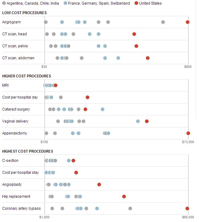
The Washington Post has provided some data on medical costs across a selection of countries (Argentina, Canada, Chile, and India in grey; France, Germany, Switzerland, and Spain in blue; and the U.S. in red). The data reveal that American health care is very expensive compared to other countries.

1

No wonder the US spends twice as much as France on health care.  In 2009, the U.S. average was $8000 per person; in France, $4000.  (Canada came in at $4800).  Why do we spend so much?  Ezra Klein quotes the title of a 2003 paper by four health-care economists:  “it’s the prices, stupid.”

And why are US prices higher?  Prices in the other OECD countries are lower partly because of what U.S. conservatives would call socialism – the active participation of the government.  In the U.K. and Canada, the government sets prices.  In other countries, the government uses its Wal-Mart-like power as a huge buyer to negotiate lower prices from providers.  (If it’s a good thing for Wal-Mart to bring lower prices for people who need to buy clothes, why is it a bad thing for the government to bring lower prices to people who need to buy, say, an appendectomy? I could never figure that out.)

There may also be cultural differences between the U.S. and other wealthy countries, differences about whether greed, for lack of a better word, is good.  How much greed is good, and in what realms is it good?  Klein quotes a man who served in the Thatcher government:

Health is a business in the United States in quite a different way than it is elsewhere.  It’s very much something people make money out of. There isn’t too much embarrassment about that compared to Europe and elsewhere.

So we Americans roll along, paying several times what others pay for medical procedures, doctor visits, and drugs.

Jay Livingston is the chair of the Sociology Department at Montclair State University. You can follow him at Montclair SocioBlog or on Twitter.

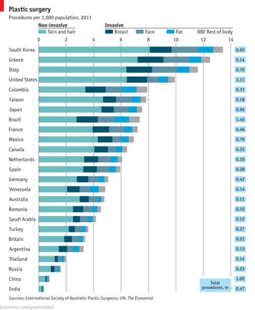
The  International Society of Aesthetic Plastic Surgeons has released new data on the incidence of invasive and non-invasive cosmetic procedures.  The U.S. leads in sheer numbers of procedures but, accounting for population, we fall into 4th place.  South Korea leads for the number of procedures per person, followed by Greece and Italy.

1

By far the most common kinds of surgical cosmetic procedures are lipoplasty and breast augmentation.  Along with fat, breasts seem to be a particular concern: breast lifts and breast reductions for both men and women are also in the top ten.  Abdominoplasty, nose jobs, eyelid surgeries, and facelifts are as well.

2

The incidence of these surgeries is strongly related to everything from the gender binary to global power dynamics.  In 2008 we reported that male breast reductions were the most common cosmetic surgery for 13-19 year olds (boys and girls combined). You would be shocked at what counts as excess breast tissue and how little the before and after photos look.  Boys and men getting breast reductions, alongside women getting augmentations, is obviously about our desire for men and women to be different, not naturally-occurring difference.  See The Story of My Man-Boobs for more.

Likewise, we’ve posted about surgeries that create an epithelial fold, a fold of skin in the eyelid more common in people with White than Asian ethnic backgrounds.  This surgery is a trend among Asians and Asian-Americans, as colonization has left us with an association between Whiteness, attractiveness, and power.

The Economist summarizes some other trends:

Breast augmentation, the second biggest surgical procedure, is most commonly performed in America and Brazil. Buttock implants are also a Brazilian specialty, as is vaginal rejuvenation. Asia is keen on nose jobs: China, Japan and South Korea are among the top five nations for rhinoplasty.

More on where and how many procedures are being performed, but nothing on why, at the ISAPS report.

Image at The Economist; via Global Sociology.

Lisa Wade, PhD is an Associate Professor at Tulane University. She is the author of American Hookup, a book about college sexual culture; a textbook about gender; and a forthcoming introductory text: Terrible Magnificent Sociology. You can follow her on Twitter and Instagram.

Cross-posted at Reports from the Economic Front.

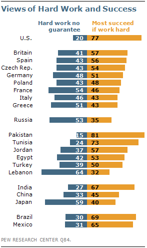
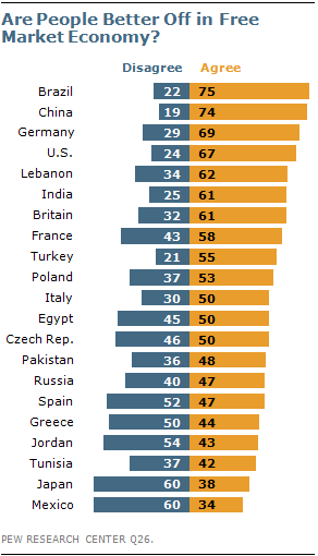
The Pew Research Center recently published a report titled “Pervasive Gloom About the World Economy.” The following two charts come from Chapter 4 which is called “The Causalities: Faith in Hard Work and Capitalism.”

The first suggests that the belief that hard work pays off remains strong in only a few countries: Pakistan (81%), the U.S. (77%), Tunisia (73%), Brazil (69%), India (67%) and Mexico (65%). The low scores in China, Germany, and Japan are worth noting. This is not to say that people everywhere are not working hard, just that many no longer believe there is a strong connection between their effort and outcome.

The second chart highlights the fact that growing numbers of people are losing faith in free market capitalism.  Despite mainstream claims that “there is no alternative,” a high percentage of people in many countries do not believe that the free market system makes people better off.

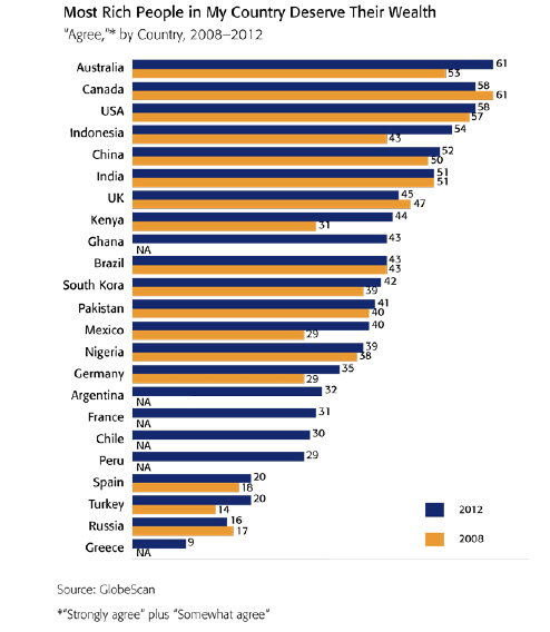
GlobeScan polled more than 12,000 adults across 23 countries about their attitudes towards economic inequality and, as the chart below reveals, the results were remarkably similar to those highlighted above.  In fact, as GlobeScan noted, “In 12 countries over 50% of people said they did not believe that the rich deserved their wealth.

It certainly seems that large numbers of people in many different countries are open to new ways of organizing economic activity.

Martin Hart-Landsberg is a professor of economics at Lewis and Clark College. You can follow him at Reports from the Economic Front.

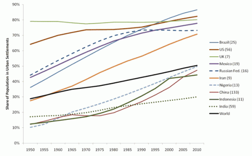
Urban Demographics posted some graphs from the UN’s State of the World’s Cities 2010/2011 report on global urbanization trends. A snapshot of urbanization in 11 countries:

You can see a few other notable trends here that illustrate various national trajectories, as Phil McDermott at Cities Matter points out. For instance, notice that while Russia underwent rapid urbanization between 1950 and 1980, it has leveled off since then. Similarly, Indonesia’s urbanization slowed significantly in the late ’90s and has continued at a much slower pace since then. We also see quite different patterns between the world’s two most populous nations: While China’s urbanization rate sped up in the early ’90s (after urbanization actually dipped in the ’70s), India has experienced fairly slow urbanization.

Credit Suisse released a report on urbanization and emerging markets, if you’re interested in the impacts of urbanization on a wide array of economic development indicators, from electricity and steel consumption to projections of future housing needs to incomes and standards of living.

In our post devoted to vintage douche ads, we present a number of examples of such ads that warn women that if they do not take steps to control their smelly, disturbing girly parts, they risk permanently alienating their male partners. Such ads encourage women to feel shame and anxiety about their bodies, which require constant vigilance or they become offensive to men.

Jeff S., Saed A., and Yvette send in a Indian commercial for Clean and Dry Intimate Wash that includes the same theme. The commercial starts out with a despondent-looking woman who cannot get her male companion’s attention. But a quick shower is just the trick; Clean and Dry apparently lightens as it deodorizes, with the word “fairness” appearing as the darkish smudge on the cartoon image magically disappears. According to the product description,

To be used while showering, its special pH-balanced formula cleans and protects the affected area, and even makes the skin fairer. Life for women will now be fresher, cleaner, fairer!

And presto! She’s confident, sassy, and suddenly has her boyfriend’s full attention; all is right with the world:

[youtube]https://www.youtube.com/watch?v=8phEyKrxBZM[/youtube]

Via Jezebel.

Gwen Sharp is an associate professor of sociology at Nevada State College. You can follow her on Twitter at @gwensharpnv.

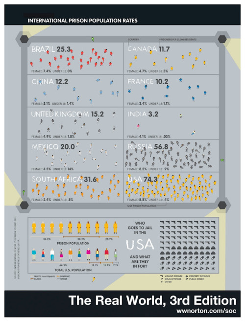
Norton Sociology recently posted an image that illustrate differences in rates of imprisonment in a number of countries. Imprisonment rates are influenced by a number of factors — what is made illegal, how intense law enforcement efforts are, preference for prison time over other options, etc. The U.S. does not compare favorably, with 74.3 per 100,000 10,000 of our population behind bars (click here for a version you can zoom in on, and sorry for the earlier typo!):

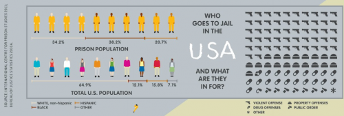
Here’s a close-up of the breakdown of the U.S. prison population:

Via Urban Demographics.