media: marketing

Cross-posted at Montclair SocioBlog.

In the Pittsburgh of my youth many decades ago, Rolling Rock was an ordinary, low-priced local beer – like Duquesne (“Duke”) or Iron City. (“Gimme a bottle of Iron,” was what you’d say to the bartender.  And if you were a true Pittsburgher, you pronounced it “Ahrn.”).  The Rolling Rock brewery was in Latrobe, PA, a town about forty miles east whose other claim to fame was Arnold Palmer. The print ads showed the pure sparking mountain stream flowing over rocks.

1

That was then.  In the late 1980s, Rolling Rock started expanding – geographically outward and socially upward.  Typically, when ideas and fashions diffuse through the social class structure they flow downward. Less frequently, the educated classes embrace an artifact of working-class culture. But why?  Their conspicuous consumption (or “signalling,” as we now say) is saying something, but what ideas about themselves and the social landscape are they expressing with their choice of beer?

I had an e-mail exchange about that question with Keith Humphreys, who blogs at The Reality-Based Community.  He too grew up in western Pennsylvania, and we both recalled being surprised years later to see Rolling Rock as a beer of choice among young stock traders and other decidedly non-working-class people.  But we had different ideas as to what these cosmopolitans thought they were doing.  Keith saw it as their way of identifying with the working class.

Those of us who grew up near Latrobe, Pennsylvania are agog when upscale hipsters who could afford something better drink Rolling Rock beer as a sign of their solidarity with us.*

I was more skeptical.  I saw it as the hipsters (or before them, the yuppies) trying to be even more hip – so discerning that they could discover an excellent product in places everyone else had overlooked.  Rolling Rock was a diamond in the rough, a Jackson Pollock for $5 at a yard sale.  The cognoscenti were not identifying with the working-class. They were magnifying the distance.  They were saying in effect, “Those people don’t know what a prize they have.  But I do.”

I had no real data to support that idea, so I asked Gerry Khermouch, who knows more about beverage marketing than do most people.  His Beverage Business Insights puts out industry newsletters, and he writes for Adweek and Brandweek.  He’s also beverage buddies with the guys who changed Rolling Rock marketing.  Here’s what he said,

[F]ar from expressing solidarity with the working class, urban drinkers far afield regarded it as an upscale icon in much the way that Stella Artois has claimed today — a triumph of pure marketing.

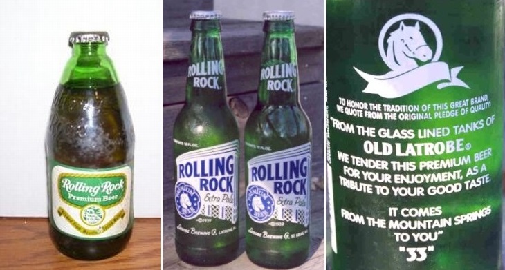
One ad campaign in the 90s, “Subtle Differences,” aimed directly at the drinker’s connoisseur fantasies.  Here are two examples:
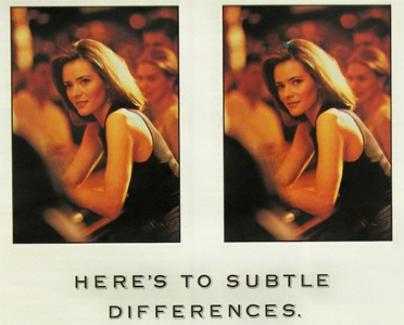
2

3
It’s the little nuances that make life more interesting. Rolling Rock uses slightly more malt than other domestic golden lagers for a refreshing taste that’s got a little more body, a little more bite. If you’ve noticed, we salute you.

Words like nuance were hardly an appeal to solidarity with the working-class.  Neither was the strategy of raising the price rather than lowering it.

To the marketers, the nuance, the malt, bite, and body didn’t count for much.  Their big investment was in packaging.  Instead of stubby bottles with paper labels, they returned to the long-necked, painted-label bottles with the mysterious “33” on the back. Apparently, the original packaging, the  “Old Latrobe” reference, and the rest added notes of working-class authenticity.

4

As for the actual beer inside those bottles, it may have once been what the ad copy said.  The brewers had tried to overcome the “watery” image from the beer’s early water-over-the-rocks imagery.  But when Anheuser-Busch bought the company in 2006, they closed the Latrobe brewery, and Rolling Rock became a watery, biteless product indistinguishable from the other innocuous lagers that dominate the US market.

* This was an aside in a post about the future of the marijuana market.  See also our post about the resurgence of Pabst Blue Ribbon.

Jay Livingston is the chair of the Sociology Department at Montclair State University. You can follow him at Montclair SocioBlog or on Twitter.

Cross-posted at Hawkblocker.This Dove commercial for hair dye is just fascinating.  It features a woman talking about what color means to her.  She observes that color is sensual, drawing connections between certain colors and the feeling of a cool breeze, the sun on one’s skin, a taste on one’s tongue, and more.  She says colors are moods: blonde is bubbly, red is passionate. The voice-over explains that dying her hair makes life “more vivid” and makes her want to laugh and dance.  She does it to invoke these characteristics.

She then explains that she’s blind.  The commercial uses her blindness to suggest that hair dye isn’t about color at all.  It’s about the feeling having dyed hair gives you, even if you can’t see the color.  “I don’t need to see it,” she says, “I can feel it.”

By using a woman who is (supposedly) blind, the commercial for hair dye uses the element of surprise to detach the product from the promise.  The sole purpose of hair dye is changing how something looks, but this ad claims that the change in appearance is entirely incidental.  Instead, dying one’s hair is supposed to make all of life more vibrant, every moment incredibly special, every pleasure more intense, and fill you to the brim with happy emotions.  It’s completely absurd.  Fantastically absurd. Insult-our-intelligence absurd.

And yet, it’s also exactly what nearly every other commercial and print ad does.  Most ads promise — in one way or another — that their product will make you happier, your life brighter, and your relationships more magical.  The product is positioned as the means, but not an end.   Most hair dye commercials, for example, promise that (1) if your hair is dyed to be more conventionally beautiful, (2) you will feel better/people will treat you better and, so, (3) your life will be improved.  This ad just skips the middle step, suggesting that chemicals in hair dye do this directly.

So, I’m glad to come across this utterly absurd commercial. It’s a good reminder to be suspicious of this message in all advertising.

Lisa Wade, PhD is an Associate Professor at Tulane University. She is the author of American Hookup, a book about college sexual culture; a textbook about gender; and a forthcoming introductory text: Terrible Magnificent Sociology. You can follow her on Twitter and Instagram.

In honor of yesterday’s game, we’re re-posting two of our favorite football-related posts. This one and one about a young team that confused its opponent by deviating from the football script without breaking the rules.

In “Televised Sport and the (Anti)Sociological Imagination,” Dan C. Hilliard discusses the rigid segmentation of televised sports programs, a schedule that in some cases requires “television timeouts”–that is, timeouts in the game due primarily to the need to break up the broadcast for commercials. Televised sports programs and advertising have become increasingly intertwined, such that they’re often nearly indistinguishable, what with the frequent mention of sponsors’ products by sports commentators.

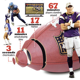
In this video from the Wall Street Journal, a journalist talks about the results of a study he completed in which he timed every element of a large number of televised football (as in American football, not soccer) games. The results? In a typical 3-hour broadcast, barely over 10 minutes shows action on the field. What makes up the rest? Well, advertising, of course, but even aside from that, most of the game coverage is made up of replays, players standing around or huddling before plays, shots of coaches or the crowd, and about 3 seconds of cheerleaders:

A breakdown of game coverage:

Here’s a breakdown of the amount of time spent on each element for a bunch of specific games.

Of course, in some cases these breaks in the action are an integral part of the game. But as things such as television timeouts show, games may also be intentionally slowed down to be sure the game fills the allotted time slot… and provides plenty of time for all the advertising they sold during it.

Gwen Sharp is an associate professor of sociology at Nevada State College. You can follow her on Twitter at @gwensharpnv.

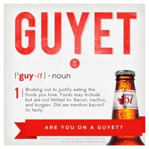
The Ethical Adman’s Tom Meggison sent along a new ad campaign by Molson.  The campaign coins the word “guyet,” a supposedly masculine alternative to “diet.”

If dieting is working out in order to be thin, then guyeting is “working out to justify eating the foods you love… Bacon, nachos, and burgers.”

There’s a very simple thing going on here: things associated with women are NOT-FOR-MEN, so anything that rings feminine must be covered in bacon, dipped in beer batter, and fried masculinized. See, for lots of examples, our Pinterest page on the phenomenon with almost 100 examples.

Importantly, this isn’t just about maintaining a strong distinction between men and women, it’s about maintaining gender inequality.  We disparage and demean femininity, which is why men want to avoid it.  Listen to the tone of voice that the narrator uses when saying the word “diet” at 21 seconds:

Dieting is stupid ’cause girls and everything associated with girls is stupid.  Guyeting is awesome ’cause guys are awesome.

The reverse doesn’t apply. Women who do things men like to do — drink whiskey, play sports, become surgeons, have dogs, etc — somehow rise in our esteem.  Men’s worth, in contrast, is harmed by their association with femininity.  This is a layer of gender inequality above and beyond sexism, the privileging of men over women; it’s androcentrism, the privileging of the masculine over the feminine.  Since women are required to do femininity, it means being required to do trivial, demeaned, and disparaged things.  Meanwhile, men have to come up with stupid excuses for participating in basic healthy activities like going for a jog.

More posts on androcentrism: “woman” as an insultbeing a girl is degradingmaking it manly: how to sell a car, good god don’t let men have long hairdon’t forget to hug like a dudesaving men from their (feminine) selvesmen must eschew femininitynot impressed with Buzz Lightyear commercialdinosaurs can’t be for girls, and sissy men are so uncool.

UPDATE: Comments closed.

Lisa Wade, PhD is an Associate Professor at Tulane University. She is the author of American Hookup, a book about college sexual culture; a textbook about gender; and a forthcoming introductory text: Terrible Magnificent Sociology. You can follow her on Twitter and Instagram.

As a sociologist who happens to DJ — or is that the other way around? — I’m always curious to see how DJing is depicted in popular culture and advertising. Ever since the 1970s, when the disco craze helped push the prominence of DJs into the public realm, disc jockeys have become iconic symbols of nightlife culture. Within the milieu of the dance floor, DJs serve as what Sarah Thornton once described as “orchestrators of a ‘living’ communal experience.”

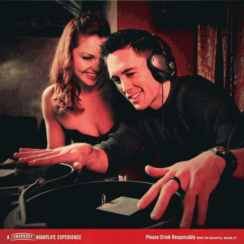
As such, the image of the DJ standing behind a pair of turntables has become ripe for appropriation by liquor and cigarette companies in particular. For them, especially in print ads, the DJ serves as a visual shorthand for any number of values they want their product associated with: culturally hip/cool, entertainment/musical mavens, the source of good times, etc. However, when it comes to that shorthand, this Smirnoff ad from last summer may have come up just a little too short.

At first glance, this image of a DJ working the turntables, with a cleavage-baring admirer looking on, seems uncomplicated: Smirnoff promises a fun, sexy time. However, a closer examination of the mise en scéne yields some instant problems.

  • There are no records on the turntables.
  • There’s not a mat on the turntables. Especially in a nightclub setting, DJs always use felt mats that sit between the platter and record. This not only protects the vinyl surface from the platter but by reducing friction between the record and platter, the DJ can “slip” a record into play at just the right moment. Hence, felt mats are called “slip mats.” In short, it’s very strange to see a turntable without a slip mat.
  • There’s no needle on the turntable arm. Therefore, even if they had bothered to put records on the turntables, Mr. Hip DJ wouldn’t have been able to actually play them.
  • There’s no visible DJ mixer. The mixer is absolutely crucial, allowing the DJ to switch between two audio sources, i.e. what makes “disc jockeying” possible to begin with. Normally, the mixer would sit between the two turntables so its absence in the image is conspicuous.
  • The gesture — hands posed over both turntables — doesn’t make sense; it’s not a pose that any DJ would ever employ. Normally, you would have one hand on a turntable, the other hand working the mixer but no nightclub DJ would  be manipulating both turntables, simultaneously. He looks like he’s trying to play bongos. (A scratch DJ, aka turntablist, may work both turntables for certain techniques but scratch DJs aren’t typically nightclub DJs – hard to dance to someone scratching).

When this ad made its rounds on social media, theories were bandied about to explain just what went wrong in this ad. The most plausible explanation is that the Smirnoff campaign selected a stock image hastily but that still opens up the question of how no one, from the original photographer, to the people in the image, to the people working on the Smirnoff ad itself, seemed to realize just how ridiculous this image was. It’d be akin to a car ad where someone is pretending to drive a car… from the backseat. With the wheels missing. And facing the wrong direction.

Of course, the vast majority of people know what driving a car is supposed to look like. One conclusion one might draw from the Smirnoff ad is that while the basic image of a DJ has some resonance in the public imagination, as a practice/craft, DJing isn’t actually well-understood at all.

————————

Dr. Oliver Wang is an associate professor of sociology at Cal State Long Beach. He contributes regularly on music and culture for NPR’s All Things Considered, KPCC’s Take Two, the LA Times, and KCET’s ArtBound. He also writes the audioblog Soul-Sides.com.

In her classic article, Teddy Bear Patriarchy, Donna Haraway examined the arrangement of the taxidermied animals in the American Museum of Natural History mammal hall in the first half of the 1900s.  She observed that the dioramas consistently featured nuclear families with strong fathers alert for dangers and nurturing mothers attending to their children.

This was a lie, of course. As we well know, the nuclear family is the exception, not the rule among mammals.  Instead of science, it was our own beliefs about men, women, and gender roles that informed the curators of the exhibits… and left viewers with a sense that these arrangements were more natural and universal than they are.

I’m an animal lover and have a broad appreciation for science, so I particularly enjoy exposing this type of projection.  Bee Movie was a particularly egregious case and we’ve written posts on nature documentaries that do this (on hyenas and flatworms).  The latest case is a Geico commercial.  See if you can catch it:

So, if you know anything about lions, you know that it’s unlikely that “Karl” is doing the hunting.  Among lions, it is the females who specialize in hunting (and they usually do so in groups, for what it’s worth).

See, no manes:

The commercial certainly coincides nicely with what many of us believe to be true about the natural role of human men, but it doesn’t reflect the reality of lion life at all.

Perhaps the people at Geico thought that a female huntress would confuse or distract the reader from their joke.  Or perhaps everyone involved in the project didn’t know this fact about lions; their gender ideology would have masked their ignorance, such that it never occurred to them to look it up.  Either way, contemporary ideas about gender shaped this “diorama” and it potentially reinforces similar beliefs among viewers.

Lisa Wade, PhD is an Associate Professor at Tulane University. She is the author of American Hookup, a book about college sexual culture; a textbook about gender; and a forthcoming introductory text: Terrible Magnificent Sociology. You can follow her on Twitter and Instagram.

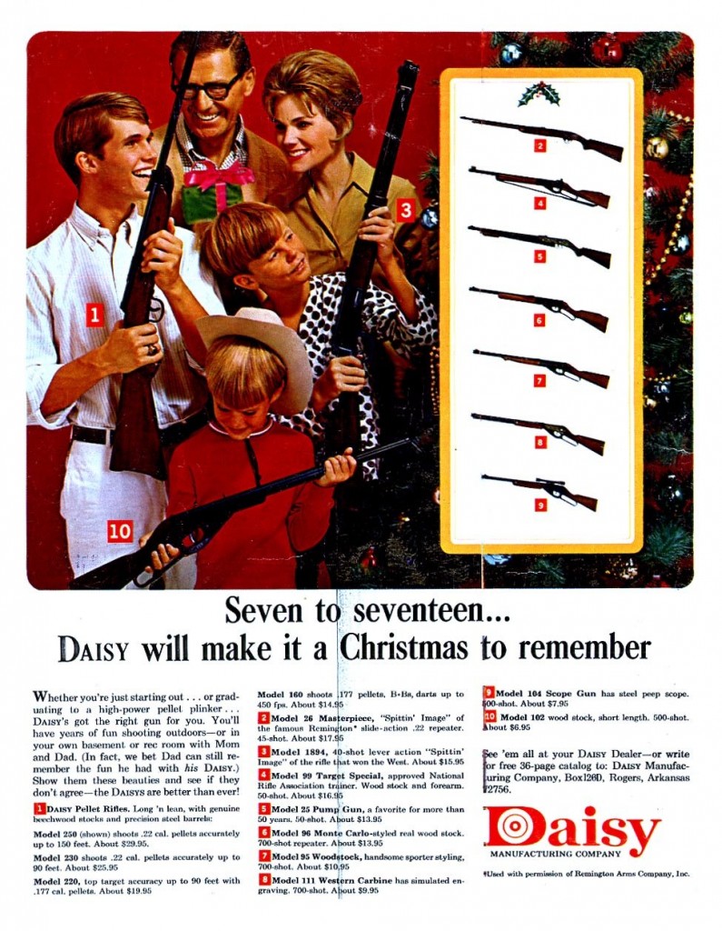
It’s an American tradition.  In fact, FBI data on background checks suggests that more guns were given as Christmas gifts last year than any previous year (source).  One-and-a-half million background checks were ordered in December 2011, more than any other month in American history.  Data from 2012 shows another uptick.

Notably, these data represent an increase in the number of guns at the same time as we see a decrease in the number of gun owners.  “[F]ewer and fewer people are owning more and more guns,” explained Caroline Brewer, representing the Brady Campaign to Prevent Gun Violence.

1939 (source):

hs2idz

Date unknown (source):

Date unknown (source):

329024228cedbd0cf0bobdc

1966 (source):

Online now (source):

Lisa Wade, PhD is an Associate Professor at Tulane University. She is the author of American Hookup, a book about college sexual culture; a textbook about gender; and a forthcoming introductory text: Terrible Magnificent Sociology. You can follow her on Twitter and Instagram.

Two days after 6 adults and 20 elementary school children were shot and killed in Newtown, CT, the Miami Herald homepage looked like this:

On the left side of this screenshot, the Herald shows images of the dead and notes how “America mourns” their loss. At right, one of their five-or-so rotating advertisements shows a large handgun and links to a website for the U.S. Concealed Carry Association, a company that sells – among other things – strategies to quickly arrange for conceal carry permits in your state.

The company’s tagline: “Knowledge is your best weapon. Preparation is your best defense.” Apparently, to a segment of the population this visual coupling advertisement read something like, “Mourn for now. Lock and load for next time.”

That such a provocative advertisement would appear in close proximity to a sensitive news story is unlikely to be accidental. News outlets are quite smart about what they post – and where – both in terms of news products and paid content.

But this juxtaposition of weaponry and those who have died from such products represents more than a short-term economic choice. Instead, it reflects the fact that we live in a culture that strongly supports gun ownership and loose gun control laws.  Had the newspaper thought that such an advertisement — published at this particular time and in this particular way — would ostracize their audience or advertisers, they wouldn’t have run it.

Some call the media the “fourth estate” – an institution that, alongside the courts, the oval office, and congress, keeps our country in balance. The juxtaposition in that screenshot, however, calls into question this role for the traditional media. Instead, they are simply reflecting the status quo, one largely controlled by those who are already in power. If this is the case, we can’t count on the media to check the power elite.  Any real change, then, is going to come from collective action and alternative media.

—————————

Robert Gutsche Jr. is an assistant professor in the School of Journalism and Mass Communication at Florida International University. His research deals with the sociology of news and news as a cultural artifact.